


H11K
-
Posts
1,151 -
Joined
-
Last visited
Posts posted by H11K
-
-
Does anyone else like the updated shade of red? That's one of my favorite parts of the uniform and a big upgrade over the previous red used. It feels like it's got a little bit more life to it now.
-
 1
1
-
-
2 minutes ago, DCarp1231 said:
If you block out 2005-22, it’s a somewhat natural progression of uniform IMO

Give those red pants the same double white stripe and these go from fine to borderline very good.
-
2
-
 1
1
-
-
My biggest problem with the uniforms.... is that they didn't listen to us Cardinals fans one bit.
We have been clamoring for some type of state flag representation on the uniforms for years and they just ignored it, I think thats why they're just so.. meh.
Just a tone deaf move to be honest, the uniforms are fine, but are perceived worse because of that in my opinion.
-
1
-
-
Very close to good, but ended up just being fine. Ill take it
-
1
-
-
If there isn't big changes I will seriously consider abandoning this team as a fan. (Not really but ill be pissed)
-
I dont care about football talk right now, show me the :censored:ing uniforms
-
5
-
-
4 minutes ago, CS85 said:
There, a new thread for you heathens.
-
1
-
-
5 minutes ago, CS85 said:
Screw you guys, just release the goddamn uniforms.
The most unserious social team in the league, and they have a reputation for it. They think they're being cool and funny with this :censored:.
-
3
-
-
31 minutes ago, ramsjetsthunder said:
Alright, everybody. Take one last look.
-
2
-
-
8 minutes ago, nuordr said:
Since @TruColor simply jumped over my question on the pants, I am guessing they are going to be plain with no stripes. Which will be awful.
As far as colors, I am guessing the orange is one of these:
The one smack dab in the middle of the grid looks nice, I hope its that
-
4
-
-
16 minutes ago, Gary said:
Trolling
-
Can totally see the red being "Sedona Red"
-
2
-
-
It's just incredible they haven't been publicly leaked yet. Love my Cardinals but they are the most dysfunctional team in the league, so I'm impressed it's still under wraps.
-
8
-
-
2 minutes ago, Indigo said:
The jerseys likely hit retail store on or after the 20th, and the team is having a PR event on that date, so I think the Cards are trying to hype that up more than the digital release (Sounds stupid, but that's all I can think of).
It wouldn't be the Cardinals if it didn't sound stupid
-
7
-
 2
2
-
-
1 hour ago, TruColor said:
For the Cardinals, I heard that there is going to be a social media reveal today, and then the players will model them on Thursday.
Interesting.... why tease the 20th, and not today then?
-
1
-
-
On 4/15/2023 at 6:22 PM, aawagner011 said:
FSU looks absolutely perfect now. Never change, Noles. They took all of the best parts of the old set and gave it the more simple 1990s and 2000s application. My only complaint is I don’t love how the pattern stops due to the collar but that’s a Nike complaint not a Florida State complaint.
Looks like they still have the white helmet in the rotation. The article mentions they have two jerseys (garnet, white), three pants (garnet, gold, white), and two helmets (gold, white). Wouldn’t be surprise if they eventually get black, too. Looks like the facemask may be chrome now.
Edit - here’s a look in natural lighting.
Man, that template is bad. Nike had basically perfected their jersey template. I get why they changed it again, but it's still disappointing. Stellar uniforms regardless.
-
2
-
-
11 minutes ago, ramsjetsthunder said:
I think we can all agree that this Cardinals identity may be the best kept secret in NFL uniform design in the past decade.
On a somewhat unrelated note, if we get a white helmet with copper fleck to create a sandy-type effect, along with the standard logo with a copper beak, I think it's an instant Top 10 helmet.
Depending on how it fits with the rest of the uniform, I would welcome this helmet design.
-
2
-
-
As a lifelong fan I am certainly excited, and ready to be let down. No date on reveal though.
-
1
-
1
-
-
The cardinals tweeted this out 30 min ago, with the current jersey. if we are indeed getting new uniforms,
I find it interesting that they wouldn't wait to do something like this.
-
59 minutes ago, WBeltz said:
So are the Cardinals going to announce the changes, or are they going to shadow drop them like the Bucs “Alarm clock” uniforms? Because they’ve been quiet on social media and haven’t posted anything.
As much as I would love for all of this smoke to be true about new uniforms... theres some auto event going on at State farm Stadium this weekend, which is likely the reason for the shop closure. Im not getting my hopes up..
-
On 4/30/2017 at 3:36 PM, Magic Dynasty said:

(At least playoff-wise)
Playoff wise for sure, haven't gotten out of the second round with Ovechkin
-
Great Uniform, but the Wrong uniform. The current uniforms have really been defined as the Fitz Era of sorts.

-
4
-
-
@hettinger_rl I think you have some real solid flags there, they instantly caught my eye, gave me that "wow" factor.
-
Here's one: Patriots at Cardinals, 2004. It was the last year before the modern uniforms for the Cardinals and the only time their classic uniforms met the modern Patriots.

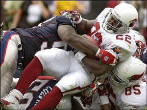
Those empty seats up top sum up the cardinals before the move to the new stadium.


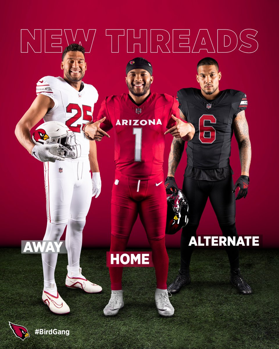


Arizona Cardinals new uniform extravaganza
in Sports Logo News
Posted
Based on this (good) photoshop, I like how they look in action.