


Phils Phan
-
Posts
378 -
Joined
-
Last visited
-
Days Won
2
Posts posted by Phils Phan
-
-
I was thinking about this the other day, I might be able to handle the mismatched colors but the completely out of place black stripes are the cherry on top that makes the whole thing a horrible mess.I find it odd that when people mention the color issues on the Cowboys' home uniforms, they almost all leave out the black outlines on the sleeve stripes:
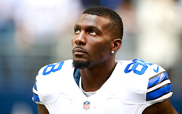
I know that this is how the stripes have been outlined since 1966, but they really should have changed it when they returned to this style of home uniform in 1995.
-
The Cash Black made me LOL, and I dont LOL very easily. Come on, it's freaking black.
Maybe so but "Liberty White" is totally it's own distinctive shade, no doubt about it.
-
I hate the Fisherman logo (too cartoonish and detailed, not a strong enough identity), number font and execution of the striping from that era, but I do LOVE the concept of the wave striping/shoulder yoke and the color scheme.
-
 1
1
-
-
I love arched nameplates. I wish the Braves still had them. I'm not crazy about them for the Rags, though; the drop-shadow and arch combine to be a bitch much sometimes.
No need for that kinda of language...
-
1
-
-
I think the Red Wings' preseason nameplates look way better than the arched ones they use normally.

Blasphemy!!!
-
The Bucs unis are too CLEAN?
The Bucs got close, if they went for a look similar to the Rutgers one I posted, more rustic and weathered, then I think their idea would have worked. The problem with their identity is they overdesigned it, like a Volkswagen, it's too clean and doesn't have enough soul.^^^^^
The problem is no team can pull chrome off right.
Lolololololololololololololololololololololololol
-
1
-
-
I hate the Bills red helmet. It felt out of place with the extremely blue-centered set and the red streak of the logo pops so much on the white.
-
Ugh the post season uni patches look like ads in all honesty...
-
Whether or not it's BFBS, it IS ugly.
-
If that's an unpopular opinion thanI hate the Black Pirates top that they seem to have worn 150 times this season. Looks like a high school or minor league jersey with just the cap logo on it.

-
I hate the Dallas Stars current logo.
I hate the Capitals new WC uniform.
I don't care one way or the other if the Red Wings have arched NOBs or not.
-
It's only a part of the logo, whereas the original fish was the main focus of the original logo.This:
 is >this:
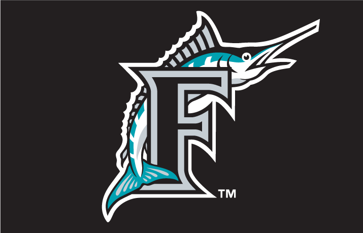 Sure the teal needs to return, but their current logo looks better than the generic, personality-less fish of their first 18 years.
A swooshing blob has personality?
-
This:
is >this:
Sure the teal needs to return, but their current logo looks better than the generic, personality-less fish of their first 18 years.
-
A major flaw I have with the Braves' set that most people don't seem to care about...


Sorry, but that triple placket piping looks atrocious. Along with the outlined, cursive script and the tomahawk, it clutters the front of the jersey way too much.
IMO the Braves themselves don't need triple placket piping, but I'd rather they wear it than no one in the MLB (Besides the A's alts), it stands out from all the pinstripes and thin piping the rest of the league uses.
-
I'm sure it's not unpopular to dislike at least some of them, but I HATE EVERY CFL uniform released this year.
-
Yeah having your logo represent half of your city name is idiotic and mocked to death if released today. And if it supposedly stands for greatness that makes it worse, it's like having your logo say "cool!" or "awesome!" Just an awful, awful, awful, AWFUL logo.
-
The current Brewers identity is better than the ball-in-glove identity.
For some reason I'll never comprehend that's a popular opinion around here.
-
1
-
-
I think LeBron will be looking A LOT better this time around in Cleveland.
-
2
-
-
This is an amazing logo.

-
1
-
-
I like the Phillies in red and blue. Sure it's a cliche color scheme, but it's also beautiful, and the red pinstripes have a very unique feel in the current MLB.

Unpopular Opinions
in Sports Logo General Discussion
Posted
The Flyers' vintage white alts are the first time the fad has bothered me. It looks awesome with the Senators former alts and all other instances have been merely for already pointless special occasion unis.
Those Flyers uniforms would still have no reason to exist without the VW though.