


damnyoutuesday
-
Posts
1,008 -
Joined
-
Last visited
-
Days Won
2
Posts posted by damnyoutuesday
-
-
1 hour ago, Silent Wind of Doom said:
"Hey, just as a note, if you're planning on doing any updates for this season (a service I appreciate more than you can imagine), on tonight's Mets radio broadcast they were discussing that the road blue jerseys (the ones reading "New York" that are labeled as Alt 2 in the image) are no more, as, according to the announcers, there's now a limit of 4 jersey options outside special MLB-wide programs (like those City Connect ones from the past few seasons and the Players Weekend ones). Now, the immediate reason for this discussion is that the Mets had to drop one of their blue jerseys in order to keep the resurrected black ones. But if the announcers were correct in their understanding (they're usually pretty good), the implication is that there will be a lot more changes as there are currently many teams with fifth (or more) jerseys"
This true? Anyone able to confirm or deny? It would explain some of the missing alts that are not specifically stated to be supply issues.
Teams to watch if this is true:
- Mariners (5)
- Padres (5)
- Diamondbacks (5)
- Rangers (5)
- Twins (6)
- Pirates (5)
- Mets (5)
-
Nationals (
hell if I know6?) - Braves (5)
- Rays (5)
-
43 minutes ago, Ferdinand Cesarano said:
The only good road look that the team has ever had.

(Though even then, the cap stinks. Put the current cap logo on that green cap.)
The team has never had a good home look.
What a consistent disaster asethetically this team has been. The only time it has ever looked good was the game it played in throwback uniforms of the Senior League's St. Petersberg Pelicans.
This is the best the Rays have ever looked
-
 13
13
-
 1
1
-
-
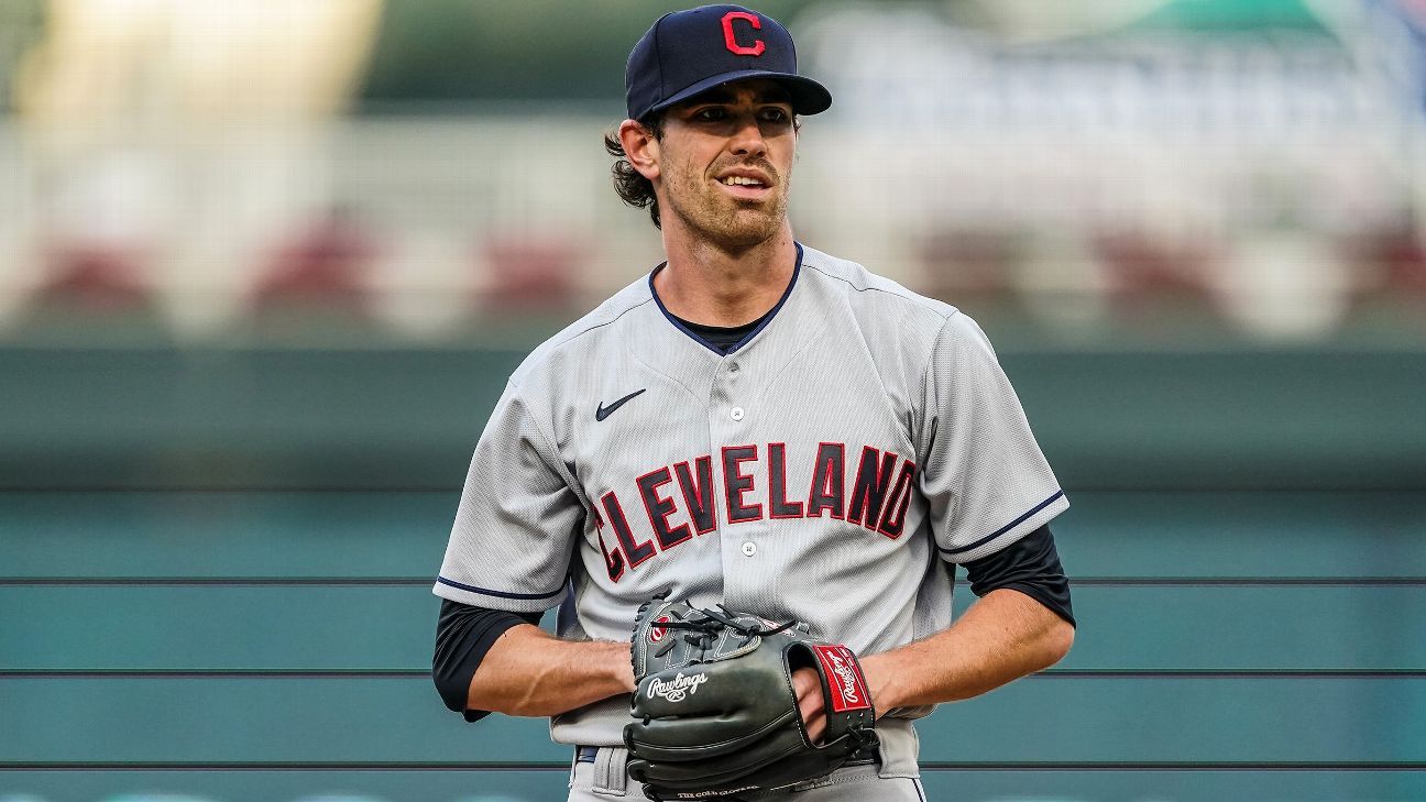
On 4/8/2022 at 7:41 AM, bbush24 said:
First look at the Guardians in action yesterday, compared to last year.
The white around the cap logo was a much needed upgrade
-
6
-
-
Brewers wore the yellow panel cap with the grey jerseys today
-
3
-
-
4 hours ago, CS85 said:
I feel like I should hate these, but they actually look pretty nice. As long as they don't go overboard with wearing them like the White Sox did with theirs, these are a solid city connect
-
4
-
-
I can stomach some of these bad designs because it's spring training
-
NFL teams need to stop going "what can we change about our uniforms that will make us hip with the youths!"
-
10
-
-
4 hours ago, DCarp1231 said:
One thing I actually do like is the use of “Commanders” on the home jersey and “Washington” on the away
My high school team did the same thing and I always liked it. I also like the idea the Rams were trying to do with it with the wordmark patches. My complaint is that Washington's wordmarks don't match. If a team like the Cardinals did it with their matching city and nickname marks, I think it would look much better.
-
After sleeping on it, I've come to the conclusion these uniforms still suck. The satin burgundy helmet can stay, but burn literally everything else
-
8
-
 1
1
-
 1
1
-
-
What they got right
- I actually really like the satin burgundy helmets. I think they look really good and have no complaints for those.
- I kind of like the unique look they went for on the alternate helmets with the number and logo placements. I don't mind teams experimenting a little, and I kind of like the non traditional helmet style. Why not.
- The name. I like it, and I think they could have built a good brand around it.
What they got wrong
- Literally everything else.
- The monochrome uniforms.
- The pointless black alternates with the ugly military motif.
- No jerseys match (even the Rams have two jerseys that match).
- The road jersey has no gold.
- The mismatching wordmarks.
- The giant wordmark on the home uniform
- The logo that looks like a marginal upgrade from the placeholder logo.
- The numbers on the road jersey are the worst in the NFL. Even to you Titans haters, these are far worse. (I don't hate the numbers on the home uniform, but they still aren't the best).
- The stupid diamond/gradient pattern.
- What on god's green earth is the black set's nameplate????
I think every single fan-made concept is 100% better than these dumpster fires. They make the Rams and Titans sets look like classics. Dan Snyder, how the hell do you drop the ball this :censored:ing bad. I can't believe we are stuck with these monstrosities for 5 years
-
6
-
20 minutes ago, SSmith48 said:
I'm not buying it, something seems off. No official NFL tags, and the font looks way too comical for the NFL/Nike to approve. This just reeks of off-brand design. Does Sport-Tek even have an NFL license?
And if this is just a custom product with the "actual" name, I'm not convinced either. Everything we have seen so far doesn't really lean toward Red Hogs being the name.
It would instantly be the worst name in the Big 4 sports leagues
-
3
-
-
15 hours ago, Crabcake said:
Yeah any pants that the Cowboys wear with their white jerseys that aren’t matte silver/gray/whatever you want to call it is just wrong. Just match the pants with the helmet. It’s not hard.
I'm more annoyed that the blue on the helmets is navy while the rest is royal
-
5
-
-
3 hours ago, burgundy said:
Why The Titans Uniforms Are A Dumpster Fire [Abridged]
- Their shoulders are giant swords.
- The alternate logo that the shoulder swords are based on is no longer anywhere to be found on the uniforms.
- The swords add two shades of gray to an already crowded color palette on the jersey.
- There's more gray on the primary jerseys than Columbia blue.
- The Columbia blue pit stains look like an afterthought.
- The numbers are the bastard lovechild of the Bucs' alarm clock numbers and West Virginia's pickaxe numbers.
- The already overly-outlined logo was made worse by putting it on a blue helmet, requiring yet another outline.
- The only use of red on the jersey is to highlight the NIKE logo.
- Their.
- Shoulders.
- Are.
- Giant.
- Swords.
On paper they should look god awful, but in practice they aren't even close to being absolutely unwatchable. I'd rather have the Cardinals, Rams, Jags, Saints, Jets, Broncos, Giants, Lions, and Eagles update their uniforms before I would consider changing the current Titans uniforms. I'll even say the current look is miles ahead of the previous look, that looks like a bad CFL template for the Argonauts. I do think the Titans should have their primary look be columbia jersey with navy pants though.
Can't wait for the one jokester to ask the mods for the dislike button for this
-
3
-
 2
2
-
-
18 hours ago, DCarp1231 said:
Eh, Cardinals are and would still be worse. There’s nothing really wrong with Tennessee’s all navy. It’s pretty on par with Seattle’s if not better.
I do not hate Tennessee's all navy, but the Seahawks all-navy is better. I also do not completely hate Tennessee's uniforms as a whole. They're not the best, but definitely not the dumpster fire everyone on here says they are
*ducks*
-
6
-
-
2 hours ago, tBBP said:
I don't get the love for these uniforms. They look like bad CFL uniforms
-
3
-
-
39 minutes ago, dont care said:
This one suffers from not being able to decide which one they want to put in front.
It's interlocking, like the Twins TC
-
3
-
-
3 hours ago, shstpt1 said:
The previous Rangers uniforms were just fine. All 4 Jerseys saying Texas, same template... Relatively good look
They were a coherent set, but I personally thought they were bland. I was excited to see them change it up with a new set, but the new 'Rangers' script is a disaster, along with the powder blue hat. Overall I like the changes made to the jerseys that say 'Texas' though
-
4 hours ago, Ted Cunningham said:
Now, the question is: will they use the above iteration of the red/white uniforms (2009 throwback to 1963)? Or will it be the 1985 version (below)? I like elements of both of these uniforms, but I don't feel more strongly about one over the other. If I had to guess though, I'd guess the 1985 version or perhaps an early 90s one with the red facemasks.
This version is better because the striping pattern is consistent
And god I love those uniforms
-
1
-
-
Only reason I don't absolutely despise it is because it's for a one-off game
-
Does this mean no uniform news
-
1
-
-
18 hours ago, DarthBrett said:
I like it but would change three things that would improve it. Drop the white trim on the piping, add piping/stripes down the pant legs and ditch the number on the front altogether. There have been many jerseys with logos but without numbers and they usually look good ('90s Angels navy alt, Dbacks black alt and original vest, the current Giants black alt and retired but recent road alt, the Marlins mid-2000s alt, the Padres 2010s unis, the early 2000s first Reds red alt, the most recent Royals blue road alt, the Tigers home whites and the Yankees home whites.
Something like this...
It just looks too plain with the chest logo
-
Also I find it odd that the Royals don't have a home royal blue alternate
-
2
-
-
I'm actually super happy that they got rid of the royal blue outline on the powder blue. It now looks much more like their original powder blue from back in the day. Kind of upset they got rid of white outlines on the road, but it still looks pretty good. Kind of a lateral move overall, but that's not necessarily a bad thing
-
1
-
-
Normally we would have full changes announced by now, which has me concerned that the Twins are still going to be wearing the gold set next year
/cdn.vox-cdn.com/uploads/chorus_image/image/59755531/51175139.jpg.0.jpg)
/cdn.vox-cdn.com/uploads/chorus_asset/file/13448086/st_pete_pelicans.jpg)


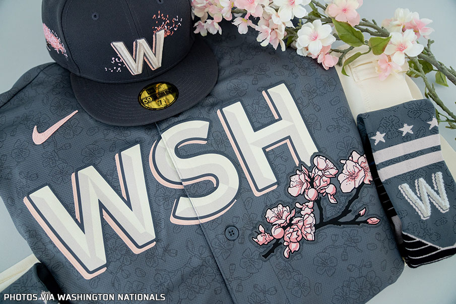
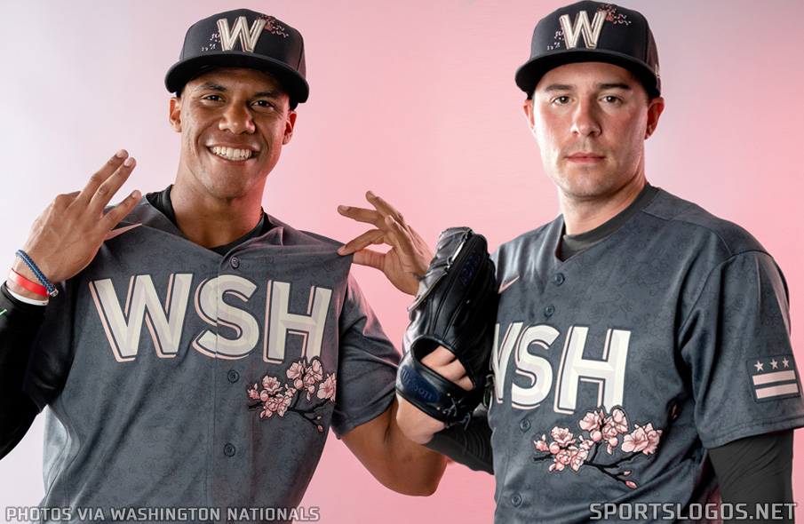
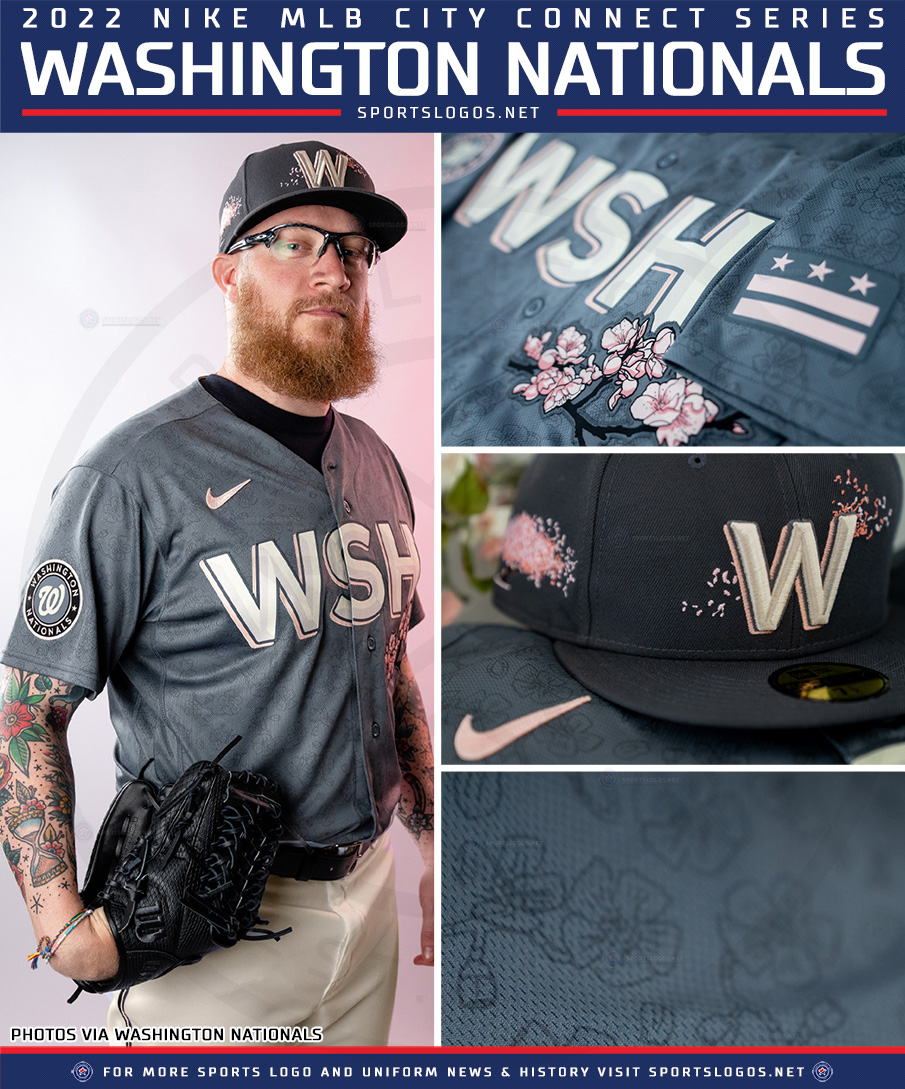


MLB 2022 Uniform/Logo Changes
in Sports Logo News
Posted
So that the players know which one is the right sleeve