


damnyoutuesday
-
Posts
1,008 -
Joined
-
Last visited
-
Days Won
2
Posts posted by damnyoutuesday
-
-
55 minutes ago, projectjohn said:
I know it’s not the point of Color Rush, but I’ve always felt the Lions’ gray tops *could* work with the blue pants. The all gray look is just awful, though.
I wish some teams would follow the Seahawks' route and mix and match a little with their color rush
-
 1
1
-
 1
1
-
-
I honestly wonder how these Lions uniforms would look with the blue socks instead
-
1
-
-
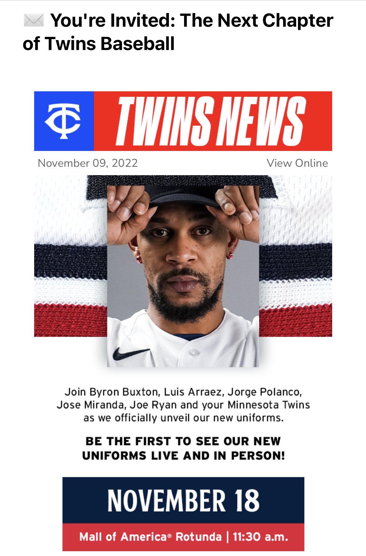
So after a week, here are my thoughts:
Overall, I really like the set as a whole. Gold is gone, and there's more consistency throughout the brand than the previous set. I love the road pinstripes, as well as the retro tri-color striping on the uniforms. Gives it a nice retro feel while still feeling modern. The lack of outlines doesn't bother me at all, because overall it looks nice. I also really like the updated script with the underline under WIN still remaining.
My complaints:
- I think the Twins heard "we want the M hat back" as "we want a M hat back." Fans wanted the classic Metrodome era M hat back, and instead we got a completely new M hat that is very mid. There's nothing wrong with it, but I will not be surprised at all if they end up slowly replacing it with the TC hat as time goes on.
- I also think the Twins heard "we want road pinstripes again" and didn't realize that also meant on the homes as well. It's not my biggest gripe, but it is definitely odd that the homes are plain white while the roads have pinstripes. It definitely makes us unique, but man it's a head scratcher.
- I'm still not used to the new TC yet, but that's probably just because I'm so used to the old one.
- I'm sad Minnie & Paul will no longer be on the uniforms, but at least they will still be in center field at Target Field
Overall, I really like this new uniform set and think it is a great step in the right direction. I have a few minor gripes, but nothing big enough to dislike it. I can't wait to see them on the field in the spring!
-
2
-
17 minutes ago, Ferdinand Cesarano said:
The pants shown with the blue road jersey do not have pinstripes.
Are you saying that these pants are not grey? If the Twins are going to wear white pants on the road with the blue jersey, and if they are going to have two distinct road looks (a dignified baseball look, and a Sunday beer league softball look), that knocks the overall grade from me down a peg, to B+.
The blue alt is going to be worn at home with white pants, and on the road with grey pinstriped pants
-
1
-
-
Overall I like it. I think it's an upgrade over our previous set.
My only really complaints are why are there pinstripes on the road but not the home? And I'm also disappointed there's no powder blue alternate
-
4
-
-
1 hour ago, sitboaf said:
Does it bother anyone else that we're at the dawn of a rebrand, and these 2 jerseys look like they belong to 2 different teams?
Nah. Kansas City has different home and road uniforms, along with the Yankees, Mets, Tigers, Guardians, White Sox, Cubs, Giants, Rangers, Reds, and Pirates
-
5
-
-
The jerseys won't have neck piping
The previous set had some form of neck piping on both navy jerseys, so Buxton is wearing the new navy jersey in this teaser
-
2
-
-
1 hour ago, Kg54mvp said:
Uh oh.
I’m hearing some bad news. There will only be three uniforms revealed, with two hats..powder blue and the Minnie and Paul handshake logo are gone.so that makes it the;
Home White
Alt Navy
Away?
Troubling news to be honest. Not only will traditionalists be upset that the Minnie and Paul logo is gone, but many that love the powder blue will be upset as well.
I'm concerned that the 3 uniforms are the home "Twins" on white, road "Minnesota" on navy blue, and the alternate is the cream with "Twin Cities" on it
-
I think the "Twin Cities" is just going to be a cream alt, in a similar vein to the Cardinals' "St. Louis" alt, with the city connect being something different
-
-
Just now, McCall said:
All those hats appear to be slouch fit, so I would assume they're just fashion caps.
While they could be fashion caps, teams often sell slouch fit hats of their normal game caps. I have both a TC and M cap by 47 brand
-
1
-
-
conceptcar2000 on reddit took this picture through the door of the Clubhouse Store of new Twins merch
- New wordmark is a combination of the updated retro script with a floating underline under WIN
- New TC mark is legit
- "Twin Cities" with the floating underline I would assume is either an alt or the city connect
- "Minnesota" in an arched font on a t-shirt in the background is what I assume the road mark will be. Seems to be an update of the Metrodome/World Series road jersey
- The Jose Miranda shirt in the background has the same name and number font as the announcement, and also matches the aforementioned Minnesota arched font.
- The Jose Miranda shirt appears to be cream colored, with the name in navy and number in red
- If the pennants are to be interpreted as what the uniforms will be, the wordmarks will be single colored
Idk about y'all, but this looks great
Edit: they could be fashion caps, but there are some "M" hats in the background that look like a downgrade from the previous M hat, as well as Minnesota state outline hats (I would assume these are city connect, probably with the Twin Cities wordmark)
-
9
-
18 hours ago, MJD7 said:
I've tried it a few times in the past, but it's never really looked right to me. Here's an updated attempt:

The one on the right looks fantastic
-
7
-
 1
1
-
-
5 minutes ago, Carolingian Steamroller said:
Look at the very top of this image. That looks like the edge of a sleeve patch:
Most likely updated version of this logo, which was worn as a sleeve patch
https://www.sportslogos.net/logos/view/6530392015/Minnesota_Twins/2015/Alternate_Logo
-
5
-
-
According to the Twins on instagram, the clubhouse store at Target Field will be closed through the 18th. My prediction is the store is being renovated with new graphics and being restocked with new merch, leading up to the uniform reveal on the 18th or 19th of November.
-
4
-
-
21 hours ago, Pigskin12 said:
https://twitter.com/Seahawks/header_photo
It's looking like another year of wolf gray in the desert. Not sure how exactly that obsession came to be in the past decade, but it's incredibly cheesy and pointless.
Could they at least mix it up and wear the navy pants with the grey?
-
4
-
-
3 hours ago, gosioux76 said:
My suspicion is that the T looks off-white is because this is an edited version of New Era's Southwest-inspired caps. But that's just a guess.
My guess is due to the popularity of the previous 1960's cream throwback, that the T on the hat will be white like it's always been, while the home uniforms will be cream with pinstripes like the throwbacks were
-
2
-
-
Not sure if I fully like the execution, but I love that it looks like they're going back to a 60s aesthetic. I think this leak could also be somewhat of a confirmation that they're going to the updated script they've been using on social media
-
2
-
-
9 minutes ago, simtek34 said:
Really? That's your only negative? I know opinions exist and all but this is their best Uniform combination! The monochrome Navy just doesn't work imo, and many would agree with that. ANY Football Uniform where the Jersey, Pants, and Socks are all the same color just never works. Having the same color helmet makes it even worse. I mean, the Gray pants just look so good! When they do all Navy, it's just a blob. This goes for every football team. Jersey/Pants/Socks should never match.
The grey pants need some green for color balance, they look a little too plain without it (same goes for the white ones). I will say the navy over grey looks good from zoomed out camera angles, but up close photos like this show how badly they need green on them. And I know this is an unpopular opinion, but I think the Seahawks all-navy is one of the few good instances of monochrome in the NFL. I would honestly argue that the blue pants are the best option for all 4 of their jersey options (I'm still waiting for the day they wear grey over navy)
-
2
-
-
Here's a hot take:
The black Cardinals helmet works way better with the color rush than the regular black alt
-
5
-
-
The Saints' gold is so dull. They really should update all gold in their uniforms to the color rush gold
-
8
-
-
15 hours ago, Cujo said:
This could very well be the worst uni matchup in league history!
Current leader in the clubhouse:
Other than the helmets, those Jacksonville uniforms were not bad. If they had just switched the helmet they would have a really nice set actually
-
4
-
-
2 hours ago, Gobbi said:
I was just checking the Twins schedule and this is the logo they’re using on the banner at the top of the page, along with brighter blue and red as mentioned above. I’m not sure how long they’ve been using it here but it caught my eye and may add to the hunch that this could be the logo to come.
I'm pretty sure that's just a stylized version of the current TC logo. It somewhat fits in with our horrible graphics package as of late. I doubt it's a sign of changes to come
-
4
-
-
6 hours ago, DCarp1231 said:
I’m still of the opinion that the Bengals should’ve only changed jerseys. Their pants stripes from from last set were perfect as-is(was?).
Except they had these weird little segments at the top that were colored differently from the rest of the stripes
-
2
-


College Football 2022
in Sports Logo News
Posted
The optimal Ole Miss uniform is Powder Blue helmet, red jersey, grey pants