


damnyoutuesday
-
Posts
1,002 -
Joined
-
Last visited
-
Days Won
2
Posts posted by damnyoutuesday
-
-
Might be the lighting, but the Guardians grey jerseys seem to match the pants well
-
 1
1
-
-
9 minutes ago, TBGKon said:
All this talk about the yellow A's jersey, which hasn't been worn since 2018. The dark green A's jersey was worn as recently as 2021.
The dark green jersey hasn't been an official option since 2021, while the yellow jersey is still technically an official option, even though it hasn't been worn for a longer period of time
-
3
-
-
2 hours ago, Sodboy13 said:
I love how that numeral font is just different enough to be "the Reds" on sight without any of the bespoke bullcrap we've seen on so many modified block numerals in the NFL.
Now that the "temporary" move to Sacramento is official, my guess on the A's 2025 uniforms is this: No change to the home whites, the road grays get the "Athletics" script across the front instead of "Oakland," the kelly green jerseys get mothballed, and the still-active yellow alts get pulled out of storage. Like everything involving the Fisher A's, the bare minimum will be done.
It's the A's we're talking about. I could see them just dropping the grey and kelly jerseys, and wearing the gold jerseys full time on the road
-
1
-
-
1 hour ago, Brave-Bird 08 said:
Are there any recent examples in other pro sports leagues of teams having uniforms literally not available before the season?
Wasn't this a problem with MLB during Covid? I remember supply chain issues kept some teams from having some uniforms
And the Eagles had to wear black for a couple games because Nike couldn't figure out how to make their dark green
-
2
-
-
Unpopular opinion: I don't care what numbers defensive players wear
-
8
-
 1
1
-
 2
2
-
-
12 minutes ago, Cujo said:
Possible Broncos unis based on "all the rumors"

If they look like this, they would firmly be "meh". I'd say an upgrade over the outdated previous set, but that's simply by getting rid of the side panels
-
1
-
 1
1
-
1
-
-
1 minute ago, PlayGloria said:
I said this earlier, but that Tigers CC graphic had tire tracks on the right hand side. There's going to be some kind of Detroit Motor City element to this thing.
Is it tire tracks? Or is it just some orange bars a graphic designer thought looked cool?
-
19 hours ago, MNtwins3 said:
Teams that have not worn one of their alternates so far:
-
Twins - Royals
- A's
- Dodgers
- Angels
- Cardinals
- White Sox
- Braves
- Nationals
- Mets
- Red Sox
Teams that have only worn an alternate so far:
- Brewers
- Blue Jays
The Giants don't have a road alternate, so they are TBD. Some of the teams listed were wearing their alternates in spring training but have not worn them in the regular season. Not saying all of the teams listed are missing uniforms, because some teams go on runs of not wearing some uniforms. Also we're only 3-5 games into the season, so who knows
Twins are wearing the navy blue alternate today
And the Brewers cream uniforms might be the worst culprit so far of see through pants. I can clearly see where the tucked in jersey ends on the starting pitcher from the goddamn centerfield camera
-
-
4 hours ago, Sport said:
If there's one improvement from the Fanatics hostile takeover it's the sleeves on the Reds road jerseys.
This is what it used to look like
Now it's an accidental callback to the 1990 uniforms and we're one step closer to my dream of wearing these with belts and buttons.
call it a pleasant surprise when I turned the game on last night.
Reds have desperately needed to drop black for like 20 years at this point
-
15
-
2
-
-
Teams that have not worn one of their alternates so far:
- Twins
- Royals
- A's
- Dodgers
- Angels
- Cardinals
- White Sox
- Braves
- Nationals
- Mets
- Red Sox
Teams that have only worn an alternate so far:
- Brewers
- Blue Jays
The Giants don't have a road alternate, so they are TBD. Some of the teams listed were wearing their alternates in spring training but have not worn them in the regular season. Not saying all of the teams listed are missing uniforms, because some teams go on runs of not wearing some uniforms. Also we're only 3-5 games into the season, so who knows
-
1
-
5 hours ago, floydnimrod said:
More of an overall question: not considering the new template, are there any teams whose road grays are better, or at least on par with the home whites? I can't think of a single team where the road gray isn't just a worse uniform design than the home uniform
Texas Rangers
Oakland Athletics
Toronto Blue Jays
Atlanta Braves
Minnesota Twins
San Diego Padres
Los Angeles Dodgers
Los Angeles Angels
Miami Marlins
St. Louis Cardinals
I'd argue the Rangers road greys are better than their home whites, and the rest the road greys are on par with the home whites (some of them are literally the same design both home and away). This isn't to say I hate all the road greys not mentioned, but some of them are definitely the weaker uniform
-
Diamondbacks alternates both look fantastic. The teal really pops as intended on the red and black jerseys, but feels more muted on the home uniforms
-
5
-
-
20 minutes ago, coco1997 said:
About damn time.
I liked that throwback. Probably wasn't the best choice for them when two of their division rivals had the same color scheme though
-
2
-
-
So the Phillies off-white looks yellow, but the Diamondbacks have looked fine?
Also I have not noticed that white uniforms have been changed to a slight off-white, they just look white
-
1
-
-
Just now, clonewars2008 said:
Also number outlines on the whites to
match the stripes.
They just need to make their uniforms a blue version of Kansas State's uniforms
-
3
-
-
Yankees have not acknowledged they changed their road jerseys on social media. I know it's the Yankees, but in 2024 that's honestly incredible
-
1
-
-
I'm shocked nobody is talking about the mothership's MLB season preview dropping on us that the Dodgers elevated their blue jersey to a permanent alternate. I've waited years for it and it finally happened
-
1
-
2
-
-
4 hours ago, 1stAndPhoremost said:
Not to jump backwards into two weeks ago, but did anyone else catch the Phillies Spring Breakout prospect team in the red alt jerseys? A lot of these players weren't around last year, and those that were wouldn't have worn their usual (lower) numbers....so did Nike break their own rule just for a one-off game?
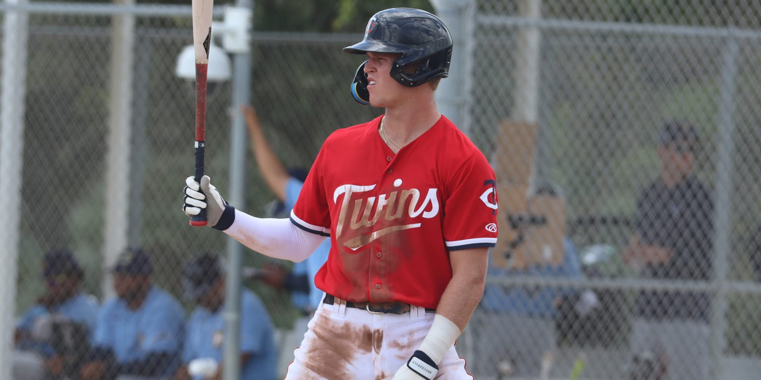
Teams have different jerseys for the minor leaguers. Twins have a red version of their current home uniform that only the minor leaguers use
-
7
-
 1
1
-
-
18 minutes ago, MCM0313 said:
He isn’t a zero. He’s whatever the most boring QB number would be. I think of 11, remembering the twilight years of Drew Bledsoe’s career, but Mariota isn’t a sitting duck in the pocket, nor was he anywhere near as good, at his peak, as peak Bledsoe. But I still think of Bledsoe’s time in Dallas for some reason.
Mariota is a plus runner and a team player. But he doesn’t make many big plays as a passer, and he commits too many turnovers for a game manager. He’s a high-end backup and a low-end starter. But he isn’t a zero.
The Peter Man is a zero. Zach Wilson is a zero
-
1 hour ago, FrutigerAero said:
So did the Mariners ever reveal a uniform update? I thought that was supposed to happen.
Supposedly the only thing that's different is the navy jersey now has a block NOB font. The number font will remain non-matching with the rest of their uniforms, and there are no other changes
-
1
-
 2
2
-
-
45 minutes ago, shaydre1019 said:
Honestly I mean almost generally speaking a colored facemask doesn't look good on a dark/black helmet.
I think these would both look better with black facemasks.
It's a case-by-case for me. Depends on the rest of the uniform in both cases
-
2
-
-
14 minutes ago, Sec19Row53 said:
Not from the stands we aren't, nor from the broadcast booth.
The broadcast booth is watching the game on a screen simultaneously. They do not need TV numbers
And as a college football fan, I have never had trouble identifying players from the stands without TV numbers
-
7
-
-
24 minutes ago, Digby said:
One other thing I still want to complain about re: the Twins is that, while the home looks great and has grown on me for the reasons others have beat to death already, it also looks a little bit lonely in the overall set, given the away set's abandonment of the TC and the script, and the City Connect (which is worn too much) losing the red. I know uniform set-wide cohesion and consistency is an outdated concept but it bugs me.
Once again, the Twin Cities jersey is not our City Connect. That is just an alternate. We are getting a City Connect this season.
And the TC hat at home/M hat on the road is a call back to the 2000's when we used to do that, even down to the pinstripes on the road. Our current set is awesome, and my only complaint is Nike's stupid 4+1 rule so we can't have a powder blue version of our home uniform
-
2
-
2
-
1
-
-
2 hours ago, BBTV said:
That's literally my point. The horn curves up, creating a perfect semi-framed space for the swoosh to live, making it essentially a logo. If you change the swoosh to some other company's logo, it changes the look of the jersey in a way that's much bigger than way back in the day when sleeve advertisers switched between Russell, Puma, Wilson, et al, and their patches were just placed any old place.
Basically a reverse of this
The swoosh is framed, and looks like it's a team logo.
Worst offender:
I'd argue the Steelers moving their entire striping pattern down to accommodate the manufacturer logo is a worse offender than the Vikings
-
4
-


2024 NFL Changes
in Sports Logo News
Posted
Praying to every deity in existence for some sort of leak this weekend