

woody86
-
Posts
115 -
Joined
-
Last visited
Posts posted by woody86
-
-
Great job on the RSL quest. Given they play in Sandy (suburb), they likely wouldn’t make a ton of nods to the city itself. That said, love the creativity!
-
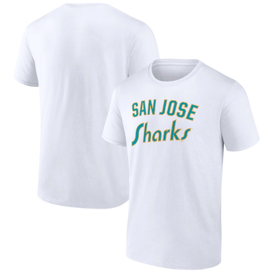
Some great looks! Nuggets need a puck in stead of a basketball
-
 1
1
-
-
1 hour ago, teeray01 said:
Charlotte A's
Logos

Home
Road
Alternate
Looks good. Logo cred to athletics nation?
-
17 hours ago, Ridleylash said:
It was already leaked as part of the T-shirt listings:
What about a shoulder logo? Like a weird shark in that circle? Nothing like that leaked yet?
-
I agree that you CAN have too much teal. Answering the question we didn’t know we have.
do people think there will be a faux back logo when their seals homage comes out?
-
On 7/16/2022 at 6:06 PM, Djruggs said:
So, it's been over 2 and a half years since my last thread, but I recently gained a bit of inspiration to make some changes to how I would prefer to see some teams look. In this thread, I won't be changing every team's uniforms just for the sake of changing them, but I may be adding alternates or changes to part of the uniform set for teams that I feel have great existing looks.
As you can see from the title, I'm not even touching many teams, but if by the time I've completed my list, some of you have some requests, I'd be happy to mock something up.
As a fair warning, I like sleeve cuffs on baseball jerseys.
As always, C&C is always welcome and encouraged.
The following teams will be as follows in no particular order:
- A's (full set)
- Angels (full set)
- Astros (full set)
- Blue Jays (alternates)
- Cardinals (tweaks)
- Cubs (tweaks)
- Diamondbacks (full set)
- Dodgers (tweaks)
- Expos (full set)
- Guardians (full set)
- Mariners (full set)
- Marlins (full set)
- Mets (tweaks)
- Nationals (full set)
- Pirates (full set)
- Rays (full set)
- Red Sox (semi-full set)
- Reds (full set)
- Rockies (full set)
- Royals (full set)
- Tigers (tweaks)
- Twins (full set)
- White Sox (alternates)
- Yankees (Alternates)
To start off this series, let's go ahead and go with the Houston Astros.
For the Astros, I wanted to build off their City Connect look and make a more traditional look based off the new elements that Nike introduced.
Yesterday I saw verlander’s NOB look super awkward in that font/size. I kinda think a player might be aesthetically up a creek if they have (say) more than 7-8 letters in their name. Does the impact, for you, go away if a more practical font gets used?
Btw I like the idea, love the execution
-
On 5/17/2022 at 9:48 AM, coco1997 said:
Totally fair! I was basing the color balance off those '70s unis, but here are the home and road set with yellow scripts and numbers:
PADRES HOME:
PADRES ROAD:
I suspect this will be a bit more to your liking.
Looks great!
-
On 5/15/2022 at 5:12 PM, coco1997 said:
Hi everyone,
I think most people were satisfied with the Padres' 2020 redesign and their long-awaited return to brown and gold. However, after seeing these recent photos of Manny Machado in a Tony Gwynn throwback jersey, I wanted to experiment with what the Padres' current set would look like in their '70s brown/gold/orange color scheme. I also dropped the pinstripes and added a gold front paneled cap for the home and alt:
PADRES HOME:
PADRES ROAD:
PADRES HOME/ROAD ALT:
Not necessarily arguing that this is better than what they wear right now, just different. C&C appreciated!
The alternate really looks great! The home and road have too much orange for me in proportion to the other colors. Great idea!


2024 Seattle Winter Classic Concept Logo
in Concepts
Posted
Great work! I will say I looked at what is the ferry and thought, “is that the stadium they’ll be playing in?”