

FlyingLamprey
-
Posts
361 -
Joined
-
Last visited
Posts posted by FlyingLamprey
-
-
Kinda surprised that the Vermont Lake Monsters haven't been updated to reflect their logo change that occurred before last season. Wasn't there even a story that the site ran about the new identity? The logo in question:

-
The logo doesn't use the words "Soccer Bowl" because that's no longer the name for their championship game. "Soccer Bowl" now refers to the entire playoff tournament, which is profoundly stupid.
Well that's just downright dumb on the NASL's part.
-
From what I can tell there are three logos (all soccer related) that aren't up there.
First is the only logo I could find for the 2014 NASL Soccer Bowl (which doesn't use the words "Soccer Bowl" for some reason).
Then a double-down for Australia's A-League, the top level of soccer in Australia. First off: in January of 2014 the Melbourne Heart were bought out by City Football Group and rebranded as Melbourne City FC.

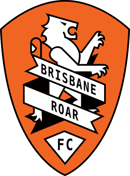
Secondly, Brisbane Roar FC changed their crest to a more traditional and European-style crest in August of 2014.
-
https://twitter.com/Brandiose/status/557614487206117377
According to Brandiose's Twitter, we're getting a new MiLB set tomorrow. Will we FINALLY be seeing the rest of the Nashville Sounds set? Or is there another set we weren't privy about?
-
What about the former Enron Field? It was the name of the Astros' new field that replaced the Astrodome from its opening in 2000 until Enron went bankrupt in 2002 and the naming rights were purchased by Minute Maid. Images are hard to come by for it but I can find a couple.


-
Anyone mention yet that Wichita State is missing a couple of wordmarks? Their liscencing guide lists a couple not seen on the mothership yet: http://goshockers.com/fls/7500/Licensing/Standards.pdf?DB_OEM_ID=7500
-
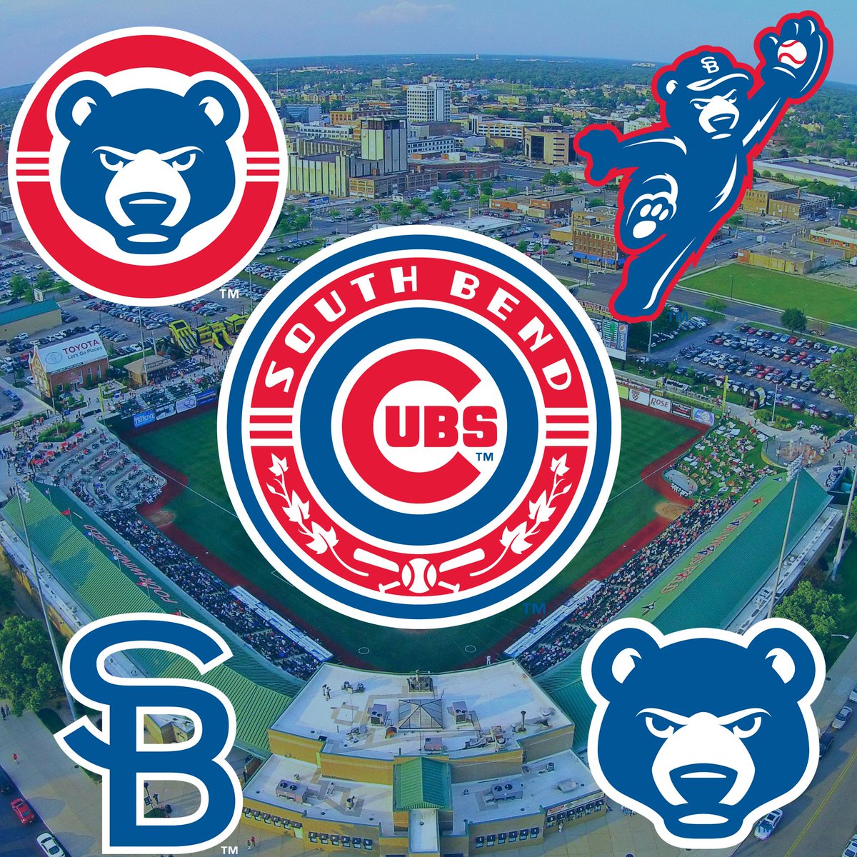
Echoing everyone on the SB logo, I love it. Anyone know the significance about the ivy in the main logo?
-
-
Are the Tortugas using light blue or gray/silver? Having trouble trying to figure what exact color that is...
Light blue. A clearer image from the mothership:

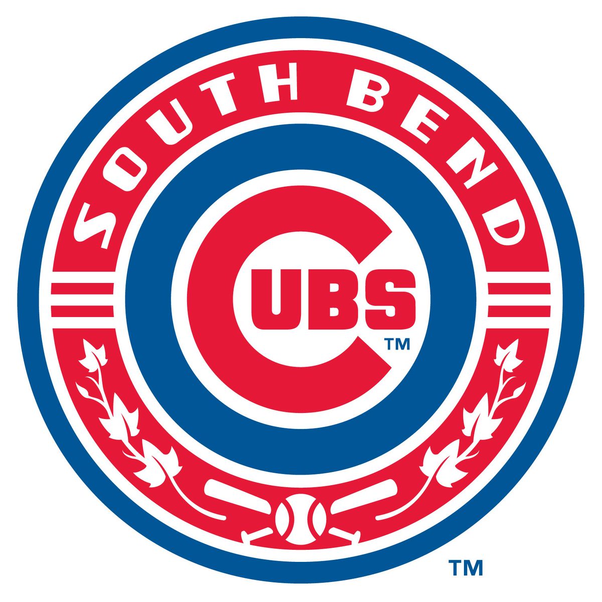
Also everyone keep your eyes peeled, South Bend's about to reveal their new logo set.
-
 1
1
-
-
Well I can't say I was expecting Tortugas at all, but I'll certainly take it wholeheartedly. The colors I love (maybe with bias as lime is my favorite color), though the dark green looks a little more blue on the uniform's wordmark. Probably the light blue outline playing tricks with me. And of course it's oceanic themed, which I love and it fits in well with other teams in the league (Hammerheads, Threshers, Manatees, Stone Crabs). Looks great. This was Studio Simon's work, correct?
The new Rome one is just silly for me. I could see that being used for Sunday games or batting practice if anything.
-
I went to look up the Nashville Sounds's shop so I could look at those vest jerseys that Mojo mentioned, and... nothing. http://sounds.milbstore.com/store.cfm?store_id=87 Could this be a sign of things to come, or am I late to the party?
On the OKC Dodgers, I really liked the Redhawks identity and I'm not a huge fan of the whole "mirroring the parent club" trend that we've seen in South Bend and such, but at the very least it looks classy. It's not like the Dodgers have a terrible brand anyways, and the OKC logo looks great to me, plus good work on incorporating the bricks into the logo. Any word on who made the design?
-
Could Brandiose's mystery project be the remainder of the Nashville Sounds set? We haven't heard anything since the original guitar pick N was released, and since they just announced a new coaching staff, the possibility exists that they could kill two birds with one stone.
-
I don't think a team with a black and blue color scheme would go with Black Jacks as a name, as that makes me think more of a black and red scheme like playing cards. I think you could make an argument for most of those names (the pink for Shrimpers, cartoon eyes for Schooners/Shuckers, etc.), but personally I'm betting on Beacon(s) due to the aforementioned striping similarities to lighthouses.
-
Now that the Major League Soccer regular season has ended, is it safe to put Chivas USA as a former club? I do know that it's definitely too soon to throw in anything for its replacement.EDIT: I'm an idiot the site already has Chivas as a former team
-
Well that's an embarrassing mistake on my part, my bad.
And yeah, it's a good thing you let him go, he's helped in the past decade. -
I'm sure this has been posted, but as a Red Sox fan, it's strange to see David Ortiz in a uniform that isn't Boston's. But it turns out he played for the Twins from 1997-2002, which was a time period I didn't pay attention to sports that much. It's also double strange since I began watching sports in 2003, Ortiz's first season with the Red Sox and Boston's championship year. Bonus points for being an alternate that he only had the chance to wear for three seasons.

-
1
-
-
Two minor things I've noticed in general.
University of Central Florida was know as the Golden Knights from 1993 to 2007 and the Knights from 1970 to 1993 and 2007 to the present day: http://www.ucfknights.com/genrel/050407abn.html
And also the new USL Pro teams, Portland Timbers 2 and Seattle Sounders FC 2 (may god help us all) haven't been put up yet. Is there a buffer period between release and posting I'm not aware of? Is it a matter of waiting until Real Monarchs is released?

Minor/Independent/Collegiate League Baseball Logo/Uniform Changes
in Sports Logo News
Posted
Per Uni Watch and WACH Fox, the name and logos for the new MiLB team in Columbia, SC (the soon-to-be-relocated Savannah Sand Gnats) will be unveiled next Tuesday, August 4th: http://www.wach.com/sports/story.aspx?id=1236397#.Vbj8vvlVhBd Any guesses on a team name?