


the_grateful_ted
-
Posts
1,698 -
Joined
-
Last visited
-
Days Won
1
Posts posted by the_grateful_ted
-
-
Haha my bad. Welp its not too bad, the primary is a good looking wolf nothing too special. The secondary paw looks unfinished to me, and the other version of that paw with the wolf face is ridiculousThat's pretty bad ^
It's only one of the logos... Here's the rest of them:


-
That's pretty bad ^
-
I think this is an unpopular opinion, but I very strongly dislike the jets striping as a whole. I think it looks clunky and weird with the hybrid shoulder cap- stripe look, and could be fixed by just choosing one and rolling with it
-
Why is Phoenix in the east and why is new Orleans in the west?. Also some of the new team suggestions seem like minor league baseball team names, not pro football names.
-
I would actually like to know, an i the only one who wants the jets to use green helmets?
-
If you're adding Colorado and Nebraska to the big 12 don't add Missouri and Texas A&M back. BOISE STATE WOOOO
-
The Big 12 and SEC are a little wonky. Is the big 12 still supposed to be in the central US? Or is it just supposed to be teams that didn't fit anywhere else?
-
I just like the royal blue look. The new one with those colors would be my pick
-
I like this color scheme alot more than the one they use now
-
This one I like--it's unconventional--but perhaps that's why I like it...Maybe I missed it, but nobody's gonna bring up, the unused 1997 Miami Dolphins helmet?
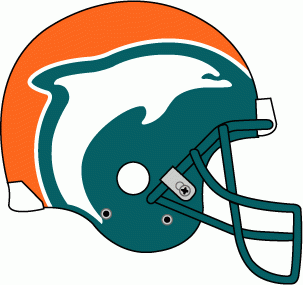
The dolphins look perfect in white helmets and they should never change that. But this helmet would cool if the NFL had teams minor league teams and the dolphins had one
-
Here's the problem with full-bodied logos: the head almost always looks tacked on.
Yeah, the 1939 helmets were really cool.
Agreed, throwback leather helmets always look cool, no surprise I always really digged the Texas A&M throwback this yearI also like these throwback alts. Even with their current helmets. (I'll catch a lot of heat for this I'm sure.)
Another thing I like that most people don't are these full body animal logos:


That's why I just glance at it and don't think too hard about it
-
I also like these throwback alts. Even with their current helmets. (I'll catch a lot of heat for this I'm sure.)
Agreed, throwback leather helmets always look cool, no surprise I always really digged the Texas A&M throwback this year
-
I agree. In theory, I should hate Dallas's mismatched blues but in practice I prefer it. The concepts never look as good as I'd think they would.
I have not seen a single concept on these boards or elsewhere where the unified blue looks as good as the current look. People always go with the dark blue and I really don't care for how that looks on the whites with the silver-green pants, which I also defend. Cowboys have the best look in the NFL. No tweaks needed
I agree with most of these, don't know what the last one means but why is it OK for the cowboys to have two different blues??? It'd be such a simple fix and it would look so much better-The Dallas Mavericks should never have green in their uniform set again
-The Dallas Cowboys having two different blues is fine.
-The Buccaneers should NEVER go back to the Creamsicles (seriously, why would you want to wear a get up named after ice cream)
-The Miami Marlins current logo is great. Not every team is the Yankees and a 90s team from Florida shouldn't be pretending like it is.
-All Original Six teams, their mythos and their uniforms are highly overrated.
And to the O6 everything about it is overrated. It's super easy to stack 24 championships when you won 13 of them when there were only six teams in the league. It's like is anyone proud of going to the playoffs in the Arena Football League? 2/3 of your conference goes to the playoffs because it's a joke set up. NHL was little league until 1967 in terms of number of teams.
I just don't see it. How does navy look good with tiny amounts of royal blue and black? The "fixed" jersey concepts always look better to me
I just don't see it. How does navy look good with tiny amounts of royal blue and black? The "fixed" jersey concepts always look better to me
I just don't see it. How does navy look good with tiny amounts of royal blue and black? The "fixed" jersey concepts always look better to me
I just don't see it. How does navy look good with tiny amounts of royal blue and black? The "fixed" jersey concepts always look better to me
I just don't see it. How does navy look good with tiny amounts of royal blue and black? The "fixed" jersey concepts always look better to me
I just don't see it. How does navy look good with tiny amounts of royal blue and black? The "fixed" jersey concepts always look better to me
I just don't see it. How does navy look good with tiny amounts of royal blue and black? The "fixed" jersey concepts always look better to me
I just don't see it. How does navy look good with tiny amounts of royal blue and black? The "fixed" jersey concepts always look better to me
-
This is a beautiful color scheme, and that logo set with old timey letters and a cartoon goat is pretty freaking cool
-
Houston/Tennesee Oliers vs Jacksonville Jaguars:
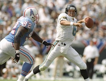
That's such a good looking game. Imagine this matchup now with the jags and titans ugh
-
 1
1
-
-
How the **** can it be done properly? Don't give me the crap that a little patch wouldn't be too bad, it's still horrendously out of place and a disgusting symbol of greed.Oh three more things
-Throwback for throwback's sake is worse than BFBS
-The new Bucks rebrand top to bottom sucks
-Sleeved NBA jerseys don't bug me that much and if done properly I wouldn't mind ads on NBA jerseys.
Agreed^ it would never look good
-
-The Dallas Mavericks should never have green in their uniform set again
-The Dallas Cowboys having two different blues is fine.
-The Buccaneers should NEVER go back to the Creamsicles (seriously, why would you want to wear a get up named after ice cream)
-The Miami Marlins current logo is great. Not every team is the Yankees and a 90s team from Florida shouldn't be pretending like it is.
-All Original Six teams, their mythos and their uniforms are highly overrated.
I agree with most of these, don't know what the last one means but why is it OK for the cowboys to have two different blues??? It'd be such a simple fix and it would look so much better
-
I guess it's not as popular of an opinion but I LOVE the purple look alot more than the green. The green isn't bad but the purple is just very distinct, and also very well designed
-
This...

...is better than this...

I might actually agree with you on this one, I'm just interested in why you think the M is better?
-
Why can't they just do this^^^^I was just thinking about this the other day and wondering if the NBA is thinking about expansion anytime soon. I know there has been talk about expanding into Europe but why not add a couple teams here in the states first. Here is my idea for a 32 team NBA. I created two new divisions and made 8 -4 team divisions with 2 new teams.The first no brainer is to bring back the Seattle Sonics. And the second team I thought could be a team in St. Louis. For divisional alignment I thought that would be a good choice. They could call them the Bombers or the Spirits as a couple past teams were named in St. Louis. They would both go the Western Conference and then Memphis could move over to the Eastern Conference. Let me know what you think or what other teams you think might be better suited for joining the NBA.

Honestly though what are the hinderments for them doing this and bringing in two more teams? 32 is just the perfect number for any league
-
This one would have been weird: Jim Kelly in Baltimore.

http://articles.baltimoresun.com/1998-02-03/sports/1998034113_1_dan-kelly-jim-kelly-ravens
Jim attempted a comeback with Buffalo in 1998 after doctors said his son Hunter wouldn't live to be a year old, but Ralph Wilson wasn't interested because he had just landed Rob Johnson... Ralph released Jim's rights and he wanted a 3-year deal from Baltimore as a replacement for Vinny Testaverde, which would have put him on that 2000 Super Bowl roster...
I could not have comprehended this. Could've been pretty weird
-
This was perfect for them in my opinionThe Jazz have the worst color scheme in sports
Yeah, it really is terrible. Should have gone back to purple instead of adding navy blue.
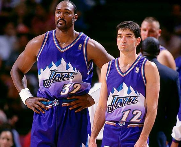
Purple, Light Blue & White with Copper accents
Favorite jazz uniform of all time right there
-
I have quite a few that I don't feel deserve the praise they've been given.
The Blackhawks logo since forever needs an update badly.
Not too crazy about the Stars jerseys.
I don't get it guys, how is this better than Hugo Hornet?
This one's the worst offender, this logo is nothing special. Not creative or innovative in any way.
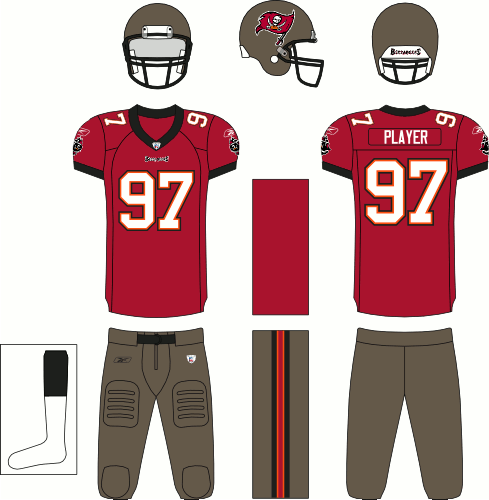
Most of these I disagree with you on or don't really have a strong opinion, but yea I never found the appeal for those bucs jerseys at all.
-
I like it with no yoke better, I don't think the white looks empty at all

Oldschoolvikings' NFL concepts - Commanders concept added
in Concepts
Posted
I think for the Bucs there's just too many colors competing at the same time. Think you should try getting rid of the red, pewter or orange because right now the amount of colors makes the design seem disjointed.