


the_grateful_ted
-
Posts
1,698 -
Joined
-
Last visited
-
Days Won
1
Posts posted by the_grateful_ted
-
-
Tulane is close for me, just not quite there. I think the retro logo is a downgrade (personal preference). With a team called “the waves” I think there’s a chance for really unique striping that was not taken.
-
 5
5
-
-
I haven't had much to say because these have all be absolutely flawless. The details like the schedule at the bottom are stellar... wow! I will say, I was a much bigger fan of the traditional Teddy Bridgewater striping for Louisville.
-
1
-
-
I will say, that new coati logo is a testament to how much your skills have improved since you started this project. Good updates, and Barnstable is probably my favorite so far. It’s always really fun to see newer designers get into their groove, keep up the good work!
-
6 hours ago, TalktoChuck said:
That's just the new academic logo and word mark for the name change. You're still going to see the standalone bison logo for athletics.

I would argue that this logo also stinks
-
1
-
-
21 hours ago, RevNet said:
Utah Tech University, the former Dixie State University, has revealed their brand.
Great, looks terrible!
-
1
-
-
Calgary vs Dallas looks SO good
-
6
-
-
Overall looks good, but the primary logo looks disconnected from everything else. If there’s that much black in the logo, there’s gotta be some in the rest
-
1
-
-
On 4/27/2022 at 6:25 AM, FinsUp1214 said:
I’ve voiced my opinion on the Jazz de-brand often here, but just to re-emphasize in a boiled down fashion:
My team makes me sad.
Well your first mistake was being a Jazz fan…
-
 4
4
-
-
7 minutes ago, Chawls said:
I don’t see why Utah can’t just use their Red Rocks color scheme.
Unpopular opinion I guess- I think these are overrated. Fine for a one off, but shouldn’t be a main brand
-
14
-
-
Looking at the grizzlies warmups tonight, I think teal/navy/yellow would actually be a pretty cool color scheme they could own
-
6
-
-
Ya gotta post something bud
-
Would’ve liked to see mavs in Royal vs jazz in yellow
-
At this point, nothing desperately shrieks “pay attention to me!” more than a needless black uniform
-
3
-
 1
1
-
-
The Timberwolves current identity is… really solid. Maybe a little more use of neon green (sparingly). Never had a reason to watch a t wolves game before but… pretty good!
-
5
-
-
12 hours ago, heavybass said:
Its hard to get engaging interaction if I put all the effort into research, development and learning about others have done in concept ideas and receive bare minimum praise.
I hate complaining in these because someone is going to call me out on it as well...“All the effort, research and development” is not saying “they felt classic so I’m going to make them look exactly like the Rams”. You get what you put in
-
3
-
-
You’ll never get as much interaction with these posts as you’d like until you slow down and put more effort into your designs. Sometimes it seems like you just want to see different colors together and don’t care about the actual design. I actually wouldn’t mind if that was your end goal, but other people don’t seem super intrigued by it. Not that you need to care what other people think, but you sometimes seem frustrated with the lack of interaction on some of your posts. Just my two cents, that is an interesting fun fact!
-
1
-
-
That pattern looks like the undergarments of an exotic dancer. I get why you’d pick it (lack of any other cohesive uniform history) but every time I’ve seen someone try to pull it off it looks cheesy
-
1
-
3
-
-
Two small things,
UM-I actually really like their white pants as a sparingly-used away alternate! glad to see the blues gone

OSU- I think the throwback jersey they currently use has a better template for striping. Their current striping leaves a lot to be desired for me.
Liberty didn’t really hit home for me. Granted, I bias against striping that just uses logo as the striping. Good work overall!
-
2
-
-
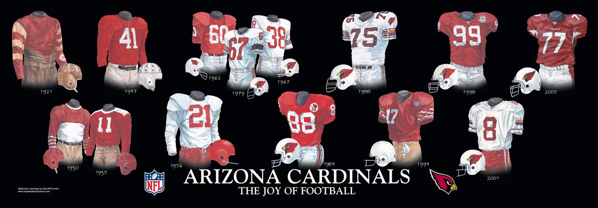
11 hours ago, DCarp1231 said:
Adding another one-
• Nothing the Cardinals have worn as ever looked good
Although, the 1930s duds have potential for a modern update
You might want to get tested for covid, losing one’s sense of taste is a common symptom
-
8
-
1
-
4
-
 1
1
-
-
In my perfect world… the cardinals use double red (ala the SA Commanders). It’s a totally unique color scheme in major league US sports, and it justifies using an extremely simple uniform that lets the colors shine on their own. I honestly don’t care if those elements were ultra-sublimated flag designs, simple truncated “wing” striping, or some subtle gradient design based off sunrises/mountain ranges. Colors could play #1, everything else is an accessory. Unfortunately this is not the ideal world, the cardinals would never do that, and I remain entirely baffled where they will take their identity
-
6
-
1
-
-
20 hours ago, heavybass said:
And finally Team 80...
THE TRIBE OF WILLIAM & MARY
Looking at the two uniforms, I prefered the road so I designed a set around the Road.... changed the gold a bit and generally make the Tribe respectful.
Why did you pick that specific jersey striping?
-
19 hours ago, heavybass said:
Next up is going to be the most unique name in college football.
Do I want to do them normal or should I Marvel them up?Give them a good uniform
-
1 hour ago, gothedistance said:
None of the Cardinals concept for a new design are very good. I feel like people want change just for the sake of it.
It would be change for the sake of changing a bad uniform…?
-
8
-
 2
2
-
1
-
-
I like the idea of the stripe “movement”, but right now it just looks like the image loaded in a glitchy way. Maybe try making the difference in “levels” more noticeable, or taper/change the width toward the back
-
6
-


International (NATIONAL TEAMS) Soccer/Football Kits 2021/2022 (World Cup, etc)
in Sports Logo News
Posted
That Georgian logo is sweet, more contemporary-medieval logos please!