


the_grateful_ted
-
Posts
1,698 -
Joined
-
Last visited
-
Days Won
1
Posts posted by the_grateful_ted
-
-
2 hours ago, BBTV said:
If this isn't performance hindering, I don't know what is. Waiting to hear how it's not.

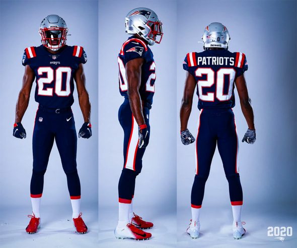
I realize that this is the “hindrance” you’re talking about. What I’m saying is that it if it was this huge, game changing problem, the players OBVIOUSLY wouldn’t do it with so much money on the line. The coaches would OBVIOUSLY say something, and it just wouldn’t happen. But it seems like getting dragged down by their jerseys isn’t a big concern it terms of performance/dosent happen that much, so oh well
 Again, I get your aesthetic problem with it. But pretending you know more about “the distinct performance difference between an untucked jersey and a tucked jersey”, than actual NFL players, is silly.
-
 6
6
-
-
34 minutes ago, BBTV said:
it’s a sports UNIFORM forum, and these morons are altering the uniform to the point where what we see in unveilings is irrelevant because that’s not what’s on the field.
If it doesn’t bother you then that’s fine, but if you’re upset that some people on this forum have issues with this, then this might not be the place for you.
IMO they look like complete slobs and the fact that they intentionally hinder their performance shows their intellect.
Intentionally hinders their performance get OUTTA here lmao, it obviously isn’t a massive hindrance if athletes with millions of dollars on the line are doing it. I’ve gotten to the point where I understand your distaste for the trend and I respect that, but pretending that it “shows their lack of intellect” is really silly.
-
3
-
-
16 minutes ago, MJWalker45 said:
I'm still not a fan of that tonal logo for Germany.
Normally I’d agree, but I think it works for Germany. There’s something really sleek and industrial about it, like a Porsche or something
 hard to put my finger on it
-
1
-
-
The issue is it’s not going to be a much of fun, colorful, interesting looks (except gaudy color rush options like Seattle). It’s going to be the occasional throwback, and a TON of Blackout and “Stormtrooper” looks. I dunno man, this could be tough.
-
9
-
-
38 minutes ago, jefrsn said:
The Citadel released their identity upgrade yesterday.
I dig it BIG time, very nice
-
3
-
-
Absolute beauty ^
-
Might be my favorite concept of yours so far, not exactly sure what the Aztec-north Carolina connection is but aesthetically it’s off the charts. Well done!
-
1
-
-
48 minutes ago, DNAsports said:
That’s... just a reverse of what they wear (or at least are supposed to wear) now
Exactly, maybe double red stripes? Something to break up the monotony of blue down past the knee. As you noted now, what they’re SUPPOSED to wear

-
5 hours ago, DNAsports said:
Eh, they still need another sock option. Silver preferably.
Silver socks (metallic in general) wig me out a bit, maybe navy with a thick red band at the top?
-
2
-
-
1 hour ago, 4_tattoos said:
I can hear Tom Brady grinding his teeth already
Yes he might get very confused and think he’s handing off to another quarterback

-
4
-
 1
1
-
-
Great change, love a wide receiver in a single digit jersey (with his jersey untucked of course
 )
)
-
1
-
-
Getting back on uniform talk, As much as I like the UNC throwbacks I hope they don’t change from their current look anytime soon. The argyle is unbelievably good looking AND unique, one of the best modern uniforms do date IMO
-
5
-
-
UNC vs TAMU looks really good. I rarely say this, but I think more colored accessories would’ve really made it pop. Some blue socks/maroon socks would’ve added a lot to an already great looking matchup
-
3
-
-
Time for my annual reminder of how much I dislike the CFB playoff logo
-
1
-
-
11 minutes ago, SSmith48 said:
Let me just mention how uncomfortable Washington State's uniforms today make me. White helmet w/ gray logo, white jersey w/ red numbers/lettering, anthracite pants. Absolute mishmash, all because of that little cougar head.
I have similar feelings about Minnesota today, they used to look so good

-
PAC 12 looked great, Big 10 looked awesome, big 12 looked awful, ACC looks fantastic as well. Honestly ISU vs OU is a hard matchup to look good (although it definitely could’ve looked better than today), just so much dark red and not a lot going on. These other games have BEAUTIFUL color contrast to start.
-
1
-
-
I think I have an expectation for things to get weird in that matchup, I actually liked how that game looked a lot.
-
I Like the Florida set a lot. It’s odd but just... pleasant to look at I guess. Hopefully it’s a sunny day so we can get a clean look at it!
-
14 hours ago, 4_tattoos said:
This Florida State/North Carolina is very pleasing on a visual level.
If it was the EJ Manuel era FSU unis, would’ve been an 11/10. As it stands was pretty dang good looking
-
2
-
-
Those new UNLV unis are crap
-
3
-
-
I’m absolutely intrigued by that UCF crest thing, being the golden knights thats a cool connection with heraldry right off the bat. It seems like the perfect combo of quirky detail while still being simple enough to comprehend at a glance. Kinda geeking about it, but if I was a player I’d think it was kickass.
-
6
-
-
Some of the details of that are really cool, but overall looks like crap. Grey numbers on grey uniforms

-
2
-
-
Syracuse is going to consistently make every matchup better, ESPECIALLY when they play teams like UNC and now Pitt. With some sunshine too?? Yes please
-
1
-
-
51 minutes ago, cajunaggie08 said:
Southern Miss picked up the Adidas grey corduroy option this year. Its odd to see a team named the GOLDEN Eagles not have any yellow/gold anywhere on the uniform.
 terrible. What is the appeal of this jersey? It’s just like a piece of ham, boring, bland... awful.
-
2
-
/cdn.vox-cdn.com/uploads/chorus_asset/file/21919042/1277174444.jpg.jpg)


NFL Changes 2021
in Sports Logo News
Posted
Agree to disagree my friend, I guess football coaches just don’t know much about football