


AgentColon2
-
Posts
1,516 -
Joined
-
Last visited
-
Days Won
1
Posts posted by AgentColon2
-
-
Reverse blue helmet, dark gray jersey, blue pants and socks.
Trying to brainstorm some awful ideas where this could go. -
Icy white, here we go!
-
 1
1
-
 1
1
-
-
My high school back in the early 90’s copied the Miami Hurricanes logo.

-
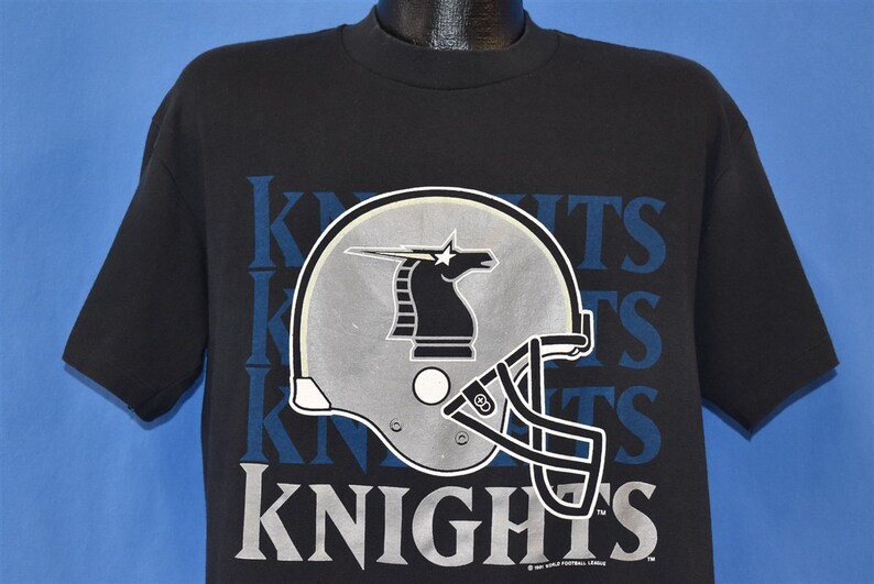
I still have my season 1, WLAF NY/NJ Knights t-shirt purchased at Giants Stadium.
Mine is packed away, but this is the same one.
-
 2
2
-
-
Looking forward to the Angels rebranding to Angeles Angels to take advantage of alliteration.
-
2
-
-
43 minutes ago, Silence of the Rams said:
FOX is owned by Disney...which owns marvel....yeah don't hope those are going away anytime soon
FOX Network is NOT owned by Disney.
20th Century Fox is owned by Disney along with FX Cable Networks and Nat Geo.
-
3
-
-
-
What’s the difference between now and then?
-
3
-
-
Oh that’s the Eagles wordmark? I thought it was some sort of PlayStation number code… 5379down3
-
 1
1
-
-
On 2/2/2023 at 2:40 PM, infrared41 said:
Since this thread is active again, my choice for the "prettiest" Super Bowl.
Had onlyyy the sun been out that day
-
-
Perfect! Getting a nice amount of bright colors to offset the Philly dullness.
-
He better remove a plate or two or he’ll be on the IR in retirement too.
-
1
-
 7
7
-
-
I’ve always thought silver, black and gold really work well together since the old WAFL knights did it.
-
9
-
 1
1
-
-
2 hours ago, DCarp1231 said:
Socks are seen as part of the official uniform (to some of us) and we are members of a website that literally discusses uniform shenanigans amongst other dealings.
Getting bent out of shape over people talking about socks is a weird flex.
It baffles me that people on these boards consider the face mask equipment as opposed to a uniform element. You people know who you are and should feel shame!
-
4
-
-
I believe this was a 1pm Pacific time game with the roof closed.
-
6
-
 1
1
-
-
I’d like the Chiefs to not wear white pants to avoid the “icy white” chatter.
-
8
-
1
-
-
North Stars had a near perfect look. Even with the slight addition of black their look remained tops. The Wild look is really good too, but the name is awful.
Similarly, the Oilers had great and unique colors. The oil derrick was iconic. Then you bring in the Texans which I consider the worst nickname in the league. But they have a pretty nice logo. The colors at the time were bland, but it was acceptable. Now with so many teams in navy they’re just lost in the mix and don’t stand out much. There’s nothing wrong with them other than being dull. Had they won some Super Bowls they would be less dull. I’d honestly prefer them to stay as is. The Titans should embrace powder and red. The Seahawks should go back to silver, Royal and green.
-
1
-
1
-
-
It’s unique. I don’t hate or love it. A nice attempt at something different. I’d choose that over a gradient helmet.
-
7
-
-
You ninja’d me before the edit. Good job.
-
Will they be dumb and wear white socks again? I’m guessing, yes. This will put both teams in white socks. At least the Chiefs have stripes.
So any idea if this will be our first Super Bowl with double white socks?
edit: did a quick search and found super bowl xx between the bears and Patriots was also double white
-
Which was the opposite of what they did all season. They wore white all year.
-
3
-
-
The Eagles lost two Super Bowls in a green jersey.
Once in midnight and once in the wacky stripes jersey.
-
1
-
-
Pick two colors please. There is no need for a third here.


NFL 2023 Changes
in Sports Logo News
Posted
They would have been better off going with white socks and blue stripes.