
.png.c18a330c65e72fece220b21b4dcfada2.png)

maxwasson
-
Posts
335 -
Joined
-
Last visited
Posts posted by maxwasson
-
-
@Silent Wind of Doom Could you add the Los Angeles Clippers 2024 Western Conference Pacific Division champs title to my signature?
-
I promised I would do a classic colors set for the rebranded Kansas City Wizards of the MLS, a few months ago in this series, and now I've finally come around to doing it, to officially close out all the soccer concepts in this series.
BRANDING

For the classic colors set, I used a blue and black color scheme borrowed from the Wizards logo from 2007-2010, and four tertiary colors of yellow, red, green, and purple borrowed from the Kansas City Wiz logo from 1996.
EXTRA SCRIPTS AND INSIGNIAS
I also decided to design scripts and "KC" insignias with the four tertiary colors as well.
UNIFORMS
As for the uniforms, I decided to swap the layouts of the home and away uniforms, which allowed me to make a black away kit that resembles this one worn by the Wiz in 1996. (As posted by @VampyrRabbit)
-
 1
1
-
-
30 minutes ago, BlueMoon18 said:
Before I officially move on to team #4...I'd like to make a different proposal for additions as well as explain color schemes for the prior three teams and get some help for the 45ers (team #4)
PART A: The Proposal
The area addition was definitely too much now that I think about it (I probably will do it as a separate topic). As a result, I have a different proposal. What if college teams had WILD arena football looks (but not too wild so it's not a fashion show)? This was inspired by @heavybass's NCAA arena football topic (kudos to his work on that), but with a much more insane twist. The 13 college teams in the three NCAA Divisions and NAIA would get concepts with this. If you need a reminder, the teams are:
- SMU Mustangs
- TCU Horned Frogs
- North Texas Mean Green (that's soon to be my college)
- UT Arlington Mavericks (they don't have a football team, but I'll give them one for the sake of consistency)
- TAMU-Commerce Lions
- Texas Woman's Pioneers (that's going to be the most interesting since that's a women-only college...)
- Dallas Baptist Patriots
- UT-Dallas Comets
- UDallas Crusaders (definitely going to change the name here due to the connotation)
- UNT-Dallas Trailblazers
- Texas Wesleyan Rams
- SW Assemblies of God Lions
- Paul Quinn Tigers
If you guys like this idea, I'll remove the NJCAA/NCCAA teams from the team list. Let me know what you think of this before I continue.
PART B: Why I Went With the Colors I Did...And Some Help
Now to explain the colors for each of the earlier three concepts.
The Texans....I just used the color of both incarnations according to TruColor. I'm going to do that a lot for the actually-existing teams.
For the Fort Worth Bulls:
- Burnt Orange is more of a heritage color to honor the Dallas Longhorns, their original identity in the city. The blue is the Cowboys royal blue they originally used (which is awkwardly similar to the '52 Texans navy...)
-
The other colors represent a cowboy/cattle theme:
- Saddle Brown = horse saddle. Horses are used sometimes to move cattle around
- Sandy Horn = Longhorn/bull horns tend to be close to this color
Now for the Texas Mockingbirds:
- Feather Gray and Charcoal reference what an actual northern mockingbird (the state bird of Texas) looks like.
- Blood Orange (it looks like a red, I know)...I really added this for an intimidation factor
- Goldeneye I added as a reference to the bald eagle eye, which the Eagles name is based upon.
For the 45ers I need some help. I know which colors I want to use and their symbolism, but not sure on which light blue I want to use.
- Building Grey - the skyscrapers built in the early 1900s
- Trinity Blue (either this or this) - the Trinity River, the river leading into the Big D
- Rusty Rail Brown - the railroads first cross Dallas in 1873
- Oil Slick Black - the Oil Boom in East Texas in the 1930s.
Let me know about some suggestions for the blues, and I hope you enjoyed this little sidepost.
I'd recommend you go with Proposal A, and split the college teams into their own thread, unless you have an idea for a fictional one like I did with Kansas Tech in my series. Especially if all you're doing is just designing new uniforms for said colleges and universities.
-
2 hours ago, BlueMoon18 said:
Ok then in that case I understand why you went that route. But is there a chance you could do one with a different color palette? The idea I'm going for is that the Gnomes were Omaha's professional soccer team in the USL instead of MLS Next Pro.
I could've done that, but ironically that would've been too similar to the color scheme I chose for the Omaha Outlanders concept from earlier this week.
-
12 hours ago, BlueMoon18 said:
Interesting that we both posted our stuff 22 minutes apart…
But anyway, I like the idea of Gnomes being the minor league version of the KC Wiz, but I’m not a fan of the two teams having the same palette. If that’s a soccer thing I understand, but it still sets me off. Other than that, great concept man.
That's how it is with the IRL Sporting KC II where they basically share the same color scheme with their parent club.
-
We stay in Omaha for this one and imagine a world where not only where Sporting KC changes their name back to the Kansas City Wizards, but their minor league affiliate; Sporting KC moves to Omaha, Nebraska and becomes the Omaha Gnomes.
BRANDING
The logo for the Gnomes is obviously based off a garden gnome, a very dwarfish wizard, they share the navy and powder blue color scheme with the Wizards and the font Kelmscott is reused here. The Gnomes would likely have to share a home field with the Omaha Storm Chasers of Minor League Baseball at Werner Park, as Omaha doesn't have a dedicated soccer stadium at the moment. The Gnomes would compete in the MLS Next Pro, MLS' Triple-A circuit.
EXTRA SCRIPTS AND INSIGNIAS
Here are the extra scripts and insignias I put together for the Omaha Gnomes, there's not as many insignia logos with there only being one letter.
UNIFORMS
The Gnomes' uniforms here are very similar to the parent club, albeit with a different jersey sponsor; The First National Bank of Omaha.
-
Up next we have a companion concept to the Kansas City Dreamers NBA expansion concept I did last year, this time we head to Omaha, Nebraska and give the expansion Dreamers a G-League team there, the Royals already have a Triple-AAA team stationed there for years why not continue that partnership with basketball?
BRANDING
For a team called the "Outlanders" the name, mascot, and color scheme were inspired by the hyenas from The Lion King. To basically keep that Disney theme going with the G-League squad. The font used for the scripts, insignias, and jersey numbers was Rogbold.
EXTRA SCRIPT LOGOS
Here are the extra script logos I put together for the Outlanders
EXTRA INSIGNIA LOGOS
And here are the extra insignia logos I put together for the Outlanders.
HOME COURT
The Omaha Outlanders would share the 8,000 seat Baxter Arena with the University of Nebraska-Omaha for home games.
UNIFORMS
And for the uniforms I put together a 4-piece set with a white home, a gray away, and 2 alternates (lime green and black)
-
2
-
-
On 4/20/2024 at 10:38 AM, coco1997 said:
Thank you both!
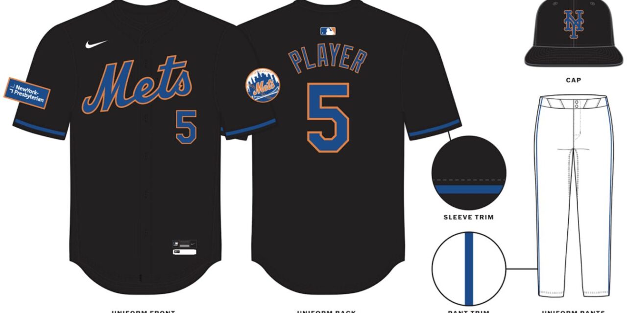
NEW YORK METSHOME:
ROAD:
HOME ALT:
ROAD ALT:
CITY CONNECT:
Notes:
- The Mets’ newly unveiled City Connect set prompted me to make a few previously unplanned changes to New York’s current set, the biggest being the removal of pinstripes from the team’s home uniform. This was done so that 1) the Mets can look as different from their crosstown rivals as possible, and 2) the pins are now unique to the City Connect.
- Despite orange being part of their colorway, the Mets had not one but TWO blue alternates for most of the past decade. Here, the team finally gets an orange alt (similar to their 2013-14 “Los Mets” jerseys) which replaces their awful new black “throwbacks.” I was never big on the Mets in black to begin with, yet the changes made to that design actually have me longing for those original jerseys to return.
- Because the City Connect also uses a Tuscan style “NYC,” I decided to bring back the Mets’ 1987 script “New York” for the road and road alt.
- Yesterday I shared my City Connect tweak here, so here's a quick summary: More purple, matching pants, and an extra pop of white on the roundel and sleeve trim.
C&C appreciated and have a great weekend!Nicely done Mets jerseys! I don't think I've ever seen the Mets have a script "New York" on their aways before, but maybe I haven't been paying to attention to recent uniform changes enough.
-
 1
1
-
-
8 minutes ago, BlueMoon18 said:
Considering one of the NOBs I used went to Baylor...I have a small question.
Should I add teams from other areas close enough to DFW but not crossing another big part of Texas? The Brazos Valley and East Texas would be added on, as well as some cities that are close enough to major cities in the DFW area to not overlap another region. This would add on the following:- Waco
- Bryan-College Station
- Killeen-Temple-Ft. Hood
-
Northeast Texas
- Tyler
- Longview
- Texarkana
- Marshall
- Mt. Pleasant
- Lubbock
- Wichita Falls-Lawton
- Abilene-Sweetwater
Let me know if I should add these cities before I continue.
I think you should just keep it within the Dallas-Fort Worth metroplex.
-
For this next part of the series we take a detour and head to Fort Worth, Texas! and wonder what if the Kansas City Royals had a Triple-A minor league baseball affiliate based in the Panther City?
BRANDING
The color scheme and insignia logo were inspired by the Omaha Storm Chasers' What-If-Night, where they known as the "Omaha Cattlemen" for a game, I decided to ask the artist I commissioned to take the Cattlemen and put them in America's largest cowtown of Fort Worth, TX. The font used for the scripts was Roadstore Regular, and the mascot is a brahma, a traditional symbol of Fort Worth as can be seen in historic downtown or the city flag.
EXTRA HOME SCRIPT LOGOS
Here are the extra home scripts I designed for the Cattlemen, I also made some "Royals-style" scripts with the help of Struck Base.
EXTRA ROAD SCRIPT LOGOS
And here are the extra road scripts I put together for the Cattlemen.
EXTRA CAP LOGOS
Here are the rest of the cap logos for the Cattlemen, I also made a few "Royals-style" cap logos with the font Century Schoolbook to try and replicate the Royals cap logo.
UNIFORMS
I put together 2 uniform sets for the Cattlemen, the first set pictured above is a standard 5-piece set with a white home, and gray road uniform, a light brown home alternate, a navy road alternate with a cap logo featuring the mascot and a "city edition" uniform that has the Fort Worth skyline on the jersey and a white cap that resembles the actual Omaha Cattlemen cap used during the promotion.
And for the second set it is Royals-themed, with a 4-piece set that mimicks the Royals home, away, powder blue, and blue alternates.
-
 1
1
-
-
Really love how clean the primary logos look, Nice job!
Also you should list the new re-digitized Dallas Texans on the header and official team list.
-
After a bit of a hiatus, I'm back with 2 redesign concepts for the NFL's Kansas City Chiefs, to round-out all the Chiefs designs in this series.
BRANDING
Starting off with a refresh of the classic Chiefs Arrowhead logo, this time with a slightly different Arrowhead design a red outline on the Arrowhead design, and a red and yellow "KC" insignia.
EXTRA SCRIPTS AND INSIGNIAS
And here are all the extra Chiefs scripts and insignias put together for this redesign.
FIELD AND UNIFORMS
The new Chiefs field comes with a noticeably bigger Arrowhead than the one currently at midfield inside Arrowhead Stadium, and for the black uniform I made a special black Chiefs logo.
EXTRA FIELDS
I put together 2 home fields with yellow and black endzones, plus multiple Super Bowl fields (LIV, LV, LVII, LVIII, and LIX) with yellow and red endzones.
Now on to the design #2, which swaps out the Arrowhead design for a dreamcatcher design
BRANDING
I've had this idea for a little while, and I'm suprised no one's ever thought of a "dreamcatcher" design for the Chiefs before, but here it is!
FIELD AND UNIFORMS
The dreamcatcher logo now takes up not only midfield, but also the area close to the north and south side of the 50-yard line, and just like with the Arrowhead refresh, there is a black version of the Dreamcatcher logo.
EXTRA FIELDS
For the yellow Super Bowl endzones, I had to put together a "white" version of the dreamcatcher design to contrast with the yellow background.
-
1
-
1
-
-
26 minutes ago, BlueMoon18 said:
Well I could say right now that the NFL/AFL Texans I combined into one concept, hence why two dates were there when I did the entry. But if you do want me to do a 1960 colorway of the Texans then I can.
So you're gonna do the Texans with the red and yellow colors of the AFL franchise and navy and white colors of the NFL franchise?
-
15 minutes ago, BlueMoon18 said:
That would be correct. I hopefully shouldn't encounter another mishap that'll force me to sketch the concepts again. Boy did that end up being a nightmare...
I would think the digital versions of the Fort Worth Bulls and Dallas Texans (AFL) V2 should be next
-
41 minutes ago, BlueMoon18 said:
Also, I should say I FINALLY got my other computer back. But due to that, it'll be a while before I get the Texas Mockingbirds concept out, as I will go ahead and re-digitize the previous two concepts alongside making the digital third concept.
For now, I'll say the Mockingbirds DO NOT use the Eagles green. The blue associated with Dallas will not be used either.
So when you say "re-digitized"?, Do you imply that the concepts going forward will be fully digital like V1 of the NFL's Dallas Texans?
-
Had to come back to this after, the XFL and USFL spring leagues merged to become the United Football League (UFL), I went back and some new UFL field and uniform sets for the Command/Brigade
PART VI: COMMAND/BRIGADE UFL SETS
For the UFL sets, I decided to have the white UFL logo at midfield like a lot of UFL home fields this year, I also made a custom endzone design with the bomber mascot on the left and right sides of the endzone.
-
1
-
-
Texas Mockingbirds for the ex-Eagles, and the Fort Worth Wranglers for the ex-Chiefs.
-
On 4/6/2024 at 12:28 PM, DCarp1231 said:
Here’s an update to the logo. Trashed the spear and went back to the arrowhead. This time however, the “KC” create the shape instead of being held in place. An abstract shape of Missouri is now used as the tail/base of the arrowhead.
I just saw this on the r/KansasCityChiefs subreddit this morning, It looks pretty good although you may wanna consider making a version of the logo with the Kansas state outline, as the Chiefs are rumored to be building a new stadium in the Legends district of KCK.
-
1
-
-
2 hours ago, Coiler said:
This looks like an EXTREME 1990s team design. And I love it.
The logo is somewhat reminiscent of the Toronto Phantoms of the Arena Football League in the early 2000s.
-
Up next on the block, is my first ever college team concept! I've been wanting to do this one for a long time as well, I've since some other fictional colleges on this forum and it's time to throw my hat into the ring.
BRANDING
Say hello to the Kansas Tech Jackals! They represent the athletics program of Kansas Tech University which is based in the north side of Kansas City, KS (close to the Quindaro Bluffs neighborhood), I commissioned a jackal mascot for the university's athletics program brushed with a violet and red color scheme, the Kansas Tech Jackals compete in the NCAA's Division II inside of the KCMO-based Mid-America Intercollegiate Association. The font used for the jersey numbers was Pronave Regular.
EXTRA SCRIPT LOGOS
Here are the extra wordmarks I put together for the Kansas Tech Jackals.
EXTRA INSIGNIA/PRIMARY/ALTERNATE LOGOS
Here are the extra insignia logos, and alternate logos for Kansas Tech, there's a special insignia logo with a violet and red gradient, and a mascot logo with a white outline to contrast a red background, an MIAA logo in Kansas Tech's colors, and a violet Under Armour logo, the shoe brand that Kansas Tech is partnered with.
BASEBALL/SOFTBALL UNIFORMS
For baseball and softball, I put together a standard set of 4 uniforms with a white home, a gray road, a red home alternate and a violet road alternate.
FOOTBALL FIELD AND UNIFORMS
I put together a home field with violet endzones for the Jackals, as well as a 6-piece football uniform set with a home, away, and all violet/white/red/black alternates.
And here is an alternate home field with black endzones.
BASKETBALL COURTS
The Kansas Tech men's and women's basketball programs would play their home games at the on-campus Price Chopper Center.
There's also an alternate black court for the Jackals.
BASKETBALL UNIFORMS
As for the basketball uniforms, there's a 4-piece set with a white home, a violet away, and 2 red/black alternates.
SOCCER UNIFORMS
We get on to the soccer set with has an interesting shoulder layout with a mascot logo on the left shoulder and then the conference patch on the right shoulder, with a red home kit and a violet away kit for Kansas Tech's soccer programs.
STADIUM LOGOS
Each component of the Kansas Tech athletics program in this concept has their own on-campus home field with sponsored names. The baseball program plays at Braum's Field, the softball program plays at Buffalo Wild Wings Park, the football program plays at Pizza Hut Stadium, the basketball programs (M/W) play at the aforementioned Price Chopper Center, and the soccer programs (M/W) play at Hallmark Field.
MIAA REALIGNMENT
With Kansas Tech being added into the MIAA, the MIAA expands to 16 teams with the IRL departure of Lincoln (MO) who is going to the GLVC, and the IRL addition of Arkansas-Fort Smith, the MIAA in this fictional scenario also adds current affiliate member; Southeastern Oklahoma State as a full member to bring the conference up to 16 teams with 4 regional pods.
OZARKS: Arkansas-Fort Smith, Missouri Southern, Northeastern State, Pittsburg State
SOUTHERN PLAINS: Central Oklahoma, Newman, Rogers State, Southeastern Oklahoma State
KAW VALLEY: Central Missouri, Kansas Tech, Missouri Western, Washburn
NORTHERN PLAINS: Emporia State, Fort Hays State, Nebraska-Kearney, Northwest Missouri State
For baseball, current affiliate member Augustana would extend its affiliate membership towards baseball in the MIAA as a stand-in for Nebraska-Kearney in the Northern Plains pod, because Nebraska-Kearney does not sponsor a baseball program.
As for how the scheduling pods work, It tends to vary in each sport
FOOTBALL: Each team will play 3 in-pod games, and 6 random out-of-pod games
BASKETBALL: Each team would have 6 home-and-home games against in-pod opponents and 12 games against all non-pod opponents with rotating home and away games each year.
BASEBALL/SOFTBALL: Each team would play a 3-game series against in-pod opponents 3x (9 games) and a 3-game series against random out-of-pod opponents 5x (15 games)
SOCCER: Each team would play 3-in pod games, and 5 random out-of-pod games
-
2
-
1
-
-
In this round of Kansas City Chiefs redesigns, Is one I've been wanting to do for a while now, this has the Chiefs changing their name to the "Reapers" the moniker originates from Patrick Mahomes' nickname that was coined after his signature 2022 AFC divisional round win against the Buffalo Bills where Mahomes became "The Grim Reaper"
BRANDING
The mascot here is a combination of KC Wolf, the Chiefs' current on-field mascot and Death from Puss in Boots: The Last Wish, the font used for the wordmarks, insignias, and jersey numbers was Anxiety of Sadness.
EXTRA SCRIPTS AND INSIGNIAS
Here are the extra script logos and insignias I put together for the Reapers.
FIELD AND UNIFORMS
I put together a 5-piece uniform set for the Reapers with a red home, a white away, and red/white/black alternates.
EXTRA FIELDS
Here are the extra fields I put together with 2 home fields that have yellow and black endzones, and then the Super Bowl fields for each of the Chiefs 4 Super Bowl appearances in the last 5 years.
On the subject of Puss in Boots: The Last Wish, can you imagine how sick it would be if Death's whistle was like a pregame echo at Arrowhead Stadium to strike fear into the visiting team?
-
2
-
1
-
 1
1
-
-
The face looks a lot like a Mii for some reason
-
 1
1
-
-
1 minute ago, Bomba Tomba said:
Would be nice if you could also talk about the implications of so and so team moving to Dallas
Like for example, if the Niners became the Fivers, then there wouldn't be a Cowboys, and SF would probably get a team later on
Not asking you to make concepts of the other teams, just maybe a short blurb about the effects of the move
Maybe @BlueMoon18 could do a concept where the Dallas "Cowboys" can't become the "Dallas Cowboys" because the Kansas City Cowboys of the NFL established in 1924 beat them to the name and the Dallas NFL franchise has to give themselves a different name.
Or Lamar Hunt's Dallas Texans of the AFL win the "Battle of Dallas" and the Cowboys leave town for possibly San Antonio, Houston, Oklahoma City, or ironically Kansas City.
-
I'm also looking through this list, and I did already do a Sacramento Kings what if?, with the Kings staying in Kansas City and keeping the name "Royals" from their Rochester and Cincinnati days, I also put together a bunch of alternate Kings/Royals logos should they have moved to Anaheim, Seattle, St. Louis, Virginia Beach (Or if they had stayed in Rochester, Cincinnati, or Omaha). I didn't know if Dallas was one of the locations that the Cincinnati Royals were considering before settling on Kansas City/Omaha, I do know St. Louis was at least considered a third home in a potential timeshare with Kansas City and Omaha.


INTO THE 816-VERSE - Apollo Beach Royals (A)
in Concepts
Posted
Next stop we are headed to the Tampa Bay area, a city known not only for having a professional baseball team in the Rays, but also home to the spring training complexes/FCL clubs/ and Florida State League clubs of the Yankees, Phillies, Blue Jays, and Pirates. What if the Royals had their spring training facilities, a Florida Complex League team, and a Florida State League team located in the Tampa Bay area?
BRANDING
This hypothetical Single-A team would be located in Apollo Beach, Florida on the east side of Tampa Bay, with the major league Rays on the other side of the bay. The Royals have previously had minor league affiliates in Fort Myers and Daytona Beach.
EXTRA HOME SCRIPT LOGOS
Here are the extra home scripts I put together, (a good chunk of these are already official scripts that the Royals have worn in their history)
ROAD SCRIPT LOGOS
Here are the extra road script logos I made with the help of Struck Base.
EXTRA CAP LOGOS
And here the extra cap logos I put together
UNIFORMS (SET 1)
Here are the first set of uniforms I designed for the Apollo Beach Royals, each uniform has the Royals alternate logo as the right-facing sleeve patch, and the left-facing sleeve patch is the Florida State League logo.
UNIFORMS (SET 2)
Here is the second set of uniforms which includes a set that resembles the Royals blue and gold alternates, and 2 black alternate uniforms. The decision to use the "Apollo Beach" road script on almost every uniform was inspired by the Burlington Royals official set when they were the rookie affiliate of the Royals in the Appalachian League.
TAMPA BAY TEAM MAP
Here you get a view of where the Royals facilites/FCL team/ and FSL affiliate would be, sharing a metro area with the Rays, Pirates, Yankees, Phillies, and Blue Jays.
The Apollo Beach Royals would also compete with the FSL affiliates of the Cardinals, Reds, Marlins, Twins, Mets, and Tigers.