


maxwasson
-
Posts
393 -
Joined
-
Last visited
Posts posted by maxwasson
-
-
On 4/30/2024 at 9:54 AM, coco1997 said:
Thank you both!
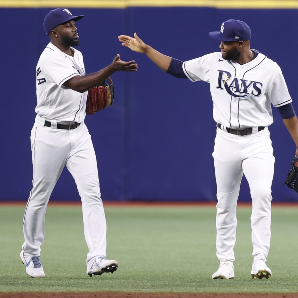
TAMPA BAY RAYSHOME:

ROAD:
HOME ALT:
ROAD ALT:
CITY CONNECT:
Notes:
- I think most would agree that after 16+ seasons, the Rays’ current look has pretty much run its course. In contrast, the team’s Devil Rays throwbacks seem to be more popular than ever—as evident by their massive influence on the Rays’ newly-unveiled City Connect design. Given that those throwbacks are included in Tampa Bay’s 4+1 anyway, I figured it wasn’t much of a leap to promote that look to primary status again, with a few updates.
- The above being said, I would like to see the return of the Rays’ ‘70s fauxbacks, as those uniforms made the best use of the team’s current navy/Columbia blue/sunshine yellow color scheme of anything they’ve worn. The fauxback therefore returns and becomes the new home alternate.
- The biggest criticism of Tampa Bay’s City Connect has been the illegibility of the wordmark and numbers, which I’ve addressed by recoloring in a solid gradient. The St. Pete pelican/palm tree logo also replaces the sunburst on the left sleeve.
- I honestly didn’t expect the City Connect design to go all-in on the original gradient, which prompted me to actually “tone down” my previous updates to the home and road by replacing the gradient-colored numbers with solid purple and white ones.
C&C appreciated!This is an interesting rebrand decision here for the Rays, they keep the "Rays" name but they go back to their Devil Rays color scheme and logos, giving this a very 2000s feel, but also very colorful.
-
 1
1
-
-
14 hours ago, timberwolf said:
We’re so back.
Before I dive into the project, I want to credit @MJD7 and @SFGiants58 for the inspiration for this collection. Their threads - MLB Multiverse and MLB: The Defunct Saga - paved the way for this idea. I highly encourage everyone to check those out.
Most NHL relocations result in a full-scale rebrand but I wanted to imagine what some of these franchises would look like if they had to retool the existing brand to fit their community. It allowed me to experiment with some iconic marks and under-utilized alternate logos from the league’s history… as well as come up with some of my own.
This project is entirely for fun. I tried to avoid getting fixated on “what the team would’ve done” and rather “what could be done”. Without further ado… let’s get into the art!
Here’s what I have drawn up and ready in the chamber!
Predators Head out for Hamilton
Penguins Leave for Hamilton
Penguins Pack up for Portland
Leafs & Oilers Swap Cities
Oilers Find New Home in Houston
Rockies Roll out for Houston
Habs Hit the Road for Cleveland
Barons Never Fold
Blue Jackets Stick with the Insect
Capitals Head North to Regina
Blues Swing Over to Saskatoon
More to Come…I’ll be updating this original post with links throughout the series. Excited to get rolling!
Additional note - I’m going to be doing my best to gather all the necessary information for the backstory explanations, as some of these concepts need some context. However, if I miss anything or there’s some additional info that I’m not aware of, please let me know!
You're missing the Penguins almost relocations to Hamilton/Kitchener-Waterloo/Kansas City in 2006 and the Islanders almost relocation to Kansas City in 2009, but otherwise it looks like you're off to a great start here.
-
1
-
-
I am now finally putting a bow on the Into the 816-Verse series with both collages completed
It's time for some credits!
DexterGraphicx: Blades (IHL), Blues (NFL), Chefs (NFL), Chiefs (Wolf Redesign) (NFL), Command/Brigade (AFL), Cowboys/Marshals (NFL), Dallas Texans (NFL), Grillers (ABA), Knights (ABA/NBA), Mustangs (WNBA/WBA), Omaha Outlanders (G-League), Outlaws (UHL), Reapers (NFL), Renegades (CPIFL), Royals 1.0 (NFL), Soul (ABA), Stars (NFL), Steers (ABL), Thunder (NBA), Tornadoes (TBL)
dollob: Cowboys (MLB), Dreamers (NBA)
PNB Graphics: Comets (MASL), Kansas City FC (MLS/NFL), Omaha Gnomes (MLS Next Pro), Spurs (NASL), Wizards (MLS)
Sajaj Paul: Giants (NLB), Packers (FL)
teeray01: Cowboys (MLB) - SFGiants58 style & Royals-style
Yusupedia: Blue Sox (A), Blues (AAA), Chiefs (Redesign) (NFL), Fort Worth Cattlemen (AAA), Kansas Tech (NCAA), Mules (MLB/NFL), Royals 2.0 (NFL), Royals (NLB), Super Bowl LXII (NFL), T-Bones (AAPB)
Homemade (me): Apollo Beach Royals (A), Lakers (NBA), Maroons (NLB), Royal Giants (NLB), Royals (NBA)
-
2
-
 1
1
-
-
And to wrap up the Into the 816-Verse series once and for all, we get to cap it off with a scenario that has the Showtime Lakers moving to Kansas City in 1957 from Minneapolis. This might sound hard to believe given the Lakers' reputation as one of the NBA's model franchises but there was a time where the Minneapolis Lakers were struggling in the late 50s, because of this; Lakers owner Ben Berger was getting ready to sell the team to an ownership group based out of Kansas City, but offered to sell to local buyers first, the Lakers were sold to Bob Short in 1957, and then they moved to the sunny beaches of Los Angeles; 3 years later and the rest is history. But what if Ben Berger had sold the Lakers to the KC-based ownership group?
BRANDING
The logo for the KC Lakers in the modern day, probably wouldn't be too different from what they use now, the font used to recreate the "Los Angeles" part of the primary logo was Elanor Extra Bold Italic. The font used for the scripts and insignias was Lakers.
EXTRA SCRIPT LOGOS
And here are the extra script logos I put together for the Lakers (A good majority of the scripts are already pretty much official)
EXTRA INSIGNIA & PRIMARY LOGOS
Here are the extra insignia logos and a couple of extra primary logos, I put together for the KC Lakers.
COURTS
The Lakers would've spent the late 50s and 60s inside the old Kansas City Municipal Auditorium, before moving into Kemper Arena (now known as HyVee Arena) througout the 70s, 80s, and 90s, and pretty much up until the opening of the Sprint Center (now known as T-Mobile Center) from the 2007-08 NBA season and onwards. I tried to make the 3-point line purple, but the way that I have my basketball court template set up wouldn't let me unless I wanted to make the whole court outline purple. But I got pretty close to replicating the Lakers official home court.
Here is the city edition court I put together, that has a "KC" insignia logo at midcourt, with the KC skyline also present.
UNIFORMS
As for the uniform set, I went in and replicated the iconic Lakers uniforms from 2001-2018 reminiscent of the Kobe/Shaq era, with a gold home, a purple away, a white alternate, and the black alternate being repurposed as the "City Edition" uniform.
-
1
-
 1
1
-
-
For this next concept, we're gonna flash ourselves back to 2006, back when the Seattle SuperSonics under owner Howard Schultz at the time were struggling both on-the court and financially as Howard Schultz was getting ready to sell the team, as efforts to a build new arena for the Seattle SuperSonics weren't making it past the drawing board. During this time, Schultz talked to ownership groups from Oklahoma City, St. Louis, Las Vegas, San Jose, Anaheim, and Kansas City. In our timeline, the SuperSonics were sold to Professional Basketball Club LLC; the OKC-based ownership group, but what if the bidding war for the Sonics was won by the Kansas City ownership group?
BRANDING
In this timeline, the Seattle SuperSonics pack their bags for Kansas City, Missouri as it's very possible that the name "Thunder" would be chosen given that Kansas City is adjacent to Tornado Alley and the Thunder would play their home games inside the brand new at-the-time Sprint Center in downtown KC. The font used for the scripts, insignias, and jersey numbers was Assiduous SmallCaps.
EXTRA HOME SCRIPTS
Here are the extra home script logos I designed for the Thunder.
ROAD SCRIPT LOGOS
And here are all the road script logos I designed for the KC Thunder.
EXTRA INSIGNIAS & PRIMARY LOGOS
I put together some orange and navy alternates for the primary logo, and to imitate the "OKC" insignia logo, I used the font Spacelord Two.
COURTS
Here is the Thunder's standard light blue home court design with navy outlines.
And here is the Thunder's City Edition court based on the current OKC Thunder City Edition court with the notable difference, being that Kansas City (a metro area based in two states) has both the state silhouettes of Kansas and Missouri on opposite sides of the court.
UNIFORMS
As for the uniforms, I put together a 5-piece set with each uniform being based on a different jersey in the Thunder's history, the home uniform is based on the OKC Thunder home uniform from 2008-2019 (I didn't like it when they switched the "Thunder" and "Oklahoma City" scripts on the white and light blue jerseys), and the away uniform is based on the Thunder's current light blue uniform with the "Kansas City" script having an orange and black outline. Then you have an orange alternate based on the Thunder's "sunset" uniform from 2015-2017, a gray alternate based on the Thunder's city edition jersey from 2022-23, and the "City Edition" jersey based on the Thunder's current city edition jersey, with the pants emblem containing the states of Kansas and Missouri.
LOUD CITY POSTER
I took a stock image in downtown KC during some nighttime stormy weather, and put together a mock promo/billboard design with the Loud City nickname being reused for Kansas City.
-
1
-
-
-
I would like to thank @coco1997 for telling me about the original Kansas City Royals, who were a Negro National League baseball club founded in 1917 by Ben Powell, they were sold to Piney Brown in 1925, and in 1928 the Negro League Royals changed their name to the Royal Giants and moved outside of Kansas City proper to play in Marshall, Missouri.
BRANDING
The original Royals are given some new life with a king mascot, plus a violet, black, and white color scheme. The font used for the script logos and jersey numbers was Kingthings Petrock.
EXTRA SCRIPT LOGOS
And here are the extra script logos I put together for the NLB Royals, there's not a ton because of a limited color scheme, but here they are.
UNIFORMS
I designed a standard 4-piece set for the Negro League Royals, a white home, a gray away, a violet home alternate, and a black away alternate.
-
1
-
-
Next stop we are headed to the Tampa Bay area, a city known not only for having a professional baseball team in the Rays, but also home to the spring training complexes/FCL clubs/ and Florida State League clubs of the Yankees, Phillies, Blue Jays, and Pirates. What if the Royals had their spring training facilities, a Florida Complex League team, and a Florida State League team located in the Tampa Bay area?
BRANDING
This hypothetical Single-A team would be located in Apollo Beach, Florida on the east side of Tampa Bay, with the major league Rays on the other side of the bay. The Royals have previously had minor league affiliates in Fort Myers and Daytona Beach.
EXTRA HOME SCRIPT LOGOS
Here are the extra home scripts I put together, (a good chunk of these are already official scripts that the Royals have worn in their history)
ROAD SCRIPT LOGOS
Here are the extra road script logos I made with the help of Struck Base.
EXTRA CAP LOGOS
And here the extra cap logos I put together
UNIFORMS (SET 1)
Here are the first set of uniforms I designed for the Apollo Beach Royals, each uniform has the Royals alternate logo as the right-facing sleeve patch, and the left-facing sleeve patch is the Florida State League logo.
UNIFORMS (SET 2)
Here is the second set of uniforms which includes a set that resembles the Royals blue and gold alternates, and 2 black alternate uniforms. The decision to use the "Apollo Beach" road script on almost every uniform was inspired by the Burlington Royals official set when they were the rookie affiliate of the Royals in the Appalachian League.
TAMPA BAY TEAM MAP
Here you get a view of where the Royals facilites/FCL team/ and FSL affiliate would be, sharing a metro area with the Rays, Pirates, Yankees, Phillies, and Blue Jays.
The Apollo Beach Royals would also compete with the FSL affiliates of the Cardinals, Reds, Marlins, Twins, Mets, and Tigers.
-
@Silent Wind of Doom Could you add the Los Angeles Clippers 2024 Western Conference Pacific Division champs title to my signature?
-
I promised I would do a classic colors set for the rebranded Kansas City Wizards of the MLS, a few months ago in this series, and now I've finally come around to doing it, to officially close out all the soccer concepts in this series.
BRANDING
For the classic colors set, I used a blue and black color scheme borrowed from the Wizards logo from 2007-2010, and four tertiary colors of yellow, red, green, and purple borrowed from the Kansas City Wiz logo from 1996.
EXTRA SCRIPTS AND INSIGNIAS
I also decided to design scripts and "KC" insignias with the four tertiary colors as well.
UNIFORMS
As for the uniforms, I decided to swap the layouts of the home and away uniforms, which allowed me to make a black away kit that resembles this one worn by the Wiz in 1996. (As posted by @VampyrRabbit)
-
1
-
-
30 minutes ago, BlueMoon18 said:
Before I officially move on to team #4...I'd like to make a different proposal for additions as well as explain color schemes for the prior three teams and get some help for the 45ers (team #4)
PART A: The Proposal
The area addition was definitely too much now that I think about it (I probably will do it as a separate topic). As a result, I have a different proposal. What if college teams had WILD arena football looks (but not too wild so it's not a fashion show)? This was inspired by @heavybass's NCAA arena football topic (kudos to his work on that), but with a much more insane twist. The 13 college teams in the three NCAA Divisions and NAIA would get concepts with this. If you need a reminder, the teams are:
- SMU Mustangs
- TCU Horned Frogs
- North Texas Mean Green (that's soon to be my college)
- UT Arlington Mavericks (they don't have a football team, but I'll give them one for the sake of consistency)
- TAMU-Commerce Lions
- Texas Woman's Pioneers (that's going to be the most interesting since that's a women-only college...)
- Dallas Baptist Patriots
- UT-Dallas Comets
- UDallas Crusaders (definitely going to change the name here due to the connotation)
- UNT-Dallas Trailblazers
- Texas Wesleyan Rams
- SW Assemblies of God Lions
- Paul Quinn Tigers
If you guys like this idea, I'll remove the NJCAA/NCCAA teams from the team list. Let me know what you think of this before I continue.
PART B: Why I Went With the Colors I Did...And Some Help
Now to explain the colors for each of the earlier three concepts.
The Texans....I just used the color of both incarnations according to TruColor. I'm going to do that a lot for the actually-existing teams.
For the Fort Worth Bulls:
- Burnt Orange is more of a heritage color to honor the Dallas Longhorns, their original identity in the city. The blue is the Cowboys royal blue they originally used (which is awkwardly similar to the '52 Texans navy...)
-
The other colors represent a cowboy/cattle theme:
- Saddle Brown = horse saddle. Horses are used sometimes to move cattle around
- Sandy Horn = Longhorn/bull horns tend to be close to this color
Now for the Texas Mockingbirds:
- Feather Gray and Charcoal reference what an actual northern mockingbird (the state bird of Texas) looks like.
- Blood Orange (it looks like a red, I know)...I really added this for an intimidation factor
- Goldeneye I added as a reference to the bald eagle eye, which the Eagles name is based upon.
For the 45ers I need some help. I know which colors I want to use and their symbolism, but not sure on which light blue I want to use.
- Building Grey - the skyscrapers built in the early 1900s
- Trinity Blue (either this or this) - the Trinity River, the river leading into the Big D
- Rusty Rail Brown - the railroads first cross Dallas in 1873
- Oil Slick Black - the Oil Boom in East Texas in the 1930s.
Let me know about some suggestions for the blues, and I hope you enjoyed this little sidepost.
I'd recommend you go with Proposal A, and split the college teams into their own thread, unless you have an idea for a fictional one like I did with Kansas Tech in my series. Especially if all you're doing is just designing new uniforms for said colleges and universities.
-
2 hours ago, BlueMoon18 said:
Ok then in that case I understand why you went that route. But is there a chance you could do one with a different color palette? The idea I'm going for is that the Gnomes were Omaha's professional soccer team in the USL instead of MLS Next Pro.
I could've done that, but ironically that would've been too similar to the color scheme I chose for the Omaha Outlanders concept from earlier this week.
-
12 hours ago, BlueMoon18 said:
Interesting that we both posted our stuff 22 minutes apart…
But anyway, I like the idea of Gnomes being the minor league version of the KC Wiz, but I’m not a fan of the two teams having the same palette. If that’s a soccer thing I understand, but it still sets me off. Other than that, great concept man.
That's how it is with the IRL Sporting KC II where they basically share the same color scheme with their parent club.
-
We stay in Omaha for this one and imagine a world where not only where Sporting KC changes their name back to the Kansas City Wizards, but their minor league affiliate; Sporting KC moves to Omaha, Nebraska and becomes the Omaha Gnomes.
BRANDING
The logo for the Gnomes is obviously based off a garden gnome, a very dwarfish wizard, they share the navy and powder blue color scheme with the Wizards and the font Kelmscott is reused here. The Gnomes would likely have to share a home field with the Omaha Storm Chasers of Minor League Baseball at Werner Park, as Omaha doesn't have a dedicated soccer stadium at the moment. The Gnomes would compete in the MLS Next Pro, MLS' Triple-A circuit.
EXTRA SCRIPTS AND INSIGNIAS
Here are the extra scripts and insignias I put together for the Omaha Gnomes, there's not as many insignia logos with there only being one letter.
UNIFORMS
The Gnomes' uniforms here are very similar to the parent club, albeit with a different jersey sponsor; The First National Bank of Omaha.
-
Up next we have a companion concept to the Kansas City Dreamers NBA expansion concept I did last year, this time we head to Omaha, Nebraska and give the expansion Dreamers a G-League team there, the Royals already have a Triple-AAA team stationed there for years why not continue that partnership with basketball?
BRANDING
For a team called the "Outlanders" the name, mascot, and color scheme were inspired by the hyenas from The Lion King. To basically keep that Disney theme going with the G-League squad. The font used for the scripts, insignias, and jersey numbers was Rogbold.
EXTRA SCRIPT LOGOS
Here are the extra script logos I put together for the Outlanders
EXTRA INSIGNIA LOGOS
And here are the extra insignia logos I put together for the Outlanders.
HOME COURT
The Omaha Outlanders would share the 8,000 seat Baxter Arena with the University of Nebraska-Omaha for home games.
UNIFORMS
And for the uniforms I put together a 4-piece set with a white home, a gray away, and 2 alternates (lime green and black)
-
2
-
-
On 4/20/2024 at 10:38 AM, coco1997 said:
Thank you both!
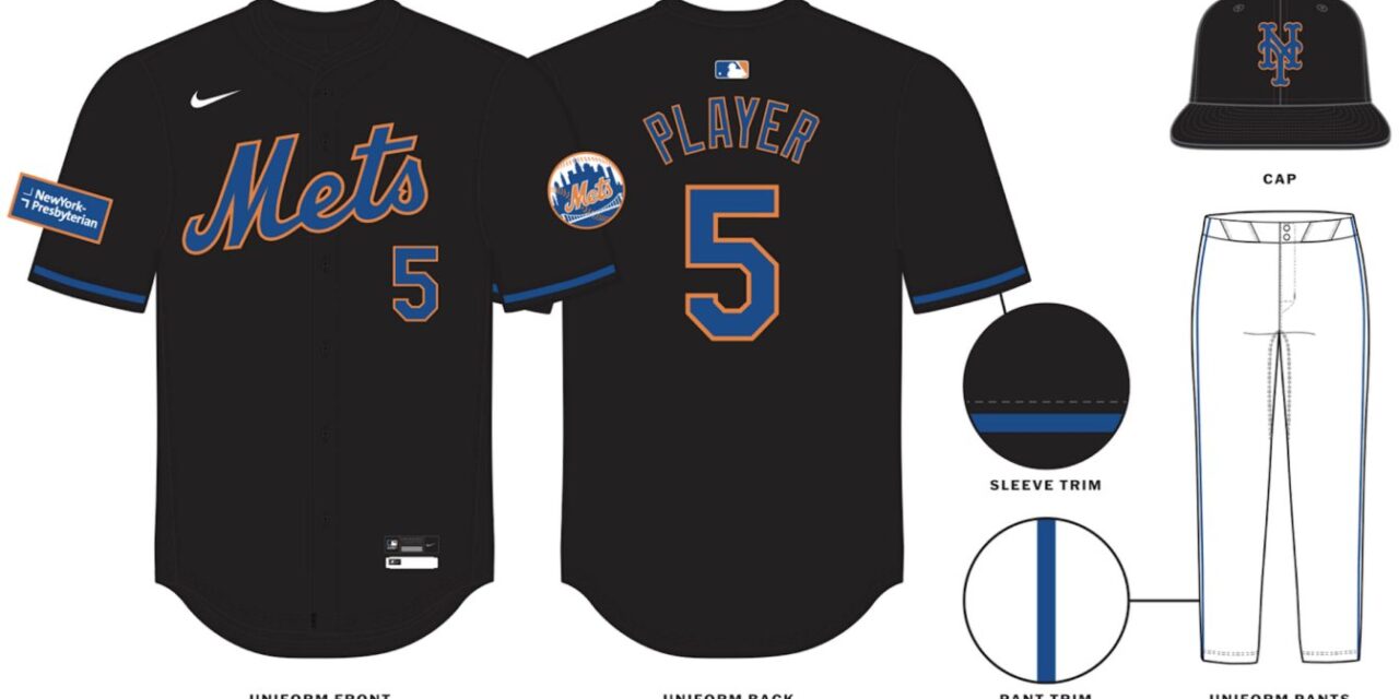
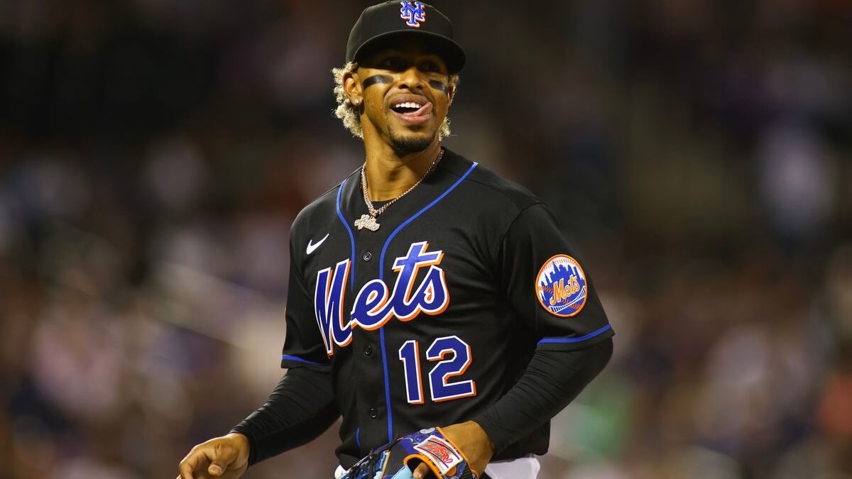
NEW YORK METSHOME:
ROAD:
HOME ALT:
ROAD ALT:
CITY CONNECT:
Notes:
- The Mets’ newly unveiled City Connect set prompted me to make a few previously unplanned changes to New York’s current set, the biggest being the removal of pinstripes from the team’s home uniform. This was done so that 1) the Mets can look as different from their crosstown rivals as possible, and 2) the pins are now unique to the City Connect.
- Despite orange being part of their colorway, the Mets had not one but TWO blue alternates for most of the past decade. Here, the team finally gets an orange alt (similar to their 2013-14 “Los Mets” jerseys) which replaces their awful new black “throwbacks.” I was never big on the Mets in black to begin with, yet the changes made to that design actually have me longing for those original jerseys to return.
- Because the City Connect also uses a Tuscan style “NYC,” I decided to bring back the Mets’ 1987 script “New York” for the road and road alt.
- Yesterday I shared my City Connect tweak here, so here's a quick summary: More purple, matching pants, and an extra pop of white on the roundel and sleeve trim.
C&C appreciated and have a great weekend!Nicely done Mets jerseys! I don't think I've ever seen the Mets have a script "New York" on their aways before, but maybe I haven't been paying to attention to recent uniform changes enough.
-
1
-
-
8 minutes ago, BlueMoon18 said:
Considering one of the NOBs I used went to Baylor...I have a small question.
Should I add teams from other areas close enough to DFW but not crossing another big part of Texas? The Brazos Valley and East Texas would be added on, as well as some cities that are close enough to major cities in the DFW area to not overlap another region. This would add on the following:- Waco
- Bryan-College Station
- Killeen-Temple-Ft. Hood
-
Northeast Texas
- Tyler
- Longview
- Texarkana
- Marshall
- Mt. Pleasant
- Lubbock
- Wichita Falls-Lawton
- Abilene-Sweetwater
Let me know if I should add these cities before I continue.
I think you should just keep it within the Dallas-Fort Worth metroplex.
-
For this next part of the series we take a detour and head to Fort Worth, Texas! and wonder what if the Kansas City Royals had a Triple-A minor league baseball affiliate based in the Panther City?
BRANDING
The color scheme and insignia logo were inspired by the Omaha Storm Chasers' What-If-Night, where they known as the "Omaha Cattlemen" for a game, I decided to ask the artist I commissioned to take the Cattlemen and put them in America's largest cowtown of Fort Worth, TX. The font used for the scripts was Roadstore Regular, and the mascot is a brahma, a traditional symbol of Fort Worth as can be seen in historic downtown or the city flag.
EXTRA HOME SCRIPT LOGOS
Here are the extra home scripts I designed for the Cattlemen, I also made some "Royals-style" scripts with the help of Struck Base.
EXTRA ROAD SCRIPT LOGOS
And here are the extra road scripts I put together for the Cattlemen.
EXTRA CAP LOGOS
Here are the rest of the cap logos for the Cattlemen, I also made a few "Royals-style" cap logos with the font Century Schoolbook to try and replicate the Royals cap logo.
UNIFORMS
I put together 2 uniform sets for the Cattlemen, the first set pictured above is a standard 5-piece set with a white home, and gray road uniform, a light brown home alternate, a navy road alternate with a cap logo featuring the mascot and a "city edition" uniform that has the Fort Worth skyline on the jersey and a white cap that resembles the actual Omaha Cattlemen cap used during the promotion.
And for the second set it is Royals-themed, with a 4-piece set that mimicks the Royals home, away, powder blue, and blue alternates.
-
 1
1
-
-
Really love how clean the primary logos look, Nice job!
Also you should list the new re-digitized Dallas Texans on the header and official team list.
-
After a bit of a hiatus, I'm back with 2 redesign concepts for the NFL's Kansas City Chiefs, to round-out all the Chiefs designs in this series.
BRANDING
Starting off with a refresh of the classic Chiefs Arrowhead logo, this time with a slightly different Arrowhead design a red outline on the Arrowhead design, and a red and yellow "KC" insignia.
EXTRA SCRIPTS AND INSIGNIAS
And here are all the extra Chiefs scripts and insignias put together for this redesign.
FIELD AND UNIFORMS
The new Chiefs field comes with a noticeably bigger Arrowhead than the one currently at midfield inside Arrowhead Stadium, and for the black uniform I made a special black Chiefs logo.
EXTRA FIELDS
I put together 2 home fields with yellow and black endzones, plus multiple Super Bowl fields (LIV, LV, LVII, LVIII, and LIX) with yellow and red endzones.
Now on to the design #2, which swaps out the Arrowhead design for a dreamcatcher design
BRANDING
I've had this idea for a little while, and I'm suprised no one's ever thought of a "dreamcatcher" design for the Chiefs before, but here it is!
FIELD AND UNIFORMS
The dreamcatcher logo now takes up not only midfield, but also the area close to the north and south side of the 50-yard line, and just like with the Arrowhead refresh, there is a black version of the Dreamcatcher logo.
EXTRA FIELDS
For the yellow Super Bowl endzones, I had to put together a "white" version of the dreamcatcher design to contrast with the yellow background.
-
1
-
1
-
-
26 minutes ago, BlueMoon18 said:
Well I could say right now that the NFL/AFL Texans I combined into one concept, hence why two dates were there when I did the entry. But if you do want me to do a 1960 colorway of the Texans then I can.
So you're gonna do the Texans with the red and yellow colors of the AFL franchise and navy and white colors of the NFL franchise?
-
15 minutes ago, BlueMoon18 said:
That would be correct. I hopefully shouldn't encounter another mishap that'll force me to sketch the concepts again. Boy did that end up being a nightmare...
I would think the digital versions of the Fort Worth Bulls and Dallas Texans (AFL) V2 should be next
-
41 minutes ago, BlueMoon18 said:
Also, I should say I FINALLY got my other computer back. But due to that, it'll be a while before I get the Texas Mockingbirds concept out, as I will go ahead and re-digitize the previous two concepts alongside making the digital third concept.
For now, I'll say the Mockingbirds DO NOT use the Eagles green. The blue associated with Dallas will not be used either.
So when you say "re-digitized"?, Do you imply that the concepts going forward will be fully digital like V1 of the NFL's Dallas Texans?
-
Had to come back to this after, the XFL and USFL spring leagues merged to become the United Football League (UFL), I went back and some new UFL field and uniform sets for the Command/Brigade
PART VI: COMMAND/BRIGADE UFL SETS
For the UFL sets, I decided to have the white UFL logo at midfield like a lot of UFL home fields this year, I also made a custom endzone design with the bomber mascot on the left and right sides of the endzone.
-
1
-


:format(jpeg)/cdn.vox-cdn.com/uploads/chorus_image/image/49631251/usa-today-8025059.0.jpg)
INTO THE 816-VERSE - Apollo Beach Royals (A) + Kansas City Royals (NLB) + Kansas City Thunder (NBA) + Kansas City Lakers (NBA) + Credits
in Concepts
Posted
You heard that right, I'm not done!
There will be a sequel series titled "Across the 816-Verse" that is coming soon with 22 more concepts in this sequel series and a brand new collage