


bbush24
-
Posts
156 -
Joined
-
Last visited
Posts posted by bbush24
-
-
As a Guardians fan, I'm satisfied with the CC uniform. I DESPISE city uniforms in general, but this is probably the best one so far. As others have said, it still feels like the Guardians. The elements are actually based on the identity of the team and not some random subcultural element of the city. The CLE thing is dumb, but I honestly wish our whole set was based around this look. The standard uniforms feel like the empty shell of the Indians. This look would've been a perfect way to move into the Guardians era.
-
 9
9
-
-
23 hours ago, SSmith48 said:
they still have so much to go on that isn't just "We are the Miami Heat".
Honestly though, as stupid as the "Heat Culture" thing is, as least they're not diluting their brand as much as most teams are. "We are the ____________" is what branding has been for most of sports history, and it was better that way. We don't need to know about every subcultural element of your city and commercialize it for jersey sales.
-
4
-
-
The fact that for 6 of 7 games in a series, the Nuggets are wearing two different uniforms that both refer to the elevation of their city is just a joke. I cannot wait until this gimmicky city era is dead.
-
8
-
 3
3
-
 1
1
-
-
47 minutes ago, pepis21 said:
(of course if NBA renew deal with nike).
Don't tease me with the possibility of that not happening.
-
1
-
-
19 hours ago, ruttep said:
What would you change about the Niners? (if it's the facemask color, I disagree)
Some people might not count this as a change since socks are kinda like the wild west at this point, but striped socks.
-
6
-
-
I'm not saying they're necessarily the best (although they might be), but the Browns are the only team that I think have "perfect" uniforms, now that they went back to the white face mask. I wouldn't change a single thing if I could.
A few other teams are very very close, but only one is perfect in my eyes:

-
8
-
 1
1
-
-
This specific combo is in the very lowest tier of uniforms in the league
-
17
-
 2
2
-
 3
3
-
-
11 minutes ago, SportsFan12 said:
Y'all are getting soft. These are awful. Screams mid-major college program.
-
14
-
 1
1
-
1
-
 1
1
-
-
I thought I wanted the Lions to go back to a blue facemask, but idk...it just doesn't looks right to me. I'll wait until we see it in different lighting on the field to have a final opinion, but it just feels off.
-
5
-
-
4 hours ago, Cujo said:
Metcalf's tweet was promptly deleted, but here's a screencap of the leak:
So technically this is a new version of the Browns helmet that's never been worn before. White facemask + shiny finish + oranger orange.
-
3
-
-
Turner?
-
3
-
-
Thinking this looks bad is something my mind can't comprehend. Stirrups remind us of all that once was good, and it could be again.
-
6
-
-
10 minutes ago, PlayGloria said:
Uni Watch has covered this issue a couple of times. Pretty unbelievable. The Cardinals had the same issue in ST so i guess we will see what they look like on the road vs the Dodgers today. This is pathetic
Wow somehow I missed that. Looks like the Cardinals were the only team to wear gray in ST but this confirms it's a league-wide problem. Really is pathetic.
-
3
-
-
Is it just me or do these jerseys not match with the pants?
-
 1
1
-
-
1 hour ago, shaydre1019 said:
I feel like I'm going crazy, but I hate red facemasks on dark helmets. It gives generic high school vibes.
I agree. I'd like to see it with a white facemask.
-
3
-
-
This guy was onto something back in 2015
-
2
-
9
-
-
Clearly an upgrade, but I'm not in love overall.
As noted above, the Twins that were the first thing that came to mind. However, I think the Twins executed it better. The contrast with the wordmarks on the red/blue jerseys is an issue imo. The amount of space between the wordmark and number also feels awkward.
The logo is a big miss for me. I'm just so tired of roundels. The NBA already has a problem with an ever increasing corporatized templated feel. All these new logos having the same style doesn't help.
-
3
-
-
3 minutes ago, BadSeed84 said:
I don't get boycotting the companies, can you blame any company for taking the opportunity to be on three sleeve of a MLB team?
If say Wawa goes on the Phillies sleeve, I don't hate Wawa all of a sudden.
It's not so much about hating the company, but discouraging companies from seeing it as a good advertising investment. I don't hate or blame the individual companies, I just hate the whole idea of it. Again, a pretty worthless endeavor considering 99.99% of the population doesn't care. But I still do it out of principle.
-
4
-
-
12 hours ago, Rebuy said:
Fans should simply boycott the advertisers.
I haven't put a drop of Marathon gas in my car since their logo has been on the Guardians jerseys. I have a feeling they haven't noticed. There's not nearly enough people who care enough to effectively boycott these companies.
-
8
-
-
7 hours ago, SSmith48 said:
I'm gonna go off on a tangent here that will make me seem like a conspiracy theorist, but what if the NFL/Nike's prerogative is to design bad/mediocre uniforms on purpose so that they can turn around, pull them 5 years later, and milk more money from fans with a new, more popular set?
I wouldn't be surprised at all. It's become extremely clear across all major pro sports that the #1 priority when it comes to branding and uniforms is short term profit.
-
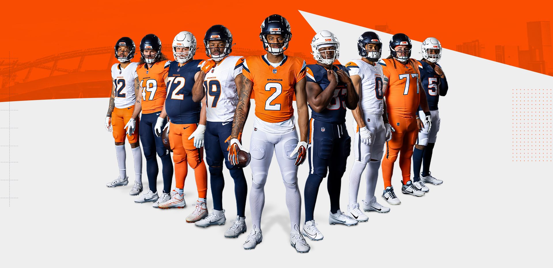
https://uni-watch.com/2024/02/20/exclusive-an-interview-with-the-guy-behind-the-broncos-uni-rumors/
I really hate this if it's true.
-
1
-
 1
1
-
2
-
 1
1
-
1
-
1
-
-
I have to admit I'm a little surprised by the amount of attention this Nike/Fanatics thing is getting outside of us weirdos here. I mean when teams unveil a completely redesigned uniform, half the replies on social media are usually "what's the difference?" just because it's the same color scheme. I'm glad it's getting so much backlash though.
-
11
-
1
-
-
You know it's bad when they keep desperately pushing propaganda to try to convince fans that it's actually a good thing.
-
5
-
1
-
-
Not to be dramatic but this literally just ruined my day. We're rapidly approaching NBA levels of destroying tradition and brand identity.
-
5
-


2024 NFL Season week by week uniform match-up combos: From HOF Game to Super Bowl LIX
in Sports Logo News
Posted
Week-by-week predictions good, full season predictions bad.