


bbush24
-
Posts
151 -
Joined
-
Last visited
Posts posted by bbush24
-
-
Honestly none of them are as good as the old one IMO. Here it is with the orangier orange. Maybe clean it up a little and we're good to go.

-
 14
14
-
 1
1
-
-
-
2
-
 2
2
-
-
10 hours ago, Blast_Brothers said:
For your consideration:
I don't know. It's okay.
I hope they do this at some point, but we all know those red and white socks would be swapped

-
6
-
2
-
-
- Red socks or striped white socks in the away uniform
- Shrink ARIZONA wordmark on home jersey x5
- Wear the white pants at home
And it's actually a pretty good set. But alas.
-
3
-
-
My problem with the NBA uniform situation isn't just the crazy designs like this new Nets one.
It's the fact that I don't even care. Whether it's ugly or beautiful, my reaction to every new uniform is exactly the same at this point. Who cares?
And I guess it's not just a uniform problem, it's a league as a whole problem. My reaction to new uniforms is the same as my reaction to player transactions.
"Oh, star player so and so got traded to that team? And what colors do they wear this year? Well it was green last year but I think it's pink this year. Ok whatever, he'll be on another team next year."
I know it's been said a million times but the lack of team identity is KILLING the NBA. There's no rivalries, there's no classic matchups that you can immediately envision in your head. It's just turned into a professional AAU league. And I'm 26 so I'm not just a cranky old man.
-
11
-
 1
1
-
-
I didn't know I loved the idea of the Yankees in road pinstripes until just now
-
This whole set was perfect and they should have never gone away from it.
-
27
-
3
-
-
36 minutes ago, Germanshepherd said:plus it’s on both sides which ruins sleeve logos, a defining feature of most baseball uniforms.
It's not actually on both sides, it's on the right sleeve of lefties and the left sleeve of righties to maximize exposure. Which I guess is better than being on both sides, but still a joke.
-
 1
1
-
1
-
-
20 hours ago, HopewellJones said:
I know this is an old gripe, but the "TBD" pants on the matchup displays really ruins it. It just takes up a bunch of space on the page and it's not nearly as exciting anymore.
Better be careful. Mods have made it clear that we're not allowed to complain and @canzman has made it clear that he does this for himself and doesn't care about our "self-serving, entitled, millennial mentality."
-
11
-
 2
2
-
 1
1
-
-
16 hours ago, 8BW14 said:
No thanks. Gray>brown>white. White just feels very collegiate or amateur to me.
It's a lost art but there was a time when a white facemask on a color helmet felt professional, and looks beautiful in my opinion.
-
10
-
1
-
1
-
-
11 hours ago, officeglenn said:
Moderator stepping in here.
That's enough griping about the "TBD". Maybe it's not how you would do it or how you would prefer it done, but if you don't like it, don't click on the thread. It certainly doesn't warrant the level of vitriol and name-calling that we've seen in this thread. So knock it off.
Any further name-calling or uncivil behavior in this thread will result in suspensions.
That's fine, but let's not act like the vitriol came from the people griping about it. Most of the comments were very civil and respectful. The name-calling came from the other side.
-
3
-
1
-
 1
1
-
1
-
 3
3
-
 1
1
-
-
15 hours ago, Cujo said:
Worst classic vs Worst modern -- easily Top 5 worst ever match-ups.
Putting the whole racist name/logo thing aside and looking at it strictly from a uniform design standpoint, it's really sad to compare sunday's match up to what we saw 3 years ago.
-
17
-
-
On 9/1/2022 at 10:06 AM, canzman said:
This is all coming across as people saying to me “You are taking your time and effort to do all this work but it isn’t the way I want or like it so I’m going to complain about what you post instead of what I feel the match-up will be.” This self-serving, entitled, millennial mentality of this isn’t what I want so I’ll just complain is exhausting.
Uh...woah. Just now saw this. I thought my comment, along with most of the others I saw, was respectful and reasonable. I apologize if it came across otherwise. I absolutely appreciate the time and effort you put into this, and you have every right to do it however you please. I figured you would want some feedback on what people thought of the new format. Apparently not.
-
1
-
-
Not sure how others feel but I'm just gonna throw it out there that I much prefer the old way of doing this. I know it's not necessarily supposed to be a prediction thread, but I used to really enjoy looking through these and seeing the potential matchups, even if they weren't all confirmed. Having a bunch of TBDs of uniforms that don't even exist with the plain white pants just doesn't do it for me. Maybe others prefer this though, and I appreciate all the work as always!
-
20
-
5
-
-
2 hours ago, canzman said:
Was never the intent to create a prediction thread. Was always the intention of posting the combos... Part of the reason I update posts once things are known. If it was only about predictions why would I update. When I started doing these threads I only had created full combo graphics, so full combos were all I could post. I have since made new graphics. There are still predictions to a point as some teams don't even announce the jerseys in advance. The thread is not named 2022 predictions.

I like the idea of having it say TBD before it's confirmed, but I think you should still have the full predicted uniform under the TBD instead of having plain white pants.
-
3
-
-
26 minutes ago, VDizzle12 said:
The real question is who the hell is signing off on these uniforms? Do fans really want to buy a plain white tank top? If so, counterfeit companies must be licking their chops. The Jazz uniforms are a disaster, but at least they managed to put some sort of design effort into them. It's funny that so many were surprised we didn't get any leaks of the Cavs jerseys. I bet it's because people saw them and just assumed they were practice jerseys or something for the summer league.
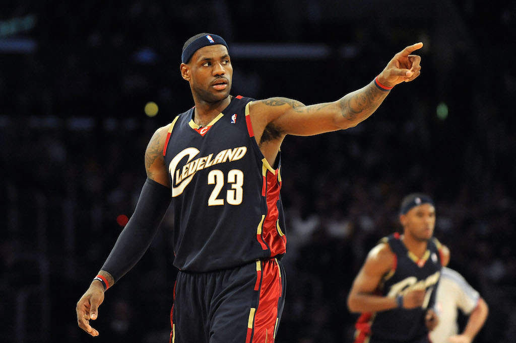
I usually try not to blame designers, because I know the client is king. But the Cavs hired this apparently internationally renowned artist to have complete control over their brand and I can't say I like any of his decisions aside from the updated color scheme. The updated logos are a jumbled mess of eras, generic and the new uniforms are embarrassingly boring. Sometimes being an artist doesn't automatically make you qualified to control a sports brand.
It was clear to me as soon as I saw the hiring of Daniel Arsham and looked at his work that this would be the direction he would take it. His artwork style is pretty minimalist with an almost entirely black and white color palette. It was a bold move to put a regular artist in charge of their branding, and it's starting to look like a mistake imo.
-
2
-
-
3 hours ago, CS85 said:
Is anyone else only seeing the bottom image?
-
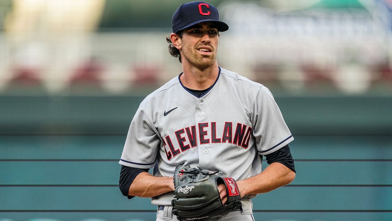
First look at the Guardians in action yesterday, compared to last year.
-
7
-
-
- Popular Post
- Popular Post
I like how they stuck to the 1932 theme by having the 32nd best uniforms in the league.
-
56
-
On 1/26/2022 at 11:49 AM, gosioux76 said:
Seeing players in their regular uniforms really highlights the diverse color palette of the league, much the same way it does for the MLB all-star game. I couldn't imagine those players running out to their positions in some specialized all-star uniforms.
You don't need to imagine, unfortunately .
-
1
-
-
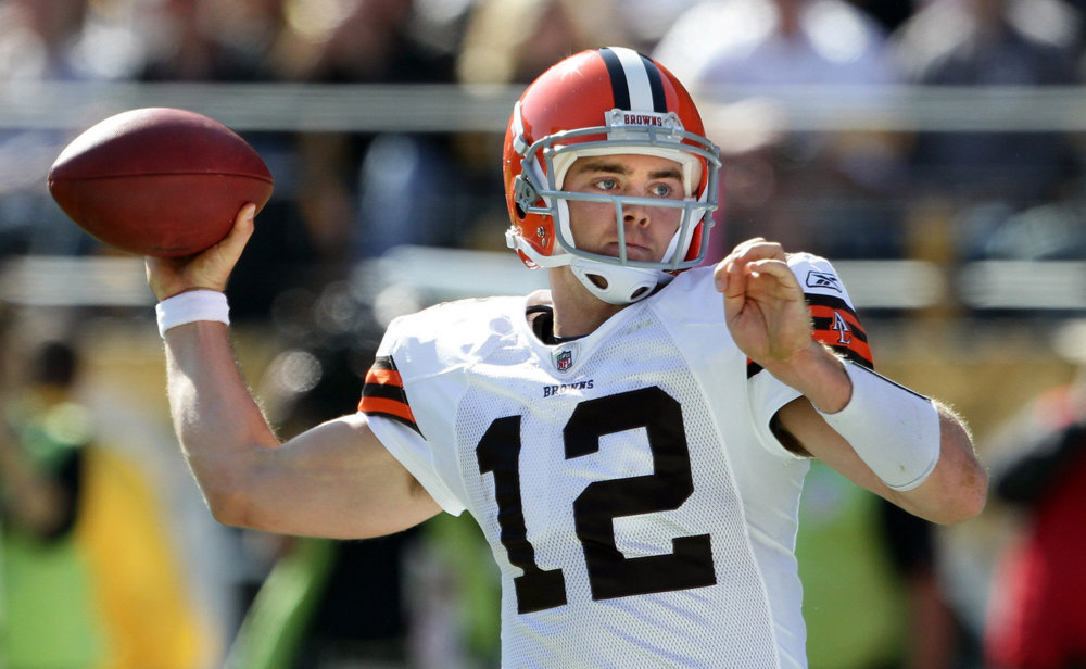
The Browns wore their white striped socks for media day instead of the brown striped socks they normally wear with the brown jerseys.
-
7
-
-
I never liked the gray facemask for the Browns. I thought it was bland and have preferred either white or brown. But for some reason on the new throwbacks I really like how it looks. And I can't for the life of me put my finger on it.
-
2
-
-
The fact that real human beings with brains said "What's the difference?" when the new uniforms came out will never not amaze me.
-
26
-
-
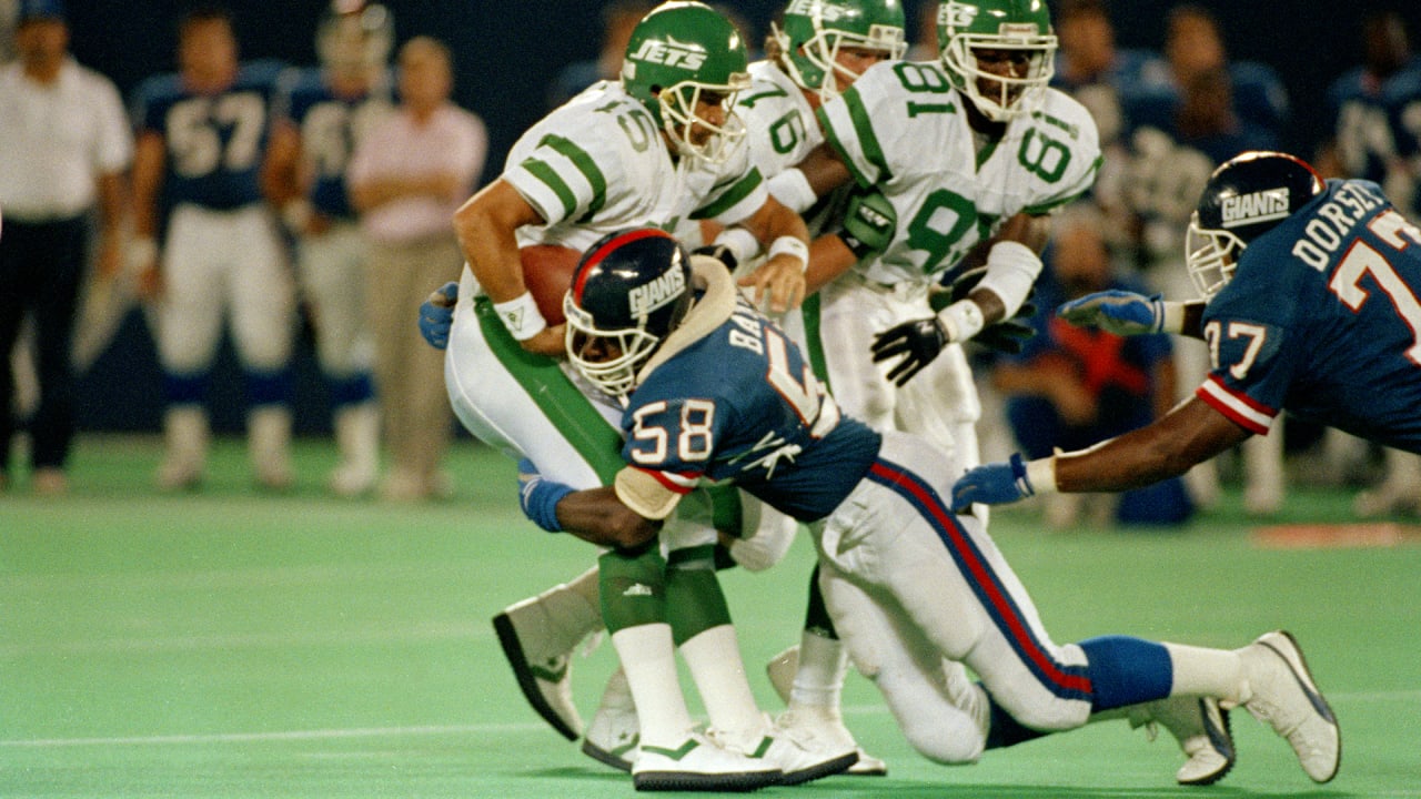
Kenny Lofton. Wrong, right, wrong.
-
2
-


/cdn.vox-cdn.com/uploads/chorus_asset/file/19664385/77616378.jpg.jpg)


2023 - 2024 NBA changes
in Sports Logo News
Posted
The Cavaliers *current numbers