


DouglasQuaid
-
Posts
411 -
Joined
-
Last visited
-
Days Won
1
Posts posted by DouglasQuaid
-
-
It's been all down hill since their original uniforms.
-
 1
1
-
-
I would've loved to have seen those proposed packer uniforms come to life, I wonder if they ever made them. I'm glad they somewhat stayed with the classic design though.
-
I asked my buddy (who doesn't know anything about football) what he thought about the uniforms tonight, and he said "they look so professional"
-
1
-
-
I like the modern pattern, they just need to fix the collar.
-
Roughnecks look to be wearing their navy road pants with their home uniform.
-
1
-
-
Houston's side panels kill the look and the Battle Hawks need blue socks for the home uniform. Great job with the white road socks though, anything to avoid yoga pants.
-
That the 49ers are now a two striped team rather than three striped team. Three looks so much better imo because that is and has always been their iconic look.
-
4
-
-
1 hour ago, Gothamite said:
What sleeves?
On the green "sleeve" caps
-
If it is true, I wish they'd remove the side panels and put the tv numbers on the sleeves.
-
The redskins concept is perfect! I love the spear and throwback face logo
-
1
-
-
3 hours ago, Wentz2Jeffery said:
One thing that really irks me about the new Jags jerseys is that they look like practice jerseys with no number outline.
What bugs me is that they have a phantom outline that matches the jersey color. The raiders also do this too on their home jerseys which makes it look cheap.

-
4
-
-
I always thought that the bengals could have orange pants that match their helmet, however I like this jersey design minus the chest logo.
-
2 hours ago, oldschoolvikings said:

I too thought the same, but then I thought how good it would be with the current color rush jerseys and silver pants. It's also a nod to their original uniforms.

(The Giants look great here by the way, gray pants are way better).
-
1
-
-
1 hour ago, OaklandIsBack said:
FIFY:
Titans perfect set
home:

(the only thing I would change is number font and matching helmet stripe).
-
6
-
-
On 12/19/2018 at 10:03 AM, oldschoolvikings said:
These are great! I like the current uniforms but they are lacking that old school vikings feel (like your name). I would take these instantly and never look back. I love the gray facemask, no black in the logo, and the pants stripe change works really well. I like the dark purple too, the vikings current uniforms seem too light at times. The only changes I would make is to have home striped socks and no wordmark on the chest
-
1
-
-
3 hours ago, oldschoolvikings said:
I think I've posted more Ravens' concepts than any other NFL team... just can't get completely satisfied.
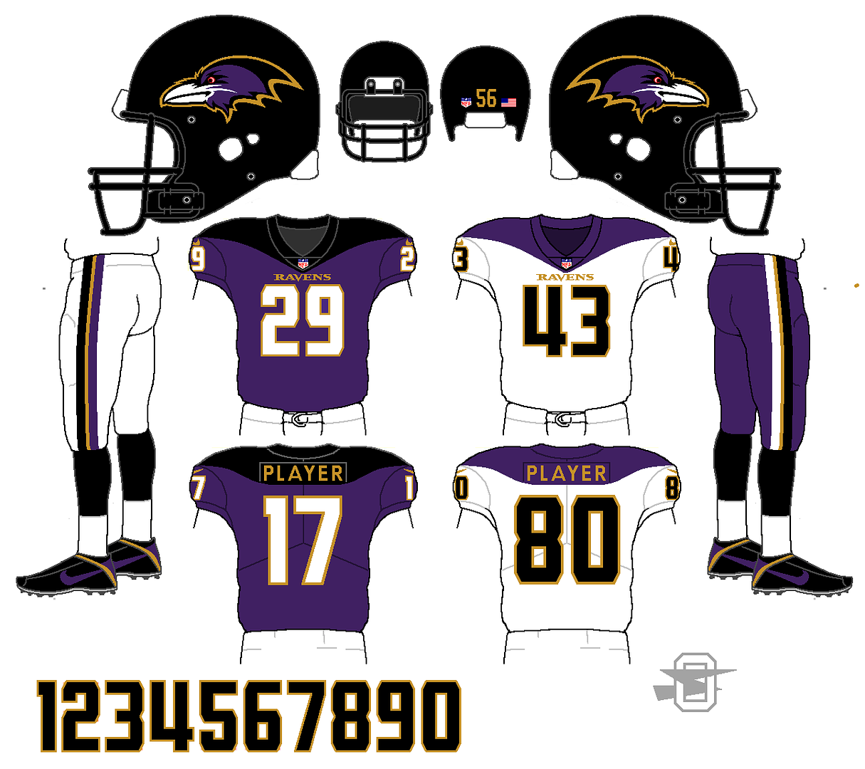
I love the idea of using the shoulder yoke. It gives an old school look but seems very modern for 2018. I also love the pants stripe and love that you dropped the "B" from the logo. Great concept!
-
2
-
-
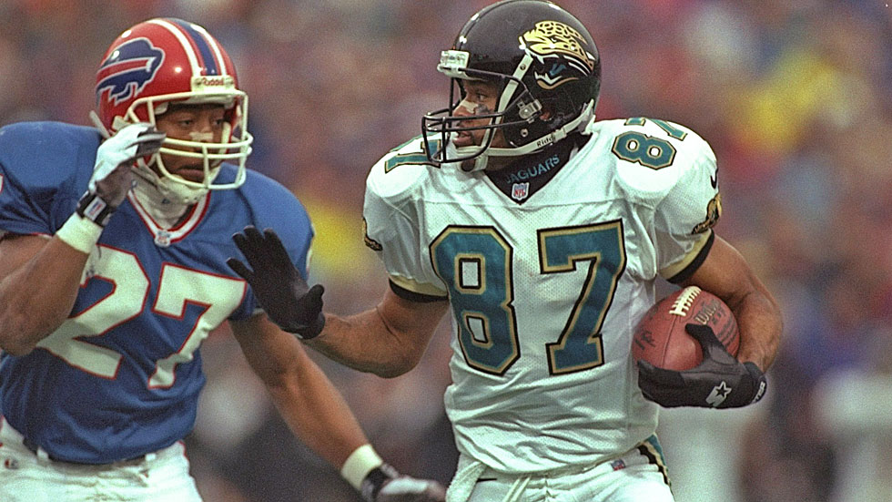
This is the best the Jags have ever looked. I prefer the block font rather than the custom. Also the pants stripes also look better than the thicker black stripes on the later uniform. I wish the new uniforms were a little more like this design.
-
3
-
-
23 minutes ago, VikWings said:
Still my favorite Vikings uniform they’ve ever worn.
Which version? I like when they had the darker helmets before 2002.
-
I'm sold, as a fellow Viking fan this is the best combo of old and new. However I would put a white facemask on the helmet and I would use the font that is in the drawings. Great work!
Road concept? Purple pants?
-
The browns look great but i think it would look better without the wordmark on the chest
-
3 hours ago, SFGiants58 said:
The "wishbone C" is overused (and should have been dropped in the 1987 redesign), the width difference between the "T" and "C" is a little distracting, and the red doesn't stand out enough from the navy background of the caps. I wish the team had touched it up during the 1987 redesign and tweaked it again during the move to Target Field. Basically, turn it into @the admiral's top-notch concept:

The other thing that makes me despise the current "TC" logo is how defensive Twins fans get about it (look at the response to Admiral's redesign). They swear that it's "untouchable" and that it can't change because "it's been there from the start." Guys, if other teams can change up classic logos without sacrificing their "spirit" (i.e. Cardinals - football and baseball, Orioles, Blue Jays, Vikings, Bruins, Maple Leafs, Blues, and a whole host of college teams), then so can the Twins.
I feel like its a great concept but I would rather see it colored like the original TC

-
2
-
-
Roger Craig with the Vikings and Raiders

-
I dont know if this has been posted, but I came across this concept for a new Minnesota state flag from 1989 known as the "Northstar Flag". (anyone know if they sell these anywhere?)


-
1
-


NFL Changes 2021
in Sports Logo News
Posted
Even if they do a total rebrand they’ll always have the past attached to them, regardless of what logo they use.