


WestCoastBias
-
Posts
589 -
Joined
-
Last visited
Posts posted by WestCoastBias
-
-
6 hours ago, heavybass said:
..... Group of 5 doesn't mean larger schools, i categorise Power 5 teams as MUCH larger schools.... i've already made the list.
Group of 5 schools are large schools, they play FBS football. Why do them when you could create new unique uniforms for schools who don't play football at all?
Sorry if I'm coming across as a dick. You do make good concepts but I just think this project would be cooler if you did schools we don't typically see concepts on here for, especially for schools out West. Like UC Santa Cruz, who wouldn't want to see an arena football uniform concept for the Banana Slugs? The UC and CSU systems have a lot of really unique brands you could do some great work with.
-
7 minutes ago, heavybass said:
Because there really isn't much teams to fit into the regions in the West as it turns out.There's 23 UC's and CSU's that don't play football plus a lot of private schools in California that don't either. The entire West Coast Conference doesn't play football besides BYU. GCU, Utah Valley, Seattle, and Denver would also be good ones. There are other schools in the state university systems of Oregon, Washington, and Colorado too.
Seems kind of redundant to do these Mountain West schools that already have regular football teams. Why would they have arena football teams.
-
 1
1
-
-
Why do these Mountain West teams have arena football teams when they already have regular football teams?
-
2 minutes ago, colinturner95 said:
Neat concept but :censored:, thats gaudy as hell.
The silicon could of looked cool stained on a regular court.
CSU Bakersfield has a pretty similar looking blue court as well, why did SJSU think it was a good idea to copy it.

-
4
-
-
Is every team getting a Classic Edition?
-
On 6/7/2022 at 12:39 PM, CaliforniaGlowin said:
I love the silicon on the new SJSU court!
Good lord that's ugly
-
4
-
 1
1
-
-
21 minutes ago, fouhy12 said:
Don't know if this is official, but it certainly looks like the Rams have switched to the white jersey as their road one based on media day.
Let's hope so, the bone is so bad.
The white jerseys with yellow pants are gorgeous and the blue jersey has really grown on me, even the gradient numbers! I prefer the yellow pants with the blue jerseys but even the blue pants look good too.
-
4
-
 1
1
-
-
2 hours ago, MJWalker45 said:
The red pants did not feel on brand last year. They just ran out of ideas.
I'd like to se them go with something based on the Marshall Faulk era uniforms, at a minimum as an alternate. I like the current helmet, but the old school helmets looked better for everyday wear.
The helmets just look plain red unless you see them up close. A modernized Faulk era uniform would be way better.
-
1
-
-
This is exactly what Utah needs to do. Their current look is a mess.
-
2
-
-
On 5/21/2022 at 10:37 AM, MJWalker45 said:
San Diego State with 100 years patch.
I feel like this may be an unpopular opinion but San Diego State's uniforms and helmets suck. I was hoping for some uniforms this year to go along with the opening of their new stadium.
-
2
-
-
On 4/25/2022 at 8:21 AM, johne9109 said:
Los Angeles Kings
For the Kings I originally going to do something Hollywood/film related, but I couldn't come up with a design I truly liked. Instead I opted to base it off of the signs at the LA area beaches mainly the Santa Monica pier sign. Everything gets a classic "forum blue" and gold treatment. The Collar reads City of Angels and the promotional image is a take on the City's flag.
The design is cool but Santa Monica is its own city, which kind of conflicts with a "City Connect" uniform that also uses the City of Los Angeles flag and "City of Angels" slogan.
-
1
-
-
On 4/19/2022 at 10:14 AM, insert name said:
Welp. It's here, it's big and it's ugly.
This is so huge, there's no room for another patch. Let's say they get to the World Series next season, they won't wear a WS patch. Are we just done with those? This sucks on every level.
It's HUGE.
I wish teams would at least get local sponsorships. It would be better if the Padres had a Stone Brewing, Sea World, San Diego Zoo, UC San Diego Health, Qualcomm, or even a Jack in the Box ad. Who even uses a Motorola anymore?
-
1
-
-
2 hours ago, NH4 said:
Thanks for catching that! I've updated the chest text to match the drop shadow style of the numbers:
When I was editing this, I also thought about removing the drop shadow from the chest text:
Thanks again and let me know which one you like better
I like the chest text with the drop shadow
-
1
-
-
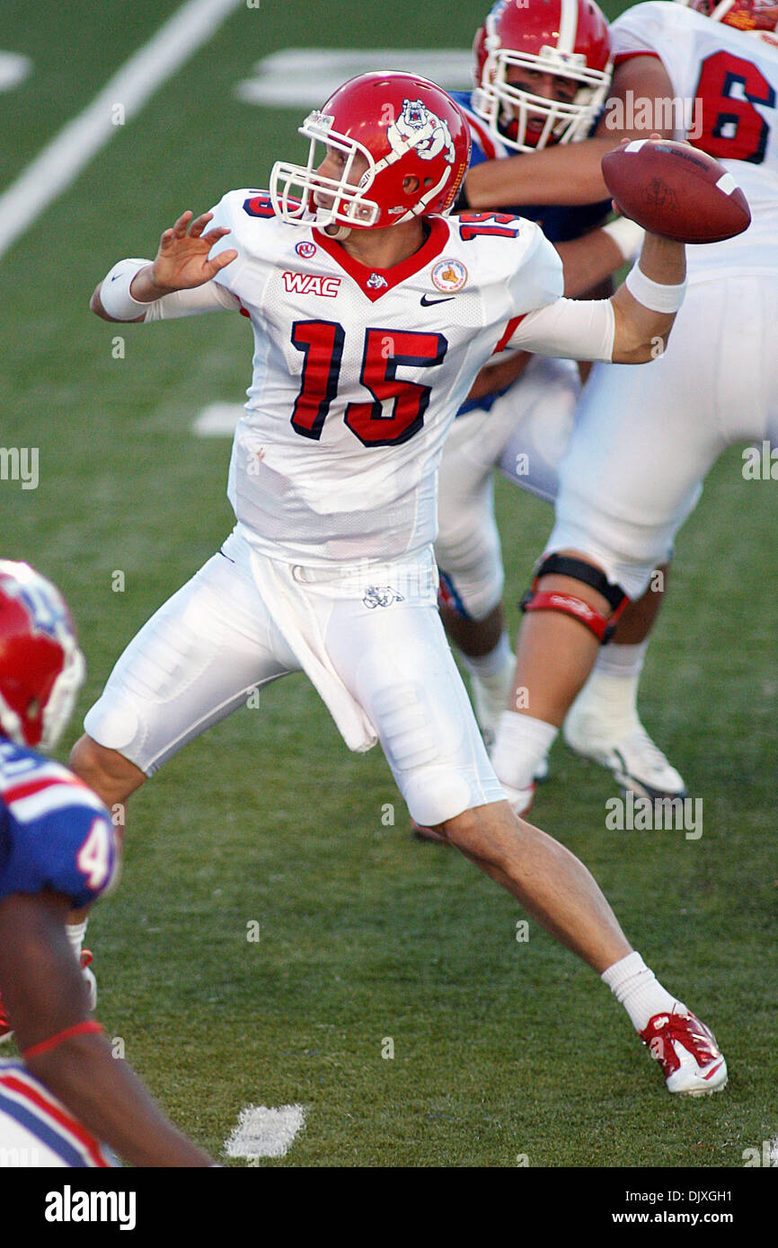
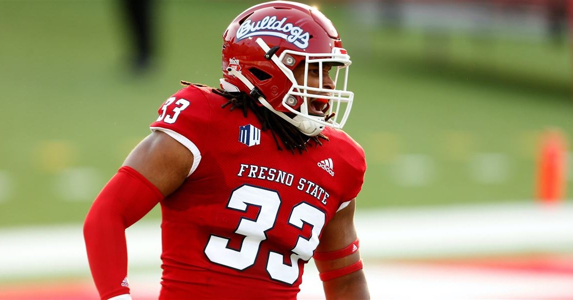
16 hours ago, NH4 said:
FRESNO STATE BULLDOGS
DESIGN
- To me, Fresno State's best uniforms were the 2000-2010 uniforms before they received Nike templated designs
- I like that they went back to more traditional uniforms with Adidas, but I wanted to bring back the drop shadow numbers
- New block font to match the numbers
HELMET
- Red helmet with white facemask
- Primary logo and the script are both on the helmets
- Valley "V" from the collar on the logo stays on the back
- "DOGS" on the front bumper and "FRESNO STATE" on the back bumper
JERSEY
- New fonts added
- Added a V with the circle to replicate the dog's collar in the logo
PANTS
- Red and white pants
SOCKS
- White socks with red accents
Up next will be UTEP. Thanks for looking and as always, C&C is greatly appreciated!
Love the return to the drop shadow, I agree Fresno's best uniforms were the 2000-2010 uniforms. I also like that you didn't include blue jerseys/pants or the white helmet. Fresno State should always be in red.
Only gripe would be the V on the collar, it's a little too big and I'd rather see the full Bulldog or Bulldog head there instead.
Go Dogs!
-
1
-
-
On 2/17/2022 at 2:41 PM, plobrien said:
Didn't see them posted in last years thread, Central Valley Fuego FC is beginning play in USL League One this year. They unveiled their logo about a year ago.
No official uniform reveal yet but player signings are being announced with these jerseys from Capelli Sport. I guess they could possibly just be practice jerseys though.
-
29 minutes ago, DCarp1231 said:
Are we ever going to stop posting pictures of players immediately after they sign with or get trade to a new team? It doesn’t make any sense. Especially if said player still has years left to play, like Von Miller and Russell Wilson
I disagree with Von Miller, his peak was with the Broncos and he was the face of their defense for a decade. A few years on the Bills isn't going to change that.
Russell Wilson could be different depending on how well he does in Denver, but the Super Bowl with the Seahawks is going to be hard to surpass. But after all, he is remembered more in college at Wisconsin than NC State.
-
5
-
-
On 2/14/2022 at 7:59 AM, MJWalker45 said:
Yes. Because I'd say Von Miller would fit in this category too. If OBJ leaves in the offseason I'd say that cements wrong uniform status.
-
4
-
-
On 3/22/2022 at 6:41 PM, flyersfan said:
I'm a fan of the TCU frog collar. It's uniquely them, and I think it works as a modern look. Awesome jersey element. Simply make the jersey numbers contrast more, make them white. Too often its too much dark on dark, especially in shadows. Keep helmets satin, and keep stripes off the helmets, or keep them simple and straight. The white uniform is great, the others just need some visibility help. I won't complain if they simplify, but they have to stay different from Northwestern's chosen identity. I just believe the current set is more of a "modern classic" with tweaks needed than a disaster, a la the Denver Broncos
I'd like TCU's uniforms more if the spikes were contained to the collar and cuffs like the LT era uniforms, kind of like Florida State's collar for a more modern example. I agree they really need to get rid of the gray/silver elements of the jersey and they also need to just stick to that purple helmet in your second photo, no more chrome.
-
1
-
-
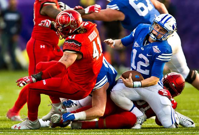
On 3/22/2022 at 4:59 PM, GrayJ12 said:
Not gonna lie, I am actually digging the BYU/Utah uniform matchup...
It wasn't just a Las Vegas Bowl thing for them either, they've done color vs color every year since 2011 I think. If Utah could clean up its uniforms a bit the Holy War be up there with USC-UCLA for best looking rivalry games.
-
5
-
-
Didn't see them posted in last years thread, Central Valley Fuego FC is beginning play in USL League One this year. They unveiled their logo about a year ago.
No official uniform reveal yet but player signings are being announced with these jerseys from Capelli Sport. I guess they could possibly just be practice jerseys though.
-
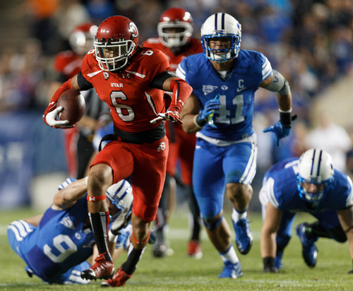
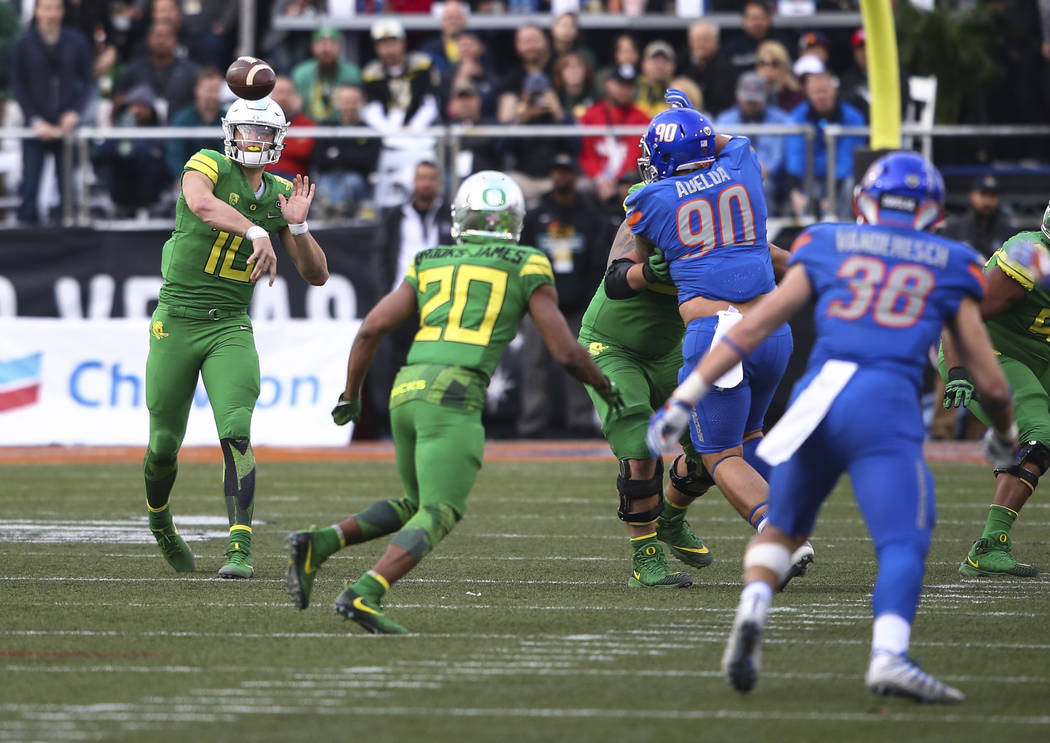
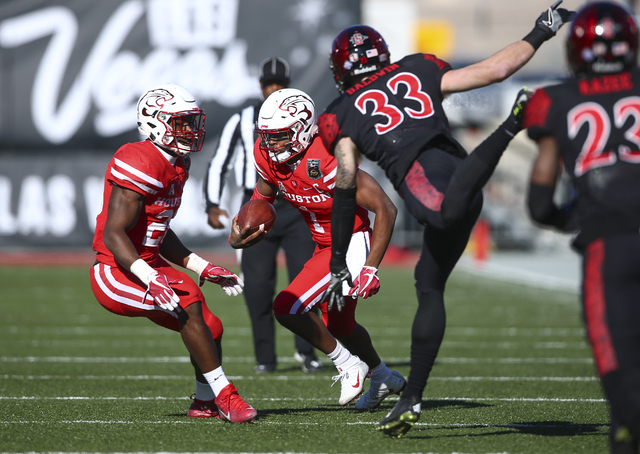
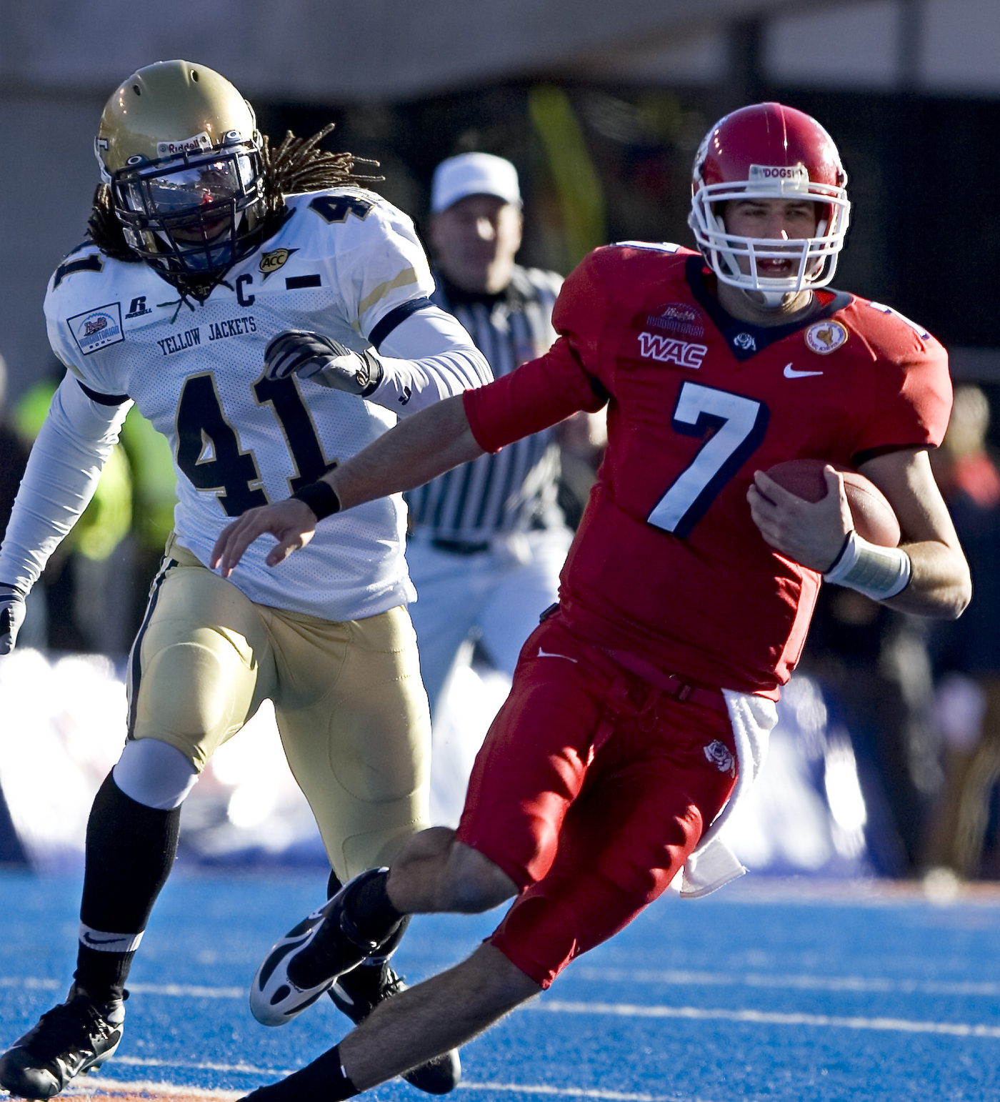
The Las Vegas Bowl had a four year streak of color vs color games.
2018, Fresno State vs Arizona State:
2017, Boise State vs Oregon:
2016, Houston vs San Diego State:
2016, BYU vs Utah:
-
New Fresno Grizzlies alternate uniform inspired by the Fresno Tigers of the West Coast Negro League.
Also, a new logo celebrating 20 seasons in Chukchansi Park and Downtown Fresno.
-
1
-
 1
1
-


/cdn.vox-cdn.com/uploads/chorus_asset/file/22503117/1229636823.jpg)

/cdn.vox-cdn.com/uploads/chorus_image/image/69843774/1235088625.5.jpg)


/cdn.vox-cdn.com/uploads/chorus_asset/file/18945029/598215.jpg)


MLB 2022 Uniform/Logo Changes
in Sports Logo News
Posted
Los Angeles Angels is better than Anaheim Angels.
The Los Angeles MSA includes Orange County. I see no problem with the Angels using Los Angeles, there's more than enough people in the MSA and the greater Los Angeles area to share the with the name with the Dodgers.