


AstroCreep
-
Posts
2,422 -
Joined
-
Last visited
-
Days Won
3
Posts posted by AstroCreep
-
-
1 hour ago, SCalderwood said:
Maybe I'm missing something really obvious, but can you be more specific about what you think is so "frustrating" about this? I think it looks okay. What am I missing?
I was slightly annoyed how the American League were blue and National League were Red when it's normally the other way around.
-
21 hours ago, WideRight said:
The Colts throwbacks are fine, but I think what they need to do is find a way to return to shoulder hoops that actually connect under the armpit. I hate the new version shoulder stripes that just stop at the chest. We need some of these (with or without sleeves, make it happen!!!)

If Under Armour can figure it out with UCLA, I'm sure Nike can too. I think it's absurd after all these years and they haven't produced a uniform that can properly display looping shoulder stipes.
-
 2
2
-
-
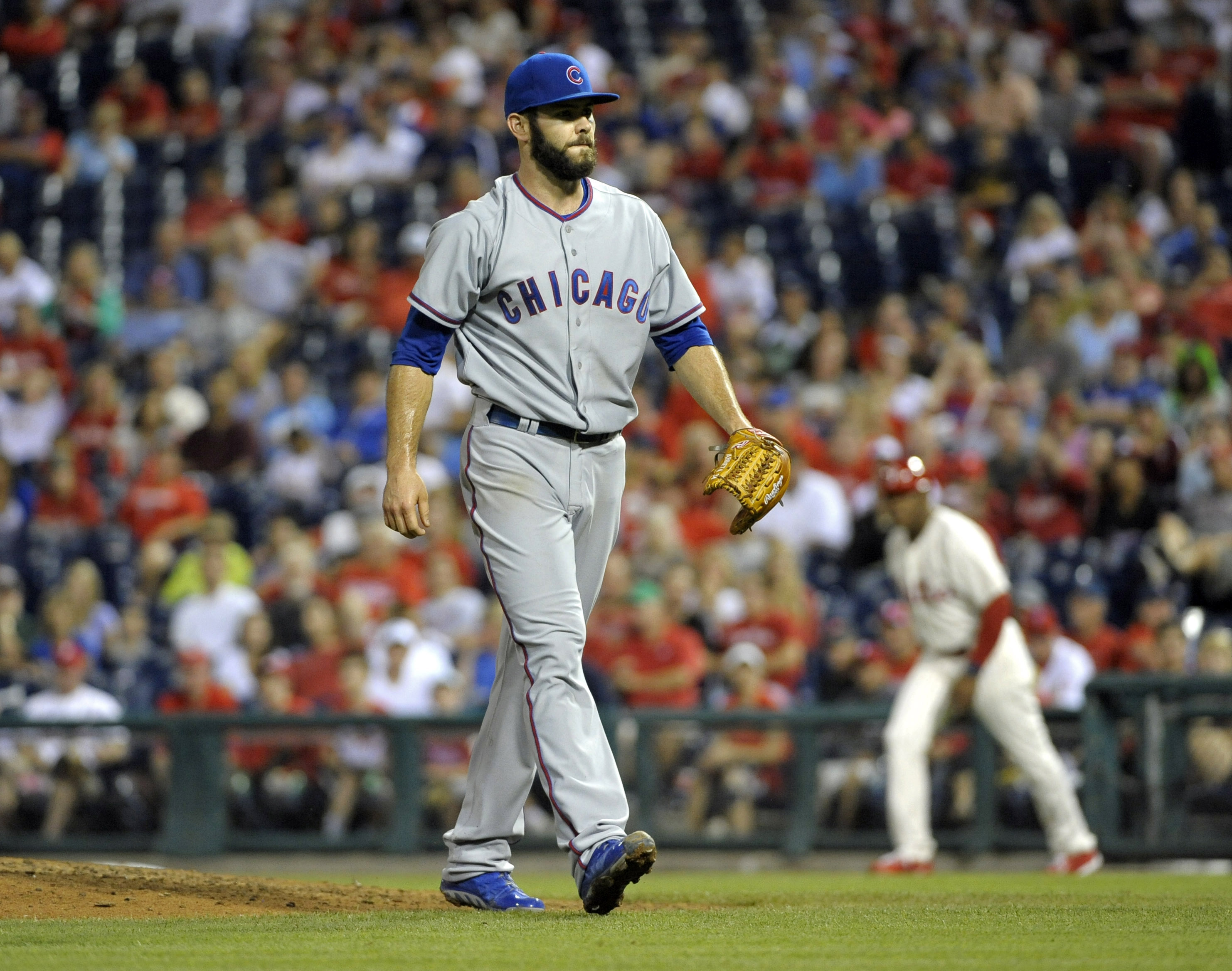
18 hours ago, Discrim said:
Ugh...if only they'd at least figure out a better looking Chicago script than this ugly one. And change the back numbers to blue. Hell, at this point I'd be content with a gray version of the pinstripes instead of these.
The word mark always looked awkward. When I saw the 1968 throwbacks, I thought those should've been promoted to fulltime.
-
4
-
-
On 7/2/2021 at 2:54 PM, Unocal said:
The Sharks did play the Devils/Whalers in 1991-92, but it's hard to find photos of such
There is a video of Sharks vs Whalers in 92.
-
This is frustrating on so many levels.
EDIT: I guess it wasn't obvious to everyone else as I thought. The AL are Blue and the NL are Red when it's typically the other way around. Found it mildly annoying.
-
Yeah, the bar was already low so anything would've been an instant upgrade. I still don't like the weird glossy look they're going with on the numbers and shoulder. This is less of an eyesore so they have that going.
-
8
-
-
Rams already gearing up for new uniforms. How many teams is this already since the start of the Nike era that have changed uniforms immediately after the 5 year hold?
-
5
-
-
25 minutes ago, Ben in LA said:
Since the appropriate thread is currently locked…
https://twitter.com/ramsnationpod/status/1409951939643772932
That means we can post this painting again!
-
29
-
-
Puma have had some pretty classy home kits during the tournament. Not sure why the away kits are the way they are.
-
2
-
-
[delete]
-
The fan jumping off the rails behind the CBS crew didn't even crack Top 5 wildest moment of the night.
-
4
-
-
Going outside the box a bit.
Back in 2004, TNA Wrestling aired on Fox Sports Net. It's the only time I can recall a wrestling show having a scorebug in every match. Using the FSN scorebug made it feel like an actual sporting event.
It was only limited to the image you see here. Everything else, like a wrestler's name during their entrance, was a custom TNA graphic.
WWE SmackDown currently airs on FOX and FS1. Can use imagine the show featuring the current FOX Sports graphics during the matches?
-
7
-
-
Man, I do not like the new NBC scorebug for NHL. It's way to small. Everything is too close to each other, especially if a team goes on the PP. There's no breathing space. Probably the current worst socrebug on the national networks.
-
4
-
-
On 5/16/2021 at 7:56 PM, sozopol said:
I guess I'm in a tiny minority that much prefers the return-to-classic look of the Jets, including the darker green, before Nike took over and the colors got weird. The dark green and white had a nice frosty, unique look to it. If they could have just cleaned it up so the stripes weren't awkward and the greens were consistent, that would have been *chef's kiss*.
I do like the new candy-apple helmet, in a vacuum, and I actually kinda like the black jersey-- would love to see it with white pants. But mostly I wish they did a modern version of:
Happened to a lot of teams.
Back when the Jets announced the new set, @keyser.soze made a small change that inverted the shoulder stripe to fit the modern Nike template. It looked pretty good too and could've fixed one major problem the Jets uniforms had since the Nike takeover.
If they did this with the current colors, it would look really good. I said before, all they needed were small tweaks, not an entire overhaul.
-
14
-
-
There's a new Adidas template coming out?
-
The new NBC scorebug looks like it was made for MLB but they failed to get the rights and didn't want the graphics to go to waste.
-
4
-
-
On 5/11/2021 at 9:58 AM, charger77 said:
are there any more photos of this?
-
How do you lose 3 franchises in such a short amount of time?
-
3
-
-
Orioles vibe from OSU.
-
1
-
-
2 minutes ago, Sec19Row53 said:
Not until they're located in DC.
oh boy, not this again
-
6
-
-
10 hours ago, ManillaToad said:
Can't think of a worse case of BFBS in the NFL than the Jets
Surly can't be a coincidence the Jets have 2 of their worst seasons in black.
-
A lot of these are really good. They really show how much the conference logos are missed in the endzones. You need that symmetry.
-
1
-
-
On 1/23/2021 at 5:24 PM, johnnysama said:
I wish they'd kept the red facemasks, though.
They did during the 2000s. Looked really good.
-
6
-
-
They are due for a new set. These overstayed its welcome.
-
9
-


NFL Changes 2021
in Sports Logo News
Posted
The eyebrow raise is what gets me. Like the person making this was a fan of The Rock.