


PrimalCookie
-
Posts
2,159 -
Joined
-
Last visited
Posts posted by PrimalCookie
-
-
Ah, yes, black and white. The colors of Iowa State.
-
 6
6
-
-
Love those South Carolina uniforms. They're consistently one of the best dressed teams in the SEC.
As for Florida, I'd expect them to counter with either O/B/W or O/B/B. Either would look good, but I'm hoping for white pants. Keep it classic for the first home game of the season.
-
14 hours ago, sleuthpanther said:
I’m absolutely intrigued by that UCF crest thing, being the golden knights thats a cool connection with heraldry right off the bat. It seems like the perfect combo of quirky detail while still being simple enough to comprehend at a glance. Kinda geeking about it, but if I was a player I’d think it was kickass.
Just Knights. They haven't been Golden since 2007.
Re: the crests themselves, that's pretty cool. It's a nice personal touch that players will love.
-
30 minutes ago, GriffinM6 said:
Anyone else still having trouble getting used to seeing players wear number 0? I get the need for it, but it just looks odd on a football jersey. I must say though, I think 00 looks pretty good on a football jersey.
PS: LSU vs. Miss. St. is probably my favorite looking game of the day so far.
Yeah, I'd much prefer 00 if they have to use it at all. 0 just doesn't look right.
-
28 minutes ago, aawagner011 said:
Not a fan of the Ole Miss alt. It’s overkill and too much of a color that’s not typical for them. The powder blue helmet worked when worn with the red and white jerseys because it was a small part of the overall uniform and it highlighted the red on the jersey and pants. It worked because the total package was traditional and cohesive. This powder blue jersey is totally disconnected from everything else. The helmet has a lot of red but there’s not a lick of it on the top or the pants. Also, the helmet has always looked like it has a hint of steel blue in it but the jersey is straight up sky blue. Wouldn’t miss them if we never saw them again. Don’t get me wrong, though, Ole Miss should make the powder blue lid the primary. It’s one of the best in all of college football.
Yeah, I haven’t liked the powder blue jerseys nearly as much as I thought I would. The helmet and jersey not completely matching certainly doesn’t help, and neither does the plain pants.
-
2
-
-
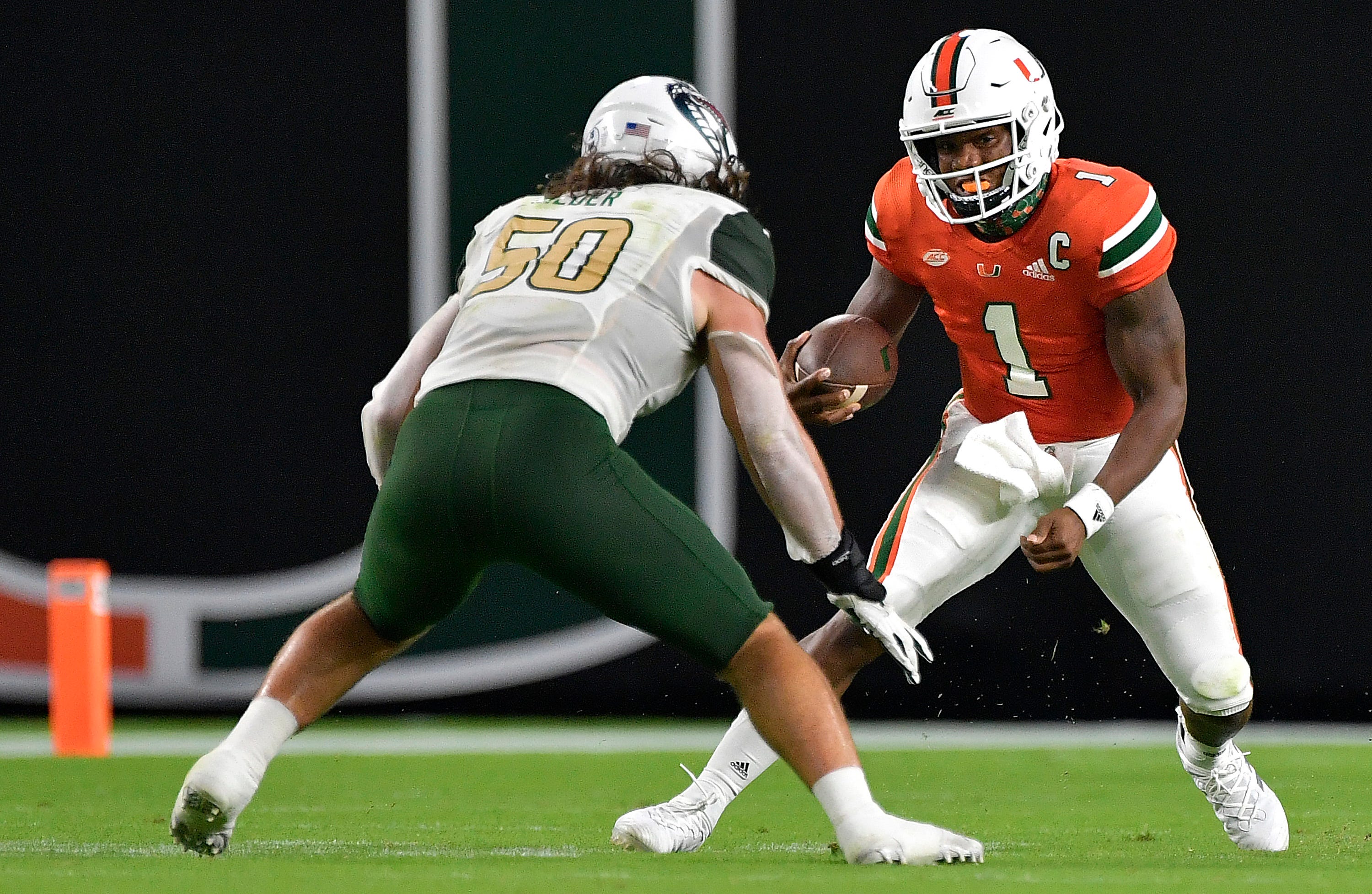
UF will counter Ole Miss's powder helmet and jersey with orange/white/orange. Should be a sharp looking game.
-
7
-
-
7 hours ago, Red Wolf said:
Texas State especially looked fantastic. The all-maroon look they used against SMU showed promise and that promise was fulfilled this weekend. Too bad they lost after tying the game with an amazing punt return only to miss the PAT and lose in OT. They were at least the better looking team, and that's what really matters on this part of the internet.

Their all maroon had promise but was ruined by the helmet.
That much white looked awful with a jersey that's only maroon and gold. The gold helmet not only matches far better, but also just looks better in general IMO. They've got a solid look, just need to pick the right combos.
-
2
-
-
37 minutes ago, guest23 said:
I know that they are throwbacks but miami really needs to settle on either the white pants stripe or the helmet stripe. I say put the pants stripe on the helmet.
I'd argue the other way. Miami is an orange team first and foremost, so orange should be the dominant color in the stripe. Also, generally dark-light-dark looks better than light-dark-light when on a white background (although there are certainly exceptions to that - see the Browns).
The mismatching stripes don't look too awful on the home, but the away - with the pant stripes on the sleeves - looks quite bad. Those would also benefit from the swapping the stripes to be green-orange-green.
-
3
-
-
Magic throwbacks:
As well as the white jersey, which as far as I know hasn't been worn as a throwback yet (but should):
-
12
-
-
7 hours ago, Maroon said:
City was among the most popular of the approximately 6,000 submissions and suggestions the club received, and in the end it beat out United, Gateway and Stars among “the four names that kind of kept coming back up,” she said.
I guess at least we didn't get yet another United? Although that wouldn't have had the whole City vs County thing (which I didn't know existed until people here started talking about it) so maybe it would've been the better choice.
-
1
-
-
9 hours ago, Gothamite said:
Updated.
Just guessing on the Charlotte and St Louis shirt colors, and I'm not willing to guess on the STL MLS badge colors, so that one stays gray for now.
[snip]
I'm almost certain their MLS badge colors will be red/pink/whatever on the top, blue on the bottom, with yellow in between. Basically the reverse of RSL's.
-
Their emphasis of City (St. Louis CITY SC) is strange. Reminds me of how the Heat tried to be the "Miami HEAT" for a few years.
-
The name isn't great, but at least it isn't yet another [City] FC. The red looks strangely pink, although that might just be my monitor. Their crest makes me think the jersey is either half-and-half or stripes, both of which I'd be okay with. They'll need to make themselves stand out, especially in a league that already has two teams that are red with navy accents.
-
1
-
-
I'm sad that they've gone away from the shoulder stripes, that was a unique and iconic look that they owned. The new uniforms aren't bad, and I understand that they have history behind them, but there was no reason to ditch the old set.
-
10
-
-
Nobody talked about them because of how awful the team is, but Rutgers had one of the best looks in the Big Ten over the last few years. The new (old?) uniforms are fine, but not nearly as good as the set they're leaving behind.
-
2
-
-
Painfully generic. Take off the name on the front and that could be any red/white/blue team in college football.
-
1
-
-
On 7/29/2020 at 12:47 PM, aawagner011 said:
A few more looks at the white numbers for FSU. An improvement for sure, but wish they switched to the cleaner Vapor Untouchable template. Would have also liked a slightly more subtle look to the pattern.
It’s incredible how much better they look now.
-
1
-
-
The current Coyotes logos and uniforms are far, far better than the Kachina look.
-
6
-
-
-
48 minutes ago, cajunaggie08 said:
Cheez-It moved their sponsorship from the game in Phoenix (which is now called the Cactus Bowl again) and moved it to the game in Orlando that used to be called the Camping World Bowl (previously the Tangerine/Champs Sports/Russell Athletic Bowl).
Is that the official logo? I'm still getting heavy Arizona vibes from that.
-
2
-
-
The Maryland flag is one of the worst in the country so it isn't too surprising that the uniforms based off of them aren't great either. I like the colors though, they work well with a lot of things when red is the dominant color and yellow-black is simply an accent (see the pre-Edge Flames white jerseys).
-
4 minutes ago, slapshot said:
I think that's the academic/administrative logo for VT though, not the athletic logo.
He was pointing out the similarities in the “Virginia” fonts between the two.
-
3
-
-
19 hours ago, cajunaggie08 said:
New logos and wordmarks for Sam Houston State. They officially designated black as an accent mark rather than blue
https://gobearkats.com/news/2020/4/16/a-new-era-of-bearkat-athletics.aspx
Great update but the paw by itself is wayyyy too Clemson.
-
4
-
-
7 hours ago, Dolphins Dynasty said:
I'm not sure why I originally came up with Dolphins Dynasty. I've never considered their back-to-back titles in the 70's as a dynasty. Maybe it was in hope of them winning multiple titles in the foreseeable future? Lol. Either way, I'll probably change it... when I think of something better.
Oh hey, I basically copied your username because I couldn’t think of anything better when I joined. I still can’t think of anything better ¯\_(ツ)_/¯


College Football 2020
in Sports Logo News
Posted
Beautiful helmet. Would be even better if the Pack wordmark was on both sides instead the logo being on one side, number on the other. That might be the worst trend in college football - I can't think of a time that it's looked good.