


PrimalCookie
-
Posts
2,159 -
Joined
-
Last visited
Posts posted by PrimalCookie
-
-
1 minute ago, Gothamite said:
The telling thing here is that MLB is saying baseball in Tampa Bay can't work out even with a new stadium. Yikes.
On top of that, they're also saying they don't fully believe in Montreal's ability to support a team.
They've somehow found a solution that's made both Rays fans and old/potential Expos fans angry. Now that's a yikes.
-
 3
3
-
-
This reminds me of the Jaguars proposal to half relocate to London a few years back, where they would have a "US base" in Jacksonville and play their playoff and primetime games there, and every other game in London. It was dumb then, and it's still dumb now.
-
5
-
-
Tampa wouldn’t show up (before everyone makes a funny original reply to this comment, yes, there are Rays fans in Tampa and the rest of Florida and they show up for games) for a team that “left”, and Montreal wouldn’t show up because the team isn’t “fully theirs”.
This is quite possibly the worst solution they could’ve come up with. Either stay or leave. You can’t have both.
-
6
-
-
Penny Hardaway in the 1999 Magic set, his last year with the team.

-
3
-
-
2 hours ago, KRZYBDGRZ said:
This works well though,
Nope. That kills the uniform for me. I really like the chevron design, and I think they should make it their primary design (with, you know, the TEAM AND CITY NAME AND NOT A VAGUE IDENTIFIER), but the shorts chevron is just awful. Since it would look terrible on both sides of the shorts, just remove it and have the claw logo on both sides. The chevron on the front is bold enough that you don’t need anything else.
To add to the topic, and slightly related, I hate when teams put wordmarks on the front that aren’t the city or team name. You’re not “Buzz City”, you’re the Charlotte Hornets. You’re not “North”, you’re the Toronto Raptors. Even nicknames like “Cavs” irk me, but I’ll let that slide.
-
6
-
-
29 minutes ago, MJWalker45 said:
https://www.bbc.com/sport/football/48373886
FIFA makes a somewhat sensible, but not the correct decision. They have decided not to increase the amount of teams for Qatar to 48.
* - The correct decision is to still move it from Qatar, but FIFA's married to that albatross now.
There was no way Qatar could do 48. I still say they move it (since the US is off the table, I would suggest Australia and New Zealand (together) or the UK as the most "ready on a short notice" nation that could take the World Cup), but that's incredibly unlikely.
-
1
-
-
1 hour ago, MC Buffalo said:
But how do you pronounce Center Martin "St.Louis". I'm guessing we all agree it's Looey and not Loo-is
Not a hockey fan, so I had to look him up, lol. If he pronounces his name Looey, I'll say it that way.
Generally, when I see "Louis", I always say Looey... except for the city. Not sure why, that's just how it works. Like, any of the French kings are Looey, not Loo-is.
-
What’s strange is that I pronounce Louisville as “looey-ville”, but St Louis as “saint loo-iss”.
The best part is that one of my mom’s favorite movies Meet Me in St Louis (pronounced in the film “saint looey”). I could recite the words to that movie because I’ve seen it so many times, but I still don’t call it “saint looey”.
-
2
-
-
26 minutes ago, KRZYBDGRZ said:
Where would the numbers go?
At least, on the front, they wouldn't. I don't think the design wraps around to the back, though.
Maybe numbers on the front of the shorts.
-
20 hours ago, MCM0313 said:
Heat maybe, but I don't think I've ever seen a concept on here that radically changes the Dolphins' color scheme.
Recently, I’ve seen more Dolphins concepts that change the orange to pink than I do ones that keep the orange. And use some sort of sun-inspired design on the sleeves.
-
2
-
-
5 hours ago, NicDB said:
I don't necessarily disagree, but would you care to expound?I don't like the colors together with the design - blue and yellow can look incredible, but has to be done right. In this case, it's a white uniform, blue pinstripes, blue wordmark, blue collar/belt, blue undershirt, blue stirrups, for some players blue shoes, and then yellow outlines on the numbers and the cap. I know that this is probably something wrong with me, but I hate how underused (and therefore out of place) it looks. Also, I just think pullovers are absolutely terrible and should never come back in any capacity.
-
1
-
-
-
The Magic and Rays (on Fox Sports Florida and Sun) could end up getting completely screwed by this. I shudder at the thought of both Orlando City and the Magic being covered by WDRQ TV27 (a Cox affiliate that only about half of the city gets). I don’t even know who would want the Rays deal if the MLB deal falls through.
-
The pop-up scam ads can’t even get my location right - I’ve gotten two in the last hour and they’ve said that I’m from Nevada and Pennsylvania.
BEFORE-POSTING EDIT: Just got a third one while typing this post, also saying I’m from Pennsylvania. It’s a wonder people fall for these things.
-
The Magic should do a “double retiring” or something for 1 - Penny Hardaway and Tracy McGrady. I also want 14 (Jameer Nelson) to be retired when he’s finally done making money to sit on a bench until the very end of the game, although that’s a long shot.
-
14 hours ago, clonewars2008 said:
This is a damn good uniform set.

A lot of people want to get rid of the silver helmet, but I love it - especially with the white and black pants. Another thing that I shouldn’t like, but I do (especially because bottom-heaviness is a problem for me with a lot of uniforms, like the Jets wearing their green pants away)
-
1
-
-
How does it feel to be on the hot seat, Angels fans? Maybe you all won’t as quickly suggest the Rays and A’s just get up and move next time.
On the serious note, I really hope that the Angels don’t leave. I would hate to see only the Dodgers in the LA area.
-
For one day, I didn’t get any border ads. Now, the only ad I’m getting period is the Honda one (Hybrids are so meh, finally, one that isn’t). I always just have to wait for it to load, run its course, and hope I close it in time before it starts up again (it loops if you don’t immediately close it). I’ve tried clearing my cookies and using different browsers (I’m on a iPhone 6S, tried accessing with Safari and Chrome), but nothing works.
-
For some reason, the Magic don’t even hang their division champs banners at all - they’re in the practice facility. The only ones up are the two conference champions banners. (This seems like a theme - there’s only one Solar Bears banner, for the 2000 IHL championship, and the Predators banners are just “ARENA BOWL CHAMPIONS” with all of the years on them. However, they ran out of space, so they made a second one with only one year on it, and it looks super empty)
-
So, were the popups replaces for those ads that go all around the border and make it so you can’t click anywhere on the page until it goes away (since the whole page is now a hitbox for the ad)? Those are so much more infuriating. I’m considering just giving up on trying to use this site on mobile.
-
1
-
-
-
They have the exact same interface but different links, for some reason.
-
Just got a popup that claimed to be Youtube and Amazon at the same time, lol. Link: https://app.co-c65.bid/claim/yt/index-2o-en-azwal-c3.html?region=Florida&td=allglassmobile.com&brand=Apple&model=iPhone&cep=eWI0N_2_GKAMAfqQCqWPeh8gpBOjxNtLjOskqGFLAGRwoeTcumRFe820bsSG0I_L66YWORNpHuHrzqejQIO5jnU2Jrrz7TZtYpitBB7Dz4R7ArWXr5H6dhU3ZbENfK08t36xIvpOGWu06_ZXf7dLgBC4M7cLHm2e9QosEAyhRNZbrwxyOe4rMg_DIbcedzDL0Wc-R95CcVWnQfeZ3_dTioFaf9gVtR43CO_OzA6oW5Q2cIp2Au4OXC7bs15c6HiyoMD0IJmLftyES8g52xeRPY4TVXf79CB5ln73sn3A8w-kL8rPMtDBk8Cso3OD7ZWXgjFZD06bFujlSv3GF2Fj3yN2GpZBi73MLMN3IBMVIGAgSAO5isxnqM81yvSGLym8AdhIztlNLz4dPLasGrbLfUqg5scssJjMLL0MhaoP8QGc2HyYJPXSOrto38YUwU0S7qobyNFxkDS_AcIKh17mTA#
-
1 hour ago, whitedawg22 said:
I think the Packers jerseys are much better now than in the early 90s.

Back in the early 90s, they had a more drab green and a lighter but more mustardy yellow, and it looked dingy. The current forest green and brighter yellow look much better, in my opinion.
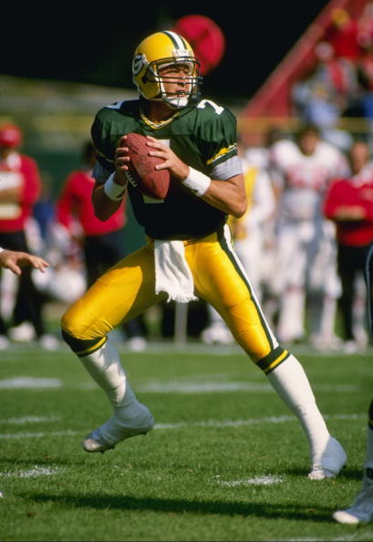
I dislike both, although I do agree that the currents are better than the other picture you posted.
-
2
-


CCSLC Board Technical Issues
in Forum Policies and Announcements
Posted
Not sure what the mods may or may not have done, but now the option to change the profile picture has been completely removed. There is usually a blue box in the corner of your picture that allows you to change it (or, the past week or so, just readjust your current picture), but now even that isn't there.