

Rj0498
-
Posts
534 -
Joined
-
Last visited
Posts posted by Rj0498
-
-
These darker revamps of familiar looks, actually are kind of cool


-
 1
1
-
-
22 minutes ago, Cujo said:
StephOn Marbury and RAY ALLEN? Wha?
And I also best remember StephOn Marbury as a T-Wolve/Wolf/Whateverthefxck.
Stupid spellcheck put it as Stephen. I see him more as a knick. That was the team he was on when his best seasons happened. And that ray allen mistake was just a brain fart
-
4
-
-
Chauncey Billups and Stephen Marbury who both end up becoming superstars outside of Minnesota


-
2
-
-
I actually like these variants of the lions uniforms. Was the addition of black unnecessary? Yes. But did it ruin the uniform? No. It was a solid look during a period where the lions were at their worst (believe it or not)

-
1
-
-
While I prefer them as the mighty ducks, I actually don't mind these


-
3
-
-
12 hours ago, Cujo said:

Speaking of overpaid qbs.... Here is someone who is no doubt beloved in new york

-
2
-
-
Continuing the wizards theme. Here is college legend christian laettner
-
2 minutes ago, ImmortalChef said:
I like the Knicks and Celtics gold ones but I hate the rest of 'em
I actually think the bulls one looks the coolest
-
1
-
-
In honor of being march i will say this, I think the st pats day unis are good.


-
While Philly fans hated him, McNabb was one of my favorite players growing up so, it was nice to have him in minny even if he was mcmuffin by then. And yes even when I was a kid I knew games could end in a tie.


-
Rodman's teammate. I remember a cousin who wore this jersey

-
2
-
-
I kind of wish the angels would add more blue to their uniforms. I also think their red alts are ugly
-
8
-
-
3 hours ago, kroywen said:
If Shaq in Orlando is wrong, then I don't want to be right.
(I admittedly have watched very, very little of the NBA in the past ~15 years, but I still think of Shaq and Penny Hardaway when I hear of the Magic. It's a shame that they ran into literally the greatest team of all time in 1996, because that team was incredibly stacked and really fun to watch.)
Agreed. I see A lot of people wear that version of shaq's jersey specifically the blue jersey. Imo shaq's right uniform is either a magic jersey, Lakers jersey or a heat jersey
-
4
-
-
10 hours ago, DG_Now said:
Yet another early 90s sports star with a bad video game:
.png)
Ah, like ken griffey

-
Speaking of aces who got into their twilight stages.

-
One of the many failed Yankees acquisitions: Dr.K!

-
These are the magic's best unis imo

-
3
-
-
10 minutes ago, MCM0313 said:
Here's another one from yours truly: Hot pink (255-0-255 in RGB) is an awesome color. It's less girly to me than other shades of pink and more just super intense. I'd love to see it in the pros someday.
I honestly think pink is a cool color for usage in a sports team. When you put black and pink together it looks even more clean. Bret hart has proven that
-
3
-
-
6 hours ago, VikWings said:
I like the actual uniform design but I don't like the logo. It's better served as a shoulder patch. Should have just cleaned up the original logo like on the helmets (or better yet left it alone). I also hate dropping the amazing stick/palm tree logo.
It is one of those occasions where the uniform is an upgrade but, the logo is a downgrade
-
1
-
-
Only player to have his number retired by the rays and yet, this is one of his wrong uniforms

-
1
-
-
15 hours ago, San Diego said:
My favorite Kings uniforms. Disappointed the new sets don't have a Sacramento version.


Really? This is unpopular? I always thought those looked awesome and they never should have changed
-
On 2/15/2017 at 1:17 PM, JerseyJosh said:
This is def my favorite thread - mainly because I have so many unpopular opinions and I love sharing them.
Guess what -- here's another:
Brooklyn Knight was awesome

Agreed. he legit looked cool but I understand why kids were frightened by him
-
4
-
-
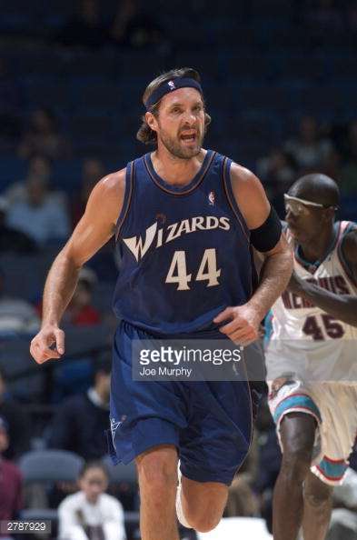
Continuing on the going to rivals train
Jared Allen

Kevin Youkilis

Darryl Strawberry
-
I am not exactly sure of how popular or unpopular this is but, I hate the Twins gold accents. I think they would look way better with powder blue instead
-
5
-


Unpopular Opinions
in Sports Logo General Discussion
Posted
I guess I am part of the very small camp of people who prefer the long "pajama" pants