


Big Yellow Flag
-
Posts
262 -
Joined
-
Last visited
Posts posted by Big Yellow Flag
-
-
16 hours ago, teeray01 said:
The Stomper logos were included in a logo package I found online years ago.
Would you be willing to send that this way?
-
Where did you find the Stomper logos for Orlando? I love them.
-
MiLB has been posting them on their Instagram as cap logos, which lowers my (already low in many cases) opinion of a lot of these.
The better move might have been to develop heroes for teams, and perhaps uniforms based on that. Slapping these comic book illustrations on the front of caps, in almost every case... I pity the embroidery machine.
-
 2
2
-
-
Manitoba image isn't working for me.
The first two are incredible, but between the two BC I also prefer turquoise on brown.
-
New kits for Beitar Jerusalem, a huge delay because they were past the deadline to get their finances settled or get bounced two leagues down but finally got sold and are staying put.
Yellow home, probably black clash and white third (that's how it usually is, but no labels). No sponsor yet because the new management hasn't signed anyone yet, but it'll probably be ugly (also, at least in Israel, you have to pay extra to get the sponsor logo on a replica, so all of mine are clean. Just here?).
-
Am I crazy, or did they finally get the Dodgers B right?
-
34 minutes ago, heavybass said:
Oh that one's easy. There are no front numbers.Right, but that's my point. Rugby doesn't wear front numbers, but American football requires them. In fact, your title says NFL uniforms specifically, so I took a minute to find this:
QuoteItem 3. Numerals. Numerals on the back and front of jerseys as specified under NFL rules for the player’s specific position. Such numerals must be a minimum of 8 inches high and 4 inches wide, and their color must be in sharp contrast with the color of the jersey.
So without front numbers, without conforming to the design restrictions of football, you aren't really making football uniforms, but rather rugby uniforms on a different template.
-
2
-
-
I think my concern is that you've essentially made very nice rugby kit concepts on the "wrong" template. Football jerseys tend to conform to certain rules of design, and I should think part of the point of a mash-up is to make the design history of one match the conventions of the other.
The thing that most glaringly jumped out to me, for instance-- where are the front numbers?
-
23 hours ago, NicDB said:
I'll be honest .. as a local, I fought "MKE" for the longest time. The traditional abbreviation for Milwaukee was MILW (watch any old Bucks game from the 1970s ABC era). MIL was closer to that and felt more intuitive to me. MKE seemed to be preferred by transplants who wanted to be cool and trendy.
But.... there's no denying that MKE has taken over as the preferred abbreviation over the past 20 years. I've also admitted that it means more to me that they were able to work the hidden 414 in. That resonates more with me as a local.... even if I live in that "other" city down the lakeshore now.
I have no issue with MKE, as I simply have no dog in the fight (though interestingly, my own local airport is TLV despite being technically located in Lod). My issue is the logo itself, which you say you like but I just can't.
-
The cap logo well and truly sucks. I can't help reading it as Mike, and also it's ugly and bad.
The rest of it is... Fine, I guess I know they say they've been working on these for two years, but I would have expected something better for that kind of time. Even the storytelling copy is lackluster, much thinner than usual, as is the tenuous Connection to the City. The People's Flag colors are also just standard Brewers colors, and is there a franchise out there whose fans don't tailgate?
I do love the grill logo, as minor league as it is. Would have made a much better hat logo than Mike.
-
Major upgrade. I dig it.
-
2
-
 2
2
-
-
https://www.montanasports.com/sports/baseball/billings-mustangs-unveil-new-logos
I don't like the 3/4 view with the rocks on the neck, but the rest are gorgeous.
-
I like this a lot more than I thought I would when I opened it, though I agree with Steamroller about the striping.
Would also consider bringing back the pinstripes, though mostly because I like them.
Good work!
-
That's incredible.
Missed opportunity to put the Michigan logo on a pinwheel cap like the mascot's, though.
-
I don't think it's an Aaron 44. There's an extra serif on the K's vertical, implying a 1, and Google tells me 414 is a Milwaukee area code.
-
1
-
-
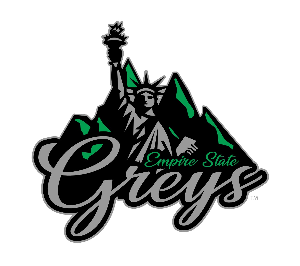
Apparently this is basically an all-star team from a different Indy league that plays in New York and New Hampshire, which makes it a bit weirder. Grays was, as I recall, the name used by the Frontier League's last travelling team (a common strategy used when a team unexpectedly folds, to keep things even).
The logos are nice, though. Maybe a bit dark.

-
1
-
-
I understand, appreciate, and even like the level of thought and creativity that went into this, but the whole look is a bit too... Cartoony? Kiddish? Fun? for me to get behind it.
Now, if they put that criminally underused penny logo on a white front panel cap, I'd be ordering right now.
-
Interesting that the Mariners version has a more colorful logo, and looks much better than the Nats and Cubs hats posted upthread as a result.
Here's hoping Washington and Chicago are the outliers, and not Seattle.
-
The brand is strange and I don't love corporate sponsored team names coming to baseball (though rumor has it it's only for a season, for some reason?), but their Twitter game is strong.
-
 1
1
-
-
Has anybody compiled all these new temporary baseball names and/or identities? Seems like some of them could make for a good inspiration folder (and a very valid new section under baseball on the mothership?).
-
I was only wondering what was taking so long with this one. The Osprey had a classic 90s MiLB logo, which also meant there wasn't a lot of room for fun things and promotions. They were a prime target for Brandiose.
This could be a lot worse, though, when it gets down to it. I kinda like it, for a Brandiose identity (in other words, thick lines and grimacing animals notwithstanding).
-
My first reaction, based purely on the name and logo sheet, was that this was the cleanest, simplest, and most cohesive look I'd seen from Brandiose.
Knowing it's Studio Simon makes a lot more sense. They look amazing, I already want a hat. The name is definitely a bit silly, but Simon had to balance the community's "Cannons" suggestion and the owners' desire to be more whimsical and family friendly than Intimidators.
Overall, I think this is a testament to working with the community and keeping designing centered on the team and not what the design firm thinks will be fun.
Hi, Brandiose.
-
4
-
-
4 hours ago, Rebuy said:
I guess I'm one of the few who find the Rocket City Trash Pandas to actually be really good as it ties in the NASA angle with an animal that is extremely common to the area. I typically don't like the over the top Brandiose stuff, but the Trash Pandas is actually very well done. The logos and identity are fantastic. I'll buy three caps and a shirt. I think it's an iconic name/identity and it will not only last but flourish.
My issue is just that the name is a meme, and memes don't tend to last. They could have been the Rocket City Raccoons, though Marvel might have needed a bit of cajoling, or perhaps the Madison Raccoons if it didn't work with the comic books folk, and used all the same logos (probably swapping the garbage can for a rocket, but other than that). Trash Pandas seems like a Brandiose, "Hey, we think this would be kind of funny and we can make a kind of clever logo for it," sort of deal, and within a decade or so it'll go the way of Baby Cakes. They'll sell hats across the country, just like all the fun names (53% of RubberDucks gear goes out-of-state), but how well will they connect to the people in town and in-state?
4 hours ago, Rebuy said:For Wichita. I like the Lineman reference, but it seems odd for baseball. One creative idea I kinda liked was the 'Twisters' thus setting up a natural rivalry with the 'Storm Chasers'. Since it's the Marlins affiliate and Wichita is apparently a big aviation place, the 'Flying Fish' was another suggestion I saw. I think that's pretty good as I like when minor league teams make a subtle connection to the parent squad while creating their own identity. The only issue with that identity is are the Marlins and Wichita going to be together in a decade? The geography doesn't lead one to think it's likely to be a long term partnership and I've got to think Miami would eventually want something in the east and one would think there are other teams that fit Wichita better.
Linemen could work with baseball. Foul line, line drive, there are connections to be made, and it's a good name in general (if a bit old-fashioned for the sad state of modern minor league baseball). I like Flying Fish, as something with a connection to the parent team that could be kept even if the affiliation changed. See the Indianapolis Indians, founded as a Braves affiliate many, many years ago (they were still in Boston) but keeping the name through plenty of reaffiliations.
-
I am genuinely curious what they're going to do with the Miners and the Miners. They're in different divisions, as per that post, but I can't imagine they'd bring in the CAL teams and then essentially shunt them off into their own subleague with no overlap. I have to think we'll see a rebrand or three in the next few months.


Teva Football League | כדורגל Teva ליגת
in Concepts
Posted
As a Beitar fan...
Much nicer than our current kits, but with the same sponsor problem. I would put the Mobileye logo directly on, without the box. Maybe making it higher, so it's not on the stripes.
Will also echo what VampyrRabbit said, but exciting to see some Israeli concepts here!