


Big Yellow Flag
-
Posts
262 -
Joined
-
Last visited
Posts posted by Big Yellow Flag
-
-
So Brandon, Manitoba, the shipping would definitely be prohibitively expensive. Alas.
If nothing else, the new Whiskey Jacks logo is better than the old Whiskey Jacks logo (above), which looks almost like a grayscale Baltimore Orioles logo. Also, I love the name Whiskey Jacks. So delicious and fun to say.
-
25 minutes ago, panthers_2012 said:
The way the bird is standing just looks weird...
The bird thinks the way you're standing just looks weird.
There's definitely something off about the stance and the eyes, and the motion lines are kind of weird. That being said, it's kind of adorable, and I'd get a hat if shipping from Wheat City wasn't almost definitely prohibitively expensive (also if I knew where Wheat City is).
-
I really liked the old now-old Nashville look, although I think it took a big hit when they changed away from the orange. Nevertheless, it was definitely one of my go-to hats (green and yellow stick out more). The new look is also great, obviously going for a different character.
Is it weird that we've heard nothing from Las Vegas so far?
-
 1
1
-
-
Minor league teams should always be different when possible.
Reason 1. In twenty years, a team can have four or five different affiliates. Fans aren't going to buy a new jersey and a cap every single time, especially when those jerseys and caps are just carbon copies of the big league clubs, maybe with some letter changes.
Reason 2. If, say, a Giants fan has to move to Nashville for work. Will he stop being a Giants fan? Not in today's world of MLB.tv. Will he become a "Nashville A's" fan on top of that? Not any more than I'd root for the "Sacramento Giants." But he can go to Sounds games just like A's fans can still scoot over to Sacramento and watch the River Cats.
Reason 3. Minor league teams, especially but not exclusively those that are locally/privately owned, rely on public engagement on the local level and on merchandise sales cross-country. For the first, you "need" a brand that connects with the locals over a brand that changes regularly based on which big club you're affiliated with. For the second, well, of the top twenty five teams in terms of licensed sales, only three shared the name (OKC, Iowa, and South Bend). The money's just not there if you're not unique.
EDIT to add more evidence, courtesy of Forbes. Of the thirty most valuable teams in 2016, which includes ticket sales, merchandise, et al, it's once again only three teams that share the name making the list. Oklahoma City, Iowa, and Pawtucket (plus the Reading Fightin' Phils, but they're only sort of sharing). It doesn't make sense to share, financially.
-
2
-
-
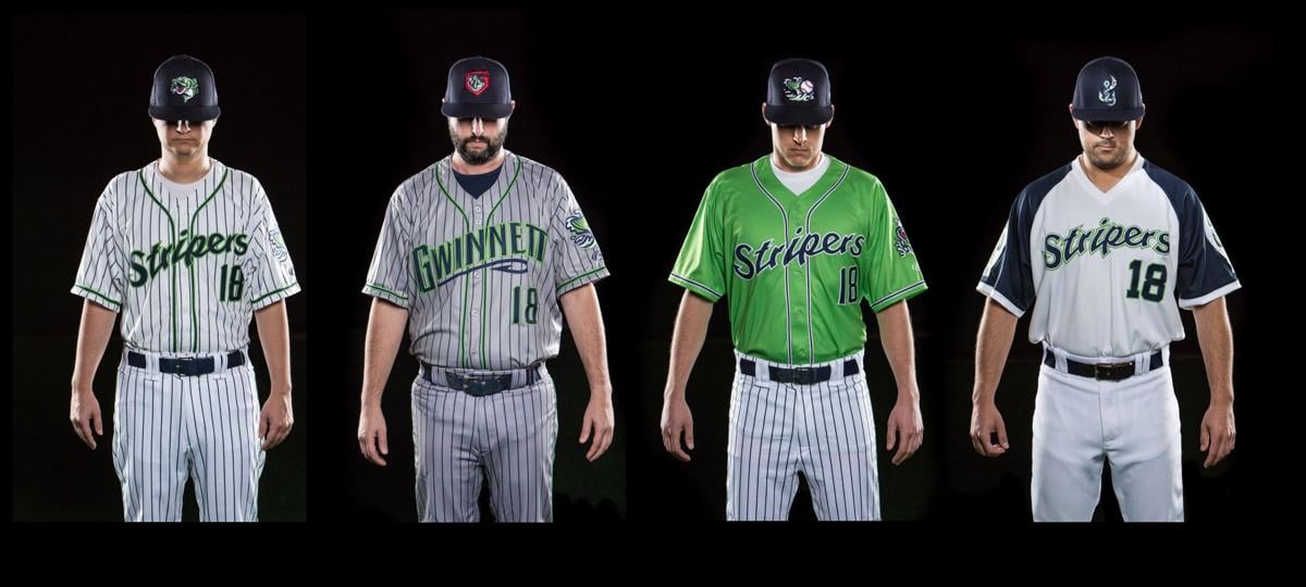
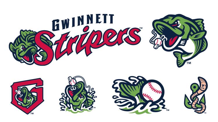
Gwinnett Stripers. Named after the striped bass. Not a fan of the name, but the logos and (most of the) uniforms are decent. Red, light green, blue.
Home white, road gray. Alt in bright green and what appear to be striped pants?. Nice fauxback with the old Braves feather sleeves (And they had Phil Niekro model it, pretty cool).
Not the best ever, but not bad (in my opinion).
EDIT: Grabbing pictures from a newspaper. Apparently everything's pinstriped, including the roads.
-
Gwinnett [Redacted]s going live momentarily. It's going to be a mess. Looking forward.
I'm totally buying a hat if it's the Buttons.
-
"Gwinnett Baseball" identity and uniforms will be released next Friday (12/8) at 11am Eastern. The temp logo they're using on Twitter is... bad.
-
Huckle-Bears is good. Hoots is kind of boring.
-
They should've moved to Newark, it's just been made 100% official that Bears & Eagles Riverfront Stadium is going to be demolished for condos.
Damn, I miss those Bears.
-
1
-
-
According to Twitter, the G-Braves have been [accidentally?] confirmed as becoming the Buttons.
I made Brandiose (because it's going to be Brandiose) a vision board for the new look.

-
3
-
-
"Buttons was the name all our fans want, but we don't have any ideas for what could be swinging in the logo, so we're going another awful direction."
It's going to be the Sweet Teas. I'm probably going to end up in a cap, but they should really just take my logo idea and run with it (it even works for Brandiose). Buttons has local connection and just enough minor league flair, but the quote from the GM seems to indicate that they saw how popular it was and threw it in the vote so the fans wouldn't riot. We know they don't care about the voting results.
AAA All Star Game looked good. Without the longstanding tradition we have (had?) at the MLB level, it was a good balance between league and team and the jerseys weren't too garish. My cousin looked good on the hill.
-
1
-
-
I'm personally partial to California City.
-
Those are... Not great. What's really throwing me off is the disparity between the different logos. The Cowboys' brand (punny) is simple, but it's clean and unoffensive. And then you go down to Santa Fe, and... That's a hot mess, there's a team wearing a clip art star, and Topeka is scary.
Also, Las Vegas, New Mexico?
-
1
-
-
2 minutes ago, Dolphins Dynasty said:
Well, that came out of left field...
Home plate, actually. I was seven, a broken bat almost took my head off (and then some jerk kid stamped on my hand and took the bat).
I only remember so well because it was the night of either the home run derby or the All Star Game. Fun time, but an ugly game (I think they were playing the Rockland Boulders) and seven year old BYF was very angry about missing All Star festivities.
-
I almost got killed at a Jackals game back in 2004. Love the new package, a serious upgrade.
I am somewhat concerned that the text they're showing on the banner as an apparent default is Jackals.com, I'm not a fan of the increased presence of social media in sports. Teams wearing Twitter handles as NOBs, etc.
-
2 hours ago, MBurmy said:
Gwinnett Braves to change name for 2018, plan name-the-team contest.
Gwinnett Buttons. 'Nuff said.I immediately imagined a Brandiose-style (they are involved) logo featuring Corduroy the bear wearing his overalls and a Revolutionary tri-corner, swinging for the fences.
Is that a bad thing?
-
3
-
-
2 hours ago, webdav said:
This all makes me so sad about how bad both my city and state flags are terrible. (Billings, Montana.)
Interesting thing - there is no official color of blue for Montana's seal on a bed sheet flag. Yet the word MONTANA is specified to be in Helvetica Bold by law.
My dad didn't understand my distaste for the MT flag. I drove him down the street in Red Lodge (they display flags from all over up and down their main drag) and asked him to tell me which was the Montana flag. It was then he realized there are at least four or five others that are identical unless the flag is totally unfurled. Then he mentioned he was in the Legislature when they made the flag stand out more by requiring MONTANA be on it in all-caps Helvetica Bold in gold (yellow.)
I asked him what ANATNOM was. He understood what I meant when he saw the flag from the back.
That's fascinating, that the blue can be any blue (technically) but MONTANA needs to be Helvetica?
Mostly unrelated, but your father was a state legislator? I'm a big fan of more local politics.
-
1
-
-
Norfolk looks good. El Paso looks good. Lake Erie looks... bad. Looks like a logo for a children's computer program where you learn math from baseball-playing fruit.
-
4
-
-
3 hours ago, panthers_2012 said:
It does work both ways, but they really want to connect it to the vineyards in the area. Our mascot is a bear named Stomper because he stomps the grapes.
You mean they couldn't come up with something more related?

(Courtesy of Google)
I'd see the grape thing a lot more if the logo wasn't a baseball player mid-swing. Probably a good thing they're changing it.
-
36 minutes ago, panthers_2012 said:
Yes, that's what that post is about. When they started in 2009, the previous owner explained the name "Crushers". Northeast Ohio is known for its wineries and thus the Crushers name was born. It never was told after the press conference announcing the team and the current identity doesn't reflect anything in about being connected to the wines. Our current owner kept the logo set this year (since it was his first year with the team) and he has invested into a new logo to reflect the connection with the vineyards. IMO, I liked the logo when it came out, but it's dated. I'm looking forward to the rebrand of the team. What are you doing with the league and if you want to DM me that's fine.
I always assumed it was about big hitters (I mean, looking at the logo, can you blame me?). Cool piece of trivia. Thanks!
-
1
-
-
I had never heard that about the Reds, but it's fascinating, especially when you consider that in recent years the Reds have been one of the most colorful farm systems in the league, with the old Bats, the Wahoos, the Tortugas, and the Dragons.


(Images pulled from mothership). I don't think any of these looks would be improved or even left undamaged by the addition of red.
-
6 hours ago, hettinger_rl said:
Maybe it has to do with being on the"left coast."
Could be. Playing in the West Coast League, you'd think that much would be obvious, though.
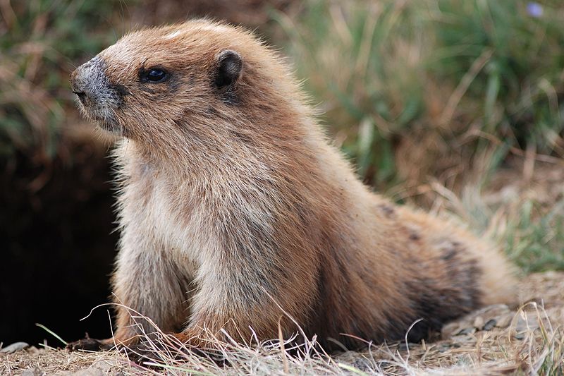
So many options for better names, too, even if you're aiming for marmots. Call them the Groundhogs or something (or Chucklings, which are baby groundhogs).
-
I haven't found an actual reason for the Lefties nickname, but the mascot is the Olympic marmot. The team name was going to be the Marmots, but the outdoor gear company wanted too much for licensing, and they ended up with... Lefties.
-
I quite like the primary logo. I think it's the kind of thing that you use primarily off-field, marketing and merchandise and what have you, and on the field you wear the Spinners S or the Canaligator L (which is, coincidentally, exactly what they're doing). Kind of like the Yankees with the top hat logo, you know?

Minor/Independent/Collegiate League Baseball Logo/Uniform Changes
in Sports Logo News
Posted
For those unfamiliar.