


jn8
-
Posts
707 -
Joined
-
Last visited
-
Days Won
5
Posts posted by jn8
-
-
Purdue in beige ain’t doin it for me
-
40 minutes ago, Mingjai said:
I’ve been saying the same thing about UCLA—they should just go back to the lighter powder blue and bring back navy as an accent color.
I always thought it was odd that UCLA had navy on the roads with virtually no powder blue, but as much as I love their current look, I miss the navy more than I thought I would. Honestly? They might be able to pull off a second white jersey in their rotation.
-
2 hours ago, Discrim said:
I'd said it when I merely made a concept centered around it, but I didn't want a white Bengals helmet to exist...and this is in spite of the fact that it remains one of my favorite concepts. Is it weird that I like this helmet but also think it doesn't need to exist?
I fully agree on this. Like, I enjoy Cardinals concepts that incorporate the flag design heavily. They’re fun, as simple as that. But I’d never want to actually see it done in real life; it would be way too tacky.
-
1 hour ago, aawagner011 said:
My counter to all of this SEC mascot discussion would be that I view the teams mostly by the university name. Unlike professional sports where the match up is the Falcons vs the Saints, for college football, it’s mostly viewed as Georgia vs Auburn. Sure, it’s also the Bulldogs vs the Tigers, but it doesn’t seem too dissimilar to the way it’s handled in European soccer. Arsenal may be the Gunners and Manchester United may be the Red Devils, but those nicknames aren’t used as the primary identifier for the teams. Same with college football.
Thank you for saying this. My body is physically pained whenever I have to hear someone at work talking about the “Hawkeye” game. I know it’s the same thing, but it just feels wrong. They’re Iowa. That’s how my brain sees it as correct. I have no valid reason for saying so, but it’s reassuring to see that someone else’s opinion can validate my own.
-
 3
3
-
-
4 hours ago, Red Wolf said:
Don't worry, there's a worse conference matchup for Arkansas in the near future.
They should both schedule Indiana as a non-conference game
-
4
-
 2
2
-
-
1 hour ago, Carolingian Steamroller said:
I think the white jersey/pants combo is fine for the Panthers... with blue socks. If anything, that's been their signature look since the founding of the franchise.
You’re right about this being a good look, I’m more frustrated about the use of white socks. I don’t mind a lot of modern trends like a number of others do, but the plain white socks trend is just stupid. Just based on things I grew up with, it looked more “professional” to see colored socks with white bottoms, as opposed to the variety of looks you’d see in college and high school. Granted, I don’t always mind it, Philadelphia looked amazing pairing them with green pants, but it just doesn’t feel right and throws off previously fine uniforms, like the Panthers’ white over white. Would the uniform still be devoid of silver below the helmet? Yeah. But the blue socks don’t make it as big of an issue as the white socks do.
-
3
-
-
I know others have floated this idea for a while, but just watching some highlights from yesterday really got me thinking that Carolina needs silver in their all white look.
It makes the helmet look out of place. Personally, I’m of the belief that the silver helmet is their best look (fine with the black as an alternate tho) and don’t like the idea of a white helmet, so I’d say while pants can be eliminated.-
2
-
-
10 hours ago, Bathysphere said:
One is a classic, while the other is “inconsistent.”
The Houston Oilers have done immeasurable damage to how we assess striping schemes.
Hot take: Da Bears should match the pants to the sleeve
-
1
-
-
Good day, gentlemen
I dislike the playoff format.
That is all
-
3
-
-
14 hours ago, O.C.D said:
I'd love to see
black helmet
red jersey's
black pants
red socks
Quick edit to see what it would look like, sorry for the sock color screwup /s
-
8
-
11
-
-
4 hours ago, TrueYankee26 said:
I know these will get some (rightful) hate for being an unnecessary blackout set, but for what it is, I love it.
-
39 minutes ago, Echo said:
Don't forget the simplified version used for tattoos:
It’s a shame this version never got more prominent usage

-
6
-
-
On 1/29/2022 at 5:01 PM, jn8 said:
Trackhouse teasing something for Chastain’s Clash scheme. Speculation is a USC sponsorship to tie in with the Colosseum:
Shockingly, baseless fan speculation was wrong:
-
Trackhouse teasing something for Chastain’s Clash scheme. Speculation is a USC sponsorship to tie in with the Colosseum:
-
1
-
-
18 minutes ago, EddieJ1984 said:
You guys got it wrong. They gotta embrace the seafoam all the way, and match the blue.
Ya know.... I don’t hate it. I’ve always been team “end the green-silver” but this has me reconsidering
-
4
-
-
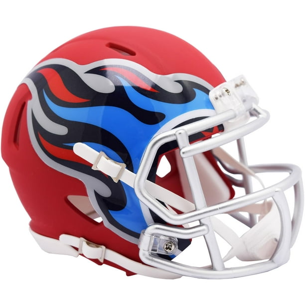
1 hour ago, WSU151 said:
Riddell did this a couple years ago but it in some ways it looks better than the navy helmet. The navy's just so bland/ho-hum compared to all the other colors they have.
1 hour ago, BBTV said:It's just a little too comical for my tastes. If they could somehow make it a little more... "mature" (for lack of a better word) I could dig it.
I don't know how to do that - maybe make it a navy base and ge rid of the silver part? Or would that lose the flame effect? Or maybe make it a silver helmet and keep that decal as is?
I tried this a couple years ago. Not sure I’m a fan of the overall design anymore, but I had the silver-based flame helmet
-
10
-
-
1 hour ago, NicDB said:
It reminds me of those ridiculous thin blue line shirts worn by the type of people who think Larry The Cable Guy is cultural entertainment.
Ah yes, the “I disagree with this viewpoint so it must mean those people are evil and beat their wives” defense. I love modern society.
-
14
-
-
19 hours ago, WSU151 said:
A 3 flipped upside down and added to a regular 3 is abnormal font design.
The style of the regular 3 looks very different than the style of the 9.
Just because you saw it on the internet doesn't make it true.
Using a mirrored version of the closed side of the 3 seems like a pretty common way to make an 8 to me. Obviously not in the case of a font like Denver’s, but I’d say 9/10 times it’s a safe bet.
-
1 hour ago, oldschoolvikings said:
Never tell her she just needs to calm down.
Idk, when I tried it she said “Fine” then walked away. She hasn’t talked to me since then, which can only mean she’s taking this valuable time to calm down and compose herself
-
8
-
-
10 hours ago, stumpygremlin said:
Damn now I can't unsee that. But weird-looking numbers are nothing new for Stewart-Haas. Look at what Chase Briscoe ran when he was in the 98 car in Xfinity. The two digits look like they're from different fonts.
I always had a weird liking of this font lol, I was a little disappointed they made the 8 look more like the 9 last year. Plus, it technically was the same font, even if it looked a little.... odd.
Oh, and the 10 should change to the 44 to better match the SHR numbering pattern

-
Hot take: keep Washington Football Team. It’s unique and quirky and kinda fits a team that’s been around forever, giving like a 1930s type of feel.
-
8
-
 1
1
-
-
2 hours ago, oldschoolvikings said:
And Alabama has had a white helmet in their past
Just because it’s happened doesn’t take away from the fact that their identity is known with a crimson helmet and I don’t want to see them break out white helmets either. And Florida is an orange helmeted team historically, with white being a strong secondary helmet. Blue helmets were just a blip on the radar. As a one off, like earlier in the year? Cool. Becoming a regular part of the rotation? Not a chance. One season over 50 years ago doesn’t justify it.
-
2
-
-
Just looking at the helmet from a design standpoint, I love it. But it’s just not Florida. I’m sure the uniforms as a whole will look good, but just because they look good, doesn’t mean it’s right. It’s the same reason teams like Nebraska, Stanford, Alabama, Texas, etc. don’t need an inverted version of their respective helmets. Just because it might look good, doesn’t mean it needs to be done. There isn’t anything wrong with the design, but the real issue is the history involved with it
-
5
-
-
14 hours ago, upperV03 said:
I would choose the nightmare green over black any day of the week, and I think most other Ducks fans would likely agree. They certainly don’t need both, which it seems like they might this year if they really do have a new black alternate in the works. Going forward they should definitely choose one and stick with it, but my vote would be for the nightmare green. I’d be fine with black, though, again just as long as they pick one. The apple green is and should continue to be the primary shade of green, and should be worn more frequently than it has been the last couple seasons.
I think the issue that I (and several others) have with the Nightmare Green is that it doesn’t always look, well, green. Don’t get me wrong, in the proper lighting it’s a good look, but more often than not it appears more of a brown color than green. I think they should take it about a shade or two more to the green side of the spectrum, while still keeping it dark enough to call back to the Joey Harrington era
-
2
-


/cdn.vox-cdn.com/uploads/chorus_asset/file/10090489/usa_today_10538729.jpg)


 I tried this a couple years ago. Not sure I’m a fan of the overall design anymore, but I had the silver-based flame helmet


Minnesota Twins New Identity
in Sports Logo News
Posted
i just woke up and have read nothing, just seen the pics.
I want to like it. But no matter how much I try to not see it, the way the w runs into the i makes it look like a cursive r. I can’t help but to read it as Turns.