-
Posts
707 -
Joined
-
Last visited
-
Days Won
5
Posts posted by jn8
-
-
3 hours ago, VancouverFan69 said:
Would Houston fans object to the Texans rebranding themselves as the Oilers 2.0? I wouldn't object. The original Oilers are the Titans after all.
I can never get over the beauty of sky blue, white and red.
Not from Houston and not a fan of either the Texans or the Titans, so take my opinion for what you will, but I'd be against this type of a move.
For starters, I think the Texans have a solid identity the way they are, the only real changes I'd make would be to make the red jerseys the primary homes and to wear red socks when they wear the blue pants. The Texans have established themselves for closing in on 20 years, there's no need to mess with them now. If the team had a bad logo and had several different jersey redesigns throughout their history, then it could be a different discussion. As is, they've had the same (good) uniform set since day one, errr whenever they decided to ditch the white helmet.
Secondly, we don't need to make things any more confusing, historically speaking. I don't want another Browns/Ravens or Hornets/Bobcats/Pelicans situation where for some reason Deshaun Watson is being credited with passing Warren Moon on the franchise's all time passing yards list or something even though the franchise Moon played for is in Tennessee and Watson's team was founded in 2002. They're different teams. The Oilers are in Tennessee and are called the Titans now. They're gone and never coming back.
Of course, all of this is meaningless because the Oilers nickname is still owned by the Adams family and the NFL has decided that the name is retired, preventing any team from using it again, including both the Titans and Texans.
-
 6
6
-
-
Not sure if this has been done before, it might’ve been but I don’t recall seeing it ever, but it’s something I feel could have an interesting discussion. Pretty self-explanatory, what uniforms do you think are the most overrated? By that I don’t mean just post any uniform you don’t like, but more along the lines of a uniform people around here (or anywhere, I guess) seem to regard as a top uniform of all time that you feel is no more than average, or something along those lines.
For me, one I’d call overrated is the classic Patriots.


For starters, that logo is God-awful. Way too much going on in the middle there that just starts to look like a mess at any distance, and on the helmet it’s way too tall to look good. IMO, helmet logos should be wider rather than taller. As for the rest of the uniform, it’s nothing special. Just some basic striping. The biggest issue? It’s primarily red. Anyone see an issue with the Patriots, a team name referencing the Revolutionary War, a team based in America, wearing red? I’ll give you a hint: Paul Revere wasn’t shouting “the blue coats are coming.” IDK, what else to say. I mean, I just don’t get what some people see in them.
So, anyone else have a uniform set thy feel is overrated?
-
 9
9
-
-
West Virginia football currently looks the best they ever have, specifically in these combinations:


Getting rid of the under arm pit stains was a huge improvement and i honestly don’t mind the black and the number font is actually pretty cool IMO.
-
 4
4
-
-
On 8/1/2018 at 10:32 AM, sc49erfan15 said:
Every time I see an 18-wheeler with this logo, I think about how it could really work as a sports logo:
I know i’m way late on this, but my old high school actually started using a modified version of this my sophomore year
-
 2
2
-
-
I hate to say it, but...

This is the only time I’ve had anything pop up with this new ad system
-
2 hours ago, Sec19Row53 said:
Is there a change in ad policy? I'm getting a constant bottom of screen ad whether in phone or PC?
I'm also seeing an ad within the posts, always following the first post of a page.been getting this too, also having a hell of a time with pop up ads and ads redirecting me to a different page. i typically only use my phone
-
1 hour ago, QueenCitySwarm said:
The Saints look terrible in all black. I think they should make the black with gold pants their full-time home uniform.
I’m sorry, but I think you’re mistaken. This is a popular opinion, the Saints are 100x better with gold pants
-
 7
7
-
-
-
5 hours ago, SilverBullet1929 said:
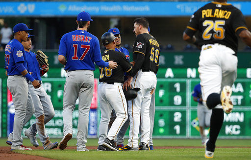
Potentially not unpopular but I prefer baseball fights/benches clearing to be done exclusively wearing alternate uniforms. The clear color definition of "red team vs blue team" or "blue vs black" "red vs navy" etc etc just looks visually appealing to me when there's 50 guys out there on the field lol.
I gotta agree here. This picture doesn’t have the same beauty if it’s white vs grey:

-
 6
6
-
-
17 minutes ago, kroywen said:
Actually, if I’m not mistaken, that appears to be a 2016 image. The 2017 Jets updated to the new vapor untouchable template:

The updated template greatly improved the color, in my opinion at least
-
 3
3
-
-
2 hours ago, MCM0313 said:
Jets, Patriots, Dolphins, Cowboys, Colts, Cardinals, Packers, Lions?
I should’ve worded my post better. I don’t like it when all three parts of the uniform (helmet, jersey, pants) are different colors and the helmet is the lightest. As far as I know, none of the teams you listed have done this, unless Miami mixed their old orange alts with aqua pants. Hopefully i worded this better than last time
-
 1
1
-
-
32 minutes ago, MCM0313 said:
How are these upside-down or unbalanced, exactly?
Also: touchdown, Wyoming Redskins!
Because the helmet is lighter than everything else. I personally feel it just looks off when the lightest element is the helmet and the jersey isn’t also the same color. Don’t like it on Wyoming, don’t like it on San Diego, didn’t like it when the Titans used to do it.
-
 1
1
-
-
I've probably got quite a few, but I'll limit it to just this one for now

This:


Is a great football uniform. All the stripes are consistent and the colors work well together and are balanced throughout the whole uniform. Don't get me wrong, I think the recent update was great and looks better, but there was nothing wrong with this that absolutely needed fixed. Being completely honest, what was wrong other than "TOO MUCH NAVY!!!1!1!!"? If Miami hadn't had their history and was an expansion team with these uniforms, I'd bet a vast majority of people on here would call them a modern classic, but because they had other looks that were better these were immediately labeled as a "horrific mess, bottom third of the league." Yes, I understand a team's uni history is a big deal, but these were nowhere near being in the bottom third of the entire NFL.
Oh, and this logo?

Godawful. The weird highlights/shading makes it look like a dolphin that washed up on the beach and dried up in the sun so a drunk frat guy put a football helmet on it to be funny. The new one is MILES better.
Okay, that's the end of my rant. Did I cross some line and get myself banned?
 It is the unpopular opinions thread though
-
 12
12
-


Oldschoolvikings' NFL concepts - New Washington Somebodies(?) concept
in Concepts
Posted
Huh, that’s odd.
From what I’m seeing on my phone, I wouldn’t call it bronze, but it’s definitely not silver-gray. It’s sort of a warm gray, kind of a mix between a standard gray and a tan.
Have you tried checking on a phone/different computer?