

RamosLynn
-
Posts
94 -
Joined
-
Last visited
Posts posted by RamosLynn
-
-

Just one more design for fun. I suck at actually placing the design together, the teambox background color is all irregular and stuff lmao. But here it is. Again, if someone who actually knows how to do this wants to do a better job than i did, go right ahead, just figured I would try this.
-
 1
1
-
-
1 hour ago, TBGKon said:
New photo confirmation
I like it, honestly. Not the best to have the same yellow+red combo as last year, but looks pretty nice.
-
1 minute ago, jlog3000 said:
I just noticed that too. Cuz the last time an NFC team was on the left was Carolina in SB L (I mean 50). Now the a little bit odd moment is shouldn't the Bucs had the jerseys home-team style (as of red jersey over pewter tights) while KC would be having the white jersey over red tights?
Not necessarily. The designated home team gets to choose uniform first. A few teams have chosen wearing white as the home team (Pittsburgh in SB XL, Denver in SB 50, New England in SB LII) and now TB in SB LV.
-
2 minutes ago, jlog3000 said:
Gotcha. For AFC it's "even" as of "odd" regular seasons (like KC was last year in the 2019 season, its SB was in early 2020). While for NFC, it's "odd" as of "even" regular seasons (like the LA Rams were in the 2018 season, its SB was in early 2019). But should there be a rule to determine endzones by relying on the designating home team format?
Correct. Odd year, even Super Bowl number for AFC, the other way around for NFC.
That was actually the case for the longest. The designated home team was on the left for like 40 years. Now it is kind of a mess and not sure how it gets determined. For the last handful of years it has been the AFC on the left.
-
1
-
-
9 minutes ago, jlog3000 said:
I know this is off-topic, but who's the designated "home team" for this year's Super Bowl?
Tampa Bay. The NFC is the home team in "Odd" Super Bowls, AFC is home in "Even" Super Bowls.
-
2
-
-
I was going to mention the smaller wordmark for the Bucs. At least them having a long name avoids an Eagles Super Bowl LII situation were it was about 50% blank space.
-
34 minutes ago, DJB said:
The latest from the NFL
Alright so yellow endzone for KC and red for TB. So like we expected.
-
35 minutes ago, GinoM said:
I don't like that at all....bummer.
In addition, for Bucs it is confirmed white jersey+pewter pants.
Bummer indeed, but it is what it is.
-
1
-
-
1 hour ago, GinoM said:
Has it been determined what uniform combo the Buccaneers will be wearing? I know they have the option, but haven't seen anything out yet.
Bucs will wear white, Chiefs red.
Which is kind of a shame. I wanted TB to wear red on pewter, KC to wear all white or white on red.
-
1
-
-
16 minutes ago, RayFinkle said:
Chiefs yellow endzone is perfect.
Yeah, I'm totally fine with a yellow endzone for KC since we saw little to no action there last year (all TDs scored on 49ers endzone).
-
1
-
-
https://www.kmbc.com/article/groundskeeper-george-toma-91-preps-field-for-super-bowl-lv/35328003#
Check this out. Confirmed same Chiefs end zone from last year.
-
1 minute ago, DJB said:
Here was another.
Just beat me to it!
-
Here is another shot. I really like the different shades of green on the grass.It was pretty obvious that the NFL was going to go with NFL logo at midfield and SB logos on the 25s.
-
Per Tampa Bay news:
"The NFL says the Super Bowl trophy logos are being painted on the field Tuesday with other field artwork continuing throughout the week."
So we will probably be able to get photos soon.
-
3 minutes ago, JQK said:
I wouldn't mind even something like this... but even this won't happen. The Super Bowl fields under Goodell have become so boring, and do not have the "look" of the ultimate championship game of the sport.
This looks really nice as well. Not sure about the NFL logos on the 25s, but I guess you gotta have them somewhere.
-
17 minutes ago, RayFinkle said:
For the Bucs, how about a white wordmark outlined in pewter? Or outlined in black? Keep the red endzone but just swap the color for the wordmark maybe?
Yeah, that could probably work. Again, I have zero skills on that so not sure how to pull it off lol.
-
2 minutes ago, RayFinkle said:
This is friggin brilliant! And beautiful. Love that the field actually looks like grass! LOL
Logos are a bit to big. I soooooo miss the Conference Logos in the endzones.
Aye! Thanks. Yeah, logos are a bit too big, you're right I made them span roughly 13 yards, maybe 10 is enough. From the 30 to the 20 so the 25 is dead on center.
-
12 minutes ago, RayFinkle said:
Agree about the SB's in Cali, just perfect. Outside, grass, starts in the day, ends at night. Might be why the Rose Bowl is my favorite College Bowl game.
The Bucs endzone, I don't know, it just reads too dark for me. No pop at all. Darkish red with a dark wordmark. I can barely read the wordmark.
Rose Bowl is my favourite, too. And yeah, unfortunately though that is on the Bucs colours. That happened in Super Bowl XXXVII as well, to a degree. Only way to make it actually "pop" is with a White endzone or something, which is not possible.
-
1 minute ago, pitt6pack said:
The endzone paint most notably got worse after the half time show, where they had to drag out the stage, and most of the crews and performers came out through that tunnel. They may have tried some different paint that year, but the good thing is, we haven't seen anything that bad since. It helps that this game will be on grass. The Super Bowl fields always look so much better on a grass field. It's extremely disappointing that the Rams new stadium opted for turf (because of the needless roof in southern California). California Super Bowls on grass have always looked by far the best, in the daylight.
California Super Bowls are the best period. Sunny to start the game, starting to get dark on the halftime show, dark to end the game.
Reason why some of my fav fields have been SB XXVII, XXXII, XXXVII and 50. Some Broncos bias, maybe. but I do think those fields were pretty good.
-
2
-
-
3 hours ago, Spurs99030507 said:
Has anyone notice the terrible paint jobs on the last couple of SB field its like they skim so so much on the paint.....
Notice that old Turf on SB the fields looked great....but the jobs on those new gassy turf looks atrocious yuck!!!
There should be ground rules
1. Conference Logo on end zone with or with or with out Helmet
2. Home Team gets the dark color end zone
3. NFL Logo on 50 and SB logos on 25 Yard line
It was specially bad in Super Bowl LI. Players literally were taking the endzone paint away. By late in the second half, the area where the Patriots logo was, became almost full-on green because all the blue had been taken away.
-
I will never ever pretend to be anywhere near as talented as Pitt or anyone that actually knows how to do this. I just got images and pasted them on top of other images just to make a concept for fun... This would be close to my "ideal" design for a Super Bowl field... Too much stuff? Maybe the logos of the Bucs and Chiefs are a bit too big, but I feel like concept is understood here. To be honest, I may have different designs in the endzone as far as it does not need to be plain color. I loved how Super Bowl XL had the boxy design around the conference logo, for example. As far as the team boxes is concerned, maybe even the hashtags they use on Twitter would look good there instead of logo, who knows.
This is close from what the NFL had between Super Bowls XXXI-XXXVII, just with the actual logo instead of helmet on the 25s, to make those 'pop' more.
Of course dueling helmets in EZ are awesome, I thought about having something like dueling helmet on left with conference logo + wordmark + dueling helmet on right with either NFL shield (like in Super Bowl XXIX) or with the Twitter hashtag there No logo since those are already on the 25s.
Finally, I love paint on yard numbers and on the 2 yard lines, I'm just not that skilled to make it happen lol.
If anyone who actually knows how to do this wants to give it a try to see if it actually looks good or dumb, that would be fun.
-
1
-
-
I just don't see the NFL deviating from this for the Super Bowl, hopefully I'm wrong...
-
Red vs Red endzone is of course the worst matchup. I think we will get Bucs with red endzone, Chiefs with yellow endzone (like last year).
Dream matchup would probably be red endzone for KC, pewter endzone for TB.
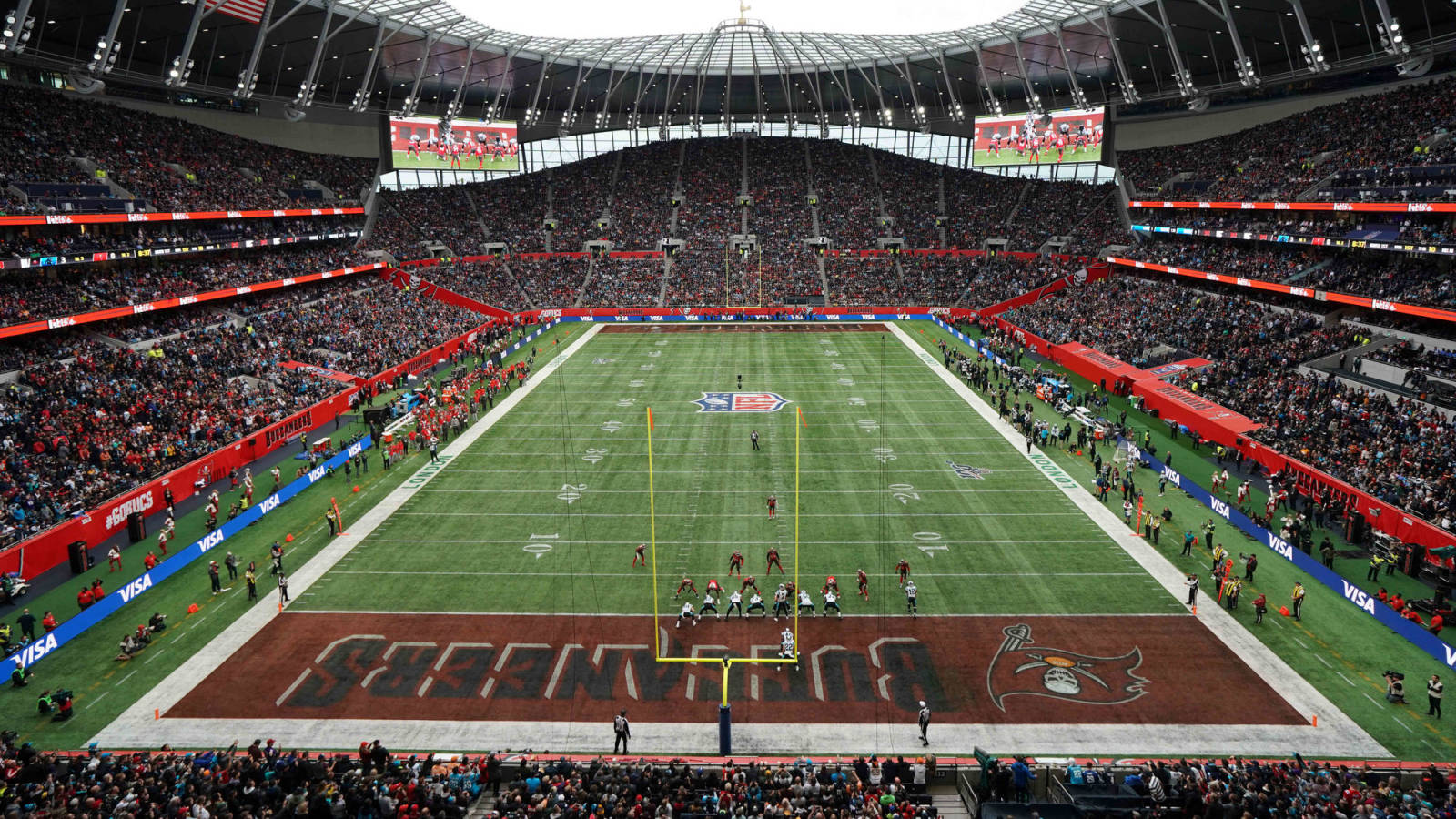
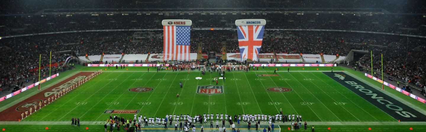
Even better would be that PLUS a different endzone design. No conference logos still makes the endzones feel like it is not a Super Bowl, but if like I was watching one of those games the NFL does in Mexico City or London.
-
1 hour ago, RayFinkle said:
Pitt, why do you think that a red Chiefs endzone for this years SB would have a yellow wordmark instead of a white one?
I'll let him answer the question. I think yellow makes sense since Chiefs place wordmark in either red or yellow all the time.
I don't think I've seen a white Chiefs wordmark before. Yellow would look more familiar.
-
1
-


Super Bowl Field Database - Super Bowl LVIII
in Concepts
Posted
Thanks! Yeah, Super Bowl IV is probably my favourite field as well and it was an inspiration for me to do this one.