


WBeltz
-
Posts
919 -
Joined
-
Last visited
-
Days Won
1
Posts posted by WBeltz
-
-
18 minutes ago, MJWalker45 said:

https://www.bbc.com/sport/football/articles/cx88w2nneego
Leeds United have had a minority stake purchased by Red Bull. So expect to see this look in the Championship this upcoming season.
I think I would prefer it be just a white logo with a blue outline because it would at least mold into the kit, but otherwise eh.
-
 1
1
-
-
14 minutes ago, Germanshepherd said:
Welp. Enjoy logo free football while you still can.
Ole Miss basically did this when they did the RealTree helmets a year or two ago. It’s gonna suck but it is what it is I suppose
-
15 minutes ago, Lights Out said:
They aren't totally the same as the Packers - the jerseys and pants have matching stripes here.Still, this looks like a cheap catalog order. So did the uniforms they're replacing. It's such a shame that the bear claw uniforms are tied to Briles and the scandal, because they could have just recolored those and changed the font and been set for another decade at least.
Baylor, Mizzou, Wake, Oklahoma State, etc. There seems to be a trend recently of power conference schools throwing away unique designs to look like a low-budget MAC school instead when they could surely do better with their budgets.
I would argue that OSU is more so them going back to their time when Barry Sanders was there. Just with multiple colors.
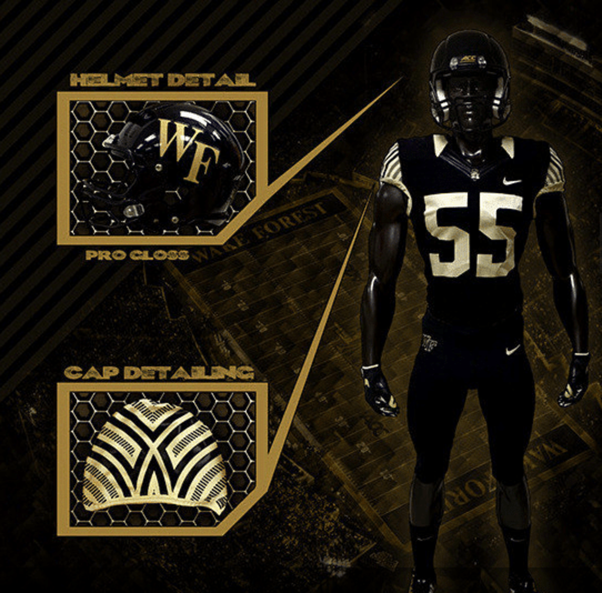
Wake Forest is interesting because these uniforms I thought were a surefire hit:
But they removed the cap details and instead put the WF on the side. However they always seems fine as simple and basic.
-
4
-
 1
1
-
-
14 minutes ago, lahaye7 said:
the vegas gold, dark Green and white was a look Baylor owned. Now it could be Packers, Edmonton, NDSU.
Why did they switch from Vegas Gold? Was there any reason? I know that for a while the basketball team had different colors to.
-
1
-
-
Back to Utah. So are the uniforms going to be just black and white? No accent colors or stripes? Will they even be for sale? I'm curious about that aspect of it.
-
I didn't mind Baylors prior look, albeit it was very simple, but at least most of the mix and match worked. Stripes are nice but it seems too generic.
-
3
-
-
3 hours ago, Old School Fool said:
The hat looks great but I will be so disappointed if the front of the jersey says T-Dot or even worse The 6ix.
Have to bring this meme up
-
6 minutes ago, VDizzle12 said:
I used to dream that eventually they would have a 3rd jersey with that logo on it.
Maybe it's because I'm an Avalanche fan that doesn't live in Colorado. But the state flag C logo and C+mountain do nothing for me.
Not to flag jack this thread but I love the Colorado flag to a point it is tattooed me and the Rockies BP/ST hats from years ago with the flag inside the mountain logo was top tier. Give me the flag on anything tbh.
-
2
-
 1
1
-
 1
1
-
-
21 hours ago, MJWalker45 said:
After seeing Man United's change shirt, I don't know how any team went with colors that are even a tiny bit off from the rest of the uniform design.
It's not as noticeable from the front, at least when it's laid out flat.
MLS shirts the next 2 years are gonna be terrible with this template.
-
4
-
-
6 hours ago, bushy said:
I really don’t even understand the fascination with them being the mile high city. Like we get it. Can you focus on your actual team name now ? 5280 this, 5280 that. It sucks.
But then we won't know how high they are. In elevation or literally speaking.
-
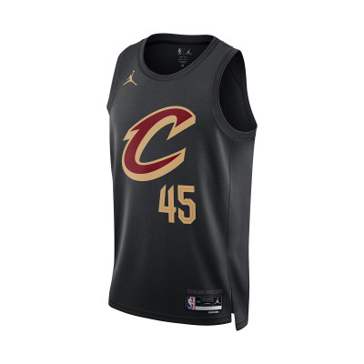
Here is the Cavs 2017 Title clinching jersey (with sleeves):
Here is their current black alt:
Outside of the use of gold vs yellow, and the number being moved due to a makers mark, and the lack of trim on the collar. They carry a very similar design that is very plain. The sleeves I'm sure on the prior weren't everyone's favorite because they ruin the aesthetics of an NBA jersey. But both are just lazy, if not boring designs that could have done better.
-
4
-
-
All things considered its not the worst thing in the world. Very middle of the pack. Was almost expecting all red, but at least the white pants break it up to look like a normal alternate.
-
21 minutes ago, namefornamesake said:
That idea was rightfully shot down 50 years ago. Take a look at this Wikipedia feature on the Yanks' uniforms.
Although the Yankees have worn the same road uniform since 1918 (with the exception of 1927 to 1930, when the arched "NEW YORK" was replaced by the word "YANKEES"), a radical change was proposed in 1974. Marty Appel, in his book Now Pitching for the Yankees, describes the proposed uniforms:[8]
In 1974 I walked into (then-General Manager) Gabe Paul's office to find samples of new Yankee road uniforms draped across his sofa. They were the opposite of the home pinstripes – they were navy with white pinstripes. The NY logo was in white. Gabe liked them. I nearly fainted. Although the drab gray road uniforms were not exciting, with the plain NEW YORK across the chest, they were just as much the Yankees' look as were the home uniforms. I think my dramatic disdain helped saved [sic] the day and saved the Yankees from wearing those awful pajamas on the field.
That would be the perfect way to do it. The White Sox did it with theirs, I think it would be a great way to keep a traditional look (I.e. pinstripes) with a more modern outlook, and keep it in the Yankee's ballpark. Even do a hat with a Navy "NY" logo outlined in white and boom. There it is.
-
13 hours ago, GriffinM6 said:
Nuggets deserve to lose for wearing these 5280 uniforms again.
I bet they do a white one next year

-
 1
1
-
 1
1
-
 2
2
-
 1
1
-
-
20 hours ago, coco1997 said:
Agreed. As soon as the Yankees adopted an ad patch the whole "sanctity" of their brand kind of went out the window. Plus, nothing stopped them from participating in the Players' Weekend promotions in years' past.A monochrome navy design with something that pays homage to the city of NYC and/or team history and doesn't incorporate any off-brand colors would be fine.
Plus the Yankees have always done in on the Mothers/Fathers/Armed Forces/4th of July hats and merch. I wonder if with the CC though how they are designed? Is it in the same way as the NFL articles that UW mentioned and the team asks a designer, and they send something off, then go from there? You would have to assume so.
-
1
-
-
2 hours ago, nuordr said:
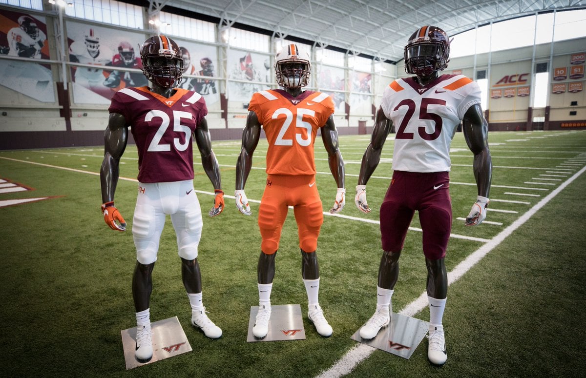
Thankfully the Virginia Tech Hokies will be getting new uniforms this season and getting rid of the horrible collarbone stripes:
I actually liked these and thought if the Jets were going to do a uniform redesign, they use this as a "modern" version of the UCLA stripes uniform they had before.
-
4
-
-
2 hours ago, Digby said:
I lied, it's up now. Sanity has gone by the wayside and the Celtics are wearing black at home vs the Cavs in white tonight. Also OKC wearing their City at home (I kinda like it tbh) and the Wolves throwbacks return tomorrow.
Last night I was struck at how normal the Knicks looked in the faux-90s uniforms, I'm coming around on those... at least til the camera zooms into the stupid wordmark.
OKC's City gives off big "Warriors 2009" vibes to me. Maybe it's the colors that are similar.
-
3
-
-
16 hours ago, Marlins93 said:
I am surprised people here like the Cleveland ones. They are horrid IMO. Some nice design elements that are completely overshadowed by how lazy and obnoxious the CLE wordmark is. I think the three-letter concept is one of the worst things about the City Connect "program" in general.
I do get it. I would prefer to have "CLEVELAND" across the chest instead of the abbreviation, even if it means losing some of those detials that are present on the lettering. But it's infinitely better than some of the ones we've seen recently.
-
4
-
-
9 minutes ago, JQK said:
Show us the throwbacks you cowards!
-
9 hours ago, Marlins93 said:
There is a small handful of great ones, a few decent ones, but I'm convinced now that the City Connect concept is a crime against baseball.
I would agree. I think some of them are tweaks away from massive improvements, but there are a handful that are just not great. If I had to rank the best ones it would be:
1. Angels
2. Marlins
3. Cleveland
4. Chicago White Sox
5. Colorado.
-
1
-
-
6 hours ago, Old School Fool said:
I don't hope the Raptors don't wear a black and gold alternate next season...
Whats crazy is since 2015 they've had 8(!!) jerseys that have gold on them. Kinda crazy.
-
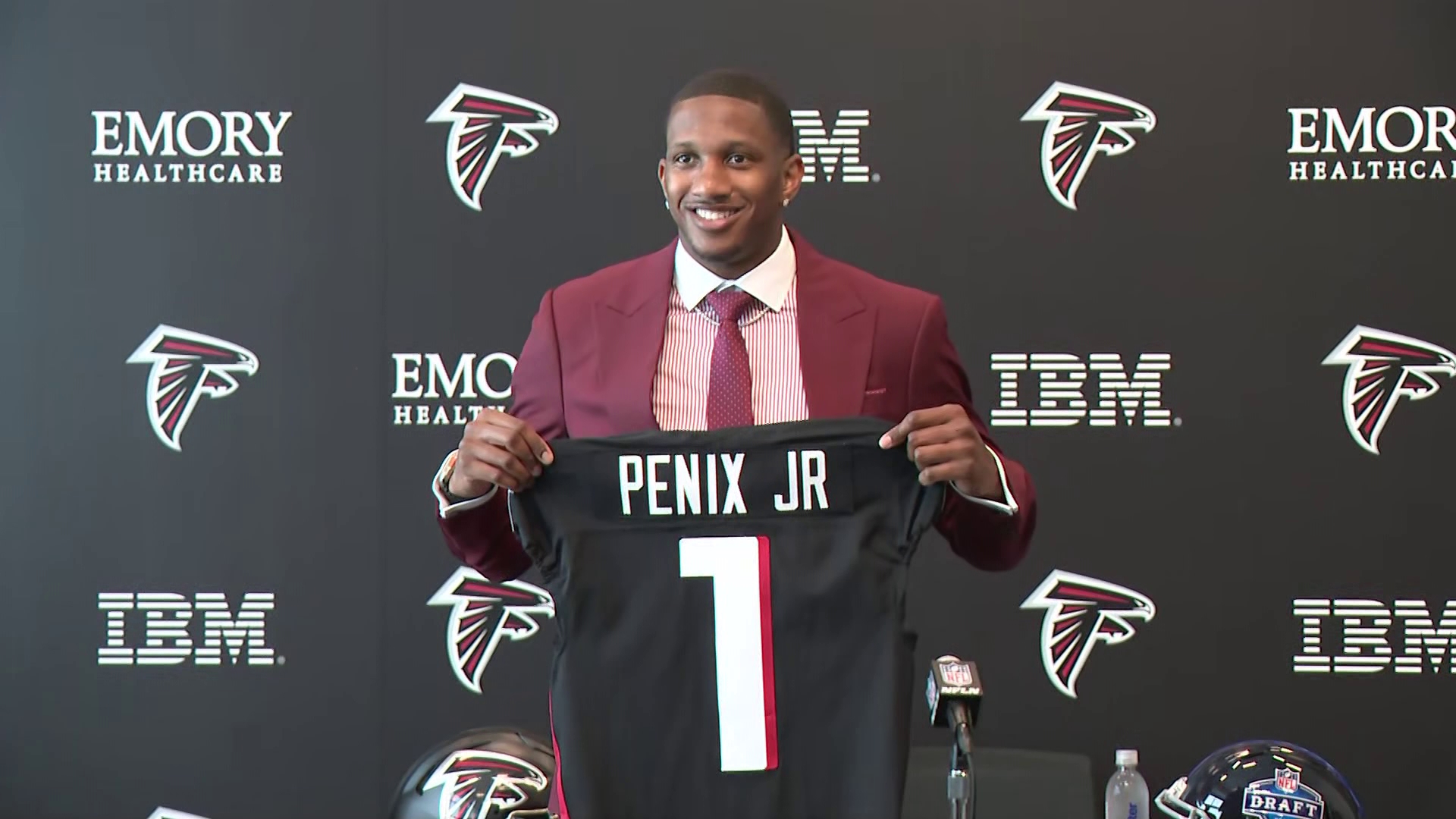
1 hour ago, Ark said:
Hey the Falcons gave away Vick’s number!!
His number has been taken for a bit.....
-
1
-
1
-
-
I am going to say in a vacuum it looks nice. I think we'll need to see it on field to actually get a good idea, but it's not terrible. I'd say above Cincy's for sure. But could've been better.
-
9 hours ago, Delicate Genius said:
What is this?
IT gives off soccer vibes. But it would only probably be good on the sleeves, or just on a workout T-shirt before the game.
-
1
-
.jpg)


.jpg)
.jpg)


College Football - 2024
in Sports Logo News
Posted
I don't hate the striping pattern on the other uniforms, but why couldn't they all do the bear claw on shoulder and just stripes on pants? I feel like they missed a mark here.
Also hoping Boise State doesn't get too basic with their new set. Still have yet to see that.