


WBeltz
-
Posts
882 -
Joined
-
Last visited
-
Days Won
1
Posts posted by WBeltz
-
-
4 minutes ago, tscuzzy said:

forgive my terrible photoshop skills but matte helmet + reducing the red trim does wonders IMO... it just looks so amateur in the leaked pic
I think I would much rather them do a Houston script instead of a letter. But that might also be worse.
-
Ok, someone tell Denver they're next. The board has got to explode.
-
 1
1
-
-
Honestly, the Texans are the one team that really didn't need a uniform change. They had a pretty decent set. Just use the red helmet full-time and make some tweaks and it would've been fine.
-
12
-
 1
1
-
-
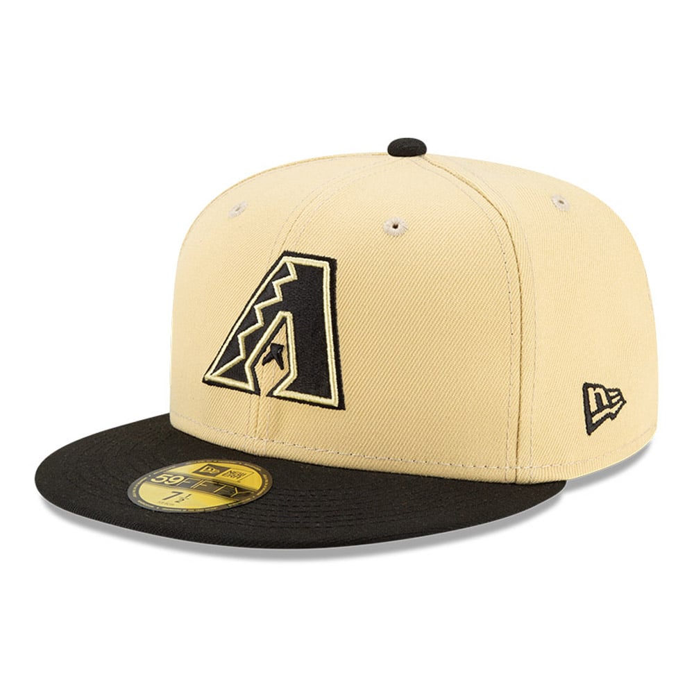
1 hour ago, Old School Fool said:
No one is going to point out the Diamondbacks have a sick new helmet logo for the City Connect?
Paul mentioned it on UW, and it is interesting that 4 years after this debuted, it shows up. Because their cap is not anywhere NEAR what the helmet is:
So it makes me wonder if they'll have that "s" logo as an alternate cap for the CC down the line, or if they couldn't get a batting helmet to match the cap specifically? Has there been any team (regardless of league) that has introduced a new element to a uniform years after its debuted?
-
2
-
-
2 hours ago, DCarp1231 said:
I still think about this.
Are these approaching Bears Orange pants level of notoriety?
-
1
-
 1
1
-
-
7 minutes ago, MJWalker45 said:
I could see the Falcons keeping theirs for a bit longer. The worst part of it are the ATL wordmark and the number font. That gradient jersey is apparently already mothballed as well.
I can see the Falcons going in the route of Miami, and making some small adjustments to the jerseys (number adjustments, shrinking/removing the ATL) but still keeping their overall look. But either or would work out for them.
-
1
-
-
17 minutes ago, AstroCree said:
Is that now 3 teams that have gone back to their previous throwbacks after the "Nike-ified" changes? Says a lot about their creative department. I wonder what's next for the Lions? I didn't think they had a bad set. It just needed a white outline.
Jacksonville, Cleveland, Tampa and now NYJ have all backtracked a Nike redesign. Miami only adjusted the numbers on their Nike set. Otherwise Minnesota, Seattle, Atlanta, New England, Rams, Chargers, Cardinals and WFT all have kept their designs since getting them.
-
42 minutes ago, DCarp1231 said:
Never forget where we came from
If the helmet was solid black these would not be terrible.
-
2 hours ago, DCarp1231 said:
Utah Angels of Salt Lake City
Sacremento Athletics of Las Vegas
-
8 minutes ago, VDizzle12 said:
I think anyone who designs anything for a living knows exactly this. I have almost never had a project go from start to finish without a client putting their fingerprints all over it. Usually the more cooks you have in the kitchen, the worse the end result will be. Especially when you have someone pushing for "new, innovative, cutting edge". At the end of the day they are the one's paying the bill and will get whatever they want. Not everything we do as designers works. But sometimes we don't deserve all the blame. I've never worked with a company like Nike or a league like the NFL. But even on a smaller scale I used to take criticism personally on social media and message boards. I've learned to just focus on the positives and appreciate the work being done. Regardless of how some people on the internet feel.
When it comes to the NFL and Nike. One positive is that most of the time teams recognize their failures and eventually go back to what works. The Browns, Bucs, Chargers, Cardinals, Jets, etc all have nice sets now after trying way too hard to modernize everything.
This comment made me think, and I highlighted two of the teams realizing a misread it the first time. But IF we go back and look at the color rush uniforms the league had made by Nike, why was Atlanta's so different from their current look? And then how come a team like the Cardinals didn't just do what the Falcons did, but with the color scheme they chose? Why did they have their color rush jersey still with all the extra nooks and crannies, when Atlanta was still carrying that similar design for their home/road looks, but went with a simple version for the CR?
I'm only now realizing this. Make it make sense.
-
41 minutes ago, DJT said:
I'm still liking the Utah Storm but that would probably open the floodgates to Stormin Mormons.
Utah Gulls I also kinda like since its the state bird. But another bird team.
Utah Yeti seems popular and i'm not sure about it.
I'd expect more surveys to come out asking for input from fans.
I need Utah NHL to do the funniest thing ever now.
-
Unpopular Opinion: I am not liking the white facemask on the Browns helmet. Should've kept it brown. It just looks too bright to me and is throwing me for a loop.
-
9
-
 1
1
-
9
-
 1
1
-
 1
1
-
-
After looking at it. It’s a much better change for the Jets. And at least the numbers are legible on the black jerseys.
-
42 minutes ago, NYCdog said:
Another possible Mets leak.
I prefer this one over the Bridge Embroidered one from the prior page.
Also with the bridge embroidered one, it’s possible it could be a fashion CC cap. They’ve done that with other CC teams. Although I don’t know with that Detroit one. That could be either way.
-
I'd like the black jersey to look like that so I can actually read the numbers. We'll have to wait and see though I suppose.
-
11 hours ago, thisguyphelps said:
Im co with this if it means the return of faux leather helmets
Ok, but the Washington ones from RG3's rookie year were and still are phenomenal. If you're going to do faux-leather that's the way to do it!
-
6
-
 4
4
-
-
The Juve home jersey looks fine. The away is a choice for sure.
-
4
-
-
3 hours ago, coco1997 said:
Apparently this art has been on the MTA for years, but it would be funny if this more or less wound up being the Mets' design.Let's circle back to this with the "can I copy your homework" meme when they get unveiled.
-
1
-
-
47 minutes ago, VDizzle12 said:
This right here is why I'm glad this community exists. Watching the game yesterday, the yellow was throwing me off the whole time. I'm sure most people didn't even really notice it and I really couldn't any info explaining why they were using yellow. In theory I guess it's fine and looks decent enough. Just doesn't feel like South Carolina.
Reminds me of when the Oregon football team incorporated orange into their uniforms to match Puddles the duck.
Unpopular opinion:
I still like THOSE Oregon uniforms. If you're going to go nuts, go nuts.
-
6
-
-
1 hour ago, SFGiants58 said:
I moved to Denver in 2019 and I go out of my way to avoid Colorado flag merchandise. Hell, the Denver flag is a better design, but even that feels ripe for co-opting by transplants.
I can see more points in favor of “Seal on a Bedsheet” these days.
Maybe it because I don't live in Colorado anymore, but I have always loved the flag. It's so beautiful and the most iconic of all the state flags. I'm bummed I never grabbed a Rockies hat with that logo.
-
4
-
3
-
-
47 minutes ago, DJT said:
so now the teams with new uniform set next season are:
Clippers (we've seen)
Pelicans
Jazz
Are the Pelicans and Jazz confirmed? Jazz are dropping one of their jerseys this year (presumably next too) but has it been confirmed their doing something different?
-
4 minutes ago, DCarp1231 said:
I can’t wait for the chest patch to be
5280
/\/\/\
DNVRWhat's really bizarre to me is that LA Rams are still the only one to have that weird little patch on their jersey. Every other team doesn't have it, makes me wonder if that's something that will come off at some point.
-
3 hours ago, DCarp1231 said:
Not using these as a base was a huge mistake
Swap the number/outline color. Add white pants. Have white jerseys and black pants, maybe a black alt and these would be top 5 in the league
-
7
-
-
10 minutes ago, tigerslionspistonshabs said:
Any rumblings on the Lions new unis? I really hope they dont mess it up.
At this point I want a giga leak of the uniform changes. Just the whole 9 yards. It's just kinda wild that outside of the Texans road uniform, no other uniform has had a significant leak from retail or even like a team photoshoot.
-
4
-


MLB 2024 Uniform/Logo Changes
in Sports Logo News
Posted
I hate that NYM CC hat with such a burning passion. The roundel logo one looked so much nicer.