

.gif.f20f8ca4c4a7b2174a37b93e4494fc64.gif)
MilSox
-
Posts
2,067 -
Joined
-
Last visited
-
Days Won
4
Posts posted by MilSox
-
-
5 hours ago, Carolingian Steamroller said:
I've said this elsewhere but I think the 1976 White Sox uniforms are one of the most genius designs ever to come out of that era.
Take away the disco collar and this isn't a bad uniform. I wouldn't mind seeing a fauxback version of this on a modern template. -
10 hours ago, SilverBullet1929 said:
We're basically agreeing right? I blamed the 2000s rebrand for being weak and you're saying the mid 90s look didn't establish itself enough so yea the bottom line is the Brewers haven't had a strong enough or long enough identity after the BiG to make people forget about the BiG. Maintaining the mid 90s identity into today would have definitely helped the matter.
We are. I'm just using your point as a jumpoff point to make mine to the BiG detractors... that there was no reason for the Brewers to rebrand so close to the club's first major overhaul which yielded some pretty nice uniforms in their own right. It was just a cynical cash grab to tie in with the move to Miller Park.
Now, with the success of the Blue Jays and Astros rebrands, on top of the Brewers fauxbacks, most fans have it set in stone what they want. -
On 5/29/2018 at 9:27 AM, SilverBullet1929 said:
If the Brewers did better with their 2000's rebrand people wouldn't be clamoring for a return to the BiG as much. A stronger rebrand would have left the BiG in the past.
They had a potentially timeless rebrand.
But they didn't give it enough of a chance to establish itself, and now it's associated only with the worst era of Brewers baseball. You can't blame fans for wanting to return to the BiG when their retro fauxback easily outclasses every other uniform that's currently at their disposal. Which also happens to be their best option at this point. Because you can only rebrand so many times before you become a team with no discernible identity... for which that "other" Milwaukee team is a perfect example.-
 2
2
-
-
On 5/30/2018 at 4:46 PM, CaliforniaGlowin said:
66ers already exists.
Not in the Texas League.
The Burlington Bees and Salt Lake Bees don't seem to have any problems co-existing. And they have the same parent club. -
Long Haulers... I guess. But wouldn't a better name for a Route 66-based identity be, I dunno... 66ers?
I miss when MiLB clubs had dignified identities. -
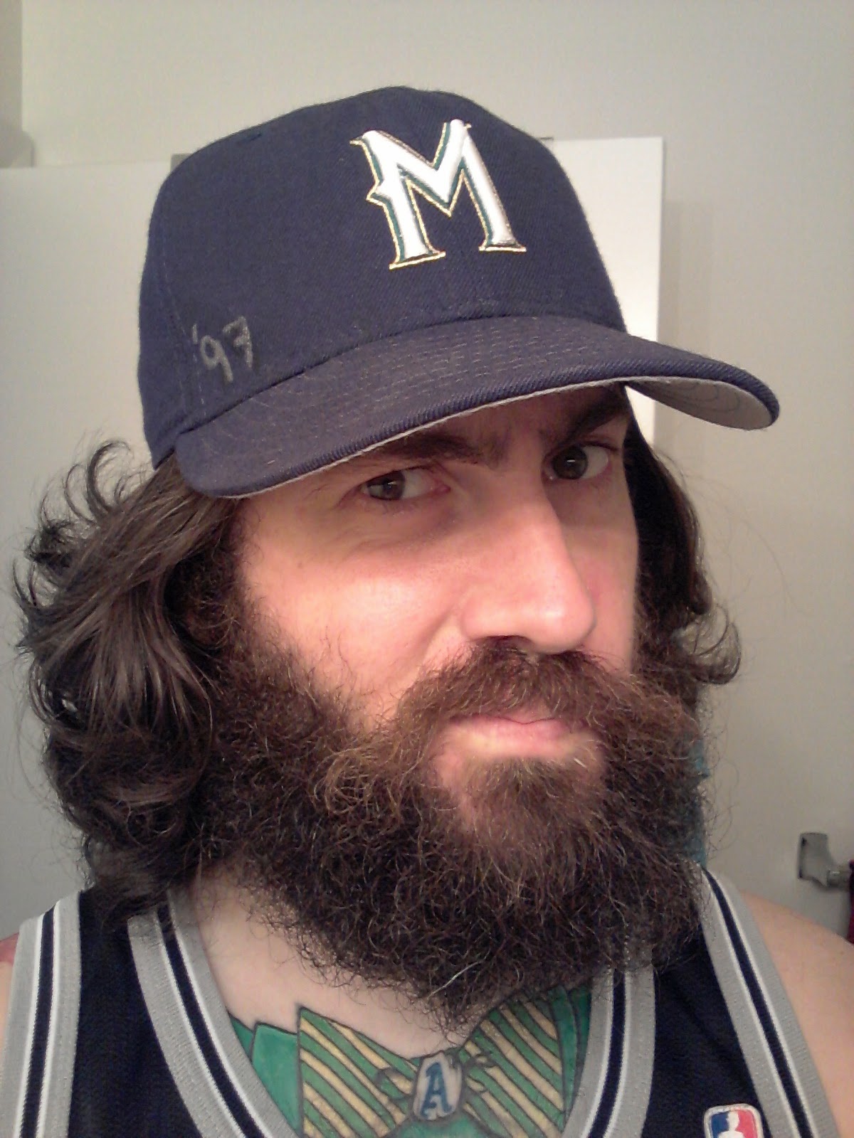
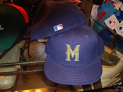
5 hours ago, Discrimihater said:
I'm more partial to the 97-99 caps myself.
 1 hour ago, SFGiants58 said:
I like this variant a bit more:
Still, knock the royal/yellow and BiG all you want, but they are everywhere in Milwaukee. In the two years that I've lived here, I haven't gone a day without seeing the royal/yellow colors and the BiG on some piece of clothing, a house decoration, a car accessory, or some other form of display. It's almost as prevalent as the Packers' logo or the UW-Madison Badger's "Bucky Badger."
Anecdotal evidence is usually horse crap, but I do think it counts for something here.
I dig all of the Germanic looks. Perhaps if the BiG hadn't been immortalized by the greatest moments in franchise history, I'd be advocating for a return to those.
But SFGiants58 hit the nail on the head, and I don't think that's something people understand unless you've spent some time here. When you're more over than Bucky Badger in Wisconsin's biggest city, it's just plain foolish to not embrace it and run with it.
4 hours ago, WavePunter said:Several of those examples are attempts to replicate a timeless American look (Giants, Dodgers, Yankees in the first 3), so while I don't agree with the practice, I at least understand what they were trying to do, so I'll give them a small pass..
I would put the Brewers fauxbacks in that category. They may not be as historically significant as the NYC-rooted clubs, but you can put them in any era and they wouldn't look out of place.
-
1
-
-
4 hours ago, Ray Lankford said:
The Brewers' best all-time look's got you covered:

Another reason I hate the current Brewers identity.... it was literally change for the sake of change and got rid of this potentially timeless look way too quickly. Instead, it has only the painful post-Robin Yount years to be associated with.
I play a lot of Ken Griffey Jr. on the SNES though too, so I have a soft spot for this one.-
1
-
-
25 minutes ago, Ray Lankford said:
It feels like "identity" is thrown around a lot as the barometer for a team's logo/look success but when it comes to the Brewers, who have a unique name that is relevant to the region, a lot of votes go to a logo that basically just says "baseball team."
I would argue they can get away with it precisely because the name is so relevant to the region.
Plus, the BiG has the added advantage of steering clear from any imagery that could be construed as marketing alcohol to kids... not that I see that happening anytime soon in a place like Wisconsin. We think nothing of getting hammered at a toddler's birthday party, FFS!
-
1
-
-
My point about the W is that the scripts would be a lot more legible without the drop shadows. But because of the cap logo, it needs them in order to match. I just wonder how many tweaks you have to make before you end up with something different enough to justify scrapping the entire thing. I get the feeling that a lot of Brewers fans are sick of the current identity simply because of the perception that it keeps getting forced on us when its obvious what the fans prefer.
But I'm gonna go off on a tangent now because this is the unpopular opinions thread... I don't actually mind when baseball teams combine their city and nickname for a cap monogram. I'll admit my biases as a BiG loyalist are at play here. But I also logged in a lot of hours playing Super Baseball Simulator 1.000 as a tween and teen, which made me curious about Japanese baseball where this is a much more common practice.
Yomiuri Giants:
Chunichi Dragons:

Yakult Swallows:

Hanshin Tigers:
In some cases, the "city" is actually the corporation that sponsors the team. The Yomiuri Giants for example, play at the Tokyo Dome and wear scripts that actually say "TOKYO" on their road greys.
-
2 hours ago, WavePunter said:
The current logo might seem a bit dated because some of its elements were fads of the early 2000's, but a league full of logos that omit every "dated" design element would be extremely boring.. A logo can have a drop shadow without being a bad logo..
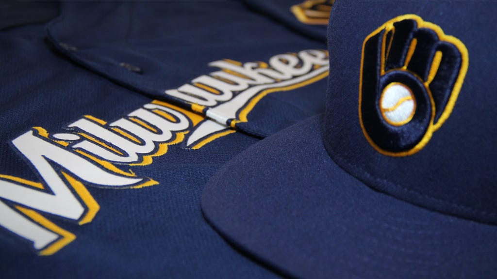
The beer-script styled M with wheat underline fits the brewers nickname and identity very well imo.. In fact, I think it's vastly superior to the BiG logo, which is only popular for nostalgic reasons.. Their current identity isn't executed perfectly, but it's a few tweaks away from being great
If that were true, it would only be popular with the over 30 crowd. Not people who don't remember or weren't even around for the BiG's original run. It's the cleverness of the hidden "mb" that's allowed it to endure.
I would also have to disagree that only a "few" tweaks would be needed to make the current identity work. You'd have to start by getting rid of that goofy MS Word number font. The current gold doesn't contrast well enough with gray, making it a muddled mess on the road unis. The scripts are unbalanced to accommodate numbers, which is a flaw in their design. Those half-assed droptails look goofy, yet don't actually work when extended all the way (several attempts at this have been made in the concepts forum). Even the blue Milwaukee jerseys exposed another design flaw... that weird blob behind the W that's needed to accommodate the drop shadow.
I also feel the current M really only works when you pair it with that heavily flawed identity package. You can't really pair it with other scripts the way you can with the BiG.
1 hour ago, MCM0313 said:I don't necessarily consider their current logo "superior" to BiG, because BiG is very clever and aesthetically pleasing - but there's no denying that their current logo is more appropriate for a team named "Brewers"...plus the wheat-ish color they currently wear is more appropriate than yellow.
Wheat can come in all different shades of gold, depending on age, texture, and lighting.
-
2
-
-
If that logo looked a bit more like this I might agree with you.

But as it is, no one can say the BiG is somehow more outdated than the "current" early 00s drop-shadowed mess of a logo.
I know that's not necessarily what you're saying here, but it's the most common reason I hear for why people should prefer the newer stuff.-
2
-
-
On 5/23/2018 at 7:27 AM, -Akronite- said:
Can people let me know if this is unpopular- While I would agree that the Brewers need to pick an identity and stick to it, this:
is still an awesome look. Fauxbacks and extra colors being thrown in are hit-or-miss at best and this isn't an upgrade over the old logo colors, but I don't blame them for trying this cause it looks sweet as hell.
I'm pretty neutral on which shade of blue they go with going forward, as long as they stick with the yellow. I think most fans prefer royal, and I don't blame them. But navy has the advantage of having represented Milwaukee teams for much longer and looking less like the Cubs.
This particular uniform though, is the epitome of the best of a bad situation. It might be the best example of their current identity, but it has to be compared to the fauxbacks, which blow it out of the water. -
2 hours ago, Dolphins Dynasty said:
Major FAIL for not including Milwaukee.
Especially considering Milwaukee's prominent place in the original AA. So many missed opportunities.
But given the politics of the area, it's not at all surprising. Most people who don't live in Milwaukee proper literally hate Milwaukee.-
4
-
-
2 hours ago, SFGiants58 said:
Ah, that makes sense. Shouldn’t be hard for a major-league team to do. Of course, it’s probably too late to change it now. Had it been 1969, things might have transpired to allow it to happen. Can’t really throw out roughly a half-century of brand equity (of all the 1969 expansion teams, the Royals have kept the closest to their initial brand).
Look no further than their 1969 AL expansion mates, the Brewers, if you want an example of how diluted and messy it can get when you move away from a proven brand for no reason. -
41 minutes ago, SFGiants58 said:
There’s a key difference. That American Association team was mundane, with a name taken by the St. Louis NHL team. The Monarchs were a long-lasting Negro League team in the founding city of the Negro Leagues. There are no Big Four teams with the “Monarchs” name. Monarchs > Blues, from a historical and branding perspective. “Royals” is an OK compromise, but the Blues really aren’t worthy of that honor. Let them be a footnote compared to the Monarchs’ legacy.
Besides, the Blues were a Yankee farm team. I’d think that the baseball fans of Kansas City would want nothing to do with an homage to a “Yankee farm team,” after that toadie Arnold Johnson ran the Kansas City A’s as one. We have enough teams named after old minor league franchises, why not have one squad named after a Negro League club? What better club than the one playing in Kansas City?
Also, look at how many games the Royals have played in Monarchs throwbacks vs. the amount in Blues uniforms. It clearly favors the Monarchs.
Point taken, but the other problem is that the Monarchs trademark is owned by the Negro League HOF, and is a significant source of its revenue. For the Royals to take on the Monarchs identity, they would have make it worth the NLHOF's while, which would probably include funding and maintaining the museum.-
1
-
-
13 hours ago, SFGiants58 said:
I’ve kind of soured on all aspects of the Royals’ identity over the past year or so.
The Name: While it’s a fine name, there exists a better alternative - the Kansas City Monarchs. It’s not a direct riff on the livestock show as much as it is slight homage. Monarchs was more importantly the name of the famed Negro League team. With Kansas City being so important to the Negro Leagues (and the site of the Negro League Museum), the name makes sense. However, the Royals started playing in 1969, when no major league owners really cared about the Negro Leagues.
Kansas City's American Association club was known as the Blues. I always thought Royals was the perfect name as it alludes to both the Monarchs and the Blues.-
2
-
-
3 hours ago, Jimmy Lethal said:
Someone finally says it, I've hated this look since day one. Go back to purple/green, please.
Purple wasn't very popular locally once the 90s trend was over. Meanwhile, these were going for $50 on eBay during their last year of the previous (red & green) uniforms.
I was willing to give the current identity a chance. But as time goes on, it becomes more and more obvious they dropped the ball.-
2
-
-
4 hours ago, DC in Da House w/o a Doubt said:
unpopular opinion: I think this entire identity is trash
I'm already sick of it, TBH. I think they really botched a chance to bring back the green rainbows like everyone wanted.-
1
-
-
8 hours ago, MCM0313 said:
Perhaps, but they already have a good color scheme, just with questionable color balance.
Too close to the Brewers for my tastes. Or at least what the Brewers should be wearing.
The original Buccaneers colors would look good for the Rays too. Especially if the Bucs insist on sticking with pewter. -
The old ABA Floridians colors are the most Florida colors ever. I feel like the Rays could pull them off with minimal effort.
-
1
-
-
3 hours ago, Mockba said:
They got the muddy colors down, but it's not really the old-school Brewers look without a generic script; the Mud Cats script is clearly too nice.
Not understanding what makes the Brewers script more generic than, say, the Dodgers, A's, or White Sox. All are universally regarded as some of the best uniforms in baseball.
-
1
-
-
1 hour ago, Mac the Knife said:
Yeah, they bought the team during the off-season.
FWIW, I've no problem with the Brewers powder blues. I've no problem with the old 80's uniforms, in fact I think they should go back to the pinstripe, either with "BREWERS" on the chest as before or the ball-in-glove on the chest, Yankees style.
On royal blue pinstripes? Waaaay too Cubs-like for my tastes.
The 1982 look has proven its timelessness over the past decade. Much like the Jays and Astros, they really don't need to reinvent the wheel on this one. I would prefer button down versions of the powder blue roads, but I'd be happy with Gothamite's suggestion as well.
EDIT: If they brought back the gold-paneled hat, I'd pair it with the homes rather than the roads. Or limit it to batting practice or a blue alt. Better color balance that way.-
2
-
-
They're not even the only Brewers farm club who gets it...

...hell, even teams outside of baseball get it...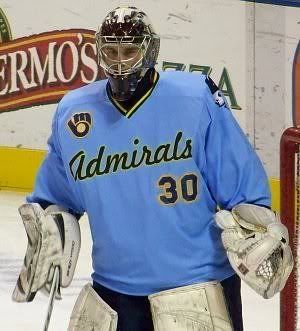
I get that the 1982 fauxbacks and the BiG aren't everyone's cup of tea. But it's a distinctive look that's instantly recognizable as "BREWERS," and it happened completely organically. The organization stuck with the current look for almost 20 years now... not only did it lose, it seems to lose a little more each year. Why are they still fighting it?-
1
-
-
I know powder blue is a divisive issue, but I feel like the Brewers were one of the few teams who actuly pulled it off.
I'd put the Royals and Phillies in that category too.
-
1
-


Unpopular Opinions
in Sports Logo General Discussion
Posted
Yeah, if it were to be brought back, I'd prefer to see it with the current "SOX" monogram.