

johnrafael
-
Posts
1,158 -
Joined
-
Last visited
Posts posted by johnrafael
-
-
The designs kind of lack uniqueness. It reminds me of those generic fan jerseys (maybe because of the "oversized" template), an "one-size-fits-all" approach that disregard individual club culture and traditions.
For example, even if Real Madrid usually goes with black as accent colour on its jerseys here and there, the traditional accent colours of the team are gold and purple (most recently blue).
Some jerseys have problems with contrast, like Palmeiras one. Those green numbers would be barely readable. Same for the blue numbers in Yokohama. Since the main colour in the jersey is blue, it gets a little hard to see, even if it's over the stripes. Gets quite cluttered. Still on contrast, you have some cases of yellow over white or white over yellow (namely Boca Juniors, Juventus, Lyon and Sporting). At a distance, it could be a problem to read too.
A personal nitpick is that names on back are very small, almost unreadable. NFL had enlarged it over the last decades, not reduced.
-
 1
1
-
-
The identity is strong, is consistent, however, the main logo seems empty, looks like a secondary logo or something. IMHO, MLS isn't still that strong in world scenario to afford for a team that doesn't have the name in their logo. People outside US will surely question: What team is this?
Will surely wait for the jersey to give a final opinion.
-
10 minutes ago, IceCap said:
It would depend on the threads. Three threads that could reasonably be one topic could be merged but three random threads of different topics wouldn't be.
It would be three topics in concepts forum, all about the same theme, but with years of difference. Could I send you a PM?
-
On 2023-08-23 at 2:02 PM, johnrafael said:
Is possible to get a series of threads by the same user merged on request?
No answers?
-
On 2023-08-08 at 11:19 AM, raysox said:
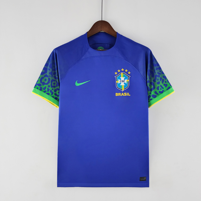
Brazil 8/30
I'm sure I could have trotted out a yellow t-shirt and have been happy crossing off Brazil, but I wanted to do some small flourishes to really set a theme here. I did a sublimated wavy-dot pattern on the front to symbolize movement and sun, two things Brazil is known for. In my NCAA Lacrosse series that used a beta version of this template, I loved this little shoulder design when I could replicate a football uniform. I brought it back here. I also used my thin jersey cuff to test it out, and I think it really looks neat here.

The blue I chose pops with the colors, and it was the logical choice for the clash kit. I used the Amazon river as the primary design, with it's estuaries stemming off from the main yellow line. I went classy with the cuffs and collar, and hid a small Brazilian flag in the collar.
Okay, starting with the nitpick. Name below the logo should be BRASIL, with an S. We haven't used Brazil (with Z) in Portuguese language since 1942. Loved the southern cross in the back of the shirt, makes a nice reference to 1952 olympic jerseys, the first yellow ones.
For the home kit, I like the amount of light blue, it's a shame that light blue is underused, after all, it was the blue in the 1970s. I believe you could have even the letters and numbers in blue, for extra boldness, since your pattern in the front is quite plain. The yoke is a little pointless just as a line, I'd add some detail on it, maybe some text or detail related to Brazilian culture and football.
For the away, I miss green. After the last Nike away kits, I'm really into the Canucks look around here. I'm not sure this is supposed to be a polo jersey, and I don't think the texture matches the idea if this is a polo. If that's it. I'd maybe rework it, to make the collar more prominent. Also, the stars above the logo should be yellow, they look almost invisible in the blue.
-
1
-
-
Is possible to get a series of threads by the same user merged on request?
-
On 2023-08-10 at 2:30 AM, Bomba Tomba said:
I agree that OP's concepts need all of those things, but you really didn't have to do them like that
I don't see where my words are offensive. I mean, I used quote marks and everything properly, didn't used any kind of slur, didn't offend the OP, didn't troll, didn't used any kind of 5h1tposting or low-quality meme. I pointed what I noted as problems, explained why and even encouraged OP to address the problems, something it has been done by OP in a very nice way. The numbers are still too big for my taste (even for NBA standards), but that's a personal opinion.
-
1
-
-
The front numbers are maybe a little too big for my taste. The uniforms also look very cheap without the sponsors, national federations logos as well as FIBA and World Cup Badges. They look something "generic", "makeshift", maybe "unlicensed", like those Chinese rip-offs. If you address these points, I think your concepts will look way better.
-
2
-
-
-
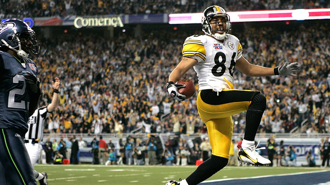
Totally unrelated to the concept, that is pretty nice, but shouldn't it be XL, like in that SuperBowl?
-
4 minutes ago, CRDesigns said:
well although harsh, i do appreciate the feedback. ive only been watching football for a couple years and ive been designing kits for even less, lol. Thanks for letting me know
No ill intent.
I'd encourage you to research more about football in other nations that are not in the MLS system. A good starting point is the excellent PascalHugo's series of European Football, especially the Spanish League, whose teams usually inspire Latin-American teams.
-
As a football jersey purist, I must admit I'm appalled and somewhat disgusted with most of these designs. This is for football the equivalent of white pants in hockey.
Seems like some US-based tycoon that shows a complete disregard for local football tradition is buying teams along North and Central America into a "franchise-based league". There's no :censored:ing way clubs in Costa Rica and Cuba would look that much "United-Statesian" (like they say in Spanish, estadounidense). In some logos, the use of fonts is completely brainless. Some applications would be completely impossible, like that highly detailed Ottawa skyline.
However, as an exploratory project of design, this is nice.
-
Apart from Ajax with the saltires, most of them are quite generic. There's a blatant lack of "deep work and research". Especially in the striped ones. The Inter or Newcastle stripes would work nicely with Atleti and vice-versa, judging by the type of generic uninspired crap made by Nike to its football teams. But considering the tool you're using, this is pretty decent.
-
The series is quite nice.
On a personal preference, I think you could tone down the presentation. It's a little bit too colorful and overcrowded.
-
1
-
 1
1
-
-
I simply love to see how much this template evolved since I handed you that rough SVG, @AusGiant. This is one of the best series I've ever seen using this. Congratulations, Victormrey!
-
1
-
1
-
-
The concepts are fire but this template sucks. Seems like the jersey is glued on a dusty wall.
Any explaining for that texture in Chicago third?
-
2
-
-
Despite well thought, this is pretty plain, and execution is lacking. The font doesn't look anything close from basketball to me, and we would never see NOBs with lowercase and no space.
-
This one is an "alternative" away jersey for Germany, working with the same texture they had in the 2022 away jersey, but "reversed".
-
Thought about a new thread, then changed my mind. I shouldn't clutter this too much.
BTW here we go. World Cup is time for Concepts, so I have new stuff to post. First, this Cerezo Osaka Away Kit inspired by the famous 1997 Japan NT kits that were made not only by one, but by three manufacturers, Asics, Puma and Adidas.
-
1
-
-
Oh. MS Paint Concepts. I feel so nostalgic when I see them. Great job so far. By the way, two tips to improve the execution:
First: Save your templates in 16-bit BMP and clean the grey lines. Copy the content and paste in a new bitmap image, saved as PNG, to get rid of those pesky lines between panels.Second: Use #000000 for the strokes or for the jersey color, but never for both at the same time.
-
1
-
-
Fast and Hard, he said.
I miss red in london away. It was solid AF and it's the national color of England to some extent.
-
The idea isn't bad. The problems keeps being:
1. The lack of planning and thought. The lack of identity persists nonetheless. What is the link between Pirates, Corsairs, Oslo, Norway and Green? That's why I call it generic. If you said this team was based on Nigeria, it would even have more distinctiveness, due to the link between green and Nigeria.
2. Execution. This is shoddy 15-minute job, let's be brutally honest here. You have different shadows of white in Corsairs numbers comparing front and back. How is it possible that you didn't even bother to check it out? Same in Vukovi. You are randomly recoloring things in Vukovi. You're merely recoloring stuff, and for me it doesn't even pass the threshold of creativity.
-
3
-
-
This series is kicking ass, as always, raysox. Other than the fact I just can't deal with all the brands using the same jersey cuts, this is pure gold.
-
1
-
-
1 hour ago, heavybass said:
Well that was kind of rude actually...
Now that I think of it, I agree and I apologize for that. Let me try again.
These concepts look uninspired. I looked at your other concepts (for instance, NFL ones) and these ones look merely like recolors of those. They look indistinctive, almost generic, like those unlicensed football games. Your NFL Europe is the most boring thing I see in these forums for some time. It's so bad that it doesn't even have "Europe" name anywhere. It looks like a cheap ripoff or a sunday league. The quality of the image is also very poor. Save this as PNG at least. If you're dealing with limited bandwidth, save it as a GIF, but NEVER AS A JPG.If you want these concepts to get better, you need to add more thought to this. There is plenty of references and ways to use them. I'll adress just one as example: Barcelona Dragons.
Barcelona, as well as Catalonia itself, is well known by its flag, named "the four bars". Four red stripes on a golden background. It's pervasive to the city, and used much up to exhaustion, by FC Barcelona and other teams. Even Dragons used it. It's a primary concept that you could have taken advantage of, but didn't. That's why your designs look generic and bland.
Hope this is less rude and more constructive now.
-
5
-


Script Missouri State Wordmark
in Concepts
Posted
Another possible way is to trace the center line of each glyph with the Pen Tool, then defining the width of the line in a larger weight. When you have the maximum weight, you can convert the linework to outline, then you fix the details of the letters and the ligatures. The image spoilered below is a quick, shoddy try of doing this. I'm not really that close to the result, but it's a start.