


Wildcomet
-
Posts
440 -
Joined
-
Last visited
-
Days Won
2
Posts posted by Wildcomet
-
-
I like the uniforms for Las Vegas, but I think I'd prefer the snake head logo to the LV logo on the helmet. Nothing against that logo, but 'letter' logos that aren't symmetrical end up with logos facing opposite directions on either side, which can be problematic.
The guardian gator is an interesting idea. A bit on the weird side, but so is naming an Orlando team Guardians to begin with haha. I can get behind it. Agreed the gator could use some tweaks but it's a solid start.
-
Here's the next batch I had prepared. Might be a little longer from this one to the next, won't be on my computer as often haha. Enjoy!
Green Bay Packers - Now I know in real life the Packers used the G logo even when they had the original version of this as a logo in 1961, but what would be the fun in making the same helmet they have now? That said, aside from using my modernized '61 logo on the helmet this is pretty much the Packers helmet of today. Too classic to mess with.

Los Angeles Rams - Similar to the Packers, the Rams' dark blue shells and ram horn helmet graphics are iconic, so I kept that motif and the white face mask from around that era and subbed in the updated version of the ram horns from my modernized logo.
Milwaukee Badgers - Had this franchise endured I could picture them adopting a helmet style not too dis-similar to the University of Michigan, which is what inspired this idea here, to take the badger head markings from my modernized logo and enlarge them to wrap around the front and sides of the helmet.
I have two more from my stuff I had made previously. I may also try to get a helmet together for Buffalo and/or Providence.
-
 1
1
-
-
Back with some more of the helmets. Hope you all enjoy.
Detroit Heralds - I took the H part of the logo I designed and made that the helmet logo, while extending the line for trumpet to the back of the helmet where both sides would connect. The graphic in the front over the facemask is the banner from the logo upside down.
Duluth Eskimos - Since this logo was already depicting what was essentially a spherical shape with the igloo, I thought it would work very well to make it an oversized graphic that would cover most of the side of the helmet. Given the size of the logo graphic, the rest of the helmet was kept to the background midnight blue color.
Duluth Nevers (Eskimos rebrand) - This was for the version where the pressure to avoid team names based on groups of people got to Duluth; the rename was based on player/owner Ernie Nevers. The front graphic is inspired by the parts of the logo where the white shifts to gray to midnight blue.
I'll have some more to post later on. Hope you enjoy!
-
3
-
-
So I'm just realizing that I'd made a few helmets for this series but never got around to sharing them, so let's do that! Since many of these designs were inspired by an era of leather helmets, I gave myself a decent amount of artistic license for what a modern helmet could look like, but in some cases where it made sense (like the team is still around today) I did keep the real life in mind.
I'll do a couple at a time so the posts don't get too long...
Akron Pros - Nothing too crazy here, the AP logo on the sides with a triple stripe based on the logo outlines down the middle.
Chicago Cardinals - Given this was one of those teams from the era of leather and from my research had about this shade of leather for their helmet, I thought this would be an occasion where it'd be fitting to give the modernized helmet a leather texture pattern on the shell. I changed the shell color a bit from the dark red in the cardinal I was originally going to use to be closer to their leather helmet in color, then added the triple stripe and the modernized logo on the sides.
Dayton Triangles - I decided to let the Triangles have a geometric pattern cover their shell; the front is a triangle inspired by the logo, but filled in solid.
The next few helmets will be posted in a little while. Hope you all enjoy!
-
3
-
-
10 hours ago, jackkmart said:
Yeah I'll keep working at it to improve the concept. Could be a combination of things from shape to coloration. It lacks some features (like eyes) and the shading is not perfect by any means as well.
Before I post a proper update I was playing with these two colorways of the same logo that may be more appealing.
Simply an inverse of the existing logo with a slightly different blue
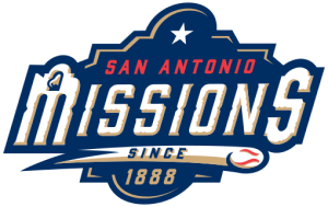
Trying a more 'tan' or sandy yellow akin to what the San Antonio Missions use. A little less e-sports when you drop the electric yellow, but I don't want to stray too far from the original Brahmas concept.
EDIT: Also, the blue I used on the first Brahmas logo is more a deep royal purple which may also not be the best choice.
It may be a bigger move from the original than you wanted, but have you tried doing the inverted colors with the tan color version? I do like that over the bright yellow and would be interested to see it. The only other things I can think of right now for possible tweaks would maybe be experimenting with the size of the star and the shape/orientation of the ears, or possibly some smaller lightning bolts down from the eye brow ridges into the blue space to incorporate the eyes more explicitly. Overall though it's a nice design, well done so far.
-
Elongating the sword in the Battlehawks logo was a great call, I really like it now. The arch in there was also a great idea.
I like some of the changes you made with Orlando's logo, but would be interested in seeing what you could come up with for the new concept that's less gargoyle like.
San Antonio is definitely on a good track and definitely looks more like a bull now. The color changes are a win for sure. All in all good work on these.
-
Here's what (at least for now) will likely be the last design update for a while on this thread (unless I get some new C&C or other inspiration on how to improve any of them), my redone Milwaukee Blaze for the National Lacrosse League.
The main focus of the touch-ups was on making the logo work a bit better on a smaller scale by bolding some of the lines and simplifying some aspects of the design, especially in the flames. I also did some of those same things to the skull, to make the 'lacrosse stick' cracks in the skull more prominent and let the eyes pop a bit more.
I'm glad this got bumped, it was fun to revisit it a bit after a couple years. Thanks to those who reacted and commented (or do in the future)!
-
 1
1
-
-
2 hours ago, jackkmart said:
Las Vegas Vipers V2
New Secondary
Redoing the Viper's old 'V' logo in the same style as the viper head I posted.
1 hour ago, BengalErnst said:Huge upgrade, however I still don't see a football logo here. This also gives me the vibes of a LFL team logo.. maybe for the Vegas Vampires or Vixens haha
I think I'd agree at least somewhat with Bengal, it's a good looking logo but could also use a little something extra to better convey 'snake themed football team'... maybe in the middle try some sort of snake tongue/football laces design?
-
1
-
-
Well here it goes, a new entry for this series, the Milwaukee Hunters are being rebranded as... the Milwaukee Comets.
I wanted to make sure it had a name that fit within the 'Deer' theme that the series has maintained, but would also fit well within the sport of hockey and I think this is a name that does those things. Hunters could have also, but as someone way back when pointed out there is something kind of off about having teams owned by the same people called the Bucks and the Hunters, haha. 'Comets' feels like something that could exist alongside other NHL teams, and they exist in the cold of outer space which fits with hockey being a cold weather sport. It's also the name of one of Santa's reindeer, which again has the connection to the Winter season and is how it connects to the deer theme of this series.
I approached the logo by recreating a side profile view of the deer from the Bucks logo and including part of its chest/front shoulder and having the comet tail come off the back of it. In keeping with a trend for the Bucks and G-League Herd to have a letter for the team name in the logo, the tan space in the comet tail wraps around the Buck to form a C-like shape. In keeping with the theme of the series, I stuck with the typical modern Bucks color scheme. I tried using either their shade of blue or the 90's purple in this one but it didn't come together for me in a way I liked as much as the green and cream did. Hope you all enjoy!
-
2
-
-
21 hours ago, loholt said:
Man those Cream City FC logos and the Blaze logo are awesome. I've always thought cream as a color is really underused today in sports logos and jerseys. When done right it can look really cool.
Thanks, I appreciate that! Those two along with the Staghorns would be my personal top three from of this series right now. That said, along with doing a new NHL team design, I did decide to touch up the Blaze logo a bit. It's one of my personal favorite concepts I've done but I can see a couple aspects to tweak that I think would make it better than it is currently. I definitely agree that cream is an underrated sports color; it contrasts well with darker colors but gives more personality than a white or light gray do.
-
On 10/26/2022 at 3:36 PM, jackkmart said:
This is pretty nice but I think you could get away with simplifying the shading on the buffalo's fur above his head a little. Apart from that this is a pretty unique logo and a nice modernization of the original 'logo', if you can call it that. Not exactly the easiest source material to work with, but well done regardless.
Thanks! I may come back to it and give that a try. I put more of the shading there to show the lighting as being brighter there, but it could possibly be simplified a bit while still showing that.
Until then, I did decide to take a crack at that Providence logo... not going to lie, this logo just confuses me and may have been the hardest for me to work with out of this whole series, but I did my best to give it an honest modernization without just switching the logo to something else entirely (though I may come back later and do a different logo for them, similar to what I did with Duluth previously). I tried to change the shading to give the design some depth, and add a bit more of an edge to some of the features. I stuck with the original two colors, adding a 3rd didn't feel necessary here and if this team were to live to the modern day the logo's simplicity would likely be considered a selling point.
-
2
-
-
3 hours ago, ItzDrew25 said:
This is awesome!! I would love to see this thread used for other cities too.
Thanks! I appreciate the kind words and am glad you enjoyed it. I've had the thought to do this with some other cities a couple times but I'd have to find the right fit (familiar with the city, doesn't already have a bunch of teams, etc).
As long as this thread has been bumped, I'm going to take the chance to add a revised version of the Soccer team I'd done originally for this series that redid a couple months ago, Cream City FC (changed from the SC in this series). With Milwaukee getting a USL Championship team in the next couple years I redid this as a concept for that franchise. I moved away from the 'Bucks' theme but think it's turned into a really solid concept on its own including a new secondary logo and uniforms.
With getting the reminder of my work on here, I'm now thinking I may also redo my NHL one. I think I could do better with a couple more years practice under my belt.
-
2
-
-
On 10/29/2022 at 1:56 PM, heavybass said:
Next up from the trio of Wisconsin that doesn't play football... but this one has one of the worse looks that they changed to... so i said
 that and reverted back to their previous look but with a off colour that they'll work with.
UW GREEN BAY PHONEIX
I am very much in agreement that UWGB's current logo is a step down from the previous one that you used here. In my head, I always pictured their uniforms if they ever had a team looking along these lines, nice work! The only thing I'd have tried different is maybe putting the wings on the helmet like the Eagles do, with the asymmetrical wings (one with red, one without) on the silver background. These still turned out nice though!
-
Those Pacers ones are nice! I was worried when I read the description before seeing the uniforms that pinstripes and checker board together would be too busy but you used them real well and it works. I'd be interested to see some new ideas for Utah as well. I've always thought Pioneers was a good name for teams in that region, but there's others that would work well too of course.
-
Nice! One thought, have you tried the two main jerseys with a little black for outlining the letters and logo? It's not as much an issue in the drawings, but in the 3D jersey renderings the cream and gold are close enough in color that I could see it being tough to read jersey names, etc. during a game. It's a good concept all around though, and I really like Revelers name. It's on brand with the community (and potential ownership), but not nearly as on the nose as some other name suggestions I've heard which I appreciate.
-
On 10/15/2022 at 5:32 PM, Darth Brooks said:
BTW, if you plan on doing the Buffalo All Americans, this was their logo. It came off a team letterhead.
It was based on an illustration from a book.
Good stuff.
Thanks! I'd been kind of trying to think of any art projects to get going, was in a bit of a lull with that, so when I saw this post I decided to give the Buffalo one a try. I may attempt something with the Providence logo, but it's not what I started with.
The reference drawing helped a lot, and it's what I worked with more than the logo itself. I enhanced the illustration to better show the contours on the buffalo and based my work off that. I altered the legs and profile a little bit to up the aggressiveness a bit. I couldn't find any firm references to the All-Americans colors, but I took the color scheme from their later Buffalo Bisons identity to use here. I added some curved lines in the black fur portion to try and convey the sense that it's fur and not just some black mass, and also give it a sense of movement like it's charging. I tried to add the streaks in some parts more than others to help sell where the lighting would hit it. I hope you all enjoy, and I'll keep taking suggestions on teams to work with if anyone has one.
-
2
-
-
On 6/13/2022 at 4:33 PM, VampyrRabbitDesign said:
Love the logos, both of them are excellent. As for kits, you should go all in on cream for the home - cream shirts, socks and shorts, like a wave washing away the opposition.
Thanks! I may give that a try with the home uniform. Even if it doesn't become a primary kit, it could be a fun Color Rush alternate.
-
Greetings! I figured I'd post once more with some additional uniform designs. Since no one commented on the last post I'll assume the updated logo design and uniforms are all "good enough" and leave them be, but I decided to add an alternate uniform and the Goalkeepers uniform to complete the set.
EDIT: I'm also reposting the main home/away kits so they can be viewed together without jumping between pages. The final logos are above each pair of kits for viewing them.
The alternate "Iron" uniform was me having a little fun with one of Owaya's jersey templates; it felt very Iron Man to me and since the team's new stadium will be in what is being called the Iron District it felt fitting to give the team a kit with that theme. The roundel also works well with this type of jersey design. The front has a small "Mk. ##" marking which would match the number on each jersey.
To make the goalkeeper kit different from the others I omitted the navy blue almost completely and focused on the sky blue and cream. It uses the same sublimated pattern on the primary home/away, albeit much smaller, this time in white to give it an almost shiny appearance. It has accent markings unique from the other kits to help it stand out as a goalkeeper uniform. I'll admit this is the first time I've ever tried to do a goalkeeper uniform so if there are rules about their appearance that I didn't follow it's because I didn't know them; all I found in researching it was that they should be visually distinctive from other uniforms the team uses.
Thanks to those who've commented on and liked posts throughout. I feel the feedback helped make what I feel is a solid design for this team, as this is the first soccer team concept I've ever done, and now I'll be waiting to see if an actual pro team comes to fruition in Milwaukee (and if so, what they end up looking like). If anyone has any thoughts on the designs I definitely welcome them, otherwise I'll probably be done with this concept unless an inspiration comes to me. Hope you all enjoy!
-
1
-
-
A nice set and logos!
The one 'critique' I'll make is that the secondary logo almost feels a bit squished to me; I wonder if it could be made to be a bit taller by enlarging the wings vertically? It's not bad by any means imo, but I'm wondering if it could help a bit.
-
I always enjoy projects like these! Some of the older defunct teams had really fun identities and can be made to look really good with modernizations. I really like the updated mouse and the new pose. I could've seen centering the mouse so that it was leaning against the middle of the M orignally, but I think the smaller M next to mouse works well too, and also like the wordmarks you've done up. I do second the idea of trying to work the bow tie back in; I think a slightly oversized bowtie would help give the mouse the mad hatter vibe even more.
-
I have both some slight logo updates and revised uniforms using the new logos to end the weekend with.
The significant update on logos here is updating the primary roundel's middle ring with larger letters, improved spacing between letters as well as between the words & lines, and reorganizing the words to give it better symmetry and smaller negative spaces. I made a small tweak to the 1 on the secondary logo, but it is otherwise unchanged.
The jerseys got a bit of a redesign, as I swiped out the asymmetrical vertical brick stack for a symmetrical pattern of rows of bricks. I thought this would fit better with the brick pattern along the shorts (their maker had an option to put the pattern just on the jersey sleeves, but the jersey just looked too plain that way and I couldn't combine it with other patterns). The secondary logo is now on both sleeves. The shorts are basically the same design as before. The one other change I made to the kits is a blocks pattern throughout both the shorts and jerseys (its showing better on the away kit but it's on both). I also made a new template for showing them to have room for the back of the uniforms this time.
I hope everyone enjoys the updated primary logo and the new kits! Thanks for checking them out!
-
1
-
-
Thanks for the feedback! As mentioned I've been wanting that 414 logo to remind people of the MAM so I'm glad it's working now. I have been wanting to work on the text in the roundel after getting the center figured out, so I think the next post I do will include any new tweaks to these logos along with uniforms to show off the entire team identity. I've kept experimenting with the uniform designer I used last time so the uniforms will be getting a new design, but retaining the striping elements I used last time to make the brick-style pattern and the general color scheme (navy blue home, white away with sky blue/cream accents on both). They're nearly done so I'll likely be sharing them tomorrow.
-
7 hours ago, vtgco said:
I really like the idea for the negative space Empire State Building! I think it'd work a lot better with an unitalicized font for the "NY," and with the horizontal bar of the "Y" raised up a bit further so the diagonal part made by the building is level to the diagonal part on the other side.
This is basically everything I was going to say. It's a clever idea and I think one with a lot of potential, but the italics may be hurting it. I'm liking the uniforms, can't think of much to critique on them.
-
1
-
-
Thanks for the feedback everyone!
I took what people seemed to think were the better overall designs (1 & 4 as a pair), and some of the suggestions made and came up with this set of primary and secondary logos. I feel like this is definitely an improvement over the last primary/secondary combo I put together, and they are feeling like a better, more cohesive set now to me. Hopefully others agree (but if not I can take it, haha).
The primary continues to use the Bodoni font-based monogram, but I added some spacing similar to logos 2 & 6 in my last share-out, and better defined the edges of the letters. I also added a slice of the sky blue to give a bit more depth between the two letters. I feel like this little element works well in tandem with some changes made in the secondary. I'm feeling like this monogram could work as its own secondary logo but I didn't think it needed to be added to the sheet in that manner since it can be seen in the primary.
The secondary got some noticeable changes. I agreed about the 1 being too big in that first draft so I condensed that digit and tweaked it a bit from there. I also added some depth elements; the sky blue underneath the numbers & the bottom of the soccer ball, and the thicker inside edges of the 4s. I also made the line widths more consistent in this version.
Thanks again, the C & C is always appreciated! Depending on the reaction this gets, I'll either keep developing these logos or return to the uniforms if the logos are good to go.
-
2
-
 1
1
-


 that and reverted back to their previous look but with a off colour that they'll work with.


Updating Pre-Superbowl NFL Team Logos (Helmets for Racine, Toledo & Buffalo)
in Concepts
Posted
Here are the last of the helmets I had previously done for the Racine Legion and Toledo Maroons, as well as one I worked on this weekend for the Buffalo All-Americans. It worked out that two of these teams had very similar color schemes, but I tried to give their helmets some distinctive differences.
Racine Legion - I removed the R from my logo and put a star into the shield since letters don't typically work well on helmet logos. I also put the chevron pattern from the logo's wreath as the center stripe. As a way to still incorporate the R portion of the logo, I decided to have the Legion adopt the tradition of putting stickers on players helmets to represent big plays they make, etc. and used the R logo for the sticker.
Toledo Maroons - I didn't see an issue with this letter-based logo on a helmet since both the letters T and M are symmetrical (though this logo isn't quite) and can work on either side. I decided to give their logo a wider silver stripe that tapers off as it goes towards the back, with a shorter white one inside of it.
Buffalo All-Americans - For this one, I took the horns from my logo reshaped them slightly and enlarged them to make them the primary graphic on their helmet. I made the facemask orange to match with the majority of the face on the primary logo. Since they are named the All-Americans, I decided to put a row of stars down the center of the helmet; I tried white first but it was just too much contrast, so I went with orange. I also attempted to gloss finish this one, but given that it's the only black helmet it may be hard to tell without another to compare it to.