


Wildcomet
-
Posts
442 -
Joined
-
Last visited
-
Days Won
2
Posts posted by Wildcomet
-
-
Greeting's all! I recently posted a concept that I enjoyed creating for updating the Green Bay Packers logo, as it was in 1961 (that thread and design can be viewed here). I have decided that I want to keep going and try my hand at some other logos from the past, whether they be defunct teams or logos no longer in use by current existing franchises. The goal will be to update the designs, ideally with minimal changes to the basic design concept. The first logo of this expanded series is going to be the Racine Legion, who played in the NFL from 1922-1924 (the team had returned in 1926 but under a new name). Starting out at least most of these will likely be Midwest/Great Lakes region teams as those are ones I know best starting off.
I did take a bit more liberty to add onto this logo than I did the '61 Packers update. This was based partially on the simplicity of the original logo, and in part because- had the team endured- it would have had 100 years for the logo to evolve beyond a simple letter and lines. That said, all of the additions drew inspiration from aspects of the team's roots and identity. The shield in the center was inspired by the idea of a Roman Legionnaire's shield, while the idea of adding the wreath and star behind it came from imagery associated with the American Legion, whom the Legion were named after. Aside from inverting the color from Maroon to White, I kept the original R logo as-is and front and center in the new look. While not in the original logo, the team did use gold in its uniforms based on pics I found online so here I added it to the logo itself. It also again reminds me of imagery of Roman Legionnaires so it works on that front also.

C & C is always welcome, but I hope you all enjoy!
EDIT: I thought it would be good to put a list of teams I have plans on updating. If there's a team logo you'd like to see updated that's not on the list feel free to share!
Done:
Green Bay Packers (1961) - In the other linked thread.
Racine Legion
Toledo Maroons
Chicago Cardinals (with later revision)
Dayton Triangles
Akron Pros
Milwaukee Badgers
Duluth Eskimos (also a rebrand as the Duluth Nevers)
Detroit Heralds
Los Angeles Rams (1950)
What if? NBC Sunday Night Football Lineup
Buffalo All-Americans
Providence Steam Rollers
Akron Pros Helmet
Chicago Cardinals Helmet
Dayton Triangles Helmet
Duluth Eskimos Helmet
Duluth Nevers (Eskimos rebrand) Helmet
Detroit Heralds Helmet
Green Bay Packers Helmet
Los Angeles Rams Helmet
Milwaukee Badgers Helmet
Racine Legion Helmet
Toledo Maroons Helmet
Buffalo All-Americans Helmet
Does anyone want to see me do a Phase 2 of this series with helmets, or are there any other teams you'd like to see done? If so let me know!
-
 10
10
-
 1
1
-
-
I think you ended up in a good spot for your Pittsburg redo. I'll admit the 70's style isn't my personal favorite in general and you've definitely hit that, but this is well executed and fits the franchise well.
-
2
-
-
Of these four D would be my preferred choice. The blue and green don't work great when contacting each other in my opinion so I think generally having a yellow or white in between them works better. The thicker striping helps and I like there being a gap between the outer rings and the G. In all the others the G is right up against the edge of the circle.
With B, I would consider adding a gap between the G and the blue ring, and making the part of the G that goes in go a little further in.
My main critique on C (I appreciate you trying it) is that the G is at a different angle than your seams indicate the rest of the logo would be, so the implied perspective is a bit jarring. I think if you either kept the G level like the seams are, or adjusted the seams and the perspective to align with the angled G (this may take more effort though), it would work better.
-
2
-
-
I like where you've landed with the Texans. It helps connect it with Houston in a better way I feel than the bull logo does.
As someone who does like the Packers logo, I think adding the dark blue could work and connect different eras of the team's history. If the goal is to get the team into a roundel style logo, I think maybe taking inspiration from the viewpoint looking at the end of a football instead of the current logo's side profile view could be a way to make it work a bit better. Putting notions of tradition aside, the things I noticed for these round G logos are that there is a pretty good amount of negative space inside of the G right now, and the G itself is looking a little plain and generic. Shaping the G in someway to hint at the end of a football may help to give the G some character like the H/T in your Texans logo have and fill the space a bit better.
-
4
-
-
8 hours ago, ianintheuk said:
As I understand it the NFL sold the logo's to some indoor-arena league but retained the names (in full i.e. city-nickname) so all the teams need new logo's. I am thinking of uploading diagrams of the uniforms if anyone is interested, although I have little skill in doing the drawings.
Might have been the Arena Football League, or at least one of their owners/investors. I remember shortly before AFL 1.0 went bankrupt and shut down at the end of the 2000's there was talk of them wanting to form an AFL Europe and talking to the NFL about the rights for those names/logos to do it.
-
4 hours ago, WideRight said:
The Knights have been revealed for 1992, so now it is on to the 1993 and 1994 updates by Nike.
Looking at these teams, which do you think is most likely to get a "1996 Broncos" style update?
Michigan Panthers
Tampa Bay Bandits
Philadelphia Stars
New Jersey Generals
One of them will be the first of the "New Nike" look. All will be updated soon, but some will have a more traditional look than others. Still only mid 1990's, so no total craziness, but when we think about how different the 96 Broncos were compared to all other NFL teams, it was a big shift. Which USFL team makes that shift with Nike?
I feel like either the Panthers or the Bandits would do best with that kind of update myself.
-
1
-
-
These are looking good so far overall! I do like Xavier's; if I were to critique I'd suggest maybe making the X on the front of the jersey taper off at the ends similar to how the one on the pants does to make them match a bit more, but overall it has the creativity seen in Arena Football uniforms but also isn't too busy or complex, it's a good balance of the two.
I like the idea of where you went with Murray State. The stars on the front beside the numbers feel a bit busy, so maybe have one on each side of Murray State like you do for the name on the back? It is for an Arena Football team though so busy is kind of the name of the game.
I think so far my favorite is Villanova, it's just a really good look in my opinion.
-
On 7/4/2021 at 12:48 PM, MChrome said:
Can you upload this in .PSD format? I think the .PDN format you posted only works if you have Paint program, and I cant find any sites that convert the file.
I can't vouch for how well it will work on your end since I only have Paint.NET, but I found a plugin for that program that lets me save files in .PSD and on my end it seems to have worked well enough. Hope it works for you.
-
1
-
-
If you wanted to break into a couple smaller regions I think (without knowing where teams are all located) you could justifiably separate the Gulf Coast (FL to LA) and Midwest/Ohio Valley (WV, TN, KY, MO) from the existing regions you have. Arguably Texas could be a region by itself.
-
You may already have this, but this could get you started on the research if you don't.
-
3 hours ago, heavybass said:
Considering doing Arena Football concepts with Non-D1 NCAA teams
This could be a really good one. Back when Arena Football was on the rise I had the thought that a step for helping the sport grow would've been to establish a college club league similar to how Ultimate or Rugby teams tend to be organized at colleges. There's a lot of fairly big D-1 schools without football teams (just in my home state there's 3 Division 1 schools without football) but do have decent arenas for basketball and/or hockey available that could theoretically be tapped into for an Arena Football college club league. Adding in D1-AA and D2/3 presents a lot of great possibilities for teams to create.
-
I was asked to share a template I use for football helmets recently in a different thread, so I decided to post it here. It's one I made myself to use for Paint.NET based on the Xenith Shadow XR helmet. I included a link to the file and a preview image showing all the different layers I built into it turned on. The file won't preview because Google Drive doesn't know how to read the file type (.pdn), but it should download fine. Full disclosure, I do not own the original photo of the helmet that I based this on. I hope this can be of use to people.
Xenith Shadow XR Helmet .PDN Template
-
Well I hope people have liked the past few logos I posted. Here it is, the last one in the series... the NHL's Milwaukee Hunters!
Truthfully I might workshop this a bit more, but I'm hoping for some C&C to get some outside ideas. I don't think it's bad, but it doesn't feel quite like it's where I want it to be yet either. I wanted to use the orange from the Blaze along with the blue to give a color scheme that would stand out from the other franchises without seeming like an independent entity. The hunter's hat and rifle were replaced with a hockey stick and helmet, and the stick is resting in the antlers like a hunter might rest a rifle on a tree branch to keep it steady. The Buck antlers are meant to frame the whole thing in, and the inner antlers are wrapping around a puck with the M logo on it. My goal was to keep the Hunter in the logo in more traditional hunting colors while blue represents the hockey-specific aspects of the logo. Unless someone has a sport they would like to see aside from what I've already done this will wrap up the new logos, but if I get feedback to help I may keep workshopping some of them. While I'm very much liking some of he logos, I know things can always be improved. Otherwise I'll move on to the next planned logo series. Thanks and enjoy!
-
1
-
-
I hope the last one was enjoyed, but I'll keep pushing forward. Here is my design for the Bucks organization's foray into Rugby, the Milwaukee White Harts!
I went with White Harts rather than just Harts in part to emphasize a specific deer which holds a role in English mythology (rugby being popular in England), and also enables more variety in the logo design without straying so far to be unrecognizable as part of the brand. As you can see I inverted the green & white parts of the deer (except for the antlers, they just looked weird in all white), while beefing up the antlers in relation to the rest of the body which seemed more fitting for this type of deer based on photos I found. Again I altered the antlers to create a rugby ball shape inside of them to carry on that theme. I changed the part of the body that typically looks like an M to be a W for White Harts. Hope whoever looks at this likes it, but C & C is always appreciated! Next up is the NHL's Hunters.
-
1
-
-
I hope people enjoyed the Staghorns logo, I'll still be happy to receive C&C on it or the touched up Does logo but I'm going to move forward. Today we have the Bucks' entry into the National Lacrosse League- the Milwaukee Blaze!
I felt that the NLL deserved a less traditional team name which would fit with current teams like Rush, Rock, Swarm, etc. The inspiration for the name was the blaze orange clothing hunters in Wisconsin are required to wear during deer hunting. I enjoyed getting to modify the color pallette and move a bit out of the shadow of the main teams while still carrying over some common themes to fit the overall brand. The main thought driving this logo was "what if a deer became Ghost Rider?", which felt like it worked given that Milwaukee is also the home to Harley Davidson, which Ghost Rider is popularly known to ride motorcycles. The main Ghost Rider character was also known as Johnny Blaze which connects to my team name. While still being a deer head-based logo, we now see the skull rather than the face. To carry on the theme of integrating parts of the sport into the logo, I fashioned cracks in the front-center skull to form a shape reminiscent of a lacrosse stick. The workmark is the traditional Bucks font in bold-italics with a relatively thick outline. This was arguably my favorite so far to make, so I hope you all like it!
-
2
-
-
Had a chance to get on tonight and keep this moving, so here is the IFL's Milwaukee Staghorns!
My big change to this logo from the parent company was to make the deer bigger and bulkier; this represents both how a Staghorn would compare to most Whitetails, and how most football players would compare to basketball players. Primarily I made the antlers and the deer's body thicker. To carry a Bucks theme of integrating the sport into the logo, I put markings on the snout representing the laces of a football, and shaped the interior antlers to be more elongated like a football would be. I again incorporated a couple splashes of the blue color they use to help it stand out, and add depth to the logo. To give it a wordmark reflecting some of the same differences I added a very slight bevel to the typical Bucks font.
Next up will be the National Lacrosse League's Milwaukee Blaze!
-
2
-
1
-
-
And we're back! Either later today or tomorrow I'll post the next new logo, but first I thought I would share out a touch-up on the WNBA'a Milwaukee Does. The touch up didn't change a lot, but there was a comment on the snout needing some help and I think I made some improvements to that. I shortened the length of the snout, and to make it work I also rotated and lowered the eyes. I feel like it's looking a bit more natural now. Hope you all enjoy! Next up I believe will be moving over to indoor football to unveil the Staghorns.
-
5 minutes ago, Bruhammydude said:
Could you make a concept for NHL as well? I'm liking these so far,
would like to see more than just different versions of the Bucks howeverI realized the whole point was to be spinoffs of the Bucks, but maybe if you have time after we could see them each with their own identity.I've had a couple people mention doing an NHL team, and that would be considered an upgrade over the Admirals (though I am a fan of theirs) so I may well do that as well if I can come up with a good identity for them. That is sort of the point that these would all be spinoffs of the Bucks, so Cream City will be about as far from their look as I deviate, though what I have in mind for the Blaze will definitely stand out from the others in some respects. If I have time that is a possibility. I would probably change some of the names as well if I'm not tying into the Bucks but something like that could be done. I had the thought of doing this with the Brewers also which could be fun spin on the idea.
-
1
-
-
2 hours ago, MJWalker45 said:
There needs to be something in the middle of this , probably a monogram.
That was a good idea, thanks! I added the Bucks' M logo without any outlining into the barrel to help tie it in a little more with the organization's other teams and fill the space.
-
1
-
-
Alright, after some revamping I am ready to share some concepts out again. Please welcome Major League Soccer's new franchise, Cream City SC!
I went with a roundel design with the major ring as well as the center being that cream color to really highlight it in the same way the Bucks' Cream City jerseys do. The central design represents the end of a barrel used for aging/storing beer, wine, etc. The soccer ball sits where the spout would normally go. While not as subtle as in the Bucks logo in this case, I do want to extend the tradition of representing the ball a sport is played with in the logo.The green ring just outside of the barrel graphic is designed to represent the metal seal around the end of a barrel. I wanted something that would represent the Bucks' branding well, fit with Milwaukee's heritage, and would also fit in with the aesthetic of other Major League Soccer teams. I hope everyone enjoys it! I'll hopefully be posting either the IFL's Milwaukee Staghorns or the NLL's Milwaukee Blaze tomorrow.
-
Thanks for the comments guys. I appreciate the feedback, as it's obvious I'm a bit rusty at this lol.
Regarding names, I used the Mustangs due to the former team, and me having some affinity for it (even if the logo design wasn't great). That said, it may be unrealistic for that name to be used in this scenario. I wasn't as sure what to do with the NLL team, but it didn't seem like the type of league to use an animal name in so I tried to think of other local connections. I was also generally worried about it being too gimmicky to use deer names for every team. But I think I will lean a bit more heavily into the theme. Cream City instead of Brew City was just a miss to tie in more, not sure hoe I missed that haha.
I now think for the NLL, the Milwaukee Blaze. I still feel animal names don't fit the league, but it references the blaze orange hunters wear so there is still a tie to the deer theme, and can pair with a flaming antler logo or something like that, and add a splash of orange to the color scheme. I do like the Staghorns for a Milwaukee football team so I think I'll make that change too l, as well as the obvious Cream City SC
I can tell the Mustangs logo was a swing and miss haha. I felt like the whole horse was too busy and the M was getting lost so I tried to a more minimalist design and I only used the front of a horse a la the revival logo. I blended the horse in hoping to make the M easier to make out. This is probably a case of me seeing it easily because I know it's there given others saying it hard to make out. I'll be reworking it for the Staghorns name; I'll use a similar basic concept as a homage but with changing the animal I'll take some more liberties with the design.
Might be an extra day or two to post new or fixed concepts so I can make some name changes. Luckily I don't think my soccer logo will need too much effort to rework. I like the Harts name with the explanation. Rather than a second lacrosse team though, I might use it as a Major League Rugby team. I'd imagine they could still play at the same field.
-
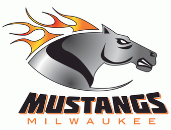
I hope to get some C&C on the Does, but in the meantime I'm going to move forward with my next team in the series and resurrect both the Arena Football League and the Milwaukee Mustangs!
I wanted this logo to reference the history of the Mustang name in Milwaukee as far as Arena Football is considered, while also still making it feel like part of the same larger organization that would own the Bucks, etc. I used the general design of the original Mustangs logo as the base, but changed the horse to something that isn't the same, but has some similar notes to their first revival logo. Of course I used the Bucks' color pallette and font. Simce I'm referencing old logos in the design, I posted the real-life Mustangs logos below my logo for comparison.
-
2
-
-
These are great! Toronto and Quebec are amazing!!
-
I have the first logo ready to share: The Milwaukee Does of the WNBA! While it is pretty blatantly derivative and shares intentional features to the Bucks logo, part of the idea is to extend their current branding. I tried to soften some of the angles in the deer to give it a less aggressive feel, and added some more of the blue to help differentiate it from their NBA counterparts. Enjoy!
-
6
-


2022 NFL Redesign -- Week 1 Matchups / Series Wrap -- Added 07/09/2022
in Concepts
Posted
People saying that doesn't surprise me at all, but I also would fall into the camp that thinks it's a good look for them. Plus, isn't the point of alternate uniforms partially so that a team can do something outside of the box with their look once in a while without making a fulltime commitment to a change? It's the perfect opportunity for a tradition-heavy team to experiment a little. These are well done, you were able to add to the designs without taking away from the timeless nature of their current uniforms.