


logo-maker
-
Posts
557 -
Joined
-
Last visited
Posts posted by logo-maker
-
-
1 hour ago, LMU said:
Something tells me it's not the wisest decision to get yourself suspended for six months for a positive drug test when you're tied for your team's lead in playoff goals.
Addiction sucks. The Avs played better with Val that without, but it's sadly time to move on and hope he finds the help he needs to clean up.
-
 1
1
-
-
1 hour ago, MDGP said:
Today we head back to the AFC South

Texans: One of the things that can get lost in these types of concept series is the fact that it was very common to see plain jerseys during the 20s-40s. The Texans, until about two weeks ago, have always had a very traditional uniform, so they seemed like a perfect candidate to simplify even more, sporting a plain navy blue jersey with plain white pants and plain navy blue socks. The helmet holds all the design details, featuring red bull horns that would act as a slight precursor to the Rams' and Eagles' helmets and a lone white star on the front of the helmet. There weren't any pro teams in the late 40s who sported a from helmet logo, but there had been teams in previous season who did sport one, so it's plausible that a team might try to revive the idea.
Jaguars: The Jaguars sport a pretty traditional 1940s look with albeit with an nontraditional color. Here, the look uses a black-teal-black northwestern stripe on the sleeves with teal numbers. While white jerseys were still relatively rare at the time, the teams that did wear white almost always wore socks matching the number colors, so here the socks are teal with a white-black-white northwestern stripe. Hey, remember when the Jaguars wore the ugliest helmet in NFL history with the harsh split gold and black gradient? Well in this world that helmet was a callback to the team's classic look of the 1940s! This type of two-tone helmet featuring a sort of circle of color on the sides with a different color top was worn by the Philadelphia Eagles throughout the 1940s.
Titans: The Tennessee titans own the double blue look in the NFL, which is why thanks to wanton mismanagement, the currently barely wear one of the colors. I really wanted to focus on emphasizing the double blue, giving both colors a chance to stand out, much like the Titans of the 90s-2010s. Here, they sport a powder blue jersey with a thick double stripe that had been word on a few occasions by a few teams. The look was never a staple, but it showed up enough that I felt comfortable using it. I debated going with white pants, but ultimately chose brown leather to further emphasize the late 20s early 30s look I was going for. Finally, the helmet features a Navy and Light Blue variation of the Michigan helmet with the stripes being cut off about halfway down the helmet, a design choice that was not uncommon at the time.
Colts: This is the second and final jersey inspired by the original AFL of this series. American Football was still figuring out its aesthetic during the 1920s and early 1930s, and as a result, there were some pretty loud designs mixed in with what would eventually become the aesthetic we know and love today. I wanted to use the colts to show that variety in one package. First, the jersey features blue raglan sleeves with contrasting white sleeve stripes. This takes its cues from teams like the sleeves of the Green Bay Packers, the Rochester Tigers, and the New York (football) Yankees. The blue pants were inspired by the rapid shift from brown to color pants by teams like the Cincinnati (football) Reds, Brooklyn (football) Dodgers, and the St. Louis Gunners. By 1940, color/white pants were the standard, and only Green Bay and Washington would wear brown leather style pants through the 40s. Finally, the helmet once again is inspired by the helmets of original AFL teams. This felt fitting as the Colts were the first team in NFL history to place their logo on the sides of their helmet (I am not including the Rams or Eagles helmet designs as logos).
For your Indianapolis Colts concept, I feel like it's a missed opportunity to turn the horse shoe on the helmet sideways to create a 'C' on the front or is that too on the nose.
-
23 minutes ago, rfraser85 said:
I wonder if the Broncos have an advantage or disadvantage if they play in the Mexico City game. They already play at altitude, but they've never had to adapt to playing higher above sea level. Altitude masks can only simulate so much.
As a Denver native, I can tell you that I have gotten altitude sickness going a few thousand feet up into the mountains on hikes and camping trips. For me, it acclimation to the thinner air.
-
1 hour ago, Survival79 said:
Utah Yetis is pretty gouda.
I think all these Utah names are Provo-lone... err overblown.
-
1
-
 6
6
-
 1
1
-
-
Per having logo/branding issues with the guardian caps, there is this:
-
4
-
-
My thoughts on the new Texans uniform set:
PROS:
- The red helmet with bull horns is a great alternated helmet
- Road jersey horn striping
- Keeping the current blue helmet
- some sort of pant stripe
CONS:
- They should have flipped the design motive on the home and alternate red so that the home and road have consistent designs and the alternate has the primary logo on the sleeve to offset the bull horns on the helmet
- Pant stripe only goes partial up the leg
- Inconsistent color usage on the H=Town alt, would have made the H on the helmet red or the numbering H-Town blue
- Numbers are a poor update from the prior font
Overall, it's a mix and trying to have something for everybody without developing consistency across all uniform elements in the design.
-
3
-
-
My thoughts on the Ford... I mean Denver Broncos new uniforms:
PROS:
- Base jersey design is good and is most likely partially based on the '65-'66 jersey
- Navy helmet as primary
- Pant stripes (for the most part)
- Nike story telling dodads are small and/or sublimated, and do not show up from distance
- Mix and match possibilities could look really good
CONS:
- White logo on white helmet
- Helmet 'stripe'
- Named uniform combinations (hopefully they wear more than those shown)
- The primary set (home, away, alternate) feels like a bunch of designers from Nike googled 'broncos' and came up with the Ford Bronco and connected it with Colorado/mountains (5280 for the Denver connection) as their design process without thinking about any other local or 'broncos' based design
Overall, they fans will always push for nostalgia (the '77 jerseys will sell very well), but the team will always go for multiple options (modern versus throwback) to appease everyone and sell more jerseys.
7/10
-
3 minutes ago, BJ Sands said:
Mmmm... Sock Stripes!
-
 1
1
-
 1
1
-
-
49 minutes ago, ManillaToad said:
Oh God they're going to subject us to a year of "Lol the Stars are playing Hockey Team
 " before we even get to whatever terrible collective noun they choose as a name
We can only hope they look that good
 .
.
-
3 minutes ago, WBeltz said:
Ok, someone tell Denver they're next. The board has got to explode.
I have a feeling that Denver is going to go the route of Atlanta's most recent uniform redesign and have more subtle, and potentially sublimated design elements with a focus on local colloquialisms and an over designed helmet.
-
1
-
-
-
26 minutes ago, KouPilot said:
Well I'm gonna assume this is the new number font and the cursive font for "release date" will be a new script logo for the broncos
I'm wondering if, instead of blocks of different colors, that we see a sublimated mountain design on the sleeve caps for both home and away jerseys.
-
I don't mind TV numbers on the sides on helmets, as long as they are placed on both sides (looking at you college football
 ).
).
-
3
-
2
-
-
21 hours ago, The_Admiral said:
If Philadelphia were to have a symbol, what do you think it should be?
Cross promotion answer:
-
3
-
1
-
-
Super Bowl LVIII
SUNDAY:
Kansas City over San Francisco
-
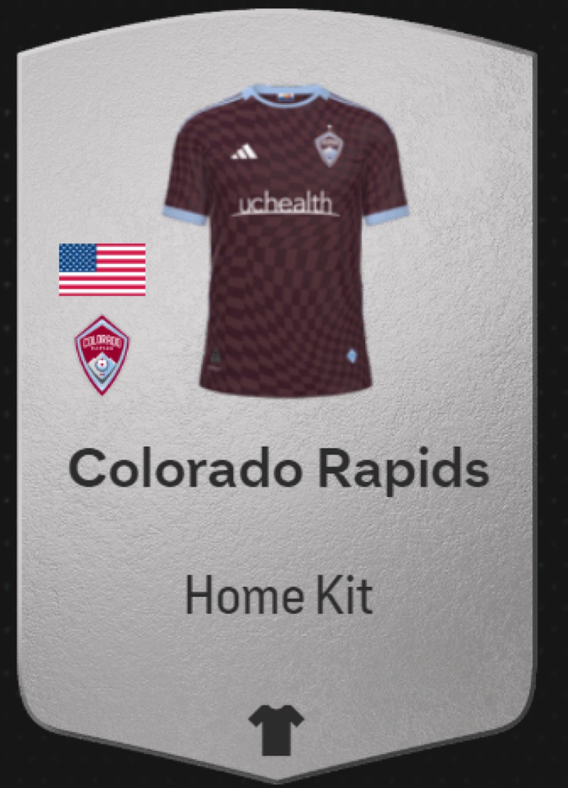
I really wish the Rapids would be a little more creative with their home kits. Maybe bring back the white sleeves or vertical stripes from the black and blue era.
-
3
-
-
Conference Championships
SUNDAY:
Baltimore over Kansas City
San Francisco over Detroit
-
Divisional Round
SATURDAY:
Baltimore over Houston
San Francisco over Green Bay
SUNDAY:
Detroit over Tampa Bay
Buffalo over Kansas City
-
Wild Card Weekend
SATURDAY:
Cleveland over Houston
Kansas City over Miami
SUNDAY:
Buffalo over Pittsburgh
Dallas over Green Bay
Detroit over LA Rams
MONDAY:
Philadelphia over Tampa Bay
-
18 hours ago, wildwing64 said:
I like it more than either of their previous black alternates and the sleeve stripes are a neat nod to the victory stripes. It's very okay.
Agreed. Although, I wish they had doubled the stripes (and potentially added silver/gray) to emulate the victory stripes more so and create a more visually interesting sleeve stripe pattern.
-
5
-
-
Week 18
SATURDAY:
Baltimore over Pittsburgh
Indianapolis over Houston
SUNDAY:
Cincinnati over Cleveland
Detroit over Minnesota
Jacksonville over Tennessee
New England over NY Jets
New Orleans over Atlanta
Tampa Bay over Carolina
Green Bay over Chicago
Las Vegas over Denver
Philadelphia over NY Giants
Seattle over Arizona
Kansas City over LA Chargers
San Francisco over LA Rams
Dallas over Washington
Buffalo over Miami
-
Week 17:
THURSDAY:
Cleveland over NY Jets
SATURDAY:
Dallas over Detroit
SUNDAY:
Buffalo over New England
Atlanta over Chicago
Indianapolis over Las Vegas
LA Rams over NY Giants
Philadelphia over Arizona
New Orleans over Tampa Bay
San Francisco over Washington
Jacksonville over Carolina
Baltimore over Miami
Houston over Tennessee
Seattle over Pittsburgh
Denver over LA Chargers
Kansas City over Cincinnati
Green Bay over Minnesota
-
Week 16:
THURSDAY:
LA Rams over New Orleans
SATURDAY:
Cincinnati over Pittsburgh
Buffalo over LA Chargers
SUNDAY:
Atlanta over Indianapolis
Seattle over Tennessee
Detroit over Minnesota
NY Jets over Washington
Green Bay over Carolina
Cleveland over Houston
Jacksonville over Tampa Bay
Chicago over Arizona
Miami over Dallas
Denver over New England
MONDAY:
Kansas City over Las Vegas
Philadelphia over NY Giants
San Francisco over Baltimore
-
Week 15:
THURSDAY:
LA Chargers over Las Vegas
SATURDAY:
Cincinnati over Minnesota
Pittsburgh over Indianapolis
Detroit over Denver
SUNDAY:
Cleveland over Chicago
Green Bay over Tampa Bay
Houston over Tennessee
Miami over NY Jets
Kansas City over New England
New Orleans over NY Giants
Atlanta over Carolina
LA Rams over Washington
San Francisco over Arizona
Dallas over Buffalo
Baltimore over Jacksonville
MONDAY:
Philadelphia over Seattle


The arranged love child of ESPN, TNT, and Fox Sports
in General Design
Posted
...or an 'e' or 'es' and been VENUE SPORTS or VENUES SPORTS