


steve61
-
Posts
489 -
Joined
-
Last visited
Posts posted by steve61
-
-
-
-
-
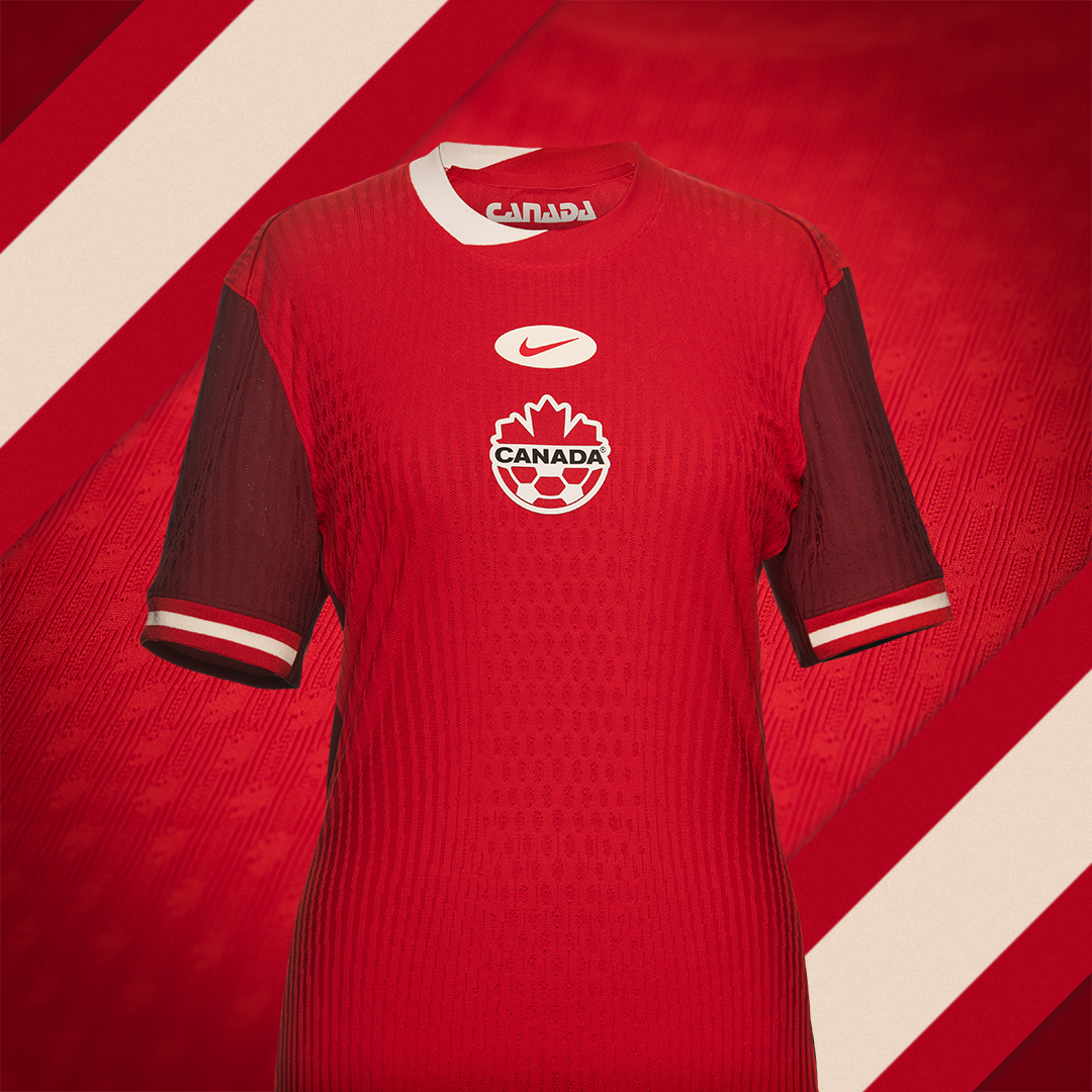
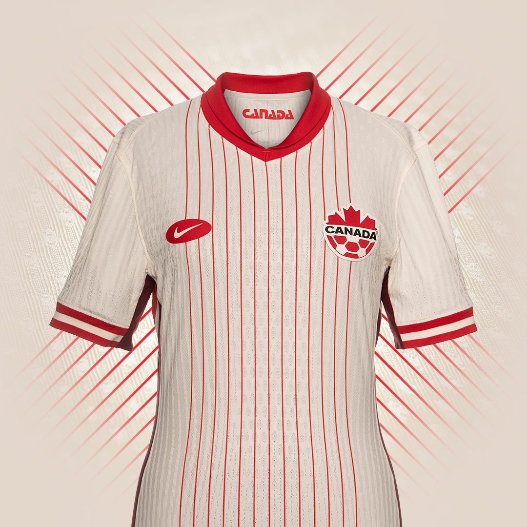
Vancouver FC

-
York 2024 Primary
-
The Bucks used to.
-
 1
1
-
-
8 hours ago, monkeypower said:
What are you talking about?
"The chevron comes up far too high, taking up way too much space"? The chevron is barely the bottom third of the jersey and the highest point doesn't seem any higher than the highest point of any basic hem striping.
"the point doesn't follow a natural flow in any meaningful way"? It's the middle of the jersey.
It looks like a fat guy tucked the front of his jersey into his breezers. It's appauling in every way a jersey can be. But that's just my humble opinion : )
-
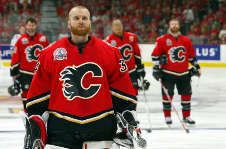
7 hours ago, ruttep said:
It's probably to appeal to the smooth brains out there that still think there should be black in the Flames' color scheme.
This is not a bad uniform (I would argue it isn't anything special either), but it does not make sense for the Flames. It gets repeated a lot, but the black in the logo does make the "C" look "burned out"
I'd be one of the few to argue that it IS in fact a bad uniform. The bottom half looks like it's swallowing up the red portion of the jersey. The weird chevron comes up far too high, taking up way too much space and the point doesn't follow a natural flow in any meaningful way. It's like they took two completely random jerseys and stiched them together. Also the black C is terrible.
-
3
-
 1
1
-
-
Has there been any update to the rumour a few months back that the Jets will be changing their home/away to some version of their Heritage Classics for 2023/24?
-
15 minutes ago, monkeypower said:
There aren't great?
They're supposed to be oars I gather, but Oregon Argonauts.
Oar-egon Argonauts
-
2
-
 8
8
-
-
51 minutes ago, kiwi_canadian said:
Yes. If I recall what they said when the federation logo was first introduced, it went something along the lines of the fire at the bottom is a connection to volcanic activity that is constant in Iceland and its in the shape of a maple leaf because of the connection to Canada that Iceland has with hockey. Fun fact, the first Olympic gold medal for hockey was won by the Winnipeg Falcons, a team made up of Icelandic Canadians. Here's the Heritage Moment where Jared Keeso of Letterkenny fame plays the coach.
Very cool! Thanks. I was aware of the Falcons but had no idea about the Icelandic connection.
-
7 hours ago, kiwi_canadian said:
Iceland has got into the new Nike template with their new jerseys for the upcoming World Championships:
This is a replica that they are selling on their federation website.
Is that a maple leaf at the bottom of the crest?
-
14 minutes ago, tigers said:
Yeah i guess 99% of the USA would think it's a Gridiron Ball.
If you know what it is because you seen the logo next to it i suppose you could crack the code.
")
I didn't realize the U.S. populous was the target audience of a South American rugby federation. My bad!

-
52 minutes ago, tigers said:
Looking at it, to me it's some type of colourful upside down U.
Who does it represent?
What is it?
We do not know enough about this country or sport to know.
I suppose a toucan in the shape of a rugby ball would be a difficult code to crack in some universe
-
2
-
1
-
-
3 hours ago, DTConcepts said:
Interesting note, but I think the Leafs are the first team to use the faux-vintage Adidas collar on a non-Winter Classic jersey.
The double hem stripes look so much better than what they're currently wearing. I really hope they eventually go back to this look. The shoulder yokes would be a nice touch too. So basically this jersey with the current logo.

-
2
-
-
-
12 minutes ago, AFirestormToPurify said:
The antlers were better
Disagree, worst case scenario, go back to the drawing board and come back with improved antlers. It could have been their thing. Nope, they'd rather look like the CFL Packers. Disappointing
Agreed. Even adding a white border to thicken the antlers would have been sufficient. While this new helmet is nicer than any of their previous EE helmets, the antlers actually stood out among a league of letter logo helmets. Disappointing but not at all surprising.
-
3
-
 1
1
-
-
-
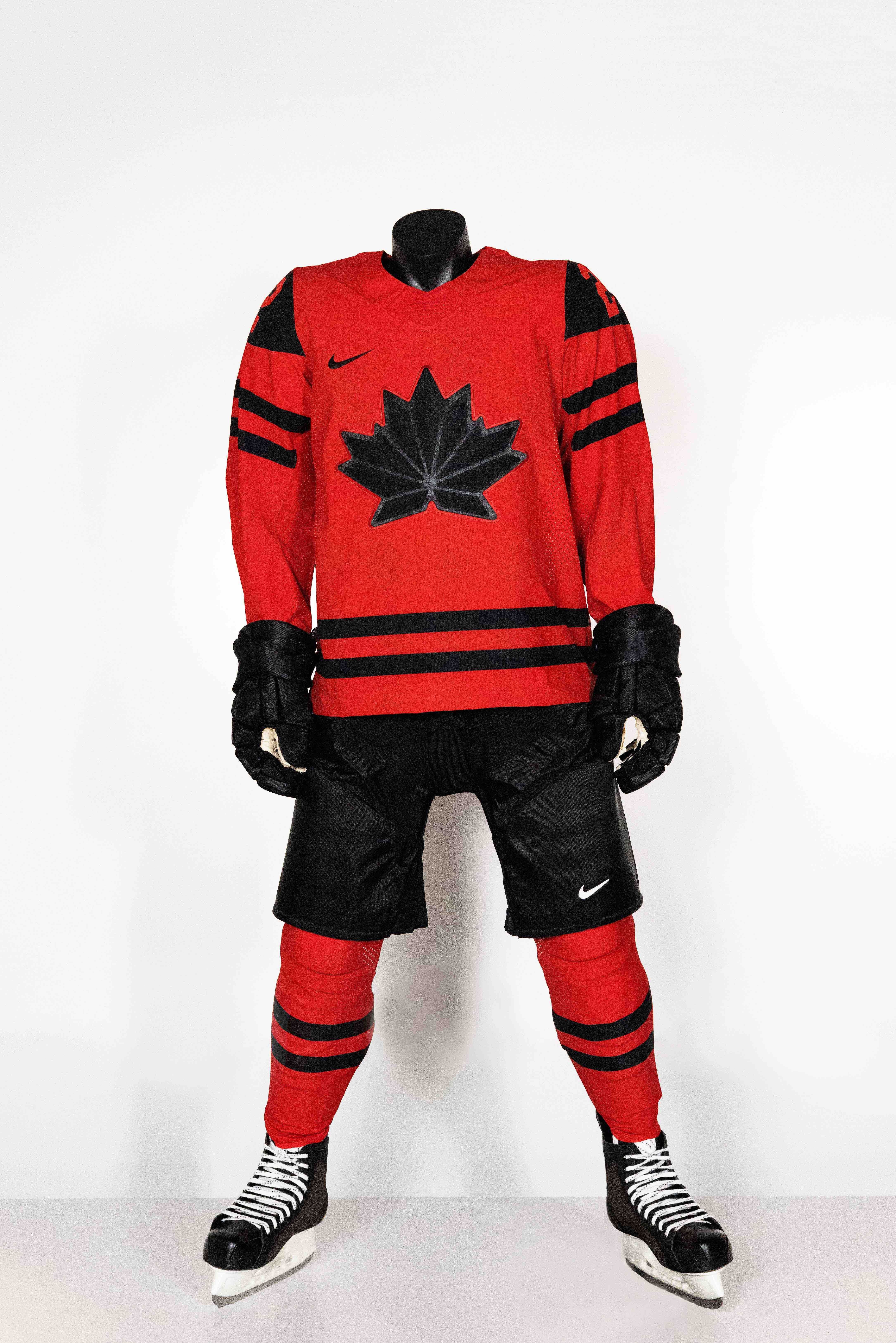
9 hours ago, kiwi_canadian said:
This Canucks-Flames game is a very good looking game. The last time these two teams looked like this was the 1994 playoffs with Bure beating Mike Vernon to send the Canucks into the second round... Dare I say, I would be okay if the Canucks brought the flying skate back full time, if not full time, then as the alternate.
-
5
-
3
-
-
12 hours ago, habsfan1 said:
This took 5 minutes to make. There's not much that can be done with "Arenas" anyway.
And somehow they managed to do even less than "not much"
-
1
-
-
1 hour ago, GT Designs said:
Nike owns Bauer
I believe Bauer still licenses some Nike brands but Peak Achievement Athletics (Co-owned by Fairfax & Sagard) now owns Bauer Hockey.
-
1
-
-
-
-


")


2024-25 NHL Changes
in Sports Logo News
Posted
Salt Lake Magic Underwear. All white homes and aways.