


steve61
-
Posts
493 -
Joined
-
Last visited
Posts posted by steve61
-
-
-
-
31 minutes ago, spartacat_12 said:
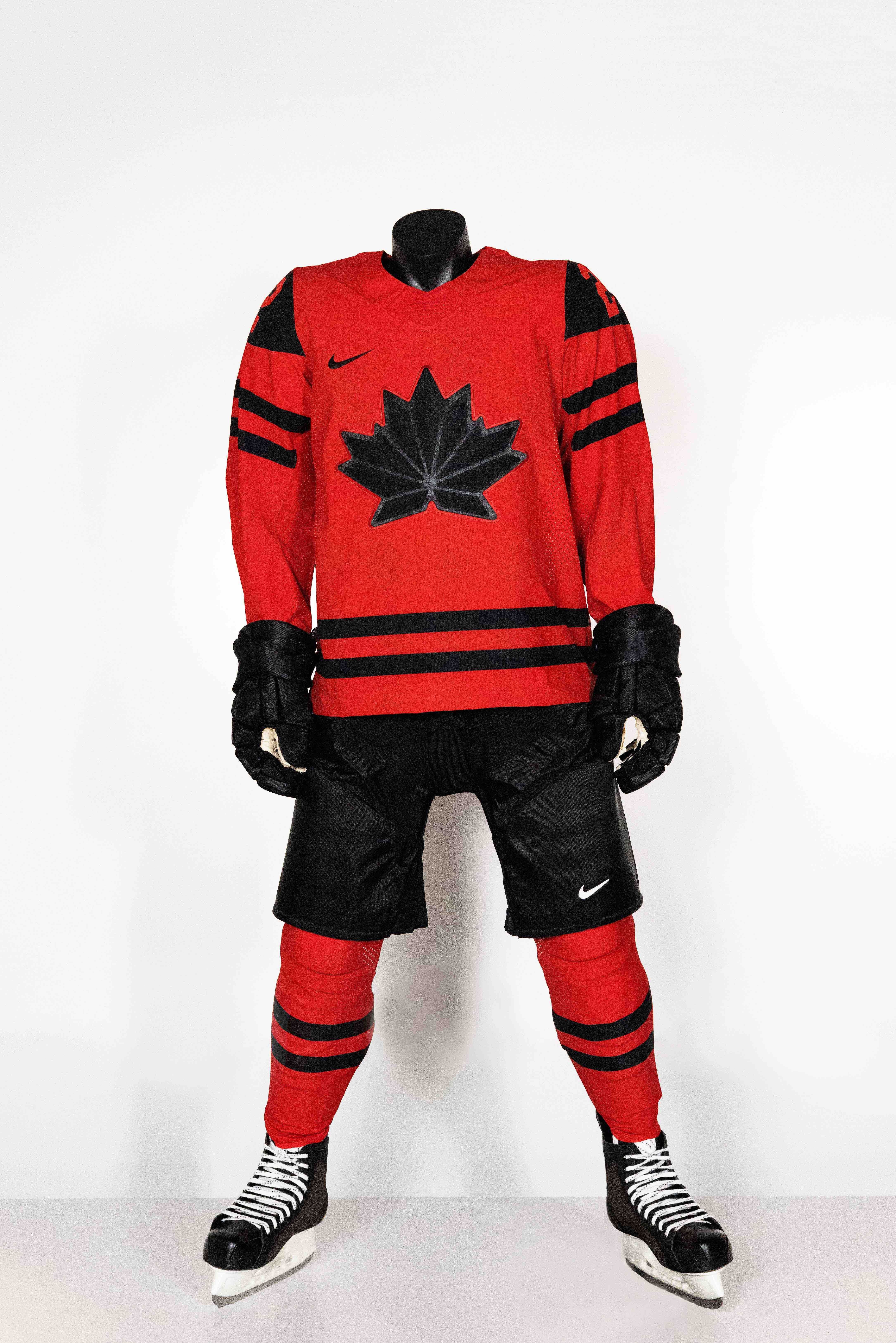
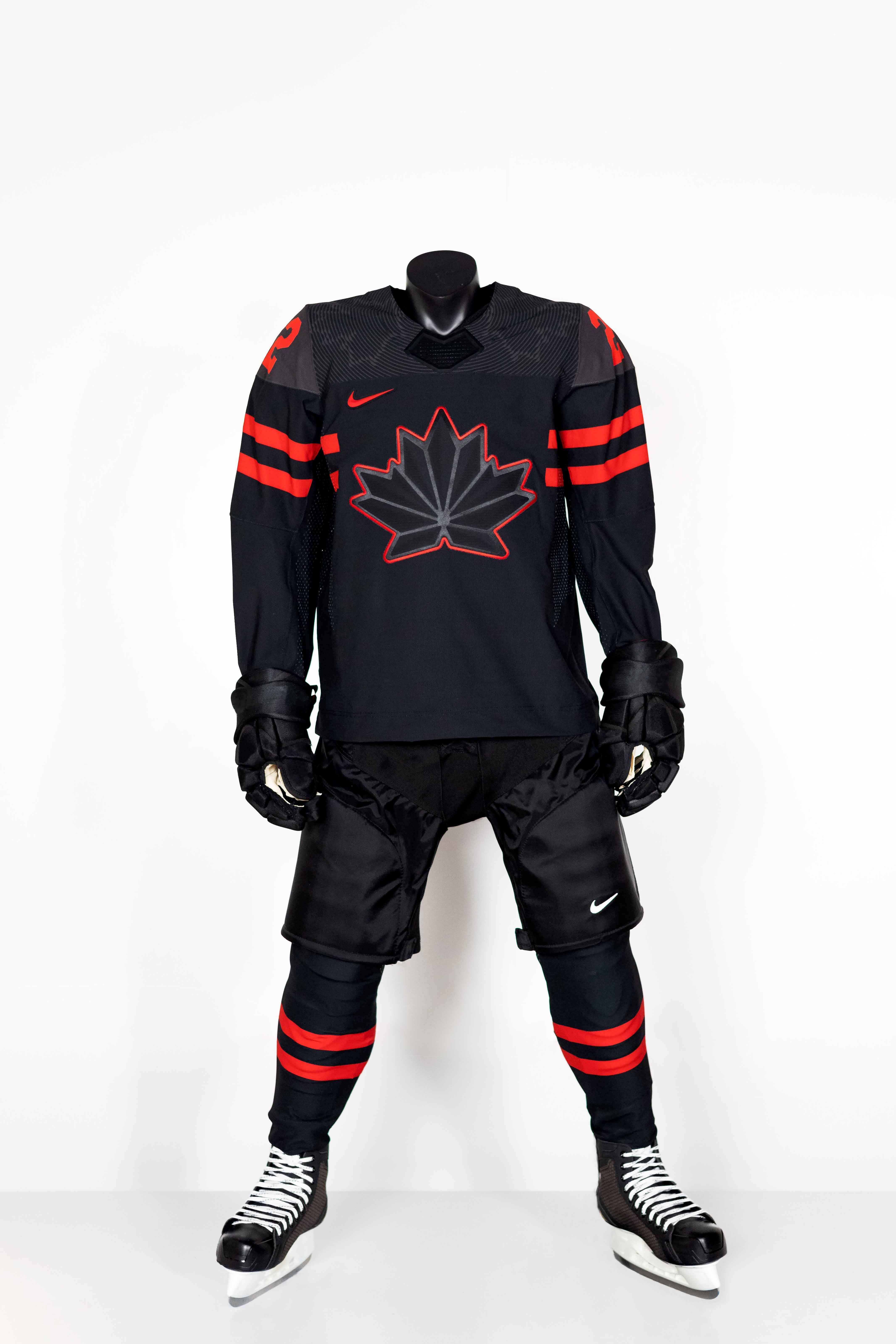
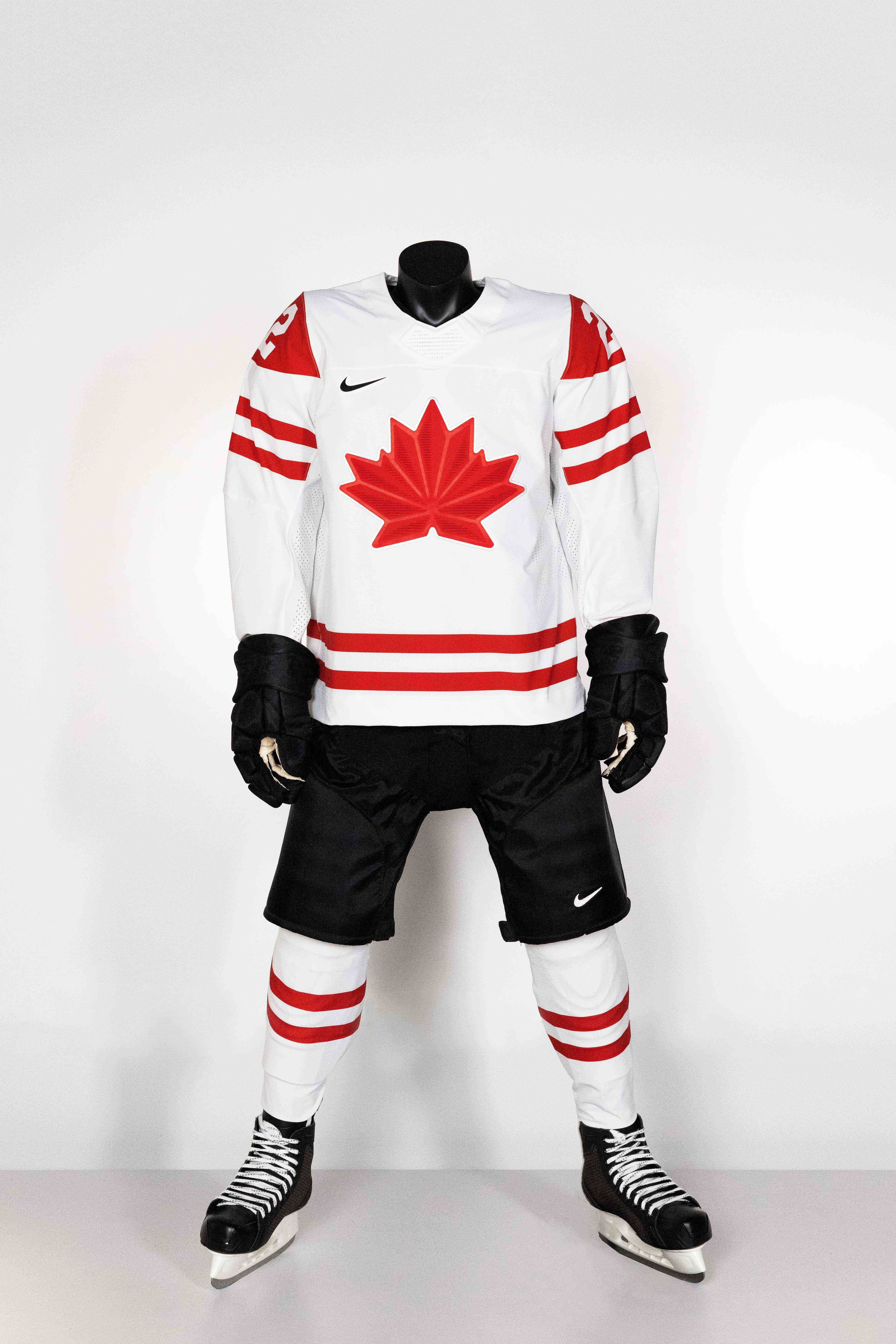
It looks like we may have a sneak peek at Canada's jersey for the upcoming Olympics:
https://www.instagram.com/p/CVV0fPehr5P/
I don't hate the design of the maple leaf, but this is way too much black. In my perfect world the Canadian hockey teams would never wear black at all, but if they feel the need to include it, it should be nothing more than a tertiary colour. The recent 'Heritage' jerseys they used & the WCH set from a few years ago were close to ideal.
Canadian Olympic teams are obsessed with black. Even the Canadian Olympic Committee's most recent website and social media page updates this summer are dominated by black. It's trend that I unfortunately don't see changing anytime soon. That said, I do like the style of the new leaf logo if this is in fact a leak.
-
 2
2
-
-
51 minutes ago, Ark said:
Is the Flames red darker?
I like it.
I think it's just the lighting. Pic from the draft looks like the usual shade.

-
7
-
-
Argos new helmets in action
-
In the Canadian Premier League section, the York 9 logo still hasn't been replaced with the York United update. Thanks in advance
CPL Logos - Canadian Premier League Logos - Chris Creamer's Sports Logos Page - SportsLogos.Net
-
26 minutes ago, DEAD! said:
I am not how to feel about this. While it's nice the boat is back, I would rather it be a secondary logo.
I'm just glad the shield's finally gone. And while a re-coloured Jason logo looks amazing on paper I think the boat somehow works better on a helmet.
-
1
-
-
It looks quite a bit like the latest version of the CBC logo and wordmark.
-
3
-
-
Duo Security and Toronto's Go Transit.
-
7
-
-
Sonoco
The new Scotiabank logo
-
5
-
-
Warner Music
TV Ontario
-
1
-
-
9 hours ago, Ice_Cap said:
Sorry for the lack of replies previously.
What goes on the Mothership (the main CCSLC site) has nothing to do with moderation. As moderators we are simply charged with, well, moderating the message board. Uploading logos to the main site is something Chris himself oversees. 9 times out of 10? The lack of uploads is due to simply not having enough people to give the project priority. I would recommend reaching out to Chris himself and letting him know it's something you want to see. Offer your services even, if it's something you think you'd like to work on.
I'll give that a shot. Thanks
-
I've asked before but still no answer so I'll throw it out there again. Any chance of seeing the Canadian Premier League logos on the main board? If not is there some copyright reason?
Thanks in advance
-
Any chance of adding Canadian Premier League logos to the main database? Thanks
-
1 hour ago, nuordr said:

Canada Post says hi

-
7
-
-
3 hours ago, BringBackTheVet said:
The seats in edmontons arena look terrible. They had better sell that place out.
Shame to lose the double logo outside the circle at center ice too.
They're t-shirts. Seats are black
-
3
-
-
-
-
-
1
-
-
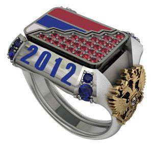
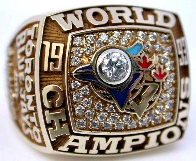
2012 IIHF World Championship ring for Team Russia. Came across it randomly on tumblr, it's different, that's for sure.
I really like that. A completely unique looking championship ring is hard to come by these days.
-
-
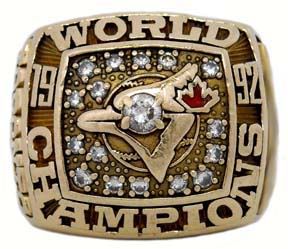
Now I'm curious about what is the oldest Grey Cup ring (which might in fact be 1928) or the oldest Stanley Cup ring?
1893 Stanley Cup

http://www.greatesthockeylegends.com/2010/04/1893-stanley-cup-ring.html
-


Up to date IIHF Jerseys
in Sports Logo News
Posted
I believe Bauer still licenses some Nike brands but Peak Achievement Athletics (Co-owned by Fairfax & Sagard) now owns Bauer Hockey.