

GeauxColonels
-
Posts
7,943 -
Joined
-
Last visited
Posts posted by GeauxColonels
-
-
Does anyone know of a free font similar to Minnesota Plaid?


-
An instagrammer known as @helmetconcepts is trying to sell t-shirts using not only copyrighted NFL & NCAA logos, but also on Davidson's template. A lot of people on there, including me have tried to tell him he can't do this. But he insists that he actually has a license to sell NFL merchandise...

And they aren't even good concepts, flat images shoved into the template, bad patterns thrown on in haste and he has absolutely zero skill in applying center stripes to the template.
-
I like the lighter shade of gold helmets the 'Noles wore at the beginning of the season. The darker helmets don't match the rest of the unis.
-
Hello again friends a new contribution to the forum , happy new year to all
Thank You


Very nice. Well done.
-
 1
1
-
-
FIFYCame across this Celtics modernization today while checking my behance page & thought I'd share it with you. All credit for this design goes to christophe lizet!
If you get a chance go over & check out the work, hers's the link: http://s332.photobucket.com/user/ren1969/media/BostonCelticsModernization2.jpg.html?sort=3&o=6#/user/ren1969/media/BostonCelticsModernization2.jpg.html?sort=3&o=6&_suid=141844168157109610971993592199


Holy
 Christophe lizet!
Beautiful!
Reeding iz hard
-
1
-
-
Very interesting video. Thanks for sharing.
-
Came across this Celtics modernization today while checking my behance page & thought I'd share it with you. All credit for this design goes to lizet christophe!
If you get a chance go over & check out the work, hers's the link: http://s332.photobucket.com/user/ren1969/media/BostonCelticsModernization2.jpg.html?sort=3&o=6#/user/ren1969/media/BostonCelticsModernization2.jpg.html?sort=3&o=6&_suid=141844168157109610971993592199
Very nice, the ONLY thing I don't care for is the lighter green highlights around the edges of the roundel. But it's a great update.
-
I've looked through a number of athletic block fonts, but can't seem to find an exact match for this one:

-
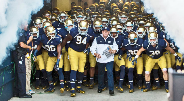
I absolutely LOVE Notre Dame's pants and helmets. I like that they don't match. It gives it a throwback feel, IMO. And, I don't really care for shiny gold pants anyway since they would never get them to match those golden domes. So I would rather a drastic difference rather than a slight difference like you see with the Saints' pants and helmets.

-
I like that. It will make a nice hat logo.
-
well I'm not sure whether he has bought these logos from the maker, but here:
Stolen Saints logo: http://mvptees.com/collections/frontpage/products/kap-copy
Stolen Eagles logo: http://mvptees.com/collections/frontpage/products/t-dallascopy
Stolen Jets logo: http://mvptees.com/collections/football/products/packcopy-1
Stolen Colts logo: http://mvptees.com/collections/football/products/bosscopy
Stolen Browns logo: http://mvptees.com/collections/football/products/luckycopy
& I know he removed others from the site, but here is where the logos came from, I recognized them as soon as I saw them
I seem to recall seeing this Detroit Lions logo posted on here as well: http://mvptees.com/collections/frontpage/products/dencopy
-
http://www.bethanywv.edu/files/3013/5774/5166/4827AthleticLogo.gif
Someone please make this logo look more modern or realistic
Helping you out here with that image post:

-
One day I hope to be able to contribute to this thread. I think I still have a little ways to go before I'm at that point.
-
1
-
-
Can someone take a shot at this old Oklahoma State logo (the one on the helmet, not including the helmet itself)?

Or this one?

The one on the helmet is in need of a makeover, but you shold probably try to find a better view of the decal. The second image is already updated. Nothing needs to be done to that one.
-
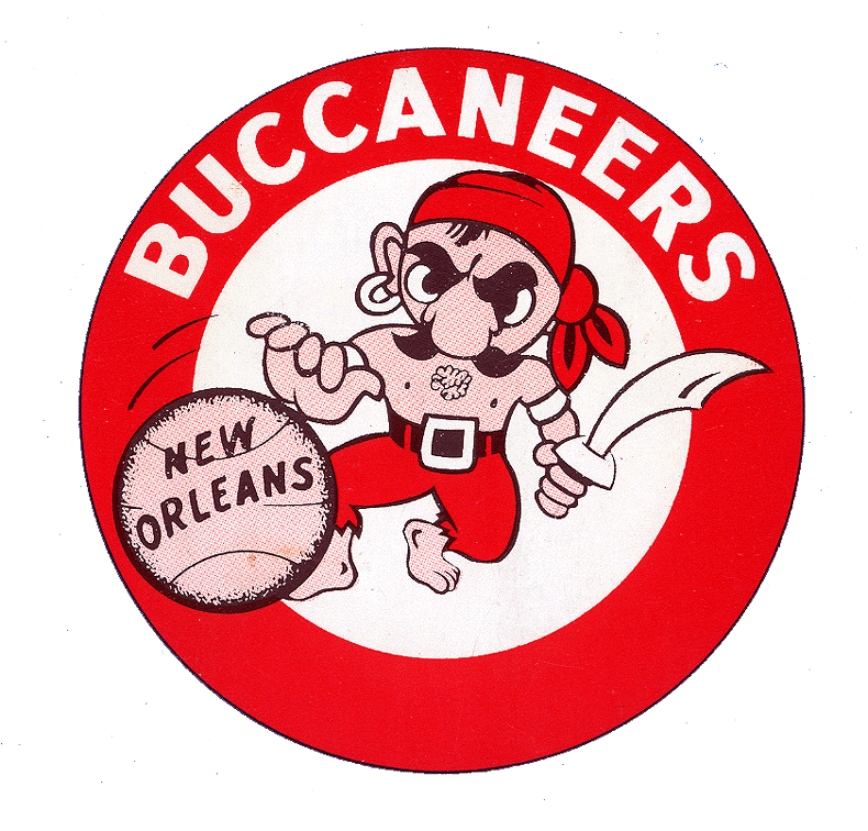
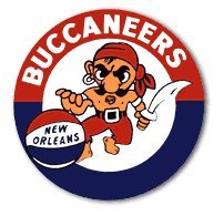
That's a great looking logo, I've never heard about that team.
That Delgado update is BRILLIANT! Delgado is a community college in New Orleans. They're known as a JUCO baseball powerhouse. LSU and Tulane get a number of their transfer players from Delgado.
I'll have to send this logo to my brother-in-law, he used to work as a trainer for the baseball team over there.
-
1
-
-
Great work on the Bullets logos, as always.
And BIG PROPS to mdlesatz. Your updates are spot on as well. Very nice.
-
Beautiful. Well done.I found an old Rice logo that hadn't been done yet, thought I would give it a go.


-
I was thinking the same thing.A big thank you to the award's namesake for pinning this for us. It appears that no one lords over concepts as a mod anymore
 (and Gary for sending Chris a message on FB for us).
Looks like it's high time that a new mod or two were named for the concepts then, don't ya think?
Here here. Coincidentally, I think the panel of judges for the Creamers would be the best candidates for mod-hood.
-
A big thank you to the award's namesake for pinning this for us. It appears that no one lords over concepts as a mod anymore
(and Gary for sending Chris a message on FB for us).Looks like it's high time that a new mod or two were named for the concepts then, don't ya think?
-
1
-
-
I've always been partial to seeing an updated look for Ol' Sarge from A&M

If you don't mind, ren, I'd like to take a crack at this guy.
ren this is awesome. It's a big eye-opener for someone like myself who has done very little using the pen tool. This gives me a much better idea of how it should be done. I've always tried to use a few nodes as possible, but it appears that you were fairly liberal in your use of nodes. I will definitely have to keep that in mind moving forward.
The pen tool is incredible, but the learning curve is steep.
I used to have a worksheet for my students (I used to teach this stuff at Bradley University) to help them practice. I'll see if I can dig it up.
That would be awesome. I first used the pen tool when I updated by NCAA FCS fantasy team's identity here.
-
ren this is awesome. It's a big eye-opener for someone like myself who has done very little using the pen tool. This gives me a much better idea of how it should be done. I've always tried to use a few nodes as possible, but it appears that you were fairly liberal in your use of nodes. I will definitely have to keep that in mind moving forward.
-
Fantastic as always. The pirate logo looks awesome.Had a little free time last night & this morning...


-
Throwing this back out there:
-
ren, the picture isn't showing for me.


 Christophe lizet!
UPDATING VINTAGE LOGOS
in Concepts
Posted
That's not for the University of Virginia?