


pepis21
-
Posts
2,757 -
Joined
-
Last visited
-
Days Won
1
Posts posted by pepis21
-
-
15 hours ago, dont care said:
Yea but when you are losing in all of your uniforms you have to thing maybe it’s the team that sucks and not wearing orange uniforms.
Ewing curse
-
18 hours ago, LA Fakers+ LA Snippers said:
The Knicks went 181-348* in the rest of their jerseys, so a losing record shouldn't deter them.
*As of 04/27/2021
At least they won something in other uniforms.

Anyway all reports said that they ditched orange uni because of notorious losing.
-
 1
1
-
-
Forgret it, Knicks are 0-8 in orange unis (0-6 in alternate and 0-2 in Christmas) so I don't think if they ever back to that color.
-
1
-
-
This is why I'd prefer to see original aways on Euro and new jerseys could be use after tournament when new shorts and socks should be provide.
Czech with volt shorts would look even uglier tan Austria.
-
1
-
-
On 4/24/2021 at 4:02 PM, Digby said:
Austria.... what?

They mixed new jersey with old shorts and socks. It would be nice if teams use their original aways on Euro but it won't happens.
-
I wouldn't say trefoil was supposed to be on jersey. FH are losing credibility over the years.
Pattern on third is built using "maple leafs" shapes from 92/93, 15/16 (third) or 17/18 away jerseys. At least from my pov.
-
53 minutes ago, DNAsports said:
Ironically, all have been for throwback uniforms like you said
Thowbacks but I mean regular e.g Vikings white for home, black for away and gold for color rush.
-
2 hours ago, gosioux76 said:
The Vikings wore white masks briefly in the early ‘80s. I thought they were too much of a distraction, and looked especially bad with the white uniforms. Switching to purple masks was a big upgrade.
I think there is a solution for this. If we can't have alternate helmets, why can't we have alternate masks instead?
-
2
-
-
Nope, you're not the only one, I would also like to see Vikings with white facemask. Black facemask for Raiders sounds great too and what about Bills in my opinion red helmet>white helmet.
-
1
-
-
5 hours ago, Digby said:
Assuming this is for the Olympics? Maybe there will be a USMNT one as well for Gold Cup, or something different.
United third vibe.
-
1
-
-
1 hour ago, habsfan1 said:
Staying in the same category. I like 'Wild' as a name.
-
9
-
-
18 minutes ago, burgundy said:
I'm guessing it's because the Packers throwback was designed during the Reebok era.
Except it was introduce one year before WTF and reebok didn't manufacture helmets.
-
8 hours ago, DNAsports said:
I wonder why Packers didn't do the same faux leather helmet as WTF which was amazing looking and I would love to see it again on field.
-
7
-
-
14 hours ago, Cujo said:
While a decent question, the Colts aren't changing their iconic look (again) anytime soon.
That's for sure, but it would be good to know which parts are listed as a "Minor adjustments" and which as a "redesign".
14 hours ago, kb105 said:If that is the case, the Colts would probably be considered a redesign because a whole new number font was used, new logos were added, and the anvil-forge-Nikespeak black was added to the away uniform.
On the other hand whole design is still the same even template is still from flywire era. They also didn't add any new logos on uniforms (except that inner-collar "C" logo but it's invisible in game) and helmet probably didn't count if we look at Rams and their white horns which were re-introduced in 2017. Nike logo shouldn't be considering as a change too because it's a manufacturer logo. So imo from all of these changes only numbers could be a reason to applied 5 years rule in this case.
-
On 1/23/2021 at 10:40 AM, dont care said:
You can make minor adjustments, just not for redesigns.
So with that 5 years rules should be applied to Colts or not? They basically only changed numbers font and rest were a minor tweaks.
-
On 11/19/2020 at 6:38 AM, packerfan21396 said:
I haven't had time to look for it myself, but I'll trace some of the numbers and see what I can find.
My mate Rhown extract those numbers from 2k21 I put them on what font is, what the font and it look like a custom font.
-
On 11/19/2020 at 6:38 AM, packerfan21396 said:
You're right, the 90s Magic logo is based off of Van Dijk, but as pepis21 pointed out, the numbers are different. I haven't had time to look for it myself, but I'll trace some of the numbers and see what I can find.
It would be nice! Meanwhile I'll try to modify Van Dijk in Font Creator maybe something will born from that.
By the way, I'll have a request to you for the Marquette numbers you showed in this topic. They could be useful for the NCAA mod which my mates prepare for 2k14.
-
I'm looking for Magic font from their City jersey. Myfonts and Whatfontis haven't got it and this isn't their exact retro font:
I'm aware it might be a custom one but I hope not.
-
Thanks! I need to make few adjustments and will be ok.
-
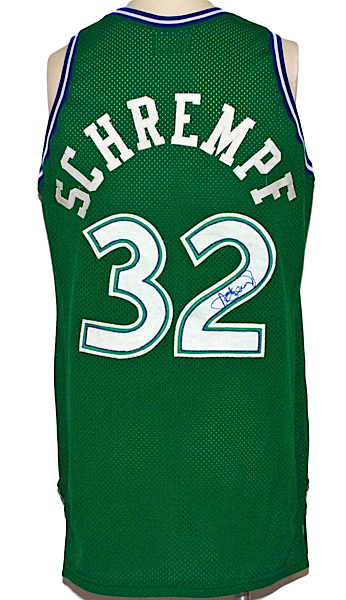
I need help with Mavs numbers font:
Thanks in advance!
-
On 8/6/2020 at 10:05 PM, mgdmhl said:
New Balance does Maine's uniform (any reason to post this image)
-
1
-
-
11 hours ago, Ridleylash said:
The RoboPen is far and away the best logo the team's had. The Skating Penguin is fine, but I love the RoboPen.
Add me to that list too I also love RoboPen and I don't understand why Pittsburgh didn't use it as a Secondary logo. They could make alernate jersey base on it.
-
1
-
-
I never knew about something like a Platypus trophy, but I recognized that is so freakin' cool even if trophy itself doesn't look good.
-
4
-
-
On 6/3/2020 at 4:28 PM, FinsUp1214 said:
I’m not sure if this fits here, considering it was technically “used” somewhere, but this Celtics backdrop caught my eye:
The text on the logo is not the hand drawn version that was used then and is still on the logo today, but looks like an actual font that’s applied (and adjusted a little better) instead.
Except text also ball lines are brown instead of black like on normal logo.
-
1
-


/cdn.vox-cdn.com/uploads/chorus_image/image/21207327/129383161.0.jpg)


2021-22 NBA Changes
in Sports Logo News
Posted
https://bleacherreport.com/articles/1195406-ny-knicks-franchise-doubly-cursed-by-patrick-ewing
They basically became to sucks and done irrational decisions (Allan Houston says hello!) after trading Ewing to Seattle.