


LEWJ
-
Posts
5,996 -
Joined
-
Last visited
Posts posted by LEWJ
-
-
23 minutes ago, TrueYankee26 said:
mariners unveil 2023 all star game logo
Big fan here

-
 2
2
-
-
6 hours ago, MJWalker45 said:
They never had a custom font with UA either, and it's not a good font they used either.
I would love to know who else used this font in 2010
 news to me

-
Saw this on Twitter and I thought it might be appropriate to share.
-
5
-
-
16 minutes ago, Magic Dynasty said:
Straight from the website:
Now we're talking Vandy. No standalone V, no weird star that the V is breaking out of, this.
I actually like the new V-star logo, awkward
This one doesn’t actually look better to me, it just seems to make the “V” look extra squatty.
-
8 hours ago, Silver_Star said:
:censored: it, why can't the Cardinals just ditch that :censored:ing Reebok design and go for their classic Jim Hart, Neil Lomax era uniforms. Those classic ones shouldn't of never been tampered with.. I mean, this franchise was born in 1898, why not something classic and not some ugly looking bull
 that screams amateur arena league.
This is hilariously close to what I texted my buddies the other day. Text copied below, along with the pic I provided.

“I do love traditional looks but i think the cardinals should really lean into it. The stuff they wear now is so stale… I'm honestly all for a rebrand similar to the browns. They are one of the oldest teams.” (Later I added: THE OLDEST*)
I think the Lomax era had the Cardinal between the stripes and TV numbers, otherwise close to the same. It’s just beautiful ugh
-
9
-
 5
5
-
-
17 hours ago, SSmith48 said:
UCF unveiled a new "Knightro" logo, now forward facing. I think it is an improvement over the old one, definitely a good "modernization" so to speak. Looks like they carried over some elements as well (plume on top, general shape/resemblance). Only nitpick is that the divide/black space between the visor and mask parts of the helmet needs to be thinned out a bit, too much negative space there.
Previous knight for comparison:
It's part of a slight* brand update. That Knights script is fantastic, although I think its been used already (football helmets if I remember correctly):
It looks as though they tried to make it appear as both a Knights’ helmet and a football helmet. I feel like the shadow kind of shows that, could just be me.
-
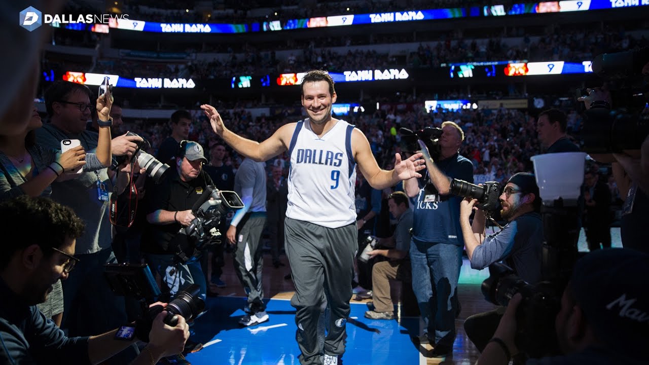
10 hours ago, beast3 said:
What are the chances Mavericks legend Tony Romo's name is listed?
It happened
-
12
-
-
9 hours ago, Digby said:
If you look at last year’s, they already did change the font from their usual one on the regular jerseys to Condensed Futura on the “banner” jersey.Good call, I hadn’t realized that either!
-
Sorry to plug my own tweet, I’m at work and didn’t want to retype

Ignore if already discussed.
-
7
-
-
5 hours ago, sayahh said:
Wasn't the logoman on back supposed to have "75" inside the logo?
Also, Phoenix supposedly opted out.
Good call, you’re right.
-
1
-
-
15 minutes ago, kimball said:
This fugly thing.
It even has the diamond logo

-
1
-
-
-
2
-
-
10 hours ago, OHK said:
New / tweaked home and away uniforms for South Carolina? Did I miss an announcement?
Are the numbers slightly stretched vertically on purpose? I was going to tear into UA but maybe they’ll look normal stretched over pads.I am pretty impressed with how UA has handled South Carolina over the years, but I am glad to see a full-time classic look

edit: I’m realizing the jerseys ARE stretched over pads (duh). We’ll see what they look like on field lol
-
Definitely looks to be refined. Typically it seems they use a double outline or a thick outline. The spacing between the serifs above the "W" is now the same width, it looks like. More balanced.
"old":
Also note the "arch" within the "F".
-
2
-
-
Lindor forgot his jersey...
-
1
-
-

Larry Nance, Jr. will wear #22 starting next week. His dad's #22 will remain in the rafters as well.
-
2
-
-
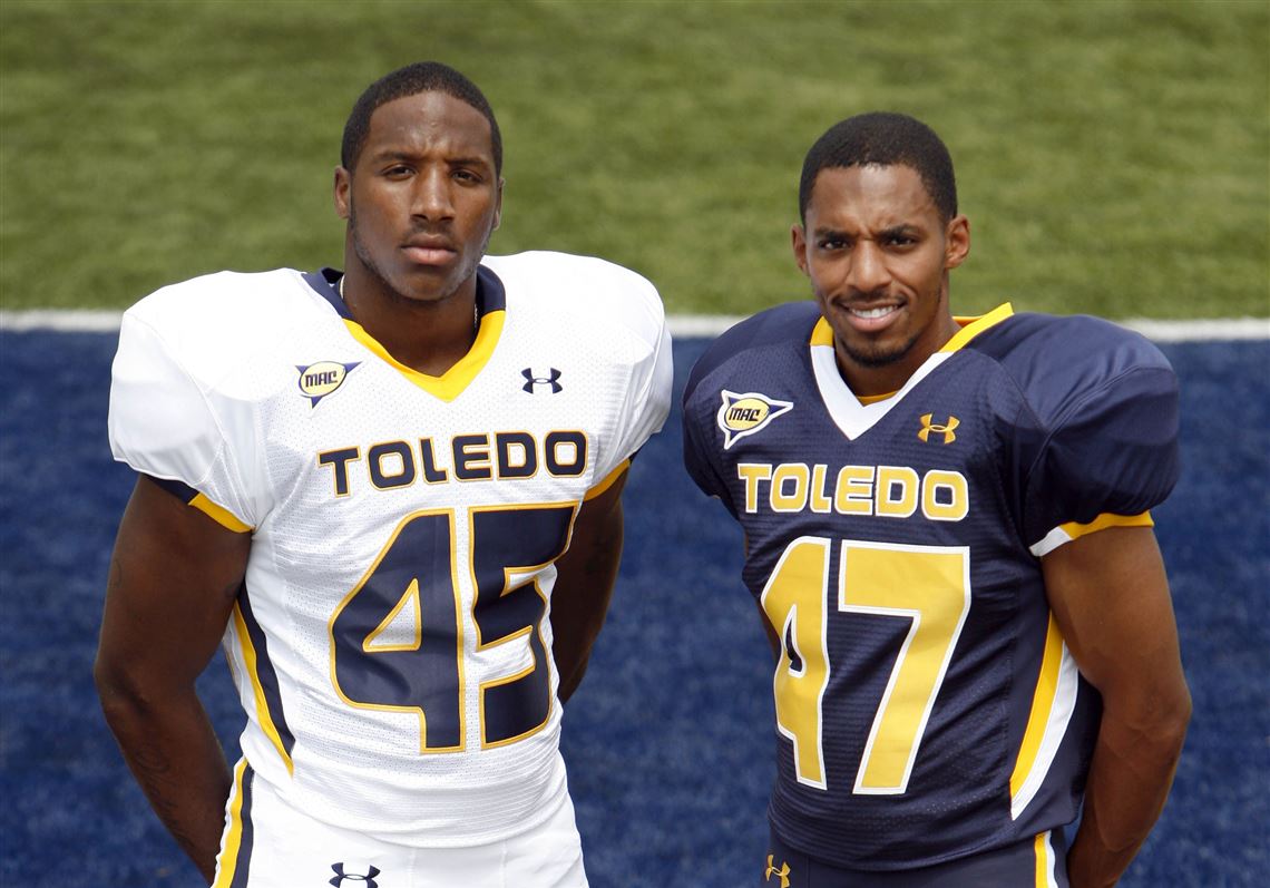
Toledo Walleye "Wizard" logos for their Harry Potter promo (to be worn January 6)
http://swampshop.milbstore.com/store_contents.cfm?store_id=115&dept_id=1787&product_id=98177


-
Larry Nance wore #6 for the remainder of the 1987-88 season (27 games, plus post-season), after his trade from Phoenix.
He switched to #22 for the 1988-89 season. (His #22 would later be retired.)

-
Probably mentioned by now.
Bernie Kosar


-
2
-
-
Forgot this happened.

-
1
-
-

Right team, wrong uniform. Looks so odd to me. Maybe it's not that weird to Detroit fans, but the fact that he wore those jerseys never really crossed my mind.
-
1
-
-
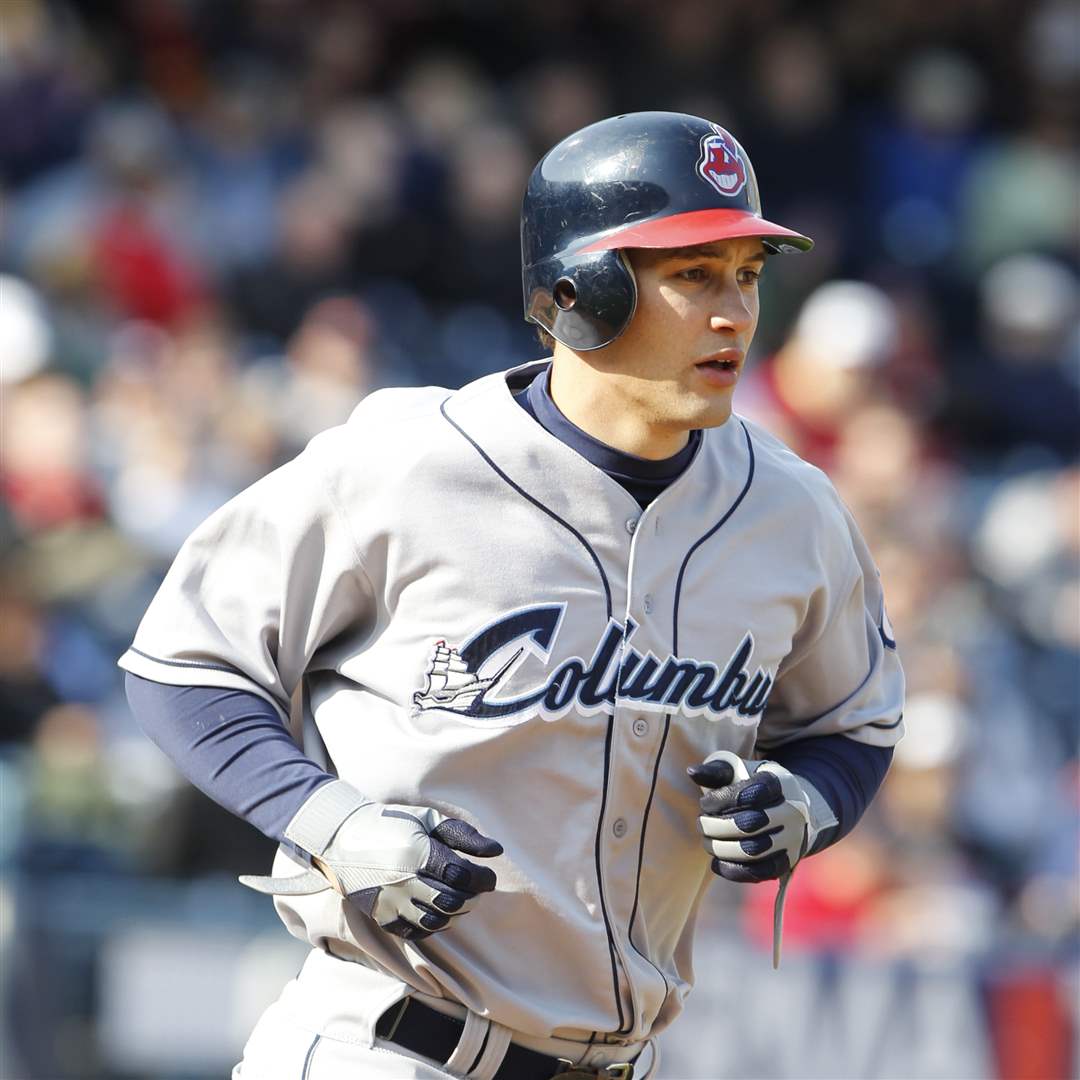
7 minutes ago, Cosmic said:
Is it common for players to bring their own batting helmets down to the minors with them? I didn't think they were that personal (but I don't know anything about baseball).
I would say the majority of players on rehab assignments wear their MLB helmets. It's always been a cool little quirk. (Grady Sizemore comes to mind, Michael Brantley, A-Rod.)


-
1
-
-
It would be awesome if the CAVS jersey wordmark from the 80s could be added (or the similar one used on their alternate jersey currently).
The primary logo from that time period is on the site, but is not arced like the uniform version.
-
55 minutes ago, Discogod said:
That's from the 1997-98 preseason, he played a couple of games with the Warriors (in the new unis) before being traded to the Magic.
Mystery solved. I obviously didn't do much research there. The couple sites that I saw, listed him as only being with Orlando in 97-98, so i just assumed that was the case. Thanks for clarifying.


 that screams amateur arena league.


MLB 2023 Uniform/Logo Changes
in Sports Logo News
Posted
Definitely! I just watched the video posted too. Great execution on the motion graphics, what a cool idea.