

raysox
-
Posts
7,590 -
Joined
-
Last visited
-
Days Won
22
Posts posted by raysox
-
-
Ive seen this font a lot, anyone help?

-
This!
-
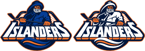
Count me in as a person who loves the Islanders' first edge jerseys. Too bad they reverted to a throwback. I also hate the new colors.
As far as the fisherman logo, I kinda like it, I prefer the circle more, but thats with a drker blue. If the colors were changed(No tooth paste aqua), it'd be real nice.
-
USA soccer player Carlos Bocanegra in MLB All-Star gear

-
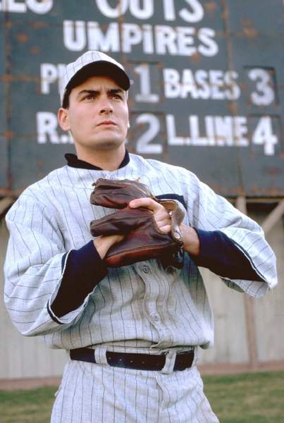
Wow, apparently Charlie Sheen was already in this thread.
Matt Lienart in a Diamonbacks jersey

Someone make a thread of athletes in other jersey taking BP.
-
Charlie Sheen on the White Sox
-
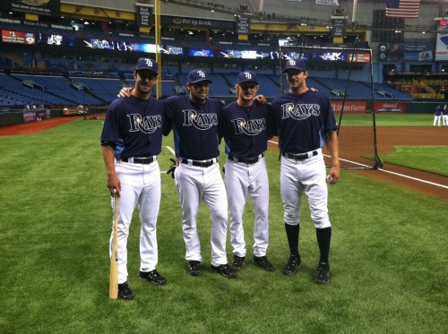
Teddy Purcell, Nate Thompson, Steven Stamkos, Mike Smith after batting practice with Rays.
It happens.
-
I was at a DVD store, and saw the dvd for Like Mike.

I noticed Steve Nash was in Mavs' gear, not Suns.

How's this one?

-
On why Anaheim over Tampa Bay? Because of stronger ownership (Disney over Phil Esposito's group) and a new arena (Anaheim Arena).
Shows how much you know. The St Pete Times Forum was opened in 1996, and is going through new renovations now. The Honda Center was opened in 1990. Also, the Lightnings' new ownership improved the Lightning 12th seed to the Eastern Conference Finals in one season.
-
As I've pointed out, Columbus is within 500 miles (driving distance) of both Washington and Carolina, as well as other conference opponents in Pittsburgh, Buffalo, Toronto, and Philadelphia.
Nashville is within 500 miles (driving distance) of none of them.
And Nashville is more of a cultural fit in the Southeast than Columbus.
/What good is ease of travel when your fans don't travel anyway?
Meh I've never thought of it being a cultural fit. I've always thought of it as a locational fit. And Columbus clearly fits in better with the rest of the East.
/Columbus fits in better with Washington and arguably Raleigh anyways. What's Raleigh like culturally?
//Still thinks everyone's thinking of the Southeast Division as including Atlanta as far as Nashville fitting better...
What does it matter what Raleigh is like? It's more southern, and more eastern than Columbus. Vanderbilt is in the South Eastern Conference. Tennessee is a southern state. Ohio was part of the union. The team is named the Blue Jackets, dammit. It just makes more sense. A whole lot more sense.
You will stay in the Central and like it.
-
Marty St. Louis as a Flame

-
Nike's procombat is a modified version of stratum by process type foundry. adidas looks like it's unique, but futura is close. under armour uses a customized version of eurostile.
Alright, thanks for the help.
Adidas is similar to Avant Garde

-
Pro Combats <3
-
Why didn't anyone mention this yet?
LOL the URL even says yellow! Also, the Packers' tab says Green pay
-
Fixed.
Nope. I'm sure I was right the first time.
You need to get out of the 90s, Mayn.
-
I think this is the best logo the Pistons had.

-
Unpopular opinion, now is the best the Pens have ever looked.
Ugh. I hope you think Ottawa looks its best now too, because they wear the same pattern of uniform. Plus the gold being more of a khaki and adhering to no tenets of a traditional hockey sweater...it's really reebokeriffic. Unfortunately, with all the bandwagoners who haven't seen any different, your opinion isn't all that unpopular, and I hate that. Sorry
Honestly, I think the Sens, Lightning, and Pens all look pretty good(leaving out the alternates, those suck).
Idk, I just really like the Vegas Gold look better than anything else. These are sweet though.
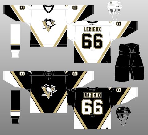
The yellow/black set's sleeves look weird to me
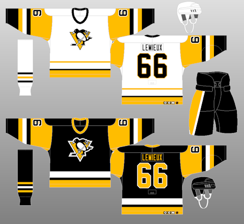
Then the next set with PITTSBURGH going down the front also isn't doing it for me.
-
^^^Not really. That one is so 90s it's ridiculous. Lemieux hates that set any way.
Unpopular opinion, now is the best the Pens have ever looked.
-
I'm about to commit board suicide here. I like the buffaslug logo... BETTER... Than the original Sabres logo.
I think the old logo falls into the category I made with the Nordiques, and Jets logos. It's just kind of basic, and make people nostalgia. If it was updated like Cfish's or GhettoFarmBoy's Sabres concept, I'd be all for it. Theres just something I don;t like about the wimpy swords, the weak handle, and the akward lines coming off the buffalo. The "updated" one just added a double outline around it. The Buffaslug is just modern and cool like most NHL logos.
-
Its funny how this thread took off. If you read everyones comments, it seems like confessing or AA.
"Hi my name is raysox and I don't care for the Ball-in-glove logo."
I love these

And hate these(Rams)

-
Two more to add to my list. The Vikings jerseys is one, I hate the retro, the white stripes stink. Also, I never thought this was an EPIC FAIL

-
Everyone has one. A logo everyone else in the whole community goes nuts for, while you're sitting in your chair just like meh. What are some sports design related things that would be deemed unpopular with most of this place. Here is an example.
With all the Brewers retro look, and everyone drooling at the BiG logo, ive looked at it a lot, and I think it's pretty cool with double meaning. I just think it's a logo that most people like just for the sake of being retro. I like the last two sets more than the original, but thats just me.
Same with most of the old logos in the NHL(like Quebec, Winnipeg, and Minnesota). Speaking of which, I enjoy most of the Edge jerseys.
How about you guys?
-
 1
1
-
-

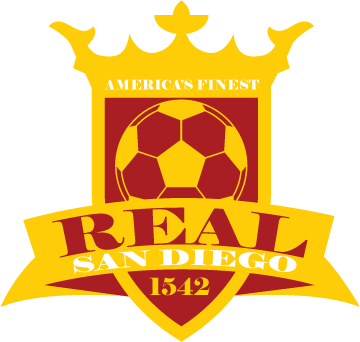
Or anything similar? It seems like a mix of MLB Reds and MLB Tucson.
-
How about this?


Name That Font!
in General Design
Posted
That's it! Thank you, sir.