


B-mer
-
Posts
1,732 -
Joined
-
Last visited
Posts posted by B-mer
-
-
Next up is the Carolina Hurricanes using the Winnipeg Jets jerseys. I liked this one as I was able to blend elements form all of Carolina's jerseys into this, and thought it came out well. The hem stripes match their old arm stripes up until their second Edge set, and the arm stripes on the road carry on the silver and black matching the numbers from their current road. I know it will be said, but I tried sublimating the warning flag design but it looked good on the red stripe on the road, but not as good on the white stripe on the home.

-
 5
5
-
-
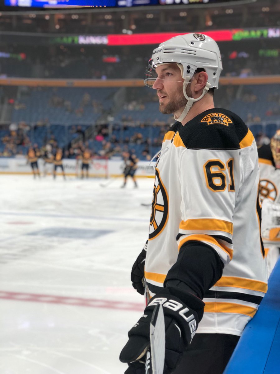
Here is my next one: Boston Bruins using New Jersey's new jerseys (meant to do that). I have another idea for Boston as well, so may end up with a bonus set later on.

-
5
-
-
I found the color, but on my monitor at least it just looks so dark and not right. How is this though?

-
2
-
-
12 minutes ago, TheGoldenTriangle said:
Something is off about that yellow, it’s too bright. Other than that, these look great
hmph. I had trouble with it finding the right shade. Before it looked too dark. but thanks.
-
Thanks for the comment.
I sat down and came up with more teams to work on than I originally thought I'd do, so I think I might try for the whole league.
Next up is Nashville. I saw a lot of easy connections to both their current jersey and the previous one in using the Minnesota Wild's new home jersey. Hope you like.

-
3
-
-
Sometimes when new jersey cuts and templates come out, I look at what we got and wonder.... what if team A used team B's jerseys? Well, here we go. I'll be posting a couple jersey swaps. These won't be full identity swaps, as you'll notice there will be some small details that were left the same/omitted. There's no weird reason i have for choosing which teams I'm pulling from, and i'm not swapping both teams with each other, just one team using another team's jersey. So far I only have a few ideas so if anyone wants to see/suggest others, please feel free.
First up is the Washington Capitals borrowing the Nashville Predators jerseys.

-
8
-
-
2 hours ago, M4One said:
Rick Nash
Fun fact: first time he hasn't worn red pants in nhl (specialty jerseys aside)
-
1 hour ago, PepMan33Conde said:
Chris Kaman, Los Angeles Clippers (NBA), 2010-2011
Are we sure that's not Biff Tannen?
-
4
-
-
I feel Doan's right uniform is the red/white sets, probably the edge version most.
-
i don't feel that Bruins jersey is real either. at least, not a real prototype. It's almost exactly what they were already wearing just with the side panel cutting off the hem stripes. The color is weird and would have to be a really early version of the edge collar if a true prototype. But the NHL logos look horrible too.
either way, thank god they moved away from that.
-
Those are good ones. I actually miss those Kings jerseys.
-
1
-
-
-
3 hours ago, nash61 said:
Tim Thomas
That's a wrong uniform and wrong dome.
-
Wow, I actually had a couple of that Gougliotta card when I was a kid and in my basketball phase.
-
Jordan's confused. He's saying "Yo Scottie, why you guarding me and wearing that ridiculous uniform?"
-
4
-
-
though it's an alumni game... I would have loved to see a prime Bourque in this uniform.

-
2
-
-
also Marc Savard and Zdeno Chara in their first year in Boston. Hell, even Marco Sturm doesn't fit with that look.


-
1
-
-
On 3/14/2017 at 11:08 PM, PepMan33Conde said:
One of the best uniform match-ups ever.
I know the Flames set has it's various issues, but the one thing that has always bugged me the most i think is the socks. The white is the dominant color of the stripes and just doesn't fit with the rest of the uniform. If they even just filled in the bottom to be black, it look a whole lot better.
To make it more maddening they flip the sock/arm stripes on their previous alt!
-
2
-
-
I would love to see those on a player with their old pants. The pants they had with the first edge set clearly were meant to go with these jerseys to line up the stripes on the sides, like Calgary does.
-
I saw those a long time ago. I actually really like the first one in the right colors. Aside from the logos anyway.
-
Loved that look for the 9ers.
-
Mickey Mouse ears?
-
1
-
-

Bledsoe only wore these for a short time. This is clearly the Tom Brady era unis.
That looks so weird...
-
1
-
-
How about an update of the crack bear from the Bruins?


NHL Adidas jersey swaps (Wild 9/21)
in Concepts
Posted
I actually have a few ideas for them, so I'm trying to narrow down which one I do. I want to do my best to avoid re-using the same teams as much as possible, even though there are some that would work well for a number of teams.