


VandyDelphia Mike
-
Posts
1,688 -
Joined
-
Last visited
-
Days Won
1
Posts posted by VandyDelphia Mike
-
-
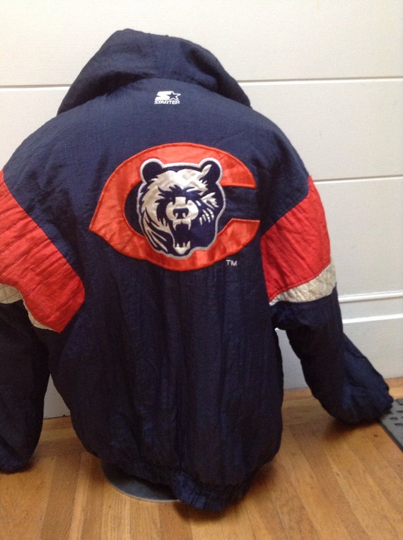
These Mets city connects would not look out of place in NPB.
The bridge on the hat is dumb.
Comparing to the set that was released previous, Phillies were only good from the neck up, while the Mets have everything but the hat decently rendered.
-
On 3/29/2024 at 2:27 PM, dont care said:
NBA has no 5 year rule.
Phoenix and Denver have made multiple changes in a 5 year time span to prove this statement.
-
 3
3
-
-
22 hours ago, BBTV said:
The Phillies botched theirs by not simply making the stars gold. It was such an obvious move to make, and would have lead to tons of new merch with the gold-star script.
Two gold stars to commemorate two WS Championships. Missed opportunity!
-
2
-
 1
1
-
-

If the Braves want to use their spring training webcast package in a post-Bally world, it wouldn't be the worst.
-
1
-
-
ACC basketball on the CW has a unique graphic package. A departure from their football coverage that just cribbed from ESPN CFB.
-
 1
1
-
 1
1
-
 1
1
-
-
NBC went with an offset top view of the Browns helmet in the 90s, I guess to avoid having a plain orange rectangle to represent Cleveland?
-
1
-
-
8 hours ago, TaylorMade said:
Feel like exotic stains (Brooklyn, or the Memphis Tigers would be examples) would have still grabbed attention and not thrown so much paint on the floor so as to be a safety issue,
Then again, there have been overly painted floors in the past too (Houston, Charlotte) and were there player complaints then?
Always thought it was decals that led to slippage, not more paint.
-
Feel like exotic stains would have still grabbed attention and not thrown so much paint on the floor so as to be a safety issue,
Then again, there have been overly painted floors in the past too (Houston, Charlotte) and were there player complaints then?
Always thought it was decals that led to slippage, not more paint.
-
So Peacock basketball modified their college football graphics instead of borrowing from the regional networks that still NBC brand.
Would not mind if the style was applied to Sixers/Celtics/Bulls/Kings/Warriors RSN broadcasts.
-
I get that from a simplicity and legibility perspective, Nike doesn't outline names anymore on association/icon/statement/city NBA jerseys.
But they could, because they do it for throwbacks.
-
Also related to the TNT reintroduction of the TNT Sports branding
https://www.bt.com/sport/features/what-is-tnt-sports-and-what-channels-does-it-offer
Warner Bros Discovery acquired BT Sport in the UK and Ireland, shuttered BT and launched TNT Sports.
-
2
-
-
Is this a Sixer city edition leak?
-
1
-
 1
1
-
2
-
1
-
1
-
-
Why just the bear head and not both? You can claim the move, but the Giants in East Rutherford and 49ers in Santa Clara still use prominent initials for NY and SF respectively ...
-
1
-
-
Game 3 - and ESPN/ABC has listened!
Points about the floor lacking any physical Finals demarcation are valid. If it were me, I'd put the Finals script and trophy icon on the baseline where the Mich Ultra ad is, then make those digital ads superimposed to the court itself. Optimizes safety and aesthetics and posterity.
-
4
-
-
On 6/5/2023 at 7:57 PM, Cujo said:
ABC/ESPN putting in max effort on this year's Finals score bug..
Effort slightly increased with using the finals script in the score bar by game 3
-
16 hours ago, WSU151 said:
That’s five in six seasons (wait they also had The City/trolley car HWCs too) and they may not have one next year. They’re more the exception rather than the rule. Miami, Milwaukee, San Antonio, Phoenix, Houston, Brooklyn and Detroit won’t all be wearing HWCs next year.
Totally forgot they had a white We Believe HWC (worn for one game - the last game of 2018/19 - and apparently they wore them based on a special player request, which means these were a ridiculous exemption of any so-called HWC rule that floats on the internet).
When Nike does a better job of capitalizing on the popularity of Steph Curry than the company he has a deal with

-
1
-
 1
1
-
-
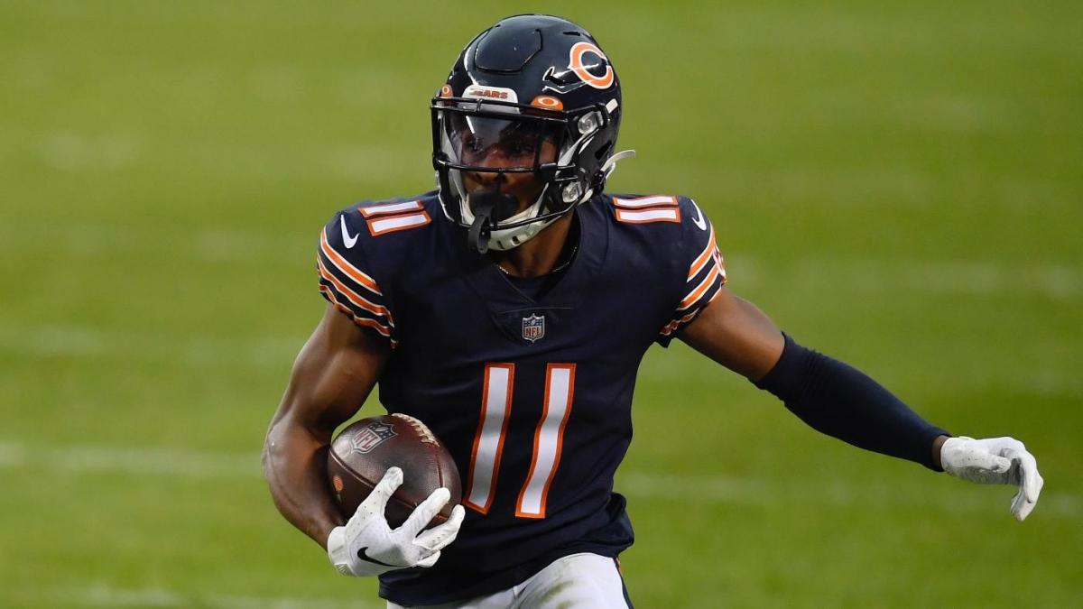
Darnell Mooney taking over for Julio when it comes to sporting the pause button.
-
7
-
2
-
-
Vanderbilt went with Lou Gehrig tribute jerseys in their matchup versus Belmont at the Sounds' home.
Normally without name on back, names made an appearance, since everyone had a 4 on their back. Their everyday uniform number was rendered in small font on the sleeve.
-
1
-
-
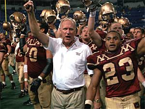
16 hours ago, tBBP said:
I'm getting some strange Jim Wacker vibes from that one...
M Boobs!
-
1
-
-
-
Nike's latest chapter in half-assing the Eagles - their Super Bowl media day attire. The jackets for LII used the uniform number font.
Meanwhile LVII has some block monstrosity.
Weak effort.
-
2
-
-
With the ad patch location varying based on handedness, does this mean the Phillies lose their shoulder numbers on the pinstripes and grays?
-
 1
1
-
-
Marcus Camby was a Rocket?
And he wore a very un-basketball number, 29?
-
1
-
-
On 1/4/2023 at 9:01 AM, seasaltvanilla said:
Which is a downgrade. I get it's supposed to be a stencil but it looks like origami.
On 1/4/2023 at 1:33 PM, jws008 said:IDK, I still like the reaction to the new logo from my neighbor's five-year-old daughter, who immediately made the correlation to our local Tex-Mex restaurant , "Why did they put the taco holder from Azteca on their helmet?"
I keep going back-and-forth between calling the team "The Commies" and "The Taco Holders".
And I still think they should have kept WFT, uniforms included.Curse you Commanders with your magic eye primary! Sometimes origami/taco holder viewed at some non-straight-ahead angle; other times a fat W in stencil font.
-
3
-
 1
1
-


2023 - 2024 NBA changes
in Sports Logo News
Posted
Add the pointless shoe contrast to the list of ways the NBA feels the need to emulate soccer