


VandyDelphia Mike
-
Posts
1,689 -
Joined
-
Last visited
-
Days Won
1
Posts posted by VandyDelphia Mike
-
-
NBC regional networks revising some of the score bug. Score is side by side instead of stacked, and logos no longer accompanied with city abbreviations.
Also note that when Wizards are in their retro gear, the network also uses the retro color scheme. The Philadelphia version did not do that when the Phillies would break out their throwbacks on Thursdays at home.
Second also note: may be true of NBCS Washington, but not true of NBCS California. As judging by Kings home opener.
Philadelphia hasn't had an NBCS broadcast yet, but they will by 10/22. They went with the old style in the preseason, though.
-
Here we have scrappy Duke Blue Devil Bobby Hurley as point guard for Indiana University (in the movie Blue Chips)

-
 1
1
-
-
21 hours ago, YELDARBfield said:
New court in Memphis:
(via The Daily Memphian's report on new SRO tickets at FedExForum)
I think I preferred the old wraparound apron stripe look from the past few years more, but this is solid. Definitely like the more full wordmark look on the baselines, too.
Keeping the woodgrain laid out straight in relation to the baseline, as opposed to the sideline like any other NBA floor that doesn't do a special pattern for their wood.
-
RE: Kentucky
 ditching checkerboard
 asymmetrical striping
-
5
-
-
14 hours ago, TBGKon said:
I believe the Cardinals were supposed to open the new stadium that year, but I think there were construction delays.
Similar to the Milwaukee Brewers and (then) Miller Park, delayed a year, wore the Times New Roman numbers in County Stadium's last year of use.
-
6
-
-
New Valpo mascots: What do they know? Do they know things? Let's find out!
-
5
-
 10
10
-
-
3 hours ago, jb1322 said:
With the classic edition unveiled, the statement uni only feels more redundant and pointless. Warriors will have 3 uniforms next year in similar shades of blue. They should’ve stuck with the Bay statement unis, or at least keep gold in the rotation with a new design.
Agreed that this makes too many blue uniforms for Golden State.
It would help if they could flip the placement of blue and yellow on their Icon Edition to balance things out a bit.
-
1
-
-
The current nike template does have armhole stripes that randomly stop without fully encircling the armhole on sets that utilize such striping, so there’s one way the switch to nike may influence design changes.
-
1
-
-
The NBA has it all backwards. Make the draft hats minimally designed and give the game uniforms extra flourishes.
-
2
-
-
Congrats Utah, you knocked Orlando from the ranks of "blandest uniform switch."
-
5
-
-
Shawn Bradley never wore this number as a 76er, instead wearing his height. 7'6" Must have had a 45 made for photo op purposes post-draft.
-
2
-
-
21 hours ago, jerrylawless3 said:
What's the reasoning behind the star placement? Why is Toronto's star bigger than everybody else's? Can't help but think it looks like the Naval Academy is hosting the All Star game when I see the stars in the top right corner.
From those caps at least, we no longer have to speculate what it would look like if every team decided to have a Vanderbilt tribute night.
-
1
-
-
19 hours ago, LA Fakers+ LA Snippers said:
Now that you mentioned it, baggy jerseys with collar trim but no shoulder cuffs were the worst (especially on small guards)
Love the Sixers but hated the wide shoulders.
When your basketball jersey can be confused for a sweater vest, it's not cut right.
-
3
-
-
More green in your everyday looks, Rockies.
For being a common color, there is very little green in the standard looks of MLB.
-
5
-
-
On 4/12/2022 at 6:13 PM, -Akronite- said:
Maybe I'm alone, but I wish the Rays stuck with the plaid bills.
Definitely not alone in that sentiment. It looked so good.-
9
-
 2
2
-
 1
1
-
 1
1
-
-
Back in his college stadium. Back in his college number.
-
 1
1
-
1
-
-
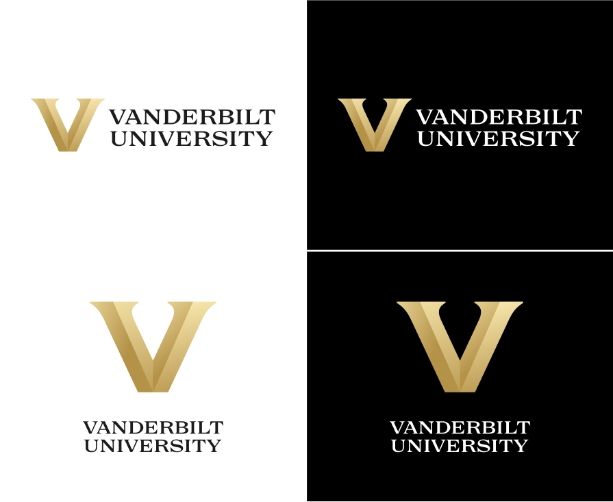
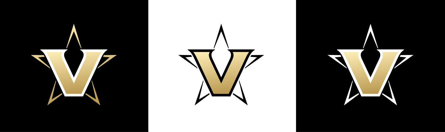
Yeah, the response to the Vanderbilt revamp may have been a bit excessive. Just a product of "don't they have better things to worry about athletics-wise?"
Anyway, here's hoping in that backlash, they stick to applications where new V stays within an enclosed star. Seems like you get nods to tradition and progress by doing that.
-
1
-
-
SNY adopting their NBC Sports cousins' font. Would make a nice update for the NBC RSNs that carry baseball.
-
1
-
-
Vanderbilt evolving to a bevel? The conference mates in College Station must have served as inspiration.
Nope, that might just be the institutional mark. But, what do we get instead for athletics? Gradients!
-
1
-
 2
2
-
1
-
-
I am not sure why Nike wants us to believe the Lakers are a team whose first jersey choice is gold, then has a purple clash kit, and wears white on a set rotation.
I'm not even that mad at the idea of less consistent home and road designations, nor do I ever wish anything good of the Lakers, but what's going on here is pure madness.
-
4
-
-
Know this place can typically frown upon reddit but figured it might be fun to look at Olympic presentations since 2000 all in one spot.
-
ESPN hasn’t changed, save for the scorebug more closely reflecting jersey colors of the combatants.
-
2
-
-
10 hours ago, BBTV said:
If sports radio and social media are any indicator, this uniform set is insanely popular. Pretty much all of the Sixers city sets have been hits (though last year's Boathouse Row was definitely polarizing) but so far the response to this one is off the charts.
They brought back the
VetSpectrum!I am glad the Sixers kept their mashing of eras fairly restrained, too. One vintage wordmark, and an homage to their former home. Can only imagine what went in the reject pile if they tried to combine certain uggos from their past. Helps when their base sets are a mashup of vintage looks already.
-
4
-
-
Interesting that Boston College put the NB logo on the hockey sweaters when New Balance has a Warrior subsidiary (logo visible on the lower right of the pants) that is more associated with hockey.
On these two sets at least, designs are more or less unchanged from last season with under armour, biggest difference being font choice for names.


/cloudfront-us-east-1.images.arcpublishing.com/pmn/BHGDMN3ECNE5FJDXNV3Q47BALM.jpg)


:format(webp)/cdn.vox-cdn.com/uploads/chorus_image/image/70038063/FCbM6fnVUAINMn_.0.jpg)

NFL 2022 Changes
in Sports Logo News
Posted
Curse you Commanders with your magic eye primary! Sometimes origami/taco holder viewed at some non-straight-ahead angle; other times a fat W in stencil font.