


VandyDelphia Mike
-
Posts
1,689 -
Joined
-
Last visited
-
Days Won
1
Posts posted by VandyDelphia Mike
-
-
12 hours ago, TheRealPepman said:
They'd show it every now and then. Hopefully they show it fully though.

Every now and then seems appropriate for the shots on goal stat.
For me, I need to see it as often as hits and errors on a baseball broadcast. Maybe even less. Others may differ.
-
 4
4
-
-
US national hockey broadcasts loving that upper left score placement!ESPN recycling the music from their last foray into NHL broadcasts, too.
-
4
-
-
Diamonized Jumpman nearly invisible on Charlotte’s whites.
-
5
-
-
On 10/4/2021 at 8:25 PM, pelicanfan said:
slight changes for the timberwolves court. baselines text is smaller (says minnesota on both sides now) and they removed the lines in the paint.
before:
after:
Images also serve to prove bench setups have gone back to pre-Covid style.
-
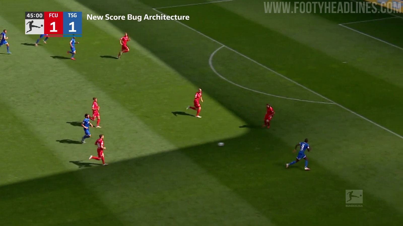
Thinking Bundesliga may have been left uncovered in this thread. Must be watching MSG for inspiration.
-
2
-
-
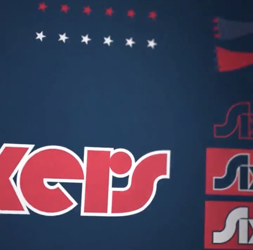
1 hour ago, ScubaSteve said:
https://twitter.com/JackPConnell/status/1440711504697856002?s=20
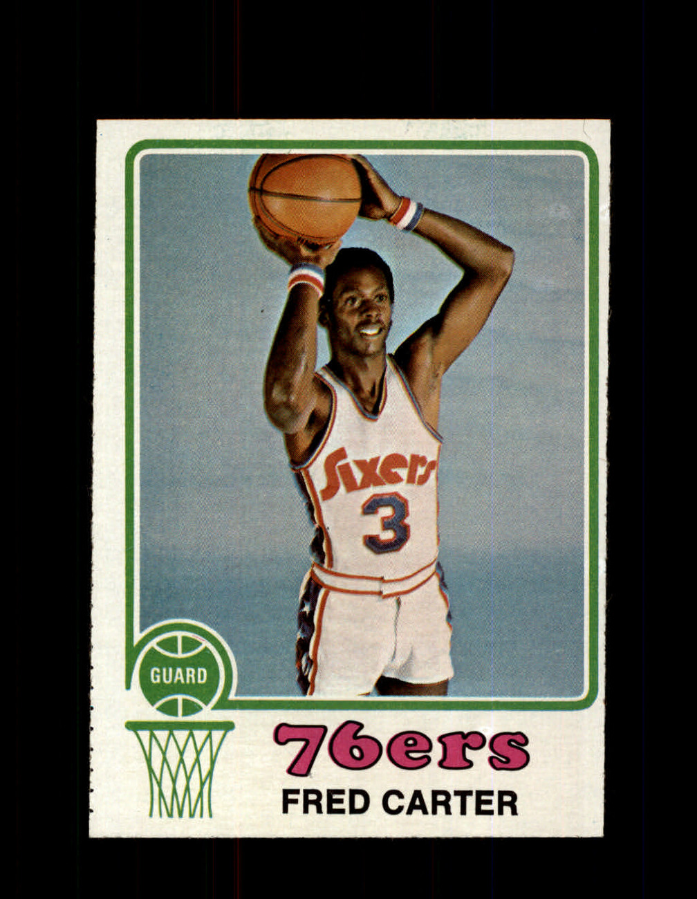
Sixers going with their 71-76 style font for City Edition. Love that quirky look for them this season, especially after the eyesore black ones
WIll be intrigued to see how they incorporate and whether it will be within an eras mashup or these duds put on a 2020s uniform cut.
(where can I get those socks?)
-
2
-
-
Were you expecting Ben Simmons to model this instead?
Observation: assuming the swoosh hasn't changed its dimensions, a squarer patch appears more prominent than the horizontal quadrilateral. Though it might be a push given the blue background of new advertiser versus the higher contrast of the old.
-
9 hours ago, mjd77 said:
Nice clean, simple warmup gear for next season...I like it.
On the warmups:
- like the simplicity
- dislike the templated approach; guess unique warmup patterns are a relic of the past like always white at home unless you’re the Lakers
-
2
-
-
What to make of this tweet?
-
It's interesting; Nike has their Oregon and UA has their Maryland.
Now NB gets their Boston College. Though I tend to think it'll be more "university close to HQ" than "school we get to experiment wackily with." Because football is not included, and because neither New Balance nor the BC Eagles are typically known for pushing the innovation envelope.
-
1
-
-
When you say TCU, I thought you were going to mention the Twins cap logo borrowing
Then there are the teams who mimic Cardinal-logo-on-bat stylings.
-
4
-
-
21 hours ago, DNAsports said:
C'mon Colts photoshop wizards! Couldn't have made the undersleeves white? Or they're getting the baselayers to match the swoosh.
-
5
-
-
On 3/11/2021 at 5:19 PM, logo-maker said:
Oop! Meant to say name on back.
Thanks for the catch.
While yellow names on white jerseys doesn't seem to make sense, it at least maintains a name color consistency with the black shirts. Plus, in 1997, the first year of the italicized numbers - the names on the white tops were single color solid black. Didn't look right.
-
7
-
-
Nets on YES have a bar instead of last season’s box
-
1
-
-
54 minutes ago, DG_ThenNowForever said:
The giant numbers combined with the empty seats make the players look tiny.
It's 2020. People have giant televisions. The score numbers should be smaller, not bigger.
It's 2020. People consume these games on mobile devices. Make the numbers too small and they become unreadable in those formats. Score numbers have to solve the goldilocks dilemma of not too small for phones, but not too big for giant TVs.
-
4
-
-
The trend of having the score numbers touch when presented horizontally continues. And we are back to italics.
-
2
-
-
Blue Jays have tweaked
-
1
-
-
How long has NBATV had the ticker styled like below?
-
3
-
-
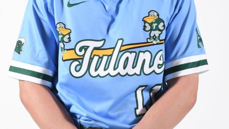
The yellow splotch in the middle of the wordmark on the Milwaukee Brewers' blues. There has to be a better way of addressing when the buttoned jersey opens up. Switch to pullover? Make that yellow part blue? Anything but the status quo.
-
15
-
-
So, the Phillies weren't wearing retro uniforms last night, but the score bug for ESPN used that logo for the team. Maybe to contrast from StL red?
-
1
-
-
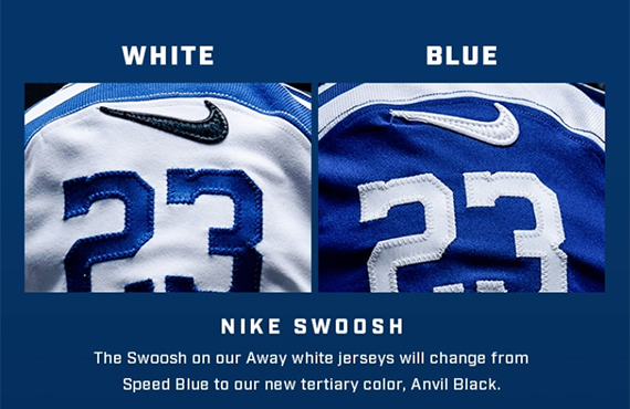
4 minutes ago, Buc said:
Setting aside the whole "that's the Steelers' stadium" thing, I think a better reason for the bright yellow is that it's one of Nike's stock yellow colors.
Don't discount this...Nike and other manufacturers would rather either get all it's teams with similar comes onto their own, sometimes proprietary, stock swatches (this happened with Florida State's garnet, going from it's more unique reddish to one of Nike's stock "dark red" swatches), or at any rate, produce as few color swatches as possible (which I'm sure the whole Seattle Seahawks fiasco under Reebok's watch had something to do with). It just makes good business sense on the supplier's end...even though it may rob us viewers of some of the more unique shades--such as Pitt's former mustard yellow. (I do however love the shade of blue they paired with it, so that to me makes up for it--plus yellow has always been my favorite anyway, so I'm good with it.
 )
)
Speaking of Pitt...I wanna see what the rest of this Cathedral-of-Learning-inspired number set looks like. Oughtta be interesting. But here's what's not interesting...
What up with that placket piping tho?? I'm sure that's probably a casualty of Nike's baseball template...but why do they continue to do things like this??? It gets irritating...)
Holy moly! That's the baseball version of cutting off armhole trim on the NBA template for no discernible reason!
What if they do this nonsense with the MLB uniforms once they take over that in 2020?
-
Score changes result in a logo flash. So they're not always missing from the screen.
-
A less ballyhooed debut than that of Lebron in Laker Yellow: tweaks to the NBA on ESPN score bar.

-
1
-
-
Remember when the main video was 4:3 safe and on HD you got extra information beyond the ticker?


 (where can I get those socks?)


2021-22 NBA Changes
in Sports Logo News
Posted
The Milwaukee mashup should have incorporated some red, considering they shoehorned purple into the side panels.