


BadSeed84
-
Posts
3,648 -
Joined
-
Last visited
-
Days Won
1
Posts posted by BadSeed84
-
-
12 hours ago, ZapRowsdower8 said:
I think we all knew ads were coming, but I’m honestly pleasantly surprised that they are limited to jerseys and batting helmets. I was sure caps would get them too. All ads are terrible, but it could have been worse.

You're kicking punched in the back of the head and kicked in the balls, but it could have been worse! You didn't get kicked in the gut as well!
It's disgusting, baseball used to seem like the most professional sport, but between the clown uniforms (All star game, city bull :censored:) and now ad's, man it sucks.
-
 3
3
-
 1
1
-
-
3 minutes ago, ThunderCeltic said:
Hopefully MLB 22 The Show will retain Cleveland's previous uniforms. They can always compromise. Just replace the previous name with "Cleveland" on the 1994 Home White/Navy Alternate and 1989 Home White.
Throwback uniforms shouldn't be included if it has to be BS versions of them, I think they have been doing that with the hats in recent games.
-
2
-
-
1 hour ago, ltjets21 said:
I kind of liked those, at this point BFBS is what it is but those houses on the schuylkill river are pretty iconic to philly.
Still looked like a 3rd grader designed it. Yea the IDEA wasn't bad, but the execution sucked (Especially with Philadelphia on the bottom and number on top)
-
3
-
-
3 hours ago, LA Fakers+ LA Snippers said:
Red wouldn’t work with the side panels.

Fair, then a white version.
-
1
-
-
6 hours ago, ltjets21 said:
I know it could be much worse but that design is just so outdated that it almost feels weird to still see it.
Yep, its pretty much the same category the Bengals were in before last year.
And now they look so great since they finally got new uniforms.
-
2
-
-
The Sixers should've just made a white (or red) version of the spectrum uniforms they wore this year.
-
3
-
 1
1
-
-
Too many I think would look better if the logo's were outlined in white or their normal colors instead of weird dark colors. Like the Cardinals for instance.
Glad the Phillies is back to just using a P.
-
5 minutes ago, DrJack said:
Pretty lame that the women's and kid's versions of these new kits don't have the collar detailing, especially considering the collar detailing IS the design for many of them.
Pretty much all replica's (Mens too), which is pretty lame. Union has no collar or cuff stripes on theirs.
-
2
-
-
https://www.mlssoccer.com/news/philadelphia-union-unveil-2022-the-for-u-kit
The Philadelphia Union had unveiled their new primary kit.
Its better than their last one, but anything would've been, glad a stripe is back, but would prefer it in the center.
-
2
-
-
I'm into production music and came across this
-
2
-
1
-
-
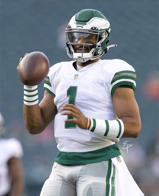
3 minutes ago, Friedrich Stuart Macbeth said:
If you want to take away from the black alternate jersey, look at the name plate there:
That is the only good part I have to say about this jersey. Imitating the logo wordmark and apply it the same way to the name plate is a nice touch and isn't too bad at all. What IS too bad is that it's now stuck with lame jersey nobody buys.
Like, that's a nice diamond in a pile of goat :censored:.
The hell is that on the back of the helmet? The black helmet looks like something a 1st grader would put together.
-
17 minutes ago, kutztown said:
Sometimes I think I want the Eagles to change their uniforms, and then I see things like this and I'm like ".........nope, we're good".
It amazes me how organizations continue to miss the mark this badly.
My exact same thoughts too when I saw these.
Just gotta hope the Eagles introduce a throwback 3rd and that's it.
-
Oh dear lord
-
29
-
-
8 minutes ago, eldandy said:
I don't understand why the uniforms had to be changed from WFT.
If you think the uniforms were problematic and needed to go, then the color scheme also had to go.
Anyone who thought the uniforms (outside of the helmet logo) were problematic probably doesn't even watch football and just spends most of their time in a starbucks in a suburb.
-
6
-
-
25 minutes ago, DCarp1231 said:
Would this be the first we see a team unveil four different jerseys at once? As well as seemingly dividing the four jerseys into two sets? One traditional burgundy and gold while the other is less gold and more black heavy?
Wait until they throw us off by unveiling the black jersey and a gold-devoid white jersey as the primaries and use the burgundy and it’s white counterpart as “legacy” and “legend” jerseys
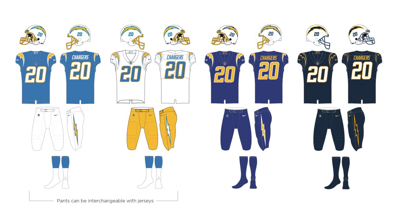
The Chargers unveiled 4 jerseys/uniforms at once. Though 1 White and 3 different blues.
-
6
-
-
You guys got it wrong. They gotta embrace the seafoam all the way, and match the blue.
-
20
-
 1
1
-
-
On 1/24/2022 at 10:21 PM, MCM0313 said:
I agree. When the Titans actually employ proper color blocking (as rare for them as proper pass blocking), they look okay. They should streamline the sword motif and cut down to one shade of silver, and get rid of those dumb things under the armpit. But those things just make them messy, not downright terrible. When they break up the mono and showcase the Columbia blue, they look pretty good. Unfortunately, they don’t like to do either of those things.
Then they could make the "sword" just one shade of light blue while they're at it.
-
4
-
-
43 minutes ago, Ark said:
I really don’t think the Rams uniforms are bad at all, but they are significantly worse than the throwbacks which sucks.
Just make the numbers solid yellow and they are very good jerseys.
-
4
-
-
5 hours ago, Kiltman said:
Would be happy with both, have a feeling they’ll lean that late 80s-early 90s era. Simpler and they can do more with it as a permanent addition.
It’ll happen this year or next year, Lurie was one of the main people pushing to get rid of the one-shell rule for awhile. Have a feeling the league quietly told the Owners they were ditching it themselves so no owner had to publicly vote on it and potentially be seen not caring about player health to some people.
Yea I was thinking the 80s-early 90s would be it as well, just classic looking.
-
2
-
-
6 hours ago, Cujo said:
Not an Eagles fan, but I need these on the field yesterday:
Just swap the helmet to the one they wore (silver wings outlined in white) with the old Eagles wordmark on that bumper.
-
3
-
-
I hope the eagles don't have throwbacks still in their style guide since the last one's they wore were the plain ones. And I'd love to see them throwback to either the Jaworskis or Cunnghams.
-
2
-
-
3 hours ago, WSU151 said:
Why wouldn't they change the color's of the A so its mostly black.
-
12 hours ago, dont care said:
And every stadium since has been trying to copy them and not execute it as well as they have.
I'm pretty sure PNC Bank & whatever the Giants is calling theirs these days come pretty close (Oracle Park after looking it up_.
Citizens Bank Park which is the one I would have bias for....falls under what you're saying I will admit (still nice tho!)
-
8
-
-
2 hours ago, spartacat_12 said:
Yeah, at least with the fisherman they were trying to be original and were creative with the logo & striping, It was obviously a jarring change from what they wore before, which is the main reason it was so hated.
The Preds just took their Winter Classic design, made the base blue, and tried to come up with a more "bold" wordmark for the chest stripe.
The idea was to reference vintage country music posters like this with the font:
I get the thinking, but the execution is awful. Yes, the posters used mis-matching fonts, but not in the same word.
Yea what they did, just comes off to me like its trying to look like the 90s, or a 20 year old interns idea of what the 90s was.


2022-2023 NHL Jersey Changes
in Sports Logo News
Posted
Sad day to see this.