


BadSeed84
-
Posts
3,650 -
Joined
-
Last visited
-
Days Won
1
Posts posted by BadSeed84
-
-
2 hours ago, spartacat_12 said:
Yeah, at least with the fisherman they were trying to be original and were creative with the logo & striping, It was obviously a jarring change from what they wore before, which is the main reason it was so hated.
The Preds just took their Winter Classic design, made the base blue, and tried to come up with a more "bold" wordmark for the chest stripe.
The idea was to reference vintage country music posters like this with the font:

I get the thinking, but the execution is awful. Yes, the posters used mis-matching fonts, but not in the same word.
Yea what they did, just comes off to me like its trying to look like the 90s, or a 20 year old interns idea of what the 90s was.
-
My condolences to predators fans.
-
 2
2
-
-
-
10 hours ago, Weapon X said:
I completely disagree on that, I think I would even rather see black jerseys with green pants before this look again.
You're no fun.
I think its fine if they only bust this out once or twice a year.
I may even say I like it better than when they wear all white.
-
17 hours ago, BBTV said:
Eagles black pants looked a lot better than I expected. Don’t need to ever see this again, but it’s not the end of the world. If they’re going to wear anything other than white or green pants, I’d prefer them to get a set of gray ones.
It looks better than the reverse imo (Black jersey over white pants) since the white jerseys still have green numbers, so its a better balance of black and green.
But the green pants still look better (and I too would love gray pants)
-
3
-
-
On 11/3/2021 at 12:16 PM, DNAsports said:
The two worst wordmarks in the NFL
I don't see how.
Especially when there is the variations of left top point on the A wordmarks
-
4
-
-
Did the Pelicans not want to incorporate the honeycomb or old hornets elements?
Along with the Hornets not wanting to have a checkered flag pattern on their sides for the Bobcats?
-
This was the best they looked imo.
-
11
-
-
19 minutes ago, Sport said:
I like the updated bolt, but that bolt is hard to screw up. I'll give them credit for at least not overhauling something that only need a small adjustment. That font is no good, though.
The Rams horn is hard to screw up but they went ahead and still did!
-
13
-
-
The only logo that got it right with changing is the Panthers logo.
Even then I question why the one eye is squinting more. But for the most part they did this one right.
-
3
-
-
On 10/4/2021 at 2:58 PM, Lights Out said:
Turns out a few more of these showed up on eBay recently. Unsurprisingly, they're all just as ugly.
https://www.ebay.com/itm/255055541850
https://www.ebay.com/itm/255057719733
Shame the Vikings didn't have the same sense that the Dolphins would end up having.
-
7
-
-
On 10/6/2021 at 9:34 AM, Bomba Tomba said:
While you probably posted this just for them being down this past Monday, I'd argue its more appropriate for what they have done to society in general.
-
4
-
-
37 minutes ago, JPDesign said:
If Nike ruined the Bulls uniforms and Adidas ruined the Bulls uniforms...maybe the suppliers aren't the problem.
Just like Nike isn't ruining MLB with the city connect jerseys when MLB has been dabbling in stupid uniforms the past 10 years (Players weekend, the holiday ones)
-
3
-
-
Sadly the crypto fits that shady franchise.
-
1
-
-
6 minutes ago, Chromatic said:
Vintage white works great as trim but shouldn't be the base of the jersey. The only example I can think off the top of my head where it works is the San Francisco Giants, and thats because they have a history with it rather than just using it on a fauxback to make it look old.
Also the Phillies cream alts work really well as well.
-
3
-
-
I miss Zephyr makin NHL hats.
-
1
-
-
5 minutes ago, WSU151 said:
Without the MLB deal New Era would have...the NFL and NBA...
Not really "hardly anything".
Came in here to say this, New Era has other leagues they do hats for.
They would still have more than Majestic has now.
-
2
-
-
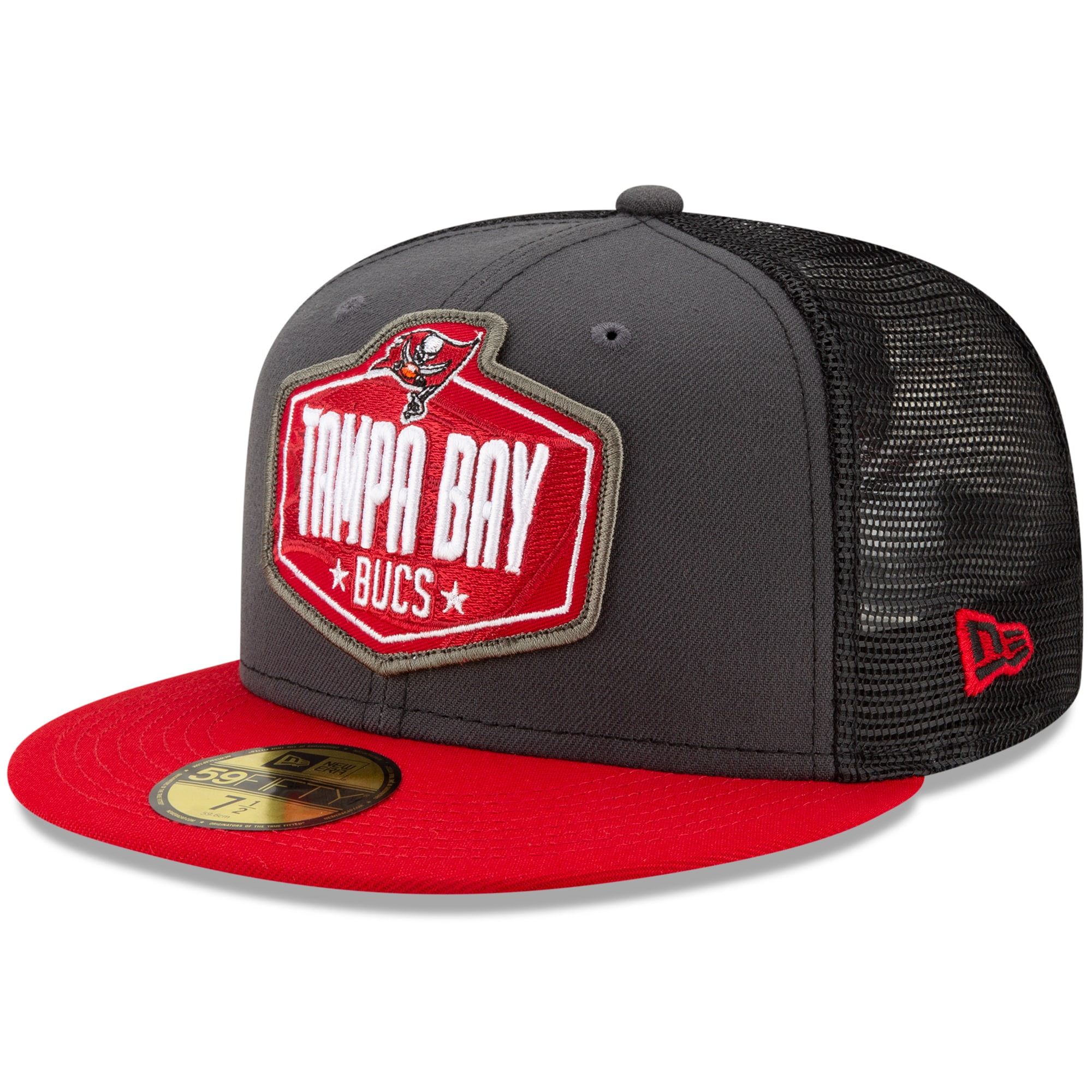
11 hours ago, TBGKon said:
New Era has made some pretty decent fitted 59Fiftys for the NFL that were decent. Interested to see what they roll out.
Obviously this design wouldn’t be the same, but this structure of hat should work and I’d probably buy one.
That's not bad, as long as they don't have every team use a contrasting color for the mesh. Let some have the same color as the front.
-
I imagine the new ST hats will be similar to this.
Oh well, I'll still rock my Phillies ST hat from 2010.
-
15 hours ago, MCM0313 said:
Then they will just use
 and
and  emojis with no words. Is that what you want?
Was just gonna say, rather have fresh & clean then the fire emoji, "lit" "swag" any day.
-
10 hours ago, JTernup said:
That is great news! The current logo in logo BP hats are probably the worst BP hats ever IMO. Also the classic mesh trucker style is really great. I got a Rays mesh back on-field and its one of my favorite New Era hats in a while.
Yea the logo in a logo crap is horrible.
I hope the Phillies return to just a bell or the blue P on a red hat.
-
2 hours ago, KittSmith_95 said:
Not sure if anyone here knows anything about this, but I noticed that in the NHL 22 teaser reel, the Islanders were presented with Barzal sporting the Navy Reverse Retro jersey. Is that just EA being EA, or could this be a leak that they're returning to Navy full-time?
I got NHL 21 on the cheap and they seem to include the past few years special jerseys.
-
1
-
-
It doesn't bug me to wear whatever, but yea I'm not loyal to just one brand, but then again....
https://www.nike.com/t/react-miler-womens-running-shoes-0mgX0d
You wear these thats 8 visible nike swooshes alone on your feets lmao.
Also again my comment earlier was more geared towards the extreme of "and this is why I'm not watching baseball anymore". I am fine with people complaining though about ads being on jerseys and nike's swoosh being on front.
-
1
-
-
2 hours ago, pepis21 said:
Anyone still believes that pandemic was the reason of helmets ads? Because it wasn't, it was excuse a very good excuse.
Once the NBA did it first, sadly we knew it was only a matter of time before the NHL joined in.


/cloudfront-us-east-1.images.arcpublishing.com/pmn/YKEGILGSYBHSVBKZJOH2OHIRSE.jpg)


MLB 2022 Uniform/Logo Changes
in Sports Logo News
Posted
I'm pretty sure PNC Bank & whatever the Giants is calling theirs these days come pretty close (Oracle Park after looking it up_.
Citizens Bank Park which is the one I would have bias for....falls under what you're saying I will admit (still nice tho!)