


BadSeed84
-
Posts
3,652 -
Joined
-
Last visited
-
Days Won
1
Posts posted by BadSeed84
-
-
Yea they should've just let the anniversary pass, cause it more comes off they only care about that they were founded in 1932 and don't give a damn now about their time as their former name. Not even a simple gesture of having 90 in the old number font, but in the crappy new font with the stencil.
-
 2
2
-
-
The 76ers old court from the Spectrum is up for sale.
-
 2
2
-
-
53 minutes ago, JayMac said:
Almost everything about the Eagles brand is outdated, except for the logo. That still holds up, IMO. But to replace the old wordmark with what I will call "generic modern NFL font" is not good.
I'd say now the Phillies & 76ers are the only 2 teams of Philly with good wordmarks.
The Flyers have a very generic modern NHL font too, but hockey you never see wordmarks so no one notices.
-
1 hour ago, Shumway said:
My first thought (other than the work I was going to have to do) was that it reminded me of the Lions wordmark, which also sucks. There's no character or charm whatsoever.
Someone on Reddit claimed it was from the same firm that designed the Lions wordmark.
-
2
-
-
1 minute ago, dbofox said:
I forgot to even look at the design. I stopped at $49! seriously? for a hat?!
They know there's suckers that will but these for that price sadly.
-
The previous 3 Eagles wordmarks were all unique looking compared to the rest of the league (60s to 90s, first mid 90s one then the one they used the past 20+ years). This one is so boring and safe,
-
3
-
-
1 minute ago, Dekabreak said:3 minutes ago, Dekabreak said:
Horrible, such a boring downgrade, going from the great bombastic looking wordmark to this.
-
2
-
-
Its like a crappy Loius Vutton purse ......in helmet form.
-
16
-
 1
1
-
-
3 hours ago, FamousAtticus said:
Right!? There's a reason why you haven't or wont ever see a guy likeRon ArtestMetta Sandiford-Artest, Patrick Beverly or Matt Barnes ever get asked to describe a team's new jerseys. Their reactions would be too real to share."And it was Barkley who said the uniforms looked like they were designed by his daughter with a crayon."

-
2
-
6
-
-
1 minute ago, Silent Wind of Doom said:
I think it's my age that is doing this, but... I don't... hate these. I's a bubbling nostalgia of the kind of trucker hat I'd expect to see on the 4th in the 90's. I hear Bruce Springsteen in my head. I see fireworks the night sky.
It's one of those instances where my head says this is an atrocity, but my heart kinda enjoys it, even from a "this is so goofy and stupid that it makes me smile" way.
I like these, my ONLY gripe is why isn't the Phillies P red.
I would even consider getting one if it was, these are alot better than "Flag pattern inside logo" approach they usually do. I still hear whiny people out there call this flag desecration, but at this point its not since its more or less its own pattern and they just want to crap on these no matter what.
-
1
-
-
1 hour ago, GriffinM6 said:
I've got some news for you...
This ain't nothing new in soccer lol.
The thing is these logos all use a thin ring with the circle. Montreal's ring is pretty big and ends up looking like they are trying to fit a shield in the inside of a doughnut.
-
5
-
-
Also whats with the red ring outlining the circle on the hat when there is no red anywhere else.
They should've just put the CR on it.
-
3
-
-
These look good, but I wish teams would just use their regular fonts cause then alot of these would knock it out of the park. I do feel like there could be a bit more purple in it.
-
3
-
-
I am hoping the Rockies is purple & green, and inspired by the Utah Jazz late 90s jerseys
-
1
-
-
5 hours ago, darthjocan said:
It'll work for some. Not all.
Well, the Yankee's, Cardinals, Dodgers, Tigers and a couple others I don't ever expect would adopt a color top as their road jersey.
-
Even color problems aside, that is probably one of the lousiest 50th anniversary logo's I have seen, the spur is just buried behind everything and you barely can make it out.
-
2
-
-
I really don't care for players wearing different color undersleeves, it was much better when it was a contrasting color to the jersey.
Like the Phillies here, they should only ever wear the burgundy sleeves with the light blues.
-
14
-
-
The news about teams having ad's for 2023 was on April 1st.
I was really really hoping it was an April fool's joke.
-
They could've at least had the cooler G on the hats with the sweet old wordmark.
-
7
-
1
-
-
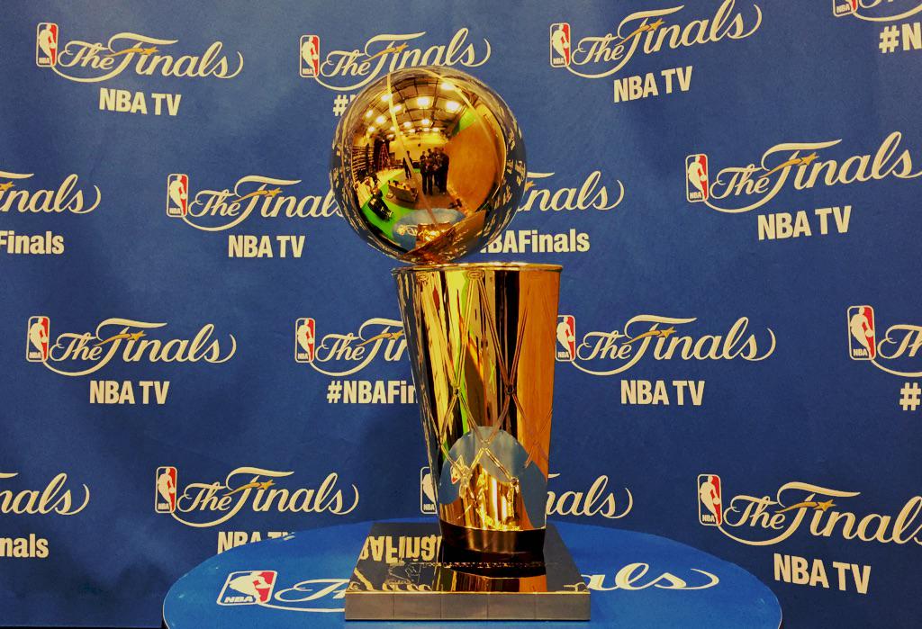
2 hours ago, UnclearInitial said:
Why is the Larry O’Bryant trophy base… not the Larry O’Bryan Trophy base?
Huge upgrade nonetheless, but it’s a bizarre decision
Unless the base is now circular like in the logo, I hope not since the usual base is meant to represent the court.
-
1
-
-
5 minutes ago, hormone said:
I agree fanatics suck, but wouldn’t Nike be on the hook for outfitting the on field product? Legitimately curious.
I do find it interesting MLB puts the blame on Fanatics too, since you would think Nike would share some of the blame too, but MLB probably doesn't want to make them upset.
-
https://www.mlb.com/news/phillies-cream-uniforms-delayed
So where was the Phillies Cream uniforms this weekend?
Because Fanatics suck.
-
 1
1
-
-
10 hours ago, BlazerBlaze said:
God damn that is so horrible...
....the music, had to instantly mute that crap/.
Uniforms are nice tho.
-
10 hours ago, Cujo said:
Could you post another dozen Eagles pics? Thanks bro!
Ok, I can! Here's pics of what 2023 will bring.
-
8
-
1
-


NFL 2022 Changes
in Sports Logo News
Posted
The Guardians I think have nailed how do handle a name change, even if you don't like the name Guardians that much, look wise they still look like how they did with minor changes (Also did help they transitioned away from Wahoo years prior)
The Commanders is just awful in every way.