


BadSeed84
-
Posts
3,648 -
Joined
-
Last visited
-
Days Won
1
Posts posted by BadSeed84
-
-
19 hours ago, TenaciousG said:
We are a year or two from Nike just making 90s uniforms over again but using Nikespeak to justify it.

- Perforated numbers for superior breathability and temperature control
- Nike Super Performance Mecha Elite shoulders for Supreme epic non-grabbiness
- Made from 69% recycled ocean garbage collected by an army of minimally paid ethically-sourced child labor dipping nets into the pacific garbage patch
- Nike Collar-Tech(TM) woven collar with the complete Declaration of Independence written on the inside
- Cromulent No-Sleeve(R) technology to make the jerseys look bad on-field
- Priced at $299.99 for the cheapest Hyper Gametime Limited Elite Epic Bacon version, definitely not a 5,000% profit margin
- Ignore the Champion logos we totally made these
I really miss how replica's were pre-Nike. I hate their stretchy thicker garbage.
-
 2
2
-
-
11 hours ago, Jamesizzo said:
We can't see the dislikes, YouTube hid the dislikes bro
There is an extension that reveals it.
-
3
-
 1
1
-
 1
1
-
-
That's cause Reebok had it alot closer.
-
8
-
-
On 4/26/2023 at 4:23 PM, the admiral said:
No it isn't. It cleans up the original logo's linework, centers it better, and makes it clear exactly what the red swooshes are (it's a cape). I think it was a tremendous success, but the Senators organization, a miserable failure, immediately discarded it.
That's exactly what they should be wearing, at least up front. I'd like some Peace Tower shoulder logos with copper-patina green, and a better font than Serpentine, a cop car font, but that gets the essence right.
You can explain it all you want. The90s and current logo is still better, Yes the cape flowing out the back just works better for a logo design.
-
3
-
 1
1
-
 1
1
-
 1
1
-
-
Those suck and I wouldn't expect anything less from TikTok.
-
3
-
 1
1
-
1
-
-
What are some concepts from the past, ideally from yourself or perhaps someone else, that either is mostly what would happen in the future or with something in it that would?
I just found this that I did in 2012.
And while the overall concept never happened, the logo I made for the sleeve would end up being the Phillies logo in 2019, just without the underline and blue bell & stars.
-
2
-
-
3 minutes ago, Sec19Row53 said:
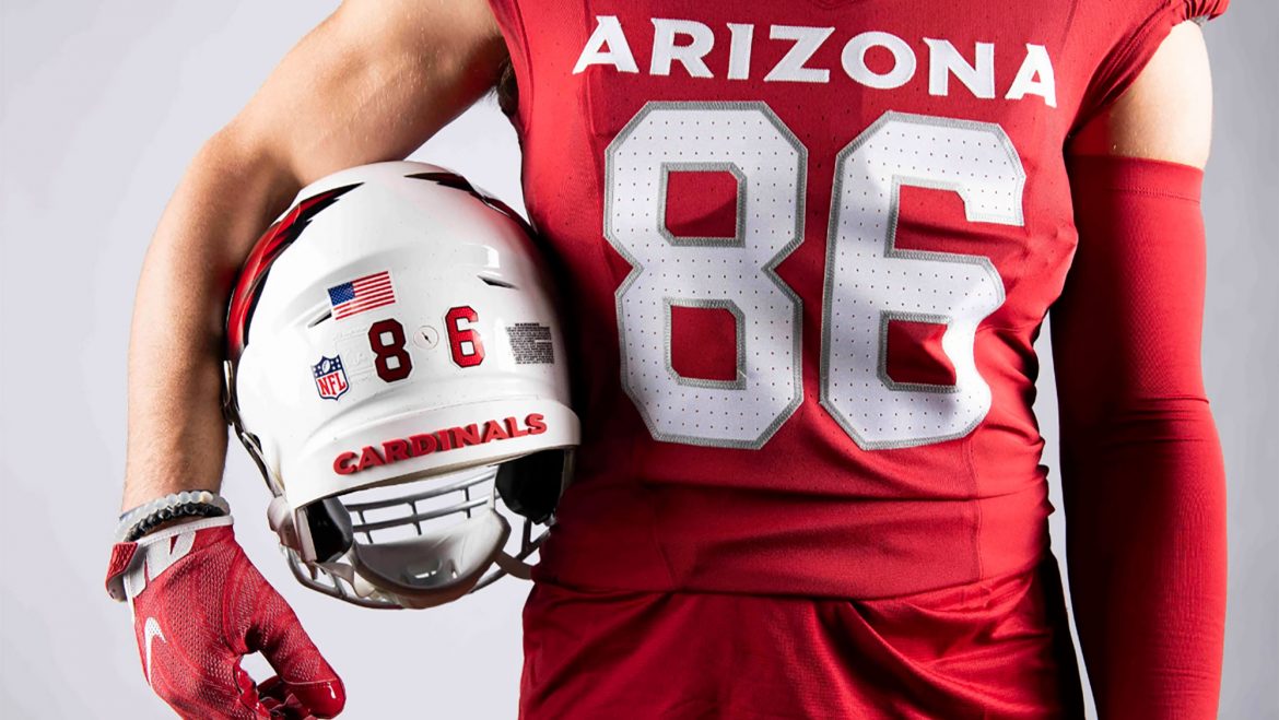
My 21 year old son texted me last night (unprompted), and stated: "After seeing the new Cardinals jerseys I am convinced I could be a graphic designer for a professional sports team. It's literally just a red jersey. No design. No twist. No "Arizona" anything. It's just red lol. What's the minimum number of years before another design change? Isn't it like 2-3?"
I told him 5.
He replied "Oh great lol"A - Which doesn't make it true
B - You DO know that we aren't the common fan, right?
I certainly do.
I also certainly know those silver specs won't even be noticed by the people in the huddle of the damn game is all I am saying.
But yes it is a different.
-
1
-
-
44 minutes ago, Sec19Row53 said:
They changed both.
Silver flakes and a silver facemask. Logo is the 3-D version and enlarged.
The common fan won't notice a difference.
-
3
-
-
2 hours ago, AndrewMLind said:
The Cardinals' press release referred to the helmet logo as "3D," which I initially brushed off as them not really knowing how to explain the metallic gradient design. However, this angle absolutely gives off a three-dimensional feel, ala some of Simon Brokmann's work:
No, its just the bumps in the helmet giving you that impression.
It is only shaded with "3d" effects.
-
1 minute ago, Survival79 said:
Miss me yet?
The new white's are definitely an upgrade.
The red's just need to make Arizona as big as Cardinals was there.
-
It doesn't help the goofy new Nike cut makes the HUGE Arizona so low.
-
2 minutes ago, RichardWitham said:
i wish we had a discord/live chat setup for days like this
I wish we had one in general.
-
6
-
-
19 minutes ago, the admiral said:
Crime is up everywhere, the entire country is going to hell in a bucket.
Mostly in big cities though.
-
But they have been the Athletics every city they have been in since 1901.
-
I guess its too late to suggest the Cardinals having their own thread lol
-
They sacrificed their red jerseys for THIS.
-
1
-
2
-
-
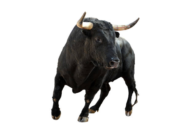
Just now, MJWalker45 said:
bulls have curved horns which curve towards the front. That's what the intent is. It also applies to the team's hashtag which is #hornsforward.
Yea I realized this right after I posted lol
-
1
-
-
2 hours ago, DCarp1231 said:
For the first time while watching SA-HOU, I noticed the negative space “B” on the back of the Brahmas helmet
I noticed this a bit ago. At first I thought the horns coming from the back was goofy but then.
Fair enough
-
1
-
-
1 hour ago, Andrew_Gamer_NZP said:
Rockies wearing white pants with the city connect jerseys tonight.
So instead of keeping the cool green pants, instead made new white one's for this. (Since their normal white is pinstriped)
I only like that it has a purple stripe on the pants but that's about it.
-
 1
1
-
-
Is it supposed to be Flintstones themed?
-
1
-
-
Yea I never noticed this either, very cool.
-
1
-
-
They should be called the Sesame Street Orioles
-
The past draft hats for the Cardinals would usually just be Red, White & Black
-
8 hours ago, Silent Wind of Doom said:
Hey! I know you're being sarcastic, but that could be Donaldson!
Groening and Cohen gave us the answer decades ago.
Whoa! That... using the logo C for the captain C is something that I would think is the coolest thing if someone said it to me, but actually seeing it...
I... actually like that Bronx shirt. But never on the field.
On the Yankees subreddit everyone was talking about their possibilities and someone suggested just doing the road grey with "The Bronx". I love the Braves one because it's unobtrusive and already a beautiful look. We saw what trying to hit on local culture did with the Coors Field All-Star uniforms that were clearly just the Atlanta ones with three-letter codes and local flora.
If it's being jammed down our throats, maybe just taking the home pinstripes and replacing the interlocking NY on the chest with BX, wearing them for a series and putting them on mothballs forever isn't the worst thing in the world.
$40 for a shirt.
No thanks (Phillies ain't too bad, Slam Diego is easily the worst)


MLB 2023 Uniform/Logo Changes
in Sports Logo News
Posted
Because then they get sales from people buying both.