


BadSeed84
-
Posts
3,647 -
Joined
-
Last visited
-
Days Won
1
Posts posted by BadSeed84
-
-
It's going to be weird seeing the Phillies not in red tops during spring training.
-
6 hours ago, AgentColon2 said:
That helmet was an eyesore.

They need to darken it a bit next season, looks much better (and they did match in the 90s)-
 3
3
-
-
5 minutes ago, Pigskin12 said:
So this is a thing again. I wasn't sure they'd do it against a division opponent.
There was a rumor going around they may have white helmets for this.
-
10 hours ago, Ridleylash said:
That's hardly a logo, though, that's a jersey design; the logo for those jerseys was the Flying Skate on the arms, not the V on the chest like the Vegas jersey.
Letters being used on the front of jerseys was extremely common in the PCHA and hockey in general in that era, as was single-color striping, so I'd imagine Vegas designed their jersey to align with that style, color scheme and all, since Seattle was already headed in that direction. Like, it's not that far removed from, say, this Rosebuds jersey;
Someone really likes italicizing words,
-
 2
2
-
-
4 minutes ago, BBTV said:
It's not choking if you're simply not good enough.
Very true,
-
1
-
-
23 hours ago, BBTV said:
I don't watch much NBA till the playoffs (and even then it's only the Sixers) but even my big basketball-fan friends can't wrap their heads around this crap.
Why do these games matter to me? OK, the players get a little extra money that most of them don't need, but as a fan, why do I give a F if these guys get even more money? What's in it for me? There's absolutely no reason for any fan to care any more about these games than they would a typical regular-season game. I genuinely don't understand why 1) anyone would or should care, and 2) why any team should coach their game or work their lineup any differently than they would any other meaningless November game.
Same here, and it's more to watch the Sixers in amusement since I know they'll choke.
-
 1
1
-
 1
1
-
-
18 minutes ago, MCM0313 said:
I wish there were a turquoise alt. Or, heck, just switch the road grey for turquoise. Other than that, it’s fantastic. The black alt is probably my favorite of the bunch.
Yea the light blue is great on it and does the effect the Marlins failed at doing with theirs.
-
2
-
-
22 minutes ago, tohasbo said:
The Serpientes is staying the same at least for the '24 season
Ah yea forgot about that one.
-
So I am going to guess the City Connect will be purple.
-
20 minutes ago, McCall said:
Not the D-snake again.

I have the opposite reaction, I like that it's back. They finally have a good consistent look again.
Also the first new uniform set in the new Nike cut is off to a good start.
-
13
-
-
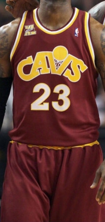
7 hours ago, -Akronite- said:
It was wine & gold but with a brighter, more royal blue. Felt like a mashup of the original colors & look with the original Cavs blue from the 80s/90s. Looking at pictures though, seems a bit lighter than even those Mark Price era blues.
The original CavFanatic jersey:
The following season's CavFanatic was a less confusing mash-up:
Love talking football jerseys!
-
 1
1
-
11
-
-
35 minutes ago, bbush24 said:
Really interesting and in-depth episode about uniforms the NFL just put out. There's a few quotes that made me roll my eyes, but overall it made me appreciate how much goes into it.
https://www.youtube.com/watch?v=EsJkeN-9RB0&ab_channel=NFLThrowback
I love when they say how tight the players want the uniforms, while how many now like having the undershirt sticking out? (which they show older clips of being cut off)
Also too Nike centric, love when they say all the work they do into a new design and such then you see the Titans uniforms.
-
2
-
-
The NFL put out this video about NFL Jersey's, has Paul Lukas of UniWatch even in it as a talking head.
Interesting video a bit too much about Nike in parts, but not bad.
-
-
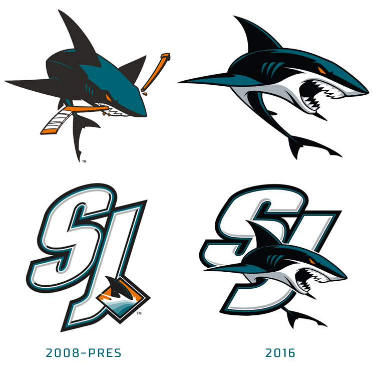
9 hours ago, GFB said:
It's the style of the cartoon for me. The shark is so overexaggerated, with those thin outlines and edgy shapes. The nose is too sharp, the top of the body is too flat, the way the teeth are illustrated as two white sections instead of individual triangles... it takes me back to a very specific time in the mid-aughts when that style was everywhere:
And the funny thing is, when the team went back to the drawing board, the team didn't think they went far enough down the "anime" route:
I don't believe the original crest is some wonderfully drawn shark either (like LIU or the old Clearwater Threshers)... but it does look more like a "real" shark, and frankly the understated nature of the original appeals to me more than either of the hyper-aggressive cartoons that followed.
The only good logo there is the fin one, Because it looks like a loog and the original looked more like a logo, especially for a professional hockey team. Those one's above look like it's for an AHL team.
-
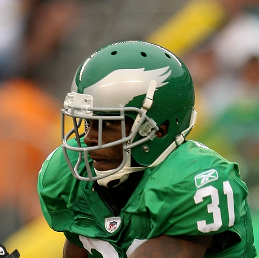
1 hour ago, BBTV said:
Disagree there. I grew up watching Seth Joyner, Jerome Brown, Reggie White, Eric Allen, Clyde Simmons, Andre Watters, Randall, Heath goddam Sherman, Keith Byers / Jackson, Jimmy freaking Giles, Arkansas Fred, and so on and so forth. So those were the uniforms of my youth and I originally hated the switch to midnight green. Not that they're perfect by any measure, but I think the 2003 update fixed all of the major issues, and I now find them superior, with one exception: The helmet wings.
The current wings are too cartoony, and would look better either being solid silver inside the black, and going back to the angled style. The white and silver combo inside the rounded wing outlined in black is just too much.
I'm fine with them going back to kelly green (though their older shade, not the oversaturated version they wore last week) but with a different look. Simple... but different. Minimal black, just silver, green, and white. Something like the Chargers, but with silver and white numbers (or green and silver on the white jersey) and no lightning bolt (duh.)
This helmet is better than both the current and the 80s. There's a second photo which is the same helmet (mini version) but the lighting is different so it looks like it would if they put those awesome wings on a midnight green helmet.
Silver-only wings on a midnight-green helmet would look great. Either way, just get me the same deep green as before.
I always liked the outline on the wing if it's going to be that look.
-
4
-
-
1 hour ago, throwuascenario said:
I basically have the opposite view from him. I'd be fine seeing any of these throwbacks (except the Oilers) coming back full-time. But until then, I don't want to see them. Trying to use two brands simultaneously inherently waters down your primary brand. I want to see teams pick one brand/uniform and stick to it. I'd much rather see alts that are just recolors and stay within the same brand.
The Titans previous look was much stronger than the Oilers look. Especially considering that all of their history occurred in it and none of their history occurred in the Oilers look. Yeah, practically anything would be better than their current primaries. But that says more about those than it does about the Oilers look or any other look. They should just go back to their original Titans set and leave them forever.
Another unpopular opinion: I much prefer the Eagles' midnight uniforms to the kellys. Yes, I am younger, so I never saw them play in the kellys. So to me, the midnight is just what the Eagles look like. But beyond that, the kellys are way too plain looking. Something about the block numbers, the horrible wing design, and the way too detailed sleeve logo just don't go together. I actually really like the number font and the sleeve logos on their current uniforms and the helmet design is 100x better. Maybe if they just recolored that one kelly, I'd prefer it.
I think it also depends on the current uniforms as well.
I would argue, yes the Buccaneers current identity should be their primary look.
But again, I am the opposite with you on the Eagles.
It is about time they should be updating their uniforms, and yes the current wings are better and could have some current elements, but simplified numbers in their current font (Though they could alter the serifs a little).
And the Titans current's are complete garbage.
-
1
-
-
7 minutes ago, DCarp1231 said:
I get his point.
Hell we are seeing it with the Buffalo Sabres, in the late 2000s when they brought back the blue & yellow with the Buffalo & sabres, yes that is what they should always wear! But now they have the goathead throwback alts and you're hilariously seeing the nostalgia cycle for that.
Like for the Eagles, I think the Kelly Green's should always be an alt, but what I would like to see if them change the current uniforms as well to have the simpler numbers without the junky charcoal & black outline with a drop shadow. And I still would like there to be a black alt option as well (Tho if they wanted to have Kelly green in that instead of midnight, it would be much better)
So I am always for a modernization of an old look coming back, the Blue Jay's & Brewers being the best examples.
-
1
-
-
Reminds me of the old Rock N Jock courts.
-
3
-
-
On one hand they are tossing a logo they had since they started.
On the otherhand before scrolling down, I thought this was a beer company or something.
-
On 10/26/2023 at 7:39 PM, bushy said:
It’s crazy. I didn’t expect the sixers new drop shadow to be that noticeable…..
it is SUPER noticeable lol
It looks like one of those red/blue 3d images now.
-
5
-
-
23 minutes ago, DCarp1231 said:
Nah, just new uniforms as a whole. Doesn’t matter if they’re kelly or midnight. Hell, do double green.
Yea the need to simplify the numbers especially, they don't need the extra outline & dropshadow.
And go with a full Eagle logo instead of just the head.
They can definitely do an update like the Charges did and have a cohesive set with Midnight Green, White, Kelly Green & Black & Kelly Green. (Since Kelly Green contrasts with black alot better)
-
3
-
-
Just now, DCarp1231 said:
So now we’re on the “throwbacks should be full time” cycle of the NFL season.
That full Eagle logo looks great midfield and the uniforms look better in every way.
-
4
-
-
The Eagles look beautiful, and love that NBC is using the throwback logo for the graphics.
-
5
-
1
-


MLB 2024 Uniform/Logo Changes
in Sports Logo News
Posted
There supposedly isn't any BP/Spring Training tops anymore. The Phillies Red did originally start out as that but became a regular alternate in the past few years.