


BadSeed84
-
Posts
3,648 -
Joined
-
Last visited
-
Days Won
1
Posts posted by BadSeed84
-
-
1 hour ago, Old School Fool said:
Oh, I'm sorry I'll just pretend that it hasn't been 32 years since they reached the NFC Championship and 66 since they won the NFL Championship.
Maybe I'm exaggerating a little bit but you can't ignore how cool it is to see unless you're an upset Vikings fan.
I'm kidding @oldschoolvikings please do not ban me I was joking.
I'm a Raiders fan so I root for the teams who haven't done much because I can relate. Aren't you two dudes Eagles fans? I thought you guys would get how it is for a team to finally come up big.
Well there is a difference.
Super Bowl LII was indeed the greatest sports game of all sports and time.
I can relate for sure.
-
Man Lions fans are hilarious, god help us if the Browns ever make it far.
-
 2
2
-
-
1 hour ago, jerrylawless3 said:
What a shame, in my opinion. I always thought the Jets’ current look was a good modern set – restrained and simple with just enough flair to make them unique.
All that y he “legacy” jerseys have going for them is just that – nostalgia. Without that they’re boring, nondescript, sporting goods uniforms.
Also a much better logo.
-
 1
1
-
-
Shrinking sleeve stripes and stupid placket placement.
I really hate Nike.
-
5
-
-
https://variety.com/2024/tv/news/the-cw-new-branding-logo-look-critics-choice-awards-1235870260/

I figured Nexstar would change the CW's logo, but I didn't expect them to barely change it.
-
 1
1
-
-
1 minute ago, pepis21 said:
Look wrong without a box. Unfortunately everything is moving toward to eliminate petrol engines, which mean this most likely gonna be their new general logo in few years.
More like 20.
EV's have been selling like crap and is pretty much a flop. I'll make sure to get a petrol based car before they are forced on everyone (well at least all new cars must be it)
-
 1
1
-
 4
4
-
-
All Star Jerseys looks like trash some 12 year old kid would find "lit".
I find it appalling coming from the NHL.
-
2
-
1
-
-
1 minute ago, dont care said:
But Denver has been called “mile high” forever, they even play at “mile high stadium” for anyone not to get that simple reference is ignorant.
I'd say then it should say Mile Hi...but then no IT SHOULDN'T SAY ANYTHING down the leg and just have a stripe.
-
2
-
-
1 minute ago, oldschoolvikings said:
If you walked up to me on the street and asked me how many feet were in a mile I’d tell you 5280. But if you randomly showed me a sports uniform that had that number on it, I don’t know that I’d immediately make the connection that that’s how many feet were in a mile, and that team is therefore from a city that’s a mile above sea level and blah blah…
Because it’s stupid.
When any element needs explaining of a backstory, it's crap. Sadly modern sports uniforms love this bull:censored:.
-
1
-
-
That 2000s lightning logo I would tuck the upper part of the bolt in the circle like the 1st one.
-
2 hours ago, LogoFan said:
I know it's supposed to be "UFL" bracketed by an abstract football, but as executed is see it as <UFL> every time, like it's in parenthesis. Is the "UFL" silent?
I see boomerangs along with the most generic "modern football" font. (I still would say a improvement over rock's XFL logo, but not much, USFL was better than both)
-
1
-
 1
1
-
-
3 hours ago, Survival79 said:
That collar. They can't be serious.
Also notice the Dodgers jersey's on the left the sleeve's end in it as well.
-
3 hours ago, ltjets21 said:
I'm not sure if these are replica jerseys. Those typically have came without patches or front numbers.
Well damn, may have to get a new Phillies light blue jersey.
Which also will be interesting to see how Nike handles racing stripes on the jerseys.
-
56 minutes ago, stumpygremlin said:
What happened with them?
It is being reported they will be filing for bankruptcy.
The change from Eurocom & radio.com to Audacy hasn't changed their fortunes.
-
I will pass judgement, I am sick & tired of Nike,, they ruin an element of EVERY league's uniforms, not because they can;t still do continuous arm trim on NBA jersey's, normal collar trim's in the NFL and now the Sleeve trim being above the fabric a bit in the MLB.
They do this to put their tramp stamp/unique "har har we're Nike" stamp on uniforms and I am tired of it.
-
4
-
1
-
1
-
-
-
8 minutes ago, heavybass said:
But then it wouldn't be called a Spring League if it started from the Super Bowl...
Fair enough, it would just be ending.
I hope the teams play in their cities.
-
Just now, heavybass said:
Well I can see this ending in failure.... again....
Well 2 mediocre spring football leagues that got low ratings, merging into 1 mediocre league that will get low ratings won't have much long.
And starting after the Super Bowl rather than Match would've been better.
-
1
-
-
5 minutes ago, DCarp1231 said:
Really hope the oversized “UFL” is a PR thing and not the legitimate game ball
And they still couldn't be bothered to make the Arlington Renegades not look like DR , but with AR or just R
-
2
-
1
-
-
1 minute ago, HOOVER said:
OOOF….this logo is like a generic high school football team t-shirt design done at Cindy’s Screen Print down the street. Font choice is a fail. UFC vibes.
Downgrade from XFL 3.0’s look. Makes me think Johnson’s team is mostly out, as one thing they did well last year was league branding.
Curious to see if Under Armour is still in or out.
Yea, The Rock & his ex-wife are still involved it would seem. Also the Black & white color scheme would be what carries over from the XFL.
-
3
-
-
The logo is better than the XFL's most recent logo.
-
7
-
-
ughhhhhh, no no no
-
1
-
 1
1
-
 5
5
-
-
14 hours ago, the admiral said:
The proprietor posts here. Hey @AndrewG70 what's goin on
"I wish I had a better update. Since Friday, I have called GoDaddy 18 times to try to get the website back up and running. So far, those 18 calls have gone precisely nowhere. It's gotten to the point where I have screamed at the top of my lungs at least two times and used some colorful language on at least three other occasions. Do know that I'm working very diligently to get the site back online."
-
1
-
-
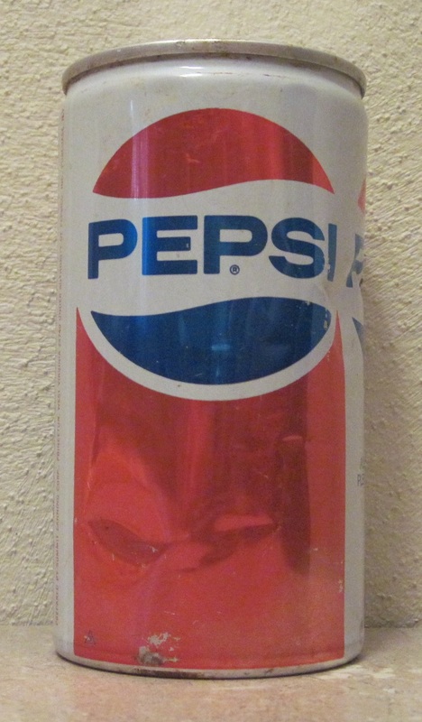
22 hours ago, BBTV said:
Oof, yeah that's bad. I still think that the concept is sound, but the execution is lacking. They'd need to get rid of the black too - which, the more I see of the new branding is by far the worst part of it.
Their most famous use of that logo never included black (nor was it solid blue, but I guess they'e all in on being the soda of the Crips. It doesn't cost three bucks, it costs three buccs.
I think they could have leaned into this more, with a blue can and white stroke around the yinyang (I think there's a black one around the white one.)
Or maybe kept something similar, but with but with blue replacing the red under the logo. Then that could be turned silver for diet, gold for caff free, black for no-sugar, pinkinsh for cherry, purple for grape (there really should be a grape Pepsi zero), etc.
The black in the logo and cans is basically the black on the Cowboys necessary. Unnecessary and jarring.
Off Topic - if anyone finds any Cherry Pepsi Zero, give a guy a tip. I've had it with Cherry Coke Zero.
I prefer Coke over Pepsi (Coke Zero over Diet Pepsi & Pepsi Zero). But think Wild Cherry Diet Pepsi is better than Cherry Coke Zero. Wild Cherry Pepsi Zero too is better.


MLB 2024 Uniform/Logo Changes
in Sports Logo News
Posted