


BadSeed84
-
Posts
3,648 -
Joined
-
Last visited
-
Days Won
1
Posts posted by BadSeed84
-
-
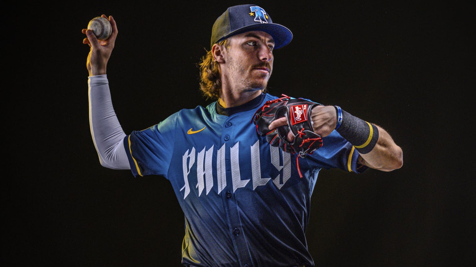
Really shocked they seemingly have gotten the Phillies powder blue throwbacks mostly right (except for the small NOB but that has been inaccurate anyways since it isn't vertically arched)
-
1 hour ago, rfraser85 said:
I'm curious about the Jets alternate uniforms. If they're using the Sack Exchange jersey template, which only has two colors, will the black jersey have any green anywhere? That's my big question for next week when they reveal their new(ish) uniforms.
You need to be asking yourself more if it will have contrast anywhere.
-
 3
3
-
-
3 minutes ago, UncleJunior said:
Was REALLY hoping those early leaks a few months ago were fake. Hope was totally lost yesterday morning.
They are pushing these jerseys so much on their social media (Twitter, Instagram)...almost like "please look at this many times and maybe you'll like them more and more..." It's not working. Majority of Phillies fans absolutely hate these. IF....big IF...they chose a different font, rather than this 'Heavy metal cover band / This is Spinal Tap' looking font, it could be a slight improvement?? The "7" looks like a "?" ....or a "2" with a faulty LED display showing the bottom line. LOL, I don't know.
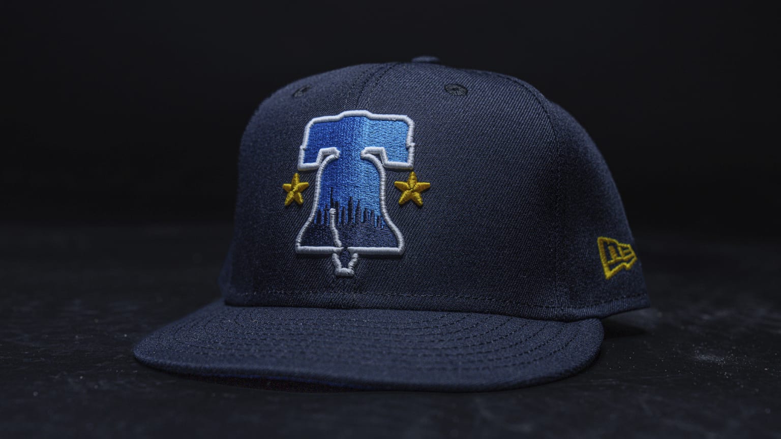
The hat however is ok I guess. The Liberty Bell with city skyline silhouette...it does remind me of a generic design you'd find at a Philly tourism store however.Make the hat light blue with a maroon bell and it would sell gangbusters.
-
3
-
-
2 minutes ago, JayMac said:
Not one speck of red. Nice job, Nike...
Replace the yellow parts with red and change the god awfuly Philly font to the old Phillies 70s wordmark saying Philly, these would have been received a bit better.
-
1
-
-
The uniforms are so bad, it caused an earthquake today.
-
4
-
 3
3
-
-

The hat is the only thing I like.
-
6
-
1
-
 4
4
-
 1
1
-
 2
2
-
 1
1
-
-
They could just be the Swingin' A's. Cause their swingers.
-
2
-
1
-
-
1 hour ago, adsarebad said:
People complained about the mesh diaper tail on the prevoius Majestic authentic jerseys..... but they were there for a reason, like the mesh underarms and side panel!
F fanatics..... but this is a Nike product..... THEY are the ones that changed the uniforms. Previous ones had the mesh underarms and behind, must have been a lot better for the players.
They must have very sweaty and sticky asses now....

only God knows what will happen come July and August

How come the players never seemed to have a problem before those?
90s, 00s they seemed fine.
-
1
-
-
20th Anniversary logo for Citizens Bank Park.
Not going to be on uniforms I imagine.
-
2
-
-
9 hours ago, tscuzzy said:
when you do a side by side , to me its a clear upgrade, even though its not that drastic. i expect the navy uniform to be a slight update like this one, and the other two to be more distinct.
The one small detail that makes more sense is having Houston above the number on their road jersey, AND it is only slightly bigger, unless what the Cardinals did.
The stupid ass number font holds it back from being a complete upgrade, and I would have preferred it still in red.
-
2
-
-
2 minutes ago, tBBP said:
And now that I see this, my suspicion is confirmed.
It looks like the [glyph forms of the] new Texans number font is based off a rectangle leaf shape:
I have absolutely no idea why or for what reason—or what this shape has to do with Houston or anything Texan—but I'm sure the team/Nike will [over]explain it away at the full reveal.
And also, not that this next part really means anything in the grand scheme of things, considering past uniform designs, but the total lack of a single semblance of anything "H-Town Blue" in these leaks now really has me wondering a/ if it will show up on the home sets and/or b/ exactly how it will show up period.
(Oh and it looks like the HOUSTON script is a little different from the soon-to-be-former one, which tells me a new TEXANS script is coming, as well...)
This tells me a new TEXANS script is coming as well lol
-
1
-
-
-
From reddit:
The shirtseys have holes in the numbers (And I'm going to guess it doesn't matter if the team has the holes or not in their jerseys)
I give them 2 washes at most before they form cracks easily.
-
2
-
 1
1
-
-
The worst part is stylistically the only thing it matches is the Nike swoosh.
-
1
-
-
The Eagles jersey (Granted the replica) with the updated wordmark, I'll tag @BBTV since he's been anticipating it.
-
4
-
2
-
1
-
 1
1
-
-
27 minutes ago, leopard88 said:
It reminds me of comparing the pre-Lombardi (Commanders) to the Lombardi (Commanders) . . . except that was intentional (or at least Lombardi didn't care that the new color didn't match the old one).
EDIT -- The board automatically replaced the team name that I typed with (Commanders). Interesting.
Interesting is one way to put it....
-
1
-
-
5 hours ago, Old School Fool said:
Test what? They put the uniform out and immediately got an overwhelmingly positive response. They said for years that they want to do kelly green real bad, and they also keep hesitating on it and it's irritating me. Do they want it or not? Make up your mind. The fans want it, the non-Eagles fans want it, but Jeffrey Lurie is too stupid to realize anything.
Regardless of what color green they choose, they need new uniforms real bad like the Broncos do.
They'll time it when they replace Jalen Hurts next season or so.
-
1
-
 1
1
-
-
6 hours ago, BBTV said:
But historically, teams with chest logos never put the number low. It's actually a more recent thing.
Makes me wonder who the 1st team to have the odd low numbers were.
-
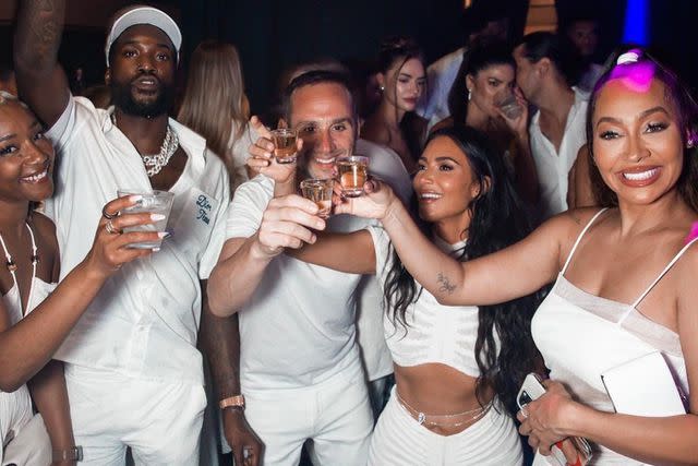
5 hours ago, BBTV said:
Here's what he does with the Fanatics and (formerly) the Sixers money. This guy's parties are legendary. Oh what I'd give to be a 5'6" jewish billionaire that gets pro athletes and rappers to temporarily put aside their war against the chosen ones.
NGL, he's living the life. Think I might start my own cheap-ass bullcrap poor-shipping and no-customer-service-having apparel company.
They're wearing the same material as the new MLB uniforms.
-
1
-
1
-
-
There was nothing wrong with the old logo, and freevee has the colors.
-
19 minutes ago, JH42XCC said:
2023 was Disney's 100th Anniversary. Unfortunately, it was not such a good year for them. With the exception of Guardians of the Galaxy Vol. 3, pretty much every movie released that year (plus the Secret Invasion Disney+ miniseries) bombed.
A couple movies bombing is probably a small chunk of Disney's profits.
I'm not even a fan too much of Disney, but they are probably doing fine still.
-
6
-
-
1 hour ago, VDizzle12 said:
So the Cavs got away with this?
I mean yeah we know it's supposed to be a basketball, but it's literally just a circle.
Maybe the basketball net gives them points.
-
2
-
-
-
1 hour ago, floydnimrod said:
I know there's a lot wrong with the new jerseys and we're all enjoying the pile on, but is it possible that last names were way too damn big to begin with?
No
-
11
-
2
-


MLB 2024 Uniform/Logo Changes
in Sports Logo News
Posted
Nevermind then, that stinks.